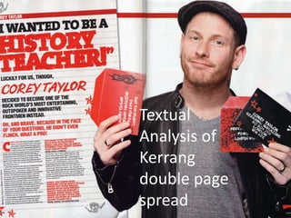
3. The main image of the double page spread is Corey Taylor, this image
takes up half of the double page spread, this shows that the article is
about him and only him since there are no other images on the page.
He is wearing a leather jacket with a plain grey top on, with a grey cap
on, he also has jewellery on, and a slight facial hair. This can be seen as
a quite casual look, but at the same time a mature look, which could
match the tone of the article. This also is a different look on him from
how he normally looks, and so shows that the article is going to be
different. He is also holding letters from Kerrang and the Slipknot
symbol on the letters, this links him to the magazine and to the band
he is in.
The font is serif and is in bold, it is a mix
between black and red, which stands out on the
white background. The style of the words
“History Teacher” seems to be drawn in marker
pen, which matches the idea of being a teacher
since they write on white boards with marker
pens. His name Corey Taylor, is in italics and in
red stands out from the other text fonts as it is
slanted and red being a bright vibrant colour
stands out on the white background. The
background itself is white lined paper, this again
creates a school style for the page, this is
further backed by the slight doodles on the
sides and bottom of the page. This style links to
the audience and from this style the audience
4. The text starts with red text to emphasise his name,
after that the writing turns to black tone, with serif
font, which reflects the serious tone of the interview,
as it is speaking about different things the singer
wanted to do in life. The less serious tone is in red and
in all caps which shows it is different from other texts
in the article. This also shows that this is the
interviewer speaking at that moment and not Corey
Taylor, this makes it clear to the reader who is
speaking at that moment in the article, this also
makes it stand out from the other text due to it’s
colour, and also that it is all in caps. This is also shown
that it is less serious as the bottom section of red text
is talking about a photo shoot, and how he is “almost
naked” and “perfect peachy bum” which is not in a
serious music magazine. This is more aimed at the
younger generation as this is the kind of things they
may ask about and not something a very serious
reader would want to know about. This also reflects
the tone of the magazine, which is a blend of serious
and none serious topics, and so also reflects the
reader, and the sort of things they would want to
know.