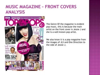
1. The Genre Of the magazine is evident
pop music, this is because the main
artist on the front cover is Jessie J and
she is a well known pop artist.
We also know it is a pop magazine from
the images of JLS and One Direction to
the side of Jessie J.
2. Its clear and easy to read. And the
name suggests that it is a pop
magazine. Also the colours used shout
that its aimed at a female audience
and possibly a younger generation.
She is behind the masthead which
shows that the magazine is not that
well known to the audience.
The ‘S’ on the end of ‘Top Of The
Pops’ is curly and this shows the
magazine is not boring.
3. The Language Techniques used are
feminine. They use words like ‘sizzling
posters’. The majority of men do not want
to see hot pictures of Men.
Also, Women want the latest gossip and
information. They also talk about
Catwalks, only women are interested in
catwalks.
4. The Button has her name in black bold
writing and it shows that she’s the main
focus of the magazine.
The main colour scheme is purple and pink
and this tells us it is a pop magazine. This is
because purple and pink are happy colours
and pop music is happy music.
5. In terms of Photography, there aren't that
many conventions that are broken. She is
looking straight at the camera, there is no
writing over her face and we can see the top
half of her body.
She is wearing a purple top and this goes
with the colour scheme of the magazine.
6. In terms of layout conventions, you have the
image of the cover artist in the middle, the
sell-lines to the side, and a button in the
middle.
There isn't as much writing on the front
cover compared to other magazines. There
are more pictures that writing on this
particular front cover.