Download to read offline


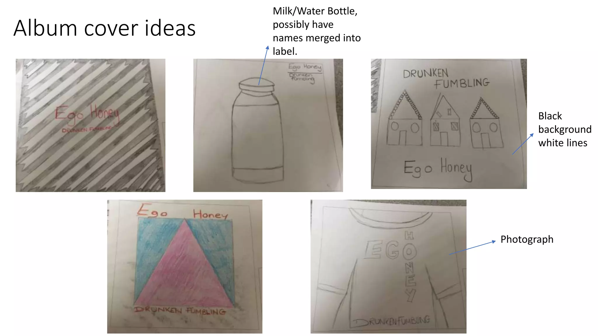


The document discusses initial ideas for a digipak album cover. It proposes using a simple single image design inspired by other album covers in the same genre. Handwritten or cursive fonts are suggested to make the cover look more homemade and urban. Specific ideas include merging the album and band names into a photograph of a milk bottle or water bottle label, or a black and white photograph with white lines. The genre is best represented by simple designs using black, white, bright pastel, or primary colors.


