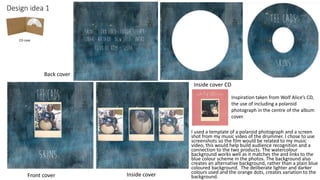
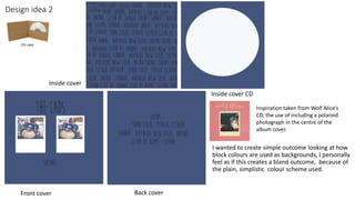
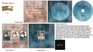
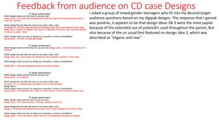
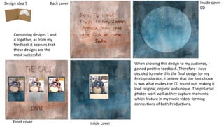
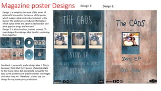
Digipak designs for a 4 panel case
Design idea 1
I used a template of a polaroid photograph and a screen
shot from my music video of the drummer. I chose to use
screenshots so the film would be related to my music
video, this would help build audience recognition and a
connection to the two products. The watercolour
background works well as it matches the and links to the
blue colour scheme in the photos. The background also
creates an alternative background, rather than a plain blue
coloured background. The deliberate lighter and darker
colours used and the orange dots, creates variation to the
background.
CD case
Front cover
Back cover
Inside cover
Inside cover CD
Inspiration taken from Wolf Alice’s CD,
the use of including a polaroid
photograph in the centre of the album
cover.
Design idea 2
I wanted to create simple outcome looking at how
block colours are used as backgrounds, I personally
feel as if this creates a bland outcome, because of
the plain, simplistic colour scheme used.
CD case
Front cover
Inside cover
Back cover
Inside cover CD
Inspiration taken from Wolf Alice’s
CD, the use of including a polaroid
photograph in the centre of the
album cover.
Design idea 3
I took inspiration from the first CD case designs that I
made, instead I experimented with layering techniques
and different filters to create pastel coloured backgrounds
and photos. The font creates a misty background effect
similar to marks made on a mirror when steamed. This is
alternative font created, which is unique and stands out.
The font also reminds me the teenage TV series “skins”
logo because of the nude coloured background against the
dark colour. The show focuses on a group of teenagers
growing up, this links to my music video and theme of
teenagers.
CD case
Front cover Inside cover
Back cover
Inside cover CD
Feedback from audience on CD case Designs
I asked a group of mixed gender teenagers who fit into my desired target
audience questions based on my digipak designs. The response that I gained
was positive, it appears to be that design ideas 1& 3 were the most poplar
because of the extended use of polaroid's used throughout the panels, But
also because of the un usual font featured on design idea 3, which was
described as “organic and raw.”
Design idea 5
Combining designs 1 and
4 together, as from my
feedback it appears that
these designs are the
most successful.
Front cover Inside cover
Back cover Inside cover
CD
When showing this design to my audience, I
gained positive feedback. Therefore I have
decided to make this the final design for my
Print production, I believe that the font choice
is was what makes the CD sound out, making it
look original, organic and unique. The polaroid
photos work well as they capture moments
which feature in my music video, forming
connections of both Productions.
Magazine poster Designs
Design 1: is simplistic because of the series of
polaroid's featured in the centre of the poster,
which makes a clear ordered orientation to the
layout. The poster presents basic information
which states when the album is realised but also
what popular songs are featured.
Design 2: is also simplistic, instead looks at CD
case designs from design idea 3 and 4, combining
them together.
Design 2:Design 1:
Feedback: I personally prefer design idea 1, This is
because I think that the 3 panels of photos relate
to the music video, but also create a visual to the
eye, as the audience are drawn towards the images
and what they are. Therefore I plan to use this
design for my poster print production.

Digipak designs for a 4 panel case

  • 1.
    Digipak designs fora 4 panel case
  • 2.
    Design idea 1 Iused a template of a polaroid photograph and a screen shot from my music video of the drummer. I chose to use screenshots so the film would be related to my music video, this would help build audience recognition and a connection to the two products. The watercolour background works well as it matches the and links to the blue colour scheme in the photos. The background also creates an alternative background, rather than a plain blue coloured background. The deliberate lighter and darker colours used and the orange dots, creates variation to the background. CD case Front cover Back cover Inside cover Inside cover CD Inspiration taken from Wolf Alice’s CD, the use of including a polaroid photograph in the centre of the album cover.
  • 3.
    Design idea 2 Iwanted to create simple outcome looking at how block colours are used as backgrounds, I personally feel as if this creates a bland outcome, because of the plain, simplistic colour scheme used. CD case Front cover Inside cover Back cover Inside cover CD Inspiration taken from Wolf Alice’s CD, the use of including a polaroid photograph in the centre of the album cover.
  • 4.
    Design idea 3 Itook inspiration from the first CD case designs that I made, instead I experimented with layering techniques and different filters to create pastel coloured backgrounds and photos. The font creates a misty background effect similar to marks made on a mirror when steamed. This is alternative font created, which is unique and stands out. The font also reminds me the teenage TV series “skins” logo because of the nude coloured background against the dark colour. The show focuses on a group of teenagers growing up, this links to my music video and theme of teenagers. CD case Front cover Inside cover Back cover Inside cover CD
  • 5.
    Feedback from audienceon CD case Designs I asked a group of mixed gender teenagers who fit into my desired target audience questions based on my digipak designs. The response that I gained was positive, it appears to be that design ideas 1& 3 were the most poplar because of the extended use of polaroid's used throughout the panels, But also because of the un usual font featured on design idea 3, which was described as “organic and raw.”
  • 6.
    Design idea 5 Combiningdesigns 1 and 4 together, as from my feedback it appears that these designs are the most successful. Front cover Inside cover Back cover Inside cover CD When showing this design to my audience, I gained positive feedback. Therefore I have decided to make this the final design for my Print production, I believe that the font choice is was what makes the CD sound out, making it look original, organic and unique. The polaroid photos work well as they capture moments which feature in my music video, forming connections of both Productions.
  • 7.
    Magazine poster Designs Design1: is simplistic because of the series of polaroid's featured in the centre of the poster, which makes a clear ordered orientation to the layout. The poster presents basic information which states when the album is realised but also what popular songs are featured. Design 2: is also simplistic, instead looks at CD case designs from design idea 3 and 4, combining them together. Design 2:Design 1: Feedback: I personally prefer design idea 1, This is because I think that the 3 panels of photos relate to the music video, but also create a visual to the eye, as the audience are drawn towards the images and what they are. Therefore I plan to use this design for my poster print production.