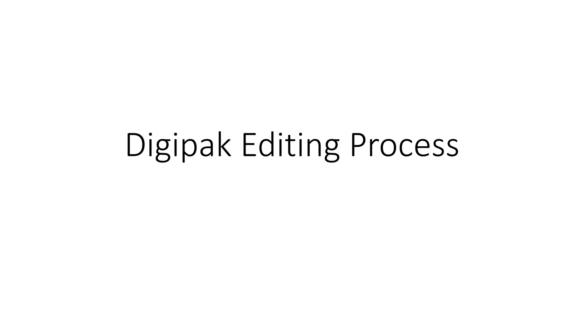
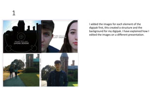
1. The document describes the process of editing a digipak. Images were added first to create the structure and background. Shapes were then added on top of the images to provide a basis for text and allow text to be seen against the background.
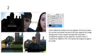
2. Text was added to the front cover including the artist name and album title using the same font as the poster to create synergy. Song titles were added to the back cover on the right side so as not to cover the images.
3. Legal text and production company information was added to the back cover using the same fonts as other elements to maintain consistency. A spine was created connecting all elements with text in a matching font.