The black background
is contrary of the
album because it is a
darker shade almost
a negative recreation
of the main design.
The colour scheme is black and a faded out of green with parts of
the background being darker than the rest and other parts being
lighter.
The graphic design of this album cover is very simple in concept,
it has a dark horse running into a white wall, with parts of it
penetrating the wall.
The main design has
stayed the same
however the colour
scheme has been
changed. The text
displaying the group's
name has been
enlarged and there is
additional text that is
telling the viewer that
the poster is about a
tour.
The album/tour poster has key information about the event
or album underneath. There is also logos and other
mentions of companies that might be related to he group
9/19/2017
9/19/2017
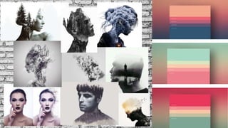
Possibly create a double exposure effect, this is
a simple yet effective effect that I can produce.
Keeping the main visual of the Digipak and
poster correlates to the genre of the band. My
idea for this is that I get people for the band
and have them in different dramatic poses
behind a white wall (so it will be easier to edit).
Then I will find a building and use that to
create a double exposure over the pictures of
the band members, then I will use a single
colour for them to show the induvial band
members for the posters. This idea stems from
the title of the song ‘six billion’, this will
represent the theme of the song of
existentialism and feeling like that you are just
a single person within the world full of human
beings.
An effect that I have also looked at for
my digipak and poster is the smoke
effect, this will be more difficult to pull
off however I can be a creative way to
represent the ideas of the song by
showing a person fading away. I will still
need to do a photo shoot to get the
pictures that I will need for the
photoshop. For the poster, I can have
separate posters which can have
different band members on each poster.
I could use the tried and tested method of having
the artists stand together and create the album
around them by inserting text and shapes to add
somewhat more to the digipak and the poster.
This is a cliché of having the band as the main
focal point is a good selling point as the audience
can grow attachments to the band and become
long-time fans.
By using the disintegration effect on a
subject (band member) and putting it
in a white or grey background can be
a successful digipak design and
poster. I think this effect fits the
album, artist and song because it's
very metaphorical in the way of the
visual saying that the person feels
that they are breaking apart.
The album can also be very minimalism
with the art style, I can go literal with
the title of the album and song and try
and make something that shows the
title of six billion. I can use the theme of
feeling unimportant in the masses of
lives in this world. This simple design
can be easier to create and it wouldn’t
need any photography shoots to create.

Mood board

  • 2.
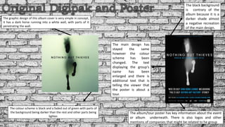
    The black background iscontrary of the album because it is a darker shade almost a negative recreation of the main design. The colour scheme is black and a faded out of green with parts of the background being darker than the rest and other parts being lighter. The graphic design of this album cover is very simple in concept, it has a dark horse running into a white wall, with parts of it penetrating the wall. The main design has stayed the same however the colour scheme has been changed. The text displaying the group's name has been enlarged and there is additional text that is telling the viewer that the poster is about a tour. The album/tour poster has key information about the event or album underneath. There is also logos and other mentions of companies that might be related to he group
  • 5.
  • 6.
  • 8.
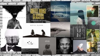
    Possibly create adouble exposure effect, this is a simple yet effective effect that I can produce. Keeping the main visual of the Digipak and poster correlates to the genre of the band. My idea for this is that I get people for the band and have them in different dramatic poses behind a white wall (so it will be easier to edit). Then I will find a building and use that to create a double exposure over the pictures of the band members, then I will use a single colour for them to show the induvial band members for the posters. This idea stems from the title of the song ‘six billion’, this will represent the theme of the song of existentialism and feeling like that you are just a single person within the world full of human beings. An effect that I have also looked at for my digipak and poster is the smoke effect, this will be more difficult to pull off however I can be a creative way to represent the ideas of the song by showing a person fading away. I will still need to do a photo shoot to get the pictures that I will need for the photoshop. For the poster, I can have separate posters which can have different band members on each poster. I could use the tried and tested method of having the artists stand together and create the album around them by inserting text and shapes to add somewhat more to the digipak and the poster. This is a cliché of having the band as the main focal point is a good selling point as the audience can grow attachments to the band and become long-time fans. By using the disintegration effect on a subject (band member) and putting it in a white or grey background can be a successful digipak design and poster. I think this effect fits the album, artist and song because it's very metaphorical in the way of the visual saying that the person feels that they are breaking apart. The album can also be very minimalism with the art style, I can go literal with the title of the album and song and try and make something that shows the title of six billion. I can use the theme of feeling unimportant in the masses of lives in this world. This simple design can be easier to create and it wouldn’t need any photography shoots to create.