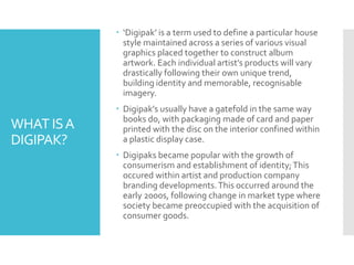
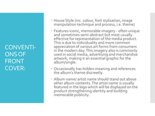
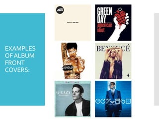
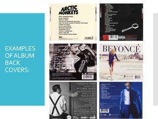
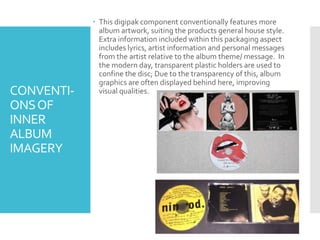
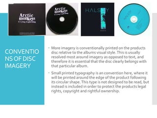
CONVENTIONS
OF PHYSICALALBUM
VISUALS
(DIGIPAK)
Research conducted through investigation of
existing products in the market today.
WHAT ISA
DIGIPAK?
 ‘Digipak’ is a term used to define a particular house
style maintained across a series of various visual
graphics placed together to construct album
artwork. Each individual artist’s products will vary
drastically following their own unique trend,
building identity and memorable, recognisable
imagery.
 Digipak’s usually have a gatefold in the same way
books do, with packaging made of card and paper
printed with the disc on the interior confined within
a plastic display case.
 Digipaks became popular with the growth of
consumerism and establishment of identity;This
occured within artist and production company
branding developments.This occurred around the
early 2000s, following change in market type where
society became preoccupied with the acquisition of
consumer goods.
EXISTING PRODUCTS
CONVENTI-
ONSOF
FRONT
COVER:
 House Style (inc. colour, font stylisation, image
manipulation technique and process, i.e. theme)
 Features iconic, memorable imagery - often unique
and sometimes semi-abstract but most usually
effective for representation of the media product.
This is due to individuality and more common
appreciation of various art forms from consumers
in the modern day.This imagery also is commonly
used in social media, advertising and merchandise
artwork, making it an essential graphic for the
album/single.
 Occasionally has hidden meaning and references
the album’s theme discreetly.
 Album name/ artist name should stand out above
other album contents.The artist name is usually
featured in the logo which will be displayed on the
product strengthening identity and building
memorable publicity.
EXAMPLES
OFALBUM
FRONT
COVERS:
CONVENTI-
ONSOF
BACK
COVER:
 References content of the media product clearly for
the audience to clearly understand what the album
features and what they’re potentially buying.
 A barcode will be located in the bottom (usually) for
sales purposes.
 Name/ address of production company/ record label.
 Often mention of those involved with production/
distribution/ manufacture.
 Legal legislation in small print – copyright ownership
 Year of production.
 External links (websites) to the record label and artist,
subtly promoting these.
 Visually pleasing aesthetics following a similar house
style to that of the front cover.This enables
consistency and identity to be built within the
product.
EXAMPLES
OFALBUM
BACK
COVERS:
CONVENTI-
ONSOF
SPINE
 Conventionally, the spinal
region of the digipack will
feature the artist name and
the album name for the
obvious reason of easy
categorisation and sorting.
This benefits the sales retailers
and consumers own personal
use and experience with
regards to handling of the
product.
 Aesthetic stylisation of this
piece will compliment the
house style in a basic sense in
order to avoid potential over-
complication.This is deliberate
to ensure attention and focus
of the consumer is not
detracted from the more
significant content in terms of
importance, this being the
text.This typography is often
stylised to create artist
identity.This is a fairly simple,
yet essential, aspect of the
product – examples displayed
on the right.
CONVENTI-
ONSOF
INNER
ALBUM
IMAGERY
 This digipak component conventionally features more
album artwork, suiting the products general house style.
Extra information included within this packaging aspect
includes lyrics, artist information and personal messages
from the artist relative to the album theme/ message. In
the modern day, transparent plastic holders are used to
confine the disc; Due to the transparency of this, album
graphics are often displayed behind here, improving
visual qualities.
CONVENTIO
NSOF DISC
IMAGERY
 More imagery is conventionally printed on the products
disc relative to the albums visual style.This is usually
resolved most around imagery as opposed to text, and
therefore it is essential that the disc clearly belongs with
that particular album.
 Small printed typography is an convention here, where it
will be printed around the edge of the product following
its circular shape.This type is not designed to be read, but
instead is included in order to protect the products legal
rights, copyright and rightful ownership.

Digipak Conventions

  • 1.
    CONVENTIONS OF PHYSICALALBUM VISUALS (DIGIPAK) Research conductedthrough investigation of existing products in the market today.
  • 2.
    WHAT ISA DIGIPAK?  ‘Digipak’is a term used to define a particular house style maintained across a series of various visual graphics placed together to construct album artwork. Each individual artist’s products will vary drastically following their own unique trend, building identity and memorable, recognisable imagery.  Digipak’s usually have a gatefold in the same way books do, with packaging made of card and paper printed with the disc on the interior confined within a plastic display case.  Digipaks became popular with the growth of consumerism and establishment of identity;This occured within artist and production company branding developments.This occurred around the early 2000s, following change in market type where society became preoccupied with the acquisition of consumer goods.
  • 3.
  • 4.
    CONVENTI- ONSOF FRONT COVER:  House Style(inc. colour, font stylisation, image manipulation technique and process, i.e. theme)  Features iconic, memorable imagery - often unique and sometimes semi-abstract but most usually effective for representation of the media product. This is due to individuality and more common appreciation of various art forms from consumers in the modern day.This imagery also is commonly used in social media, advertising and merchandise artwork, making it an essential graphic for the album/single.  Occasionally has hidden meaning and references the album’s theme discreetly.  Album name/ artist name should stand out above other album contents.The artist name is usually featured in the logo which will be displayed on the product strengthening identity and building memorable publicity.
  • 5.
  • 6.
    CONVENTI- ONSOF BACK COVER:  References contentof the media product clearly for the audience to clearly understand what the album features and what they’re potentially buying.  A barcode will be located in the bottom (usually) for sales purposes.  Name/ address of production company/ record label.  Often mention of those involved with production/ distribution/ manufacture.  Legal legislation in small print – copyright ownership  Year of production.  External links (websites) to the record label and artist, subtly promoting these.  Visually pleasing aesthetics following a similar house style to that of the front cover.This enables consistency and identity to be built within the product.
  • 7.
  • 8.
    CONVENTI- ONSOF SPINE  Conventionally, thespinal region of the digipack will feature the artist name and the album name for the obvious reason of easy categorisation and sorting. This benefits the sales retailers and consumers own personal use and experience with regards to handling of the product.  Aesthetic stylisation of this piece will compliment the house style in a basic sense in order to avoid potential over- complication.This is deliberate to ensure attention and focus of the consumer is not detracted from the more significant content in terms of importance, this being the text.This typography is often stylised to create artist identity.This is a fairly simple, yet essential, aspect of the product – examples displayed on the right.
  • 9.
    CONVENTI- ONSOF INNER ALBUM IMAGERY  This digipakcomponent conventionally features more album artwork, suiting the products general house style. Extra information included within this packaging aspect includes lyrics, artist information and personal messages from the artist relative to the album theme/ message. In the modern day, transparent plastic holders are used to confine the disc; Due to the transparency of this, album graphics are often displayed behind here, improving visual qualities.
  • 10.
    CONVENTIO NSOF DISC IMAGERY  Moreimagery is conventionally printed on the products disc relative to the albums visual style.This is usually resolved most around imagery as opposed to text, and therefore it is essential that the disc clearly belongs with that particular album.  Small printed typography is an convention here, where it will be printed around the edge of the product following its circular shape.This type is not designed to be read, but instead is included in order to protect the products legal rights, copyright and rightful ownership.