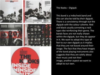
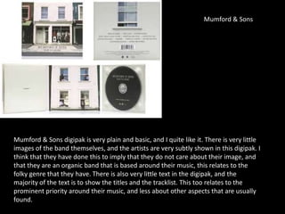
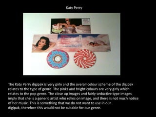
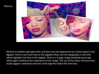
Digipaks
The Kooks – Digipak
This band is a indie/rock band and
this can also be told by their digipak.
There is a consistency through out the
digipak with the colour scheme. Red
and black usually connoting a rock
type vibe reinforcing their genre. The
bands faces are not really shown
within the digipak, but they do appear
in it. We want to adopt this type of
feel to our own digipak as it implies
that they are not based around their
image. The fact that they have images
of the band playing instruments also
suggests that they are solely about
their music and not their
image, another aspect we want to
adopt to our own.
Mumford & Sons
Mumford & Sons digipak is very plain and basic, and I quite like it. There is very little
images of the band themselves, and the artists are very subtly shown in this digipak. I
think that they have done this to imply that they do not care about their image, and
that they are an organic band that is based around their music, this relates to the
folky genre that they have. There is also very little text in the digipak, and the
majority of the text is to show the titles and the tracklist. This too relates to the
prominent priority around their music, and less about other aspects that are usually
found.
Katy Perry
The Katy Perry digipak is very girly and the overall colour scheme of the digipak
relates to the type of genre. The pinks and bright colours are very girly which
relates to the pop genre. The close up images and fairly seductive type images
imply that she is a generic artist who relies on image, and there is not much notice
of her music. This is something that we do not want to use in our
digipak, therefore this would not be suitable for our genre.
Oasis
Although this is a very hard image
to see, from what I can see it
seems that the band want to
imply that they are purposed
around their music. This seems to
be a convention that
indie/rock/folk bands have
constructed. There doesn’t seem
to be an actual image of the band
which reinforces this. The use of
the image of an instrument on
the front of the digipak also
implies the prominent aspect that
music has for the band. The back
of the digipak shows the tracklist
too which seems to be in
bold, signifying the importance of
music.
Rihanna
Rihanna is another pop type artist, and also uses her appearance as a main aspect in her
digipak. There is not much text on the digipak either, and the typography is very thin
which highlights her face in the digipak. There is a 3 page image stretched across too
which again reinforces the importance of her image. The use of the colour red and roses
could suggest a seductive and also a love type feel about the artist too.

Independent Digipak analysis

  • 1.
  • 2.
    The Kooks –Digipak This band is a indie/rock band and this can also be told by their digipak. There is a consistency through out the digipak with the colour scheme. Red and black usually connoting a rock type vibe reinforcing their genre. The bands faces are not really shown within the digipak, but they do appear in it. We want to adopt this type of feel to our own digipak as it implies that they are not based around their image. The fact that they have images of the band playing instruments also suggests that they are solely about their music and not their image, another aspect we want to adopt to our own.
  • 3.
    Mumford & Sons Mumford& Sons digipak is very plain and basic, and I quite like it. There is very little images of the band themselves, and the artists are very subtly shown in this digipak. I think that they have done this to imply that they do not care about their image, and that they are an organic band that is based around their music, this relates to the folky genre that they have. There is also very little text in the digipak, and the majority of the text is to show the titles and the tracklist. This too relates to the prominent priority around their music, and less about other aspects that are usually found.
  • 4.
    Katy Perry The KatyPerry digipak is very girly and the overall colour scheme of the digipak relates to the type of genre. The pinks and bright colours are very girly which relates to the pop genre. The close up images and fairly seductive type images imply that she is a generic artist who relies on image, and there is not much notice of her music. This is something that we do not want to use in our digipak, therefore this would not be suitable for our genre.
  • 5.
    Oasis Although this isa very hard image to see, from what I can see it seems that the band want to imply that they are purposed around their music. This seems to be a convention that indie/rock/folk bands have constructed. There doesn’t seem to be an actual image of the band which reinforces this. The use of the image of an instrument on the front of the digipak also implies the prominent aspect that music has for the band. The back of the digipak shows the tracklist too which seems to be in bold, signifying the importance of music.
  • 6.
    Rihanna Rihanna is anotherpop type artist, and also uses her appearance as a main aspect in her digipak. There is not much text on the digipak either, and the typography is very thin which highlights her face in the digipak. There is a 3 page image stretched across too which again reinforces the importance of her image. The use of the colour red and roses could suggest a seductive and also a love type feel about the artist too.