DIGI-PACK
FRONT COVER
              For the dig pack we used
              the singer so then our
              audience knows who the
              singer is. Also it meets
              the genre convention for
              using the singer whilst
              playing a guitar. It’s also
              shown through the
              clothing, which is seen as
              smart casual but the
              checker shit/ waistcoat
              combo show’s
              individuality.
Before taking the pictures for the
              digi pack I did some research on
FRONT COVER   other indie/rock artists covers.
              As you can see the artist on the
              front of the “Keith Urban” album
              the main focus is him and his
              instrument that has been
              effectively used to be the main
              focus therefore meaning I could
              use this convention to get a
              successful front cover.
              Another inspiration for my album
              cover was John Mayer, I liked
              the way he wasn’t looking
              directly into the camera which
              shows a mysterious side to the
              artist also this colour and clothes
              that both artists will attract my
              target audience.
INSIDE LEFT

              For the inside left cover we
              decided to use a collage of lips
              to represent the song Dirty
              Talk. This is because the lips
              are showing seduction which
              the song is about a boy
              wanting a girl. We use many
              different lips over lapping for
              individuality as a lot of album
              cover include lips and we
              wanted to keep things
              different.
INSIDE LEFT   We looked through
              many albums that
              included lips, we took
              note of the fact they
              were all glossy and
              were a pinky/red
              colour, which shows to
              be seductive.
              We decided to go with
              having the song title
              written across the
              lips, and instead of
              showing the whole
              face, just use the lips.
CD
     I decided to have the
     disc have the same
     image as the inside
     cover, this means the
     album has a similarity
     which gives a personal
     direct look about them
     and also used the same
     font as on the front
     cover. This gives it good
     individuality and stands
     out without the case but
     also links ups with the
     whole digi pack.
INSIDE RIGHT
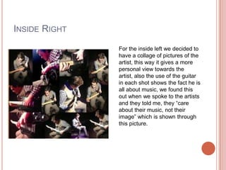
               For the inside left we decided to
               have a collage of pictures of the
               artist, this way it gives a more
               personal view towards the
               artist, also the use of the guitar
               in each shot shows the fact he is
               all about music, we found this
               out when we spoke to the artists
               and they told me, they “care
               about their music, not their
               image” which is shown through
               this picture.
For the inside right, I
               researched bands that
               have collaged photos
INSIDE RIGHT   inside. With The Beatles
               there was very simplistic of
               just there faces whilst
               Example’s was very fun
               and random.
               After thinking through it, I
               didn’t want my collage to
               be simple or random as it
               didn’t meet my genre or
               audience. I then thought to
               include my artist with his
               guitar, that way it became
               a norm for my artist just
               like The Beatles keep there
               album cover simple and
               Example are random.
BACK COVER

             For the back cover we decided to
             use another picture of the artist to
             link the whole digi pack together.
             He is also facing the list of the
             songs that are included which
             draws the audience towards
             them. Using the artist on the back
             cover carries the close
             relationship with the audience
             and artist all the way through the
             digi pack.

Digi pack

  • 1.
  • 2.
    FRONT COVER For the dig pack we used the singer so then our audience knows who the singer is. Also it meets the genre convention for using the singer whilst playing a guitar. It’s also shown through the clothing, which is seen as smart casual but the checker shit/ waistcoat combo show’s individuality.
  • 3.
    Before taking thepictures for the digi pack I did some research on FRONT COVER other indie/rock artists covers. As you can see the artist on the front of the “Keith Urban” album the main focus is him and his instrument that has been effectively used to be the main focus therefore meaning I could use this convention to get a successful front cover. Another inspiration for my album cover was John Mayer, I liked the way he wasn’t looking directly into the camera which shows a mysterious side to the artist also this colour and clothes that both artists will attract my target audience.
  • 4.
    INSIDE LEFT For the inside left cover we decided to use a collage of lips to represent the song Dirty Talk. This is because the lips are showing seduction which the song is about a boy wanting a girl. We use many different lips over lapping for individuality as a lot of album cover include lips and we wanted to keep things different.
  • 5.
    INSIDE LEFT We looked through many albums that included lips, we took note of the fact they were all glossy and were a pinky/red colour, which shows to be seductive. We decided to go with having the song title written across the lips, and instead of showing the whole face, just use the lips.
  • 6.
    CD I decided to have the disc have the same image as the inside cover, this means the album has a similarity which gives a personal direct look about them and also used the same font as on the front cover. This gives it good individuality and stands out without the case but also links ups with the whole digi pack.
  • 7.
    INSIDE RIGHT For the inside left we decided to have a collage of pictures of the artist, this way it gives a more personal view towards the artist, also the use of the guitar in each shot shows the fact he is all about music, we found this out when we spoke to the artists and they told me, they “care about their music, not their image” which is shown through this picture.
  • 8.
    For the insideright, I researched bands that have collaged photos INSIDE RIGHT inside. With The Beatles there was very simplistic of just there faces whilst Example’s was very fun and random. After thinking through it, I didn’t want my collage to be simple or random as it didn’t meet my genre or audience. I then thought to include my artist with his guitar, that way it became a norm for my artist just like The Beatles keep there album cover simple and Example are random.
  • 9.
    BACK COVER For the back cover we decided to use another picture of the artist to link the whole digi pack together. He is also facing the list of the songs that are included which draws the audience towards them. Using the artist on the back cover carries the close relationship with the audience and artist all the way through the digi pack.