The document summarizes the design decisions made for a band's album cover. Key elements included:
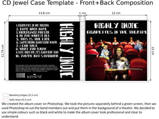
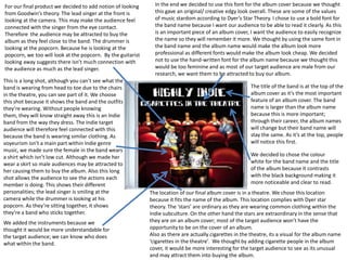
- Photoshop was used to composite band member photos into a theatre background. Simple black and white colors were chosen to make the cover look professional.
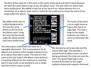
- Font and positioning choices were made to ensure the band name was prominently displayed and easy to read to attract audiences.
- Images of the band members showed their personalities and outfits to connect with indie music fans. Instrument inclusion helped identify who played what.
- Standard information like the track list and copyright was included at the back for convention and clarity.