An introduction to usability


                                 Dey Alexander
                             Usability Specialist
                              Monash University
               dey.alexander@its.monash.edu.au

                             Version 1: July 2004
An introduction to usability


Table of contents
  Aims of this workshop .............................................................. 3

  What is usability? .................................................................... 4

  The history of usability ............................................................. 7

  Usability problems in our daily lives ............................................. 9

  Why usability is important for the web ......................................... 17

  Design challenges................................................................... 18

  The role of the designer........................................................... 22

  Human behaviour on the web .................................................... 27

  User-centred design................................................................ 30

  Exercises ............................................................................. 33

  References........................................................................... 41

  Resources ............................................................................ 42


                                        - Page 2 -
An introduction to usability


Aims of this workshop
This workshop aims to introduce participants to usability by:

    •    Introducing some common definitions of usability

    •    Identifying some of the experiential components of usability

    •    Providing examples of poor usability from everyday life

    •    Illustrating some basic human factors design principles that affect
         usability

    •    Providing an overview of user-centred design

The workshop also provides an opportunity for participants to informally
evaluate the usability of several websites. Participants will play the role of
usability test observer and will be able to discuss their findings as a group.


                                     - Page 3 -
An introduction to usability


What is usability?
Consider some of the everyday experiences we have of things that are hard
to use:

   •    doors that we try to push open when we should have pulled them

   •    VCRs that we can't program

   •    telephone features, like “divert to voicemail” that we can never
        remember how to use

   •    photocopiers or fax machines that we simply cannot fathom

   •    computer programs that take forever to understand

   •    websites where it takes ages to find what we are looking for.

Some things are a constant struggle to use and we find ourselves repeatedly
having to read the manual or ask our colleagues and friends to help us figure
out how to get them to work. Others work without problem, and as a result,
blend into the background as we go about our daily tasks.

The difference between difficult-to-use products or systems and those we
don't have to think about using is usability. In other words, usability is ease
of use.

Jakob Nielsen, a well known advocate of usability, says “usability is the
measure of the quality of the user experience when interacting with
something”.

A formal definition
In ISO 9241: Ergonomics requirements for office work with visual display
terminals, the International Organisation for Standardisation defines
usability as “a measure of the effectiveness, efficiency and satisfaction with
which specified users can achieve specified goals in a particular
environment.”

The key terms to note in this definition are:

   •    effectiveness: are users able to achieve their goals, fully and in the
        manner expected, when using a product or system?

   •    efficiency: how much effort is required to use the product or system?

   •    satisfaction: was the user satisfied with the product or system?


                                     - Page 4 -
An introduction to usability


But note also the acknowledgement that systems and products are designed
for:

    •    a specified group of users

    •    to allow users to achieve specific goals

    •    a specific context or environment

This definition indicates that designers need to be aware of who the users of
their product or system will be. They must also understand the users’ goals
in using the product or system. And designers must also be aware of the
context in which users will use the system. There seems to be no place for a
“one size fits all” approach.

The 5 Es of usability
Whitney Quesenbery has suggested that a useful way to think about usability
is to consider the 5 Es of usability:

    1. Effective

    2. Efficient

    3. Engaging

    4. Error tolerant

    5. Easy to learn

Effective
To be effective, a product or system must enable the user to complete the
task fully and accurately.

    •    Completeness: was the task fully completed? Were the user's goals
         met?

    •    Accuracy: was the task completed successfully? Did the user get the
         right or correct result? How well was the work done?

Efficient
To be efficient, a product or system must enable the user to complete the
task without too much physical or mental effort.

    •    Speed: was the user able to complete the task quickly? Was the
         physical effort involved kept to a minimum?

    •    Effort: was the user able to complete the task without too much
         mental effort?


                                      - Page 5 -
An introduction to usability


Engaging
To be engaging, the user must have a good and satisfying experience when
using the product or system.

   •    Pleasant: did the user have a pleasant experience when working on
        the task?

   •    Satisfying: was the user satisfied by the way in which the application
        supported her work?

Error tolerant
To be error tolerant, the product or system should minimise the chance of
errors and maximise the user’s ability to recover from any error that may
occur.

   •    Error prevention: did the user interface help users avoid making errors
        or did poor design features result in mistakes? When errors occurred,
        were they minor rather than major?

   •    Error recovery: if the user made an error, how hard did they have to
        work to recover from it? Was it easy to recognise that an error had
        occurred and find a way around it?

Easy to learn
To be easy to learn, the product or system must be predictable and behave
consistently.

   •    Predictability: was the user able to work with some certainty because
        the user interface built on her previous knowledge?

   •    Consistency: was the interface consistent, so that once a user learnt
        how to use part of the application, they were able to easily learn how
        to use another part?

How “usability” is used
The term “usability” can be used in a variety of ways.

   •    Usability as an outcome or goal: websites and applications that are
        usable

   •    Usability as a process: a design methodology or approach

   •    Usability as a set of techniques: usability testing, contextual enquiry,
        heuristic evaluation. There are many techniques whose aim is to
        improve usability


                                     - Page 6 -
An introduction to usability


    •    Usability as a philosophy: where improved usability is a value that
         motivates the way in which products or systems are developed

The history of usability
The concept of usability comes from the field of human factors. Human
factors—sometimes known as ergonomics—has its roots in psychology and
originated in the United States military during World War II as a means of
ensuring that military staff could use sophisticated weaponry in the
conditions of war.

Human factors specialists study human beings and their interaction with
their environment. In particular, human factors is concerned with the
capabilities and limitations of the human mind and body, and how these
affect interactions with objects and conditions in the environment.

Human factors is now a multi-disciplinary field. Mark Chignall, drawing on
the work of Alphonse Chapanis, provides an overview of some of the
disciplines involved include:

    •    Psychology: human sensory capacities, human memory and cognitive
         processes, and individual differences and their measurement.

    •    Anthropometry: the measurement of the physical features of people
         as used in the design of seats, chairs, tables, computer consoles, car
         interiors, aeroplane cockpits, and other workstations.

    •    Environmental medicine: environmental factors and their effects on
         health and human performance.

    •    Engineering: electrical, mechanical, and chemical characteristics of
         elements and systems and principles of design, construction and
         operation of structures, equipment and systems.

    •    Operation research: quantitative methods for the analysis of the
         performance of manpower, machinery, equipment, and policies in
         government, military, or commercial spheres; the development of
         models, such as queueing and allocation models for describing
         operations

    •    Applied physiology: the vital process and the responses of these vital
         processes to work, stress, and environmental influences.

    •    Statistics: used for summarising large amounts of data on human
         measurements and human performance; also used to design sampling
         schemes and experiments for human studies and performance
         measurements.


                                      - Page 7 -
An introduction to usability


   •    Industrial design: design, colour, arrangement, and packaging to
        combine functionality and an aesthetically satisfying appearance.

   •    Computing: primarily through human-computer interaction which is
        concerned with human factors relevant to interactions with computers
        and software applications.

The basic goals of human factors work includes:

   •    Meeting a range of basic operational and business objectives including
        the reduction of errors, improved safety and improved system
        performance, reduction in loss of time and equipment and increased
        economy of production.

   •    Objectives bearing on reliability, maintainability, and availability
        (otherwise known as RMA), and integrated logistic support (also known
        as ILS). The goals would include increasing reliability, improving
        maintainability, reducing personnel requirements and reducing
        training requirements.

   •    Objectives affecting users and operators. Here goals would include
        improving the working environment, reducing fatigue and physical
        stress, increasing human comfort, reducing boredom and monotony,
        increasing ease of use, and increasing user acceptance.

Notes
___________________________________________________________________

___________________________________________________________________

___________________________________________________________________

___________________________________________________________________

___________________________________________________________________

___________________________________________________________________

___________________________________________________________________

___________________________________________________________________

___________________________________________________________________


                                    - Page 8 -
An introduction to usability


Usability problems in our daily lives
Let's take a closer look at the design of some ordinary, everyday objects
that are difficult to use. These examples will help us delve into the causes
of usability problems and introduce some design principles from the field
of human factors.

Trapped between the doors
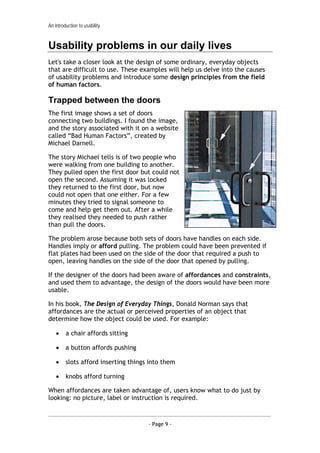
The first image shows a set of doors
connecting two buildings. I found the image,
and the story associated with it on a website
called “Bad Human Factors”, created by
Michael Darnell.

The story Michael tells is of two people who
were walking from one building to another.
They pulled open the first door but could not
open the second. Assuming it was locked
they returned to the first door, but now
could not open that one either. For a few
minutes they tried to signal someone to
come and help get them out. After a while
they realised they needed to push rather
than pull the doors.

The problem arose because both sets of doors have handles on each side.
Handles imply or afford pulling. The problem could have been prevented if
flat plates had been used on the side of the door that required a push to
open, leaving handles on the side of the door that opened by pulling.

If the designer of the doors had been aware of affordances and constraints,
and used them to advantage, the design of the doors would have been more
usable.

In his book, The Design of Everyday Things, Donald Norman says that
affordances are the actual or perceived properties of an object that
determine how the object could be used. For example:

    •    a chair affords sitting

    •    a button affords pushing

    •    slots afford inserting things into them

    •    knobs afford turning

When affordances are taken advantage of, users know what to do just by
looking: no picture, label or instruction is required.


                                      - Page 9 -
An introduction to usability


Constraints, on the other hand, are properties of an object that limit the
way the object can be used in order to make its mode of use obvious.

For example, the holes in the handle of a pair of scissors provide constraints
for use. The small hole suggests only one finger will fit, while the larger
hole suggests more than one.

Jigsaw puzzles are also an excellent example of using constraints. The shape
of the piece, and the colours and patterns printed on it, provide constraints
for where it can be placed.

In the case of our example doors, the use of flat plates on the sides of the
doors that required pushing would have provided a constraint so that it was
obvious to users that they must push the door.

How do you open the fridge?
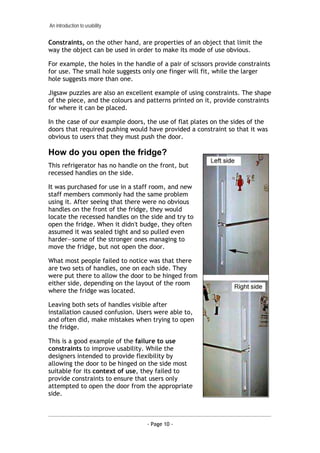
This refrigerator has no handle on the front, but
recessed handles on the side.

It was purchased for use in a staff room, and new
staff members commonly had the same problem
using it. After seeing that there were no obvious
handles on the front of the fridge, they would
locate the recessed handles on the side and try to
open the fridge. When it didn't budge, they often
assumed it was sealed tight and so pulled even
harder—some of the stronger ones managing to
move the fridge, but not open the door.

What most people failed to notice was that there
are two sets of handles, one on each side. They
were put there to allow the door to be hinged from
either side, depending on the layout of the room
where the fridge was located.

Leaving both sets of handles visible after
installation caused confusion. Users were able to,
and often did, make mistakes when trying to open
the fridge.

This is a good example of the failure to use
constraints to improve usability. While the
designers intended to provide flexibility by
allowing the door to be hinged on the side most
suitable for its context of use, they failed to
provide constraints to ensure that users only
attempted to open the door from the appropriate
side.


                                  - Page 10 -
An introduction to usability


The case of the mistaken urinal
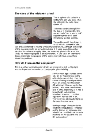
                                                 This is a photo of a toilet in a
                                                 restaurant. Can you guess what
                                                 the object in the right-hand
                                                 corner is?

                                                 The small handmade sign over
                                                 the top of it (indicated by the
                                                 arrow) reads "this is a mop sink"
                                                 suggesting that it has been
                                                 mistakenly used as a urinal.

                                             The problem with this design is
                                             to do with its context of use.
Men are accustomed to finding urinals in public toilets. Although the design
of the mop sink might be perfectly suitable if it were placed in another
location (in a cleaner's supply room, for instance), given its location in a
toilet, its intended purpose is easily mistaken. In this case, an alternative
design that made the purpose of the object more obvious, would have
solved the problem.

How do I turn on the computer?
This is a rather humiliating story that I am prepared to tell to highlight
another important human factors design principle—visibility.

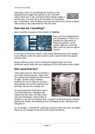
                                             Several years ago I started a new
                                             job. On my first morning in the
                                             office I discovered that I had the
                                             choice of using an antiquated old
                                             PC or an almost new Macintosh
                                             G3. Although I'd never used a Mac
                                             before, I was more than keen to
                                             give it a try, especially as it had a
                                             beautiful 21 inch monitor
                                             attached. However, I couldn't
                                             figure out how to turn it on.
                                             There were no obvious buttons on
                                             the case, front or back.

                                             Risking damage to my yet-to-be
                                             established reputation, I knocked
                                             on the door of my colleague and
                                             asked if he could help me turn the
                                             machine on. He couldn't find the
                                             ON button either.


                                   - Page 11 -
An introduction to usability


Eventually, one of us accidentally hit the key on the
keyboard that brought the machine to life. We didn't
notice which one it was, and had trouble finding it again a
second time. It turned out to be the apple (or command)
key. Incidentally, many Windows users say they have had a similar problem
when trying to use a Macintosh for the first time.

How fast am I travelling?
Here is another example of the problem of visibility.

                                                 Many cars have speedometers
                                                 and tachometers. There is no
                                                 standard for placement of
                                                 these instruments, so the
                                                 speedo might be on the left
                                                 side in one car and the right in
                                                 another.

In the case of the picture above, what makes identification of the speedo
more difficult is that the same numeric scale is used for both the speedo
and the tacho.

Using a different scale, and/or making the speedo larger and more
prominent would make the more important of the instruments more visible.

Did I send that fax?
A few years back our office purchased a
new multi-function printer, copier and
fax machine that looked just like the one
at right. I'd been using it without
problems for a few weeks for printing
and copying, but my first experience at
sending a fax was not a happy one.

I'd just pressed the send button when I
was interrupted by a colleague who
walked into the room. We had a short
chat and afterwards, I had no idea of
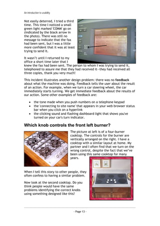
whether or not the fax had been sent. I couldn't recall hearing the machine
dialling the number and nothing on the LCD display screen indicated what
had gone on.

So I tried again. I listened for a dialling sound but there was none, and again
there was no message on the LCD screen (pictured below).


                                   - Page 12 -
An introduction to usability


Not easily deterred, I tried a third
time. This time I noticed a small
green light marked 'COMM' go on
(indicated by the black arrow in
the photo). There was still no
message to indicate that the fax
had been sent, but I was a little
more confident that it was at least
trying to send it.

It wasn’t until I returned to my
office a short time later that I
knew the fax had been sent. The person to whom I was trying to send it,
telephoned to assure me that they had received it—they had received all
three copies, thank you very much!

This incident illustrates another design problem: there was no feedback
about what the machine was doing. Feedback tells the user about the result
of an action. For example, when we turn a car steering wheel, the car
immediately starts turning. We get immediate feedback about the results of
our action. Some other examples of feedback are:

     •    the tone made when you push numbers on a telephone keypad
     •    the 'connecting to site name' that appears in your web browser status
          bar when you click on a hyperlink
     •    the clicking sound and flashing dashboard light that shows you've
          turned on your car's turn indicator.

Which knob controls the front left burner?
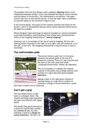
                                  The picture at left is of a four-burner
                                  cooktop. The controls for the burner are
                                  vertically arranged on the right. I have a
                                  cooktop with a similar layout at home. My
                                  partner and I often find that we turn on the
                                  wrong control, despite the fact that we’ve
                                  been using this same cooktop for many
                                  years.


When I tell this story to other people, they
often confess to having a similar problem.

Now look at the second cooktop. Do you
think people would have the same
problems identifying the correct knobs
using something designed like this?


                                     - Page 13 -
An introduction to usability


The problem with the first design is poor mapping. Mapping refers to the
relationship between things, in this case between the layout of the controls
and the layout of the burners. The relationship is not obvious. The upper
control may turn on the top left burner, or the top right. Users would have
to read the labels on the controls to figure it out.

In the second design, the layout of the controls matches the layout of the
burners, and it is immediately obvious which control operates which burner.
No labels are needed.

Where designers take advantage of physical analogies or cultural standards
to provide immediate understanding of how things work, Donald Norman
refers to the mapping relationship as “natural mapping”.

Steering a car is an example of the use of natural mapping. We turn the
steering wheel clockwise to the right to turn right, and anti-clockwise, or to
the left, to turn left. The mapping relationship is natural and so is easy to
remember.

The well-trodden path
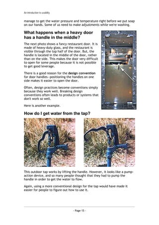
                               This picture shows a path worn in the grass
                               between two paved paths at the end of a
                               pedestrian crossing. There is a sign erected near
                               the start of the worn path that reads
                               "Landscape Preservation. Please use sidewalks".

                               This is an example of a design (the original
                               location of the paths) and a design solution (the
                               erection of a sign) that both ignore human
                               behaviour.

                            Making a path in the right place instead of
                            wasting money on a sign that is unlikely to
                            motivate a change in human behaviour, would
have been a better use of resources.

Can’t get a grip
The next photo shows a wash
basin in a designer hotel. The
smooth tap knobs make operating
the taps very difficult with soapy
hands.

This design fails partly because of
a failure to realistically consider
the context of use, but also
indicates a failure to design for
human behaviour. We don’t all


                                      - Page 14 -
An introduction to usability


manage to get the water pressure and temperature right before we put soap
on our hands. Some of us need to make adjustments while we're washing.

What happens when a heavy door
has a handle in the middle?
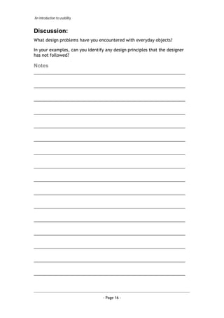
The next photo shows a fancy restaurant door. It is
made of heavy-duty glass, and the restaurant is
visible through the top half of the door. But, the
handle is located in the middle of the door, rather
than on the side. This makes the door very difficult
to open for some people because it is not possible
to get good leverage.

There is a good reason for the design convention
for door handles—positioning the handles on one
side makes it easier to open the door.

Often, design practices become conventions simply
because they work well. Breaking design
conventions often leads to products or systems that
don't work so well.

Here is another example.

How do I get water from the tap?


This outdoor tap works by lifting the handle. However, it looks like a pump-
action device, and so many people thought that they had to pump the
handle in order to get the water to flow.

Again, using a more conventional design for the tap would have made it
easier for people to figure out how to use it.


                                  - Page 15 -
An introduction to usability


Discussion:
What design problems have you encountered with everyday objects?

In your examples, can you identify any design principles that the designer
has not followed?

Notes
___________________________________________________________________

___________________________________________________________________

___________________________________________________________________

___________________________________________________________________

___________________________________________________________________

___________________________________________________________________

___________________________________________________________________

___________________________________________________________________

___________________________________________________________________

___________________________________________________________________

___________________________________________________________________

___________________________________________________________________

___________________________________________________________________

___________________________________________________________________

___________________________________________________________________

___________________________________________________________________


                                  - Page 16 -

Dey alexander usability_training_notes_01

  • 1.
    An introduction tousability Dey Alexander Usability Specialist Monash University dey.alexander@its.monash.edu.au Version 1: July 2004
  • 2.
    An introduction tousability Table of contents Aims of this workshop .............................................................. 3 What is usability? .................................................................... 4 The history of usability ............................................................. 7 Usability problems in our daily lives ............................................. 9 Why usability is important for the web ......................................... 17 Design challenges................................................................... 18 The role of the designer........................................................... 22 Human behaviour on the web .................................................... 27 User-centred design................................................................ 30 Exercises ............................................................................. 33 References........................................................................... 41 Resources ............................................................................ 42 - Page 2 -
  • 3.
    An introduction tousability Aims of this workshop This workshop aims to introduce participants to usability by: • Introducing some common definitions of usability • Identifying some of the experiential components of usability • Providing examples of poor usability from everyday life • Illustrating some basic human factors design principles that affect usability • Providing an overview of user-centred design The workshop also provides an opportunity for participants to informally evaluate the usability of several websites. Participants will play the role of usability test observer and will be able to discuss their findings as a group. - Page 3 -
  • 4.
    An introduction tousability What is usability? Consider some of the everyday experiences we have of things that are hard to use: • doors that we try to push open when we should have pulled them • VCRs that we can't program • telephone features, like “divert to voicemail” that we can never remember how to use • photocopiers or fax machines that we simply cannot fathom • computer programs that take forever to understand • websites where it takes ages to find what we are looking for. Some things are a constant struggle to use and we find ourselves repeatedly having to read the manual or ask our colleagues and friends to help us figure out how to get them to work. Others work without problem, and as a result, blend into the background as we go about our daily tasks. The difference between difficult-to-use products or systems and those we don't have to think about using is usability. In other words, usability is ease of use. Jakob Nielsen, a well known advocate of usability, says “usability is the measure of the quality of the user experience when interacting with something”. A formal definition In ISO 9241: Ergonomics requirements for office work with visual display terminals, the International Organisation for Standardisation defines usability as “a measure of the effectiveness, efficiency and satisfaction with which specified users can achieve specified goals in a particular environment.” The key terms to note in this definition are: • effectiveness: are users able to achieve their goals, fully and in the manner expected, when using a product or system? • efficiency: how much effort is required to use the product or system? • satisfaction: was the user satisfied with the product or system? - Page 4 -
  • 5.
    An introduction tousability But note also the acknowledgement that systems and products are designed for: • a specified group of users • to allow users to achieve specific goals • a specific context or environment This definition indicates that designers need to be aware of who the users of their product or system will be. They must also understand the users’ goals in using the product or system. And designers must also be aware of the context in which users will use the system. There seems to be no place for a “one size fits all” approach. The 5 Es of usability Whitney Quesenbery has suggested that a useful way to think about usability is to consider the 5 Es of usability: 1. Effective 2. Efficient 3. Engaging 4. Error tolerant 5. Easy to learn Effective To be effective, a product or system must enable the user to complete the task fully and accurately. • Completeness: was the task fully completed? Were the user's goals met? • Accuracy: was the task completed successfully? Did the user get the right or correct result? How well was the work done? Efficient To be efficient, a product or system must enable the user to complete the task without too much physical or mental effort. • Speed: was the user able to complete the task quickly? Was the physical effort involved kept to a minimum? • Effort: was the user able to complete the task without too much mental effort? - Page 5 -
  • 6.
    An introduction tousability Engaging To be engaging, the user must have a good and satisfying experience when using the product or system. • Pleasant: did the user have a pleasant experience when working on the task? • Satisfying: was the user satisfied by the way in which the application supported her work? Error tolerant To be error tolerant, the product or system should minimise the chance of errors and maximise the user’s ability to recover from any error that may occur. • Error prevention: did the user interface help users avoid making errors or did poor design features result in mistakes? When errors occurred, were they minor rather than major? • Error recovery: if the user made an error, how hard did they have to work to recover from it? Was it easy to recognise that an error had occurred and find a way around it? Easy to learn To be easy to learn, the product or system must be predictable and behave consistently. • Predictability: was the user able to work with some certainty because the user interface built on her previous knowledge? • Consistency: was the interface consistent, so that once a user learnt how to use part of the application, they were able to easily learn how to use another part? How “usability” is used The term “usability” can be used in a variety of ways. • Usability as an outcome or goal: websites and applications that are usable • Usability as a process: a design methodology or approach • Usability as a set of techniques: usability testing, contextual enquiry, heuristic evaluation. There are many techniques whose aim is to improve usability - Page 6 -
  • 7.
    An introduction tousability • Usability as a philosophy: where improved usability is a value that motivates the way in which products or systems are developed The history of usability The concept of usability comes from the field of human factors. Human factors—sometimes known as ergonomics—has its roots in psychology and originated in the United States military during World War II as a means of ensuring that military staff could use sophisticated weaponry in the conditions of war. Human factors specialists study human beings and their interaction with their environment. In particular, human factors is concerned with the capabilities and limitations of the human mind and body, and how these affect interactions with objects and conditions in the environment. Human factors is now a multi-disciplinary field. Mark Chignall, drawing on the work of Alphonse Chapanis, provides an overview of some of the disciplines involved include: • Psychology: human sensory capacities, human memory and cognitive processes, and individual differences and their measurement. • Anthropometry: the measurement of the physical features of people as used in the design of seats, chairs, tables, computer consoles, car interiors, aeroplane cockpits, and other workstations. • Environmental medicine: environmental factors and their effects on health and human performance. • Engineering: electrical, mechanical, and chemical characteristics of elements and systems and principles of design, construction and operation of structures, equipment and systems. • Operation research: quantitative methods for the analysis of the performance of manpower, machinery, equipment, and policies in government, military, or commercial spheres; the development of models, such as queueing and allocation models for describing operations • Applied physiology: the vital process and the responses of these vital processes to work, stress, and environmental influences. • Statistics: used for summarising large amounts of data on human measurements and human performance; also used to design sampling schemes and experiments for human studies and performance measurements. - Page 7 -
  • 8.
    An introduction tousability • Industrial design: design, colour, arrangement, and packaging to combine functionality and an aesthetically satisfying appearance. • Computing: primarily through human-computer interaction which is concerned with human factors relevant to interactions with computers and software applications. The basic goals of human factors work includes: • Meeting a range of basic operational and business objectives including the reduction of errors, improved safety and improved system performance, reduction in loss of time and equipment and increased economy of production. • Objectives bearing on reliability, maintainability, and availability (otherwise known as RMA), and integrated logistic support (also known as ILS). The goals would include increasing reliability, improving maintainability, reducing personnel requirements and reducing training requirements. • Objectives affecting users and operators. Here goals would include improving the working environment, reducing fatigue and physical stress, increasing human comfort, reducing boredom and monotony, increasing ease of use, and increasing user acceptance. Notes ___________________________________________________________________ ___________________________________________________________________ ___________________________________________________________________ ___________________________________________________________________ ___________________________________________________________________ ___________________________________________________________________ ___________________________________________________________________ ___________________________________________________________________ ___________________________________________________________________ - Page 8 -
  • 9.
    An introduction tousability Usability problems in our daily lives Let's take a closer look at the design of some ordinary, everyday objects that are difficult to use. These examples will help us delve into the causes of usability problems and introduce some design principles from the field of human factors. Trapped between the doors The first image shows a set of doors connecting two buildings. I found the image, and the story associated with it on a website called “Bad Human Factors”, created by Michael Darnell. The story Michael tells is of two people who were walking from one building to another. They pulled open the first door but could not open the second. Assuming it was locked they returned to the first door, but now could not open that one either. For a few minutes they tried to signal someone to come and help get them out. After a while they realised they needed to push rather than pull the doors. The problem arose because both sets of doors have handles on each side. Handles imply or afford pulling. The problem could have been prevented if flat plates had been used on the side of the door that required a push to open, leaving handles on the side of the door that opened by pulling. If the designer of the doors had been aware of affordances and constraints, and used them to advantage, the design of the doors would have been more usable. In his book, The Design of Everyday Things, Donald Norman says that affordances are the actual or perceived properties of an object that determine how the object could be used. For example: • a chair affords sitting • a button affords pushing • slots afford inserting things into them • knobs afford turning When affordances are taken advantage of, users know what to do just by looking: no picture, label or instruction is required. - Page 9 -
  • 10.
    An introduction tousability Constraints, on the other hand, are properties of an object that limit the way the object can be used in order to make its mode of use obvious. For example, the holes in the handle of a pair of scissors provide constraints for use. The small hole suggests only one finger will fit, while the larger hole suggests more than one. Jigsaw puzzles are also an excellent example of using constraints. The shape of the piece, and the colours and patterns printed on it, provide constraints for where it can be placed. In the case of our example doors, the use of flat plates on the sides of the doors that required pushing would have provided a constraint so that it was obvious to users that they must push the door. How do you open the fridge? This refrigerator has no handle on the front, but recessed handles on the side. It was purchased for use in a staff room, and new staff members commonly had the same problem using it. After seeing that there were no obvious handles on the front of the fridge, they would locate the recessed handles on the side and try to open the fridge. When it didn't budge, they often assumed it was sealed tight and so pulled even harder—some of the stronger ones managing to move the fridge, but not open the door. What most people failed to notice was that there are two sets of handles, one on each side. They were put there to allow the door to be hinged from either side, depending on the layout of the room where the fridge was located. Leaving both sets of handles visible after installation caused confusion. Users were able to, and often did, make mistakes when trying to open the fridge. This is a good example of the failure to use constraints to improve usability. While the designers intended to provide flexibility by allowing the door to be hinged on the side most suitable for its context of use, they failed to provide constraints to ensure that users only attempted to open the door from the appropriate side. - Page 10 -
  • 11.
    An introduction tousability The case of the mistaken urinal This is a photo of a toilet in a restaurant. Can you guess what the object in the right-hand corner is? The small handmade sign over the top of it (indicated by the arrow) reads "this is a mop sink" suggesting that it has been mistakenly used as a urinal. The problem with this design is to do with its context of use. Men are accustomed to finding urinals in public toilets. Although the design of the mop sink might be perfectly suitable if it were placed in another location (in a cleaner's supply room, for instance), given its location in a toilet, its intended purpose is easily mistaken. In this case, an alternative design that made the purpose of the object more obvious, would have solved the problem. How do I turn on the computer? This is a rather humiliating story that I am prepared to tell to highlight another important human factors design principle—visibility. Several years ago I started a new job. On my first morning in the office I discovered that I had the choice of using an antiquated old PC or an almost new Macintosh G3. Although I'd never used a Mac before, I was more than keen to give it a try, especially as it had a beautiful 21 inch monitor attached. However, I couldn't figure out how to turn it on. There were no obvious buttons on the case, front or back. Risking damage to my yet-to-be established reputation, I knocked on the door of my colleague and asked if he could help me turn the machine on. He couldn't find the ON button either. - Page 11 -
  • 12.
    An introduction tousability Eventually, one of us accidentally hit the key on the keyboard that brought the machine to life. We didn't notice which one it was, and had trouble finding it again a second time. It turned out to be the apple (or command) key. Incidentally, many Windows users say they have had a similar problem when trying to use a Macintosh for the first time. How fast am I travelling? Here is another example of the problem of visibility. Many cars have speedometers and tachometers. There is no standard for placement of these instruments, so the speedo might be on the left side in one car and the right in another. In the case of the picture above, what makes identification of the speedo more difficult is that the same numeric scale is used for both the speedo and the tacho. Using a different scale, and/or making the speedo larger and more prominent would make the more important of the instruments more visible. Did I send that fax? A few years back our office purchased a new multi-function printer, copier and fax machine that looked just like the one at right. I'd been using it without problems for a few weeks for printing and copying, but my first experience at sending a fax was not a happy one. I'd just pressed the send button when I was interrupted by a colleague who walked into the room. We had a short chat and afterwards, I had no idea of whether or not the fax had been sent. I couldn't recall hearing the machine dialling the number and nothing on the LCD display screen indicated what had gone on. So I tried again. I listened for a dialling sound but there was none, and again there was no message on the LCD screen (pictured below). - Page 12 -
  • 13.
    An introduction tousability Not easily deterred, I tried a third time. This time I noticed a small green light marked 'COMM' go on (indicated by the black arrow in the photo). There was still no message to indicate that the fax had been sent, but I was a little more confident that it was at least trying to send it. It wasn’t until I returned to my office a short time later that I knew the fax had been sent. The person to whom I was trying to send it, telephoned to assure me that they had received it—they had received all three copies, thank you very much! This incident illustrates another design problem: there was no feedback about what the machine was doing. Feedback tells the user about the result of an action. For example, when we turn a car steering wheel, the car immediately starts turning. We get immediate feedback about the results of our action. Some other examples of feedback are: • the tone made when you push numbers on a telephone keypad • the 'connecting to site name' that appears in your web browser status bar when you click on a hyperlink • the clicking sound and flashing dashboard light that shows you've turned on your car's turn indicator. Which knob controls the front left burner? The picture at left is of a four-burner cooktop. The controls for the burner are vertically arranged on the right. I have a cooktop with a similar layout at home. My partner and I often find that we turn on the wrong control, despite the fact that we’ve been using this same cooktop for many years. When I tell this story to other people, they often confess to having a similar problem. Now look at the second cooktop. Do you think people would have the same problems identifying the correct knobs using something designed like this? - Page 13 -
  • 14.
    An introduction tousability The problem with the first design is poor mapping. Mapping refers to the relationship between things, in this case between the layout of the controls and the layout of the burners. The relationship is not obvious. The upper control may turn on the top left burner, or the top right. Users would have to read the labels on the controls to figure it out. In the second design, the layout of the controls matches the layout of the burners, and it is immediately obvious which control operates which burner. No labels are needed. Where designers take advantage of physical analogies or cultural standards to provide immediate understanding of how things work, Donald Norman refers to the mapping relationship as “natural mapping”. Steering a car is an example of the use of natural mapping. We turn the steering wheel clockwise to the right to turn right, and anti-clockwise, or to the left, to turn left. The mapping relationship is natural and so is easy to remember. The well-trodden path This picture shows a path worn in the grass between two paved paths at the end of a pedestrian crossing. There is a sign erected near the start of the worn path that reads "Landscape Preservation. Please use sidewalks". This is an example of a design (the original location of the paths) and a design solution (the erection of a sign) that both ignore human behaviour. Making a path in the right place instead of wasting money on a sign that is unlikely to motivate a change in human behaviour, would have been a better use of resources. Can’t get a grip The next photo shows a wash basin in a designer hotel. The smooth tap knobs make operating the taps very difficult with soapy hands. This design fails partly because of a failure to realistically consider the context of use, but also indicates a failure to design for human behaviour. We don’t all - Page 14 -
  • 15.
    An introduction tousability manage to get the water pressure and temperature right before we put soap on our hands. Some of us need to make adjustments while we're washing. What happens when a heavy door has a handle in the middle? The next photo shows a fancy restaurant door. It is made of heavy-duty glass, and the restaurant is visible through the top half of the door. But, the handle is located in the middle of the door, rather than on the side. This makes the door very difficult to open for some people because it is not possible to get good leverage. There is a good reason for the design convention for door handles—positioning the handles on one side makes it easier to open the door. Often, design practices become conventions simply because they work well. Breaking design conventions often leads to products or systems that don't work so well. Here is another example. How do I get water from the tap? This outdoor tap works by lifting the handle. However, it looks like a pump- action device, and so many people thought that they had to pump the handle in order to get the water to flow. Again, using a more conventional design for the tap would have made it easier for people to figure out how to use it. - Page 15 -
  • 16.
    An introduction tousability Discussion: What design problems have you encountered with everyday objects? In your examples, can you identify any design principles that the designer has not followed? Notes ___________________________________________________________________ ___________________________________________________________________ ___________________________________________________________________ ___________________________________________________________________ ___________________________________________________________________ ___________________________________________________________________ ___________________________________________________________________ ___________________________________________________________________ ___________________________________________________________________ ___________________________________________________________________ ___________________________________________________________________ ___________________________________________________________________ ___________________________________________________________________ ___________________________________________________________________ ___________________________________________________________________ ___________________________________________________________________ - Page 16 -