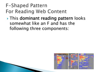
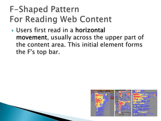
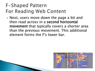
Damian Gordon
The Design of
Everyday Things
by Donald Norman
“The human mind is exquisitely tailored to make sense of the

world. Give it the slightest clue and off it goes, providing
explanation, rationalization, understanding. Consider the objects
– nooks, radios, kitchen, appliances, office machines, and light
switches – that make up our everyday lives. Well- designed
objects are easy to interpret and understand. They contain visible
clues to their operation.
Poorly designed objects can be difficult and frustrating to use.
They provide no clues – or sometimes false clues. They trap the
user and thwart the normal processing interpretation and
understanding…The result is a world filled with frustration.”





A key issue is usability.
Usability is the ease of use and learnability of
a human-made object.
The object of use can be a software
application, website, book, tool, machine, pro
cess, or anything a human interacts with.




A usability study may be conducted as a
primary job function by a usability analyst or
as a secondary job function by
designers, technical writers, marketing
personnel, and others.
It is widely used in consumer
electronics, communication, and knowledge
transfer objects (such as a cookbook, a
document or online help) and mechanical
objects such as a door handle or a hammer.




Usability includes methods of measuring
usability and the study of the principles
behind an object's perceived efficiency or
elegance.
In human-computer interaction and
computer science, usability studies the
elegance and clarity with which the
interaction with a computer program or a web
site (web usability) is designed.





Born 5 Oct 1957
Born in Copenhagen,
Denmark
a leading web usability
consultant
founded the "discount
usability engineering"
movement for fast and
cheap improvements
of user interfaces and
has invented several
usability methods.





Born 5 Oct 1957
Born in Copenhagen,
Denmark
a leading web usability
consultant
founded the "discount
usability engineering"
movement for fast and
cheap improvements
of user interfaces and
has invented several
usability methods.


This dominant reading pattern looks
somewhat like an F and has the
following three components:


Users first read in a horizontal
movement, usually across the upper part of
the content area. This initial element forms
the F's top bar.


Next, users move down the page a bit and
then read across in a second horizontal
movement that typically covers a shorter area
than the previous movement. This additional
element forms the F's lower bar.


Finally, users scan the content's left side in a
vertical movement. Sometimes this is a fairly
slow and systematic scan that appears as a
solid stripe on an eyetracking heatmap. Other
times users move faster, creating a spottier
heatmap. This last element forms the F's
stem.






Users won't read your text thoroughly in a word-by-word
manner. Exhaustive reading is rare, especially when
prospective customers are conducting their initial research
to compile a shortlist of vendors. Yes, some people will
read more, but most won't.
The first two paragraphs must state the most important
information. There's some hope that users will actually
read this material, though they'll probably read more of
the first paragraph than the second.
Start subheads, paragraphs, and bullet points with
information-carrying words that users will notice when
scanning down the left side of your content in the final
stem of their F-behavior. They'll read the third word on a
line much less often than the first two words.
1.
2.
3.
4.
5.
6.
7.

8.
9.
10.

Visibility of system status
Match between system and the real world
User control and freedom
Consistency and standards
Error prevention
Recognition rather than recall
Flexibility and efficiency of use
Aesthetic and minimalist design
Help users recognize, diagnose, and recover from errors
Help and documentation

15
1. Visibility of system status


The system should always keep users
informed about what is going on, through
appropriate feedback within reasonable time.

16
2. Match between system and the real world


The system should speak the users' language,
with words, phrases and concepts familiar to
the user, rather than system-oriented terms.
Follow real-world conventions, making
information appear in a natural and logical
order.

17
3. User control and freedom


Users often choose system functions by
mistake and will need a clearly marked
"emergency exit" to leave the unwanted state
without having to go through an extended
dialogue. Support undo and redo.

18
4. Consistency and standards


Users should not have to wonder whether
different words, situations, or actions mean
the same thing. Follow platform conventions.

19
5. Error prevention


Even better than good error messages is a
careful design which prevents a problem from
occurring in the first place. Either eliminate
error-prone conditions or check for them and
present users with a confirmation option
before they commit to the action.

20
6. Recognition rather than recall
Minimize

the user's memory load by making
objects, actions, and options visible. The user
should not have to remember information from
one part of the dialogue to another. Instructions
for use of the system should be visible or easily
retrievable whenever appropriate.

21
7. Flexibility and efficiency of use


Accelerators -- unseen by the novice user -may often speed up the interaction for the
expert user such that the system can cater to
both inexperienced and experienced users.
Allow users to tailor frequent actions.

22
8. Aesthetic and minimalist design


Dialogues should not contain information
which is irrelevant or rarely needed. Every
extra unit of information in a dialogue
competes with the relevant units of
information and diminishes their relative
visibility.

23
9. Help users recognize, diagnose, and
recover from errors


Error messages should be expressed in
plain language (no codes), precisely indicate
the problem, and constructively suggest a
solution.

24
10. Help and documentation
Even

though it is better if the system can be
used without documentation, it may be
necessary to provide help and documentation.
Any such information should be easy to search,
focused on the user's task, list concrete steps to
be carried out, and not be too large.

25
1.
2.
3.
4.
5.

6.
7.

Equitable Use
Flexibility in Use
Simple and Intuitive
Perceptible Information
Tolerance for Error
Low Physical Effort
Size and Space for Approach and Use

27
•

•
•

•

Provide the same means of use for all users:
identical whenever possible; equivalent when
not
Avoid segregating or stigmatising any users
Provisions for privacy, security and safety
should be equally available to all users
Make the design appealing to all users

28
29
•
•

•
•

Provide choice in method of use
Accommodate right-handed or left-handed
access and use
Facilitate the user’s accuracy and precision
Provide adaptability to the user’s pace

30
31
•
•

•

•

•

Eliminate unnecessary complexity
Be consistent with user expectations and
intuition
Accommodate a wide range of literacy and
language skills
Arrange information consistent with its
importance
Provide effective prompting and feedback
during and after task completion

32
33
•

•

•

•

•

Use different modes (pictorial, verbal, tactile) for redundant
presentation of essential information
Provide adequate contrast between essential information and
its surroundings
Maximise legibility of essential information and its
surroundings
Differentiate elements in ways that can be described (i.e.
make it easy to give instructions or directions)
Provide compatibility with a variety of techniques or devices
used by people with sensory limitations

34
35
•

•

•
•

Arrange elements to minimise hazards and
errors: most used elements, most accessible;
hazardous elements eliminated, isolated or
shielded
Provide warnings of hazards and errors
Provide fail safe features
Discourage unconscious action in tasks that
require vigilance

36
37
•

•
•
•

Allow user to maintain a neutral body
position
Use reasonable operating forces
Minimise repetitive actions
Minimise sustained physical effort

38
39
•

•

•

•

Provide a clear line of sight to important
elements for any seated or standing user
Make reach to all components comfortable
for any seated or standing user
Accommodate variations in hand and grip
size
Provide adequate space for the use of
assistive devices or personal assistance

40
41
1.
2.
3.
4.
5.
6.
7.
8.

Strive for consistency
Cater to universal usability
Offer informative feedback
Design dialogs to yield closure
Prevent errors
Permit easy reversal of actions
Support internal locus of control
Reduce short term memory

42
Perceptual Principles
1. Make displays legible (or audible)
2. Avoid absolute judgment limits
3. Top-down processing
4. Redundancy gain
5. Similarity causes confusion: Use discriminable elements
Mental Model Principles
6. Principle of pictorial realism
7. Principle of the moving part
Principles Based on Attention
8. Minimizing information access cost
9. Proximity compatibility principle
10. Principle of multiple resources
Memory Principles
11. Replace memory with visual information: knowledge in the world
12. Principle of predictive aiding
13. Principle of consistency
1
2
3
4
5
6
7
8

Anticipation
Autonomy
Colour Blindness
Consistency
Defaults
Efficiency of the User
Explorable Interfaces
Fitts' Law

9 Human-Interface
Objects
10 Latency Reduction
11 Learnability
12 Metaphors
13 Protect the User's
Work
14 Readability
15 Track State
16 Visible Interfaces
Managing the Thinking
Setting the focus
Making summaries
Overviews & conclusions
Action Plans

Information & Data

Feelings and Intuition

Neutral and objective
Checked and believed facts
Missing information &
Where to source it

Emotions and hunches
No reasons or justifications
“At this point”
Keep it short

FOCUS
Creative Thinking

Possibilities * Alternatives
New Ideas * New Thinking
Overcome black hat issues
Reinforce yellow hat issues

Why it may work

Values * Benefits
(both known and potential)
Logical reasons
must be given

Why it may not work
Cautions * Dangers
Problems * Faults
Logical reasons
must be given
1.
2.
3.
4.
5.
6.
7.
8.
9.

10.

Creative Design
Aesthetic Design
Sustainable Design
Consistent Design
Understandable Design
Unobtrusive Design
Useful Design
Minimalist Design
Thorough design
Honest Design
Usability, Accessibility, and Design Evaluation

Usability, Accessibility, and Design Evaluation

  • 1.
  • 2.
    The Design of EverydayThings by Donald Norman “The human mind is exquisitely tailored to make sense of the world. Give it the slightest clue and off it goes, providing explanation, rationalization, understanding. Consider the objects – nooks, radios, kitchen, appliances, office machines, and light switches – that make up our everyday lives. Well- designed objects are easy to interpret and understand. They contain visible clues to their operation. Poorly designed objects can be difficult and frustrating to use. They provide no clues – or sometimes false clues. They trap the user and thwart the normal processing interpretation and understanding…The result is a world filled with frustration.”
  • 3.
       A key issueis usability. Usability is the ease of use and learnability of a human-made object. The object of use can be a software application, website, book, tool, machine, pro cess, or anything a human interacts with.
  • 4.
      A usability studymay be conducted as a primary job function by a usability analyst or as a secondary job function by designers, technical writers, marketing personnel, and others. It is widely used in consumer electronics, communication, and knowledge transfer objects (such as a cookbook, a document or online help) and mechanical objects such as a door handle or a hammer.
  • 5.
      Usability includes methodsof measuring usability and the study of the principles behind an object's perceived efficiency or elegance. In human-computer interaction and computer science, usability studies the elegance and clarity with which the interaction with a computer program or a web site (web usability) is designed.
  • 6.
        Born 5 Oct1957 Born in Copenhagen, Denmark a leading web usability consultant founded the "discount usability engineering" movement for fast and cheap improvements of user interfaces and has invented several usability methods.
  • 7.
        Born 5 Oct1957 Born in Copenhagen, Denmark a leading web usability consultant founded the "discount usability engineering" movement for fast and cheap improvements of user interfaces and has invented several usability methods.
  • 9.
     This dominant readingpattern looks somewhat like an F and has the following three components:
  • 10.
     Users first readin a horizontal movement, usually across the upper part of the content area. This initial element forms the F's top bar.
  • 11.
     Next, users movedown the page a bit and then read across in a second horizontal movement that typically covers a shorter area than the previous movement. This additional element forms the F's lower bar.
  • 12.
     Finally, users scanthe content's left side in a vertical movement. Sometimes this is a fairly slow and systematic scan that appears as a solid stripe on an eyetracking heatmap. Other times users move faster, creating a spottier heatmap. This last element forms the F's stem.
  • 13.
       Users won't readyour text thoroughly in a word-by-word manner. Exhaustive reading is rare, especially when prospective customers are conducting their initial research to compile a shortlist of vendors. Yes, some people will read more, but most won't. The first two paragraphs must state the most important information. There's some hope that users will actually read this material, though they'll probably read more of the first paragraph than the second. Start subheads, paragraphs, and bullet points with information-carrying words that users will notice when scanning down the left side of your content in the final stem of their F-behavior. They'll read the third word on a line much less often than the first two words.
  • 15.
    1. 2. 3. 4. 5. 6. 7. 8. 9. 10. Visibility of systemstatus Match between system and the real world User control and freedom Consistency and standards Error prevention Recognition rather than recall Flexibility and efficiency of use Aesthetic and minimalist design Help users recognize, diagnose, and recover from errors Help and documentation 15
  • 16.
    1. Visibility ofsystem status  The system should always keep users informed about what is going on, through appropriate feedback within reasonable time. 16
  • 17.
    2. Match betweensystem and the real world  The system should speak the users' language, with words, phrases and concepts familiar to the user, rather than system-oriented terms. Follow real-world conventions, making information appear in a natural and logical order. 17
  • 18.
    3. User controland freedom  Users often choose system functions by mistake and will need a clearly marked "emergency exit" to leave the unwanted state without having to go through an extended dialogue. Support undo and redo. 18
  • 19.
    4. Consistency andstandards  Users should not have to wonder whether different words, situations, or actions mean the same thing. Follow platform conventions. 19
  • 20.
    5. Error prevention  Evenbetter than good error messages is a careful design which prevents a problem from occurring in the first place. Either eliminate error-prone conditions or check for them and present users with a confirmation option before they commit to the action. 20
  • 21.
    6. Recognition ratherthan recall Minimize the user's memory load by making objects, actions, and options visible. The user should not have to remember information from one part of the dialogue to another. Instructions for use of the system should be visible or easily retrievable whenever appropriate. 21
  • 22.
    7. Flexibility andefficiency of use  Accelerators -- unseen by the novice user -may often speed up the interaction for the expert user such that the system can cater to both inexperienced and experienced users. Allow users to tailor frequent actions. 22
  • 23.
    8. Aesthetic andminimalist design  Dialogues should not contain information which is irrelevant or rarely needed. Every extra unit of information in a dialogue competes with the relevant units of information and diminishes their relative visibility. 23
  • 24.
    9. Help usersrecognize, diagnose, and recover from errors  Error messages should be expressed in plain language (no codes), precisely indicate the problem, and constructively suggest a solution. 24
  • 25.
    10. Help anddocumentation Even though it is better if the system can be used without documentation, it may be necessary to provide help and documentation. Any such information should be easy to search, focused on the user's task, list concrete steps to be carried out, and not be too large. 25
  • 27.
    1. 2. 3. 4. 5. 6. 7. Equitable Use Flexibility inUse Simple and Intuitive Perceptible Information Tolerance for Error Low Physical Effort Size and Space for Approach and Use 27
  • 28.
    • • • • Provide the samemeans of use for all users: identical whenever possible; equivalent when not Avoid segregating or stigmatising any users Provisions for privacy, security and safety should be equally available to all users Make the design appealing to all users 28
  • 29.
  • 30.
    • • • • Provide choice inmethod of use Accommodate right-handed or left-handed access and use Facilitate the user’s accuracy and precision Provide adaptability to the user’s pace 30
  • 31.
  • 32.
    • • • • • Eliminate unnecessary complexity Beconsistent with user expectations and intuition Accommodate a wide range of literacy and language skills Arrange information consistent with its importance Provide effective prompting and feedback during and after task completion 32
  • 33.
  • 34.
    • • • • • Use different modes(pictorial, verbal, tactile) for redundant presentation of essential information Provide adequate contrast between essential information and its surroundings Maximise legibility of essential information and its surroundings Differentiate elements in ways that can be described (i.e. make it easy to give instructions or directions) Provide compatibility with a variety of techniques or devices used by people with sensory limitations 34
  • 35.
  • 36.
    • • • • Arrange elements tominimise hazards and errors: most used elements, most accessible; hazardous elements eliminated, isolated or shielded Provide warnings of hazards and errors Provide fail safe features Discourage unconscious action in tasks that require vigilance 36
  • 37.
  • 38.
    • • • • Allow user tomaintain a neutral body position Use reasonable operating forces Minimise repetitive actions Minimise sustained physical effort 38
  • 39.
  • 40.
    • • • • Provide a clearline of sight to important elements for any seated or standing user Make reach to all components comfortable for any seated or standing user Accommodate variations in hand and grip size Provide adequate space for the use of assistive devices or personal assistance 40
  • 41.
  • 42.
    1. 2. 3. 4. 5. 6. 7. 8. Strive for consistency Caterto universal usability Offer informative feedback Design dialogs to yield closure Prevent errors Permit easy reversal of actions Support internal locus of control Reduce short term memory 42
  • 43.
    Perceptual Principles 1. Makedisplays legible (or audible) 2. Avoid absolute judgment limits 3. Top-down processing 4. Redundancy gain 5. Similarity causes confusion: Use discriminable elements Mental Model Principles 6. Principle of pictorial realism 7. Principle of the moving part Principles Based on Attention 8. Minimizing information access cost 9. Proximity compatibility principle 10. Principle of multiple resources Memory Principles 11. Replace memory with visual information: knowledge in the world 12. Principle of predictive aiding 13. Principle of consistency
  • 44.
    1 2 3 4 5 6 7 8 Anticipation Autonomy Colour Blindness Consistency Defaults Efficiency ofthe User Explorable Interfaces Fitts' Law 9 Human-Interface Objects 10 Latency Reduction 11 Learnability 12 Metaphors 13 Protect the User's Work 14 Readability 15 Track State 16 Visible Interfaces
  • 45.
    Managing the Thinking Settingthe focus Making summaries Overviews & conclusions Action Plans Information & Data Feelings and Intuition Neutral and objective Checked and believed facts Missing information & Where to source it Emotions and hunches No reasons or justifications “At this point” Keep it short FOCUS Creative Thinking Possibilities * Alternatives New Ideas * New Thinking Overcome black hat issues Reinforce yellow hat issues Why it may work Values * Benefits (both known and potential) Logical reasons must be given Why it may not work Cautions * Dangers Problems * Faults Logical reasons must be given
  • 46.
    1. 2. 3. 4. 5. 6. 7. 8. 9. 10. Creative Design Aesthetic Design SustainableDesign Consistent Design Understandable Design Unobtrusive Design Useful Design Minimalist Design Thorough design Honest Design