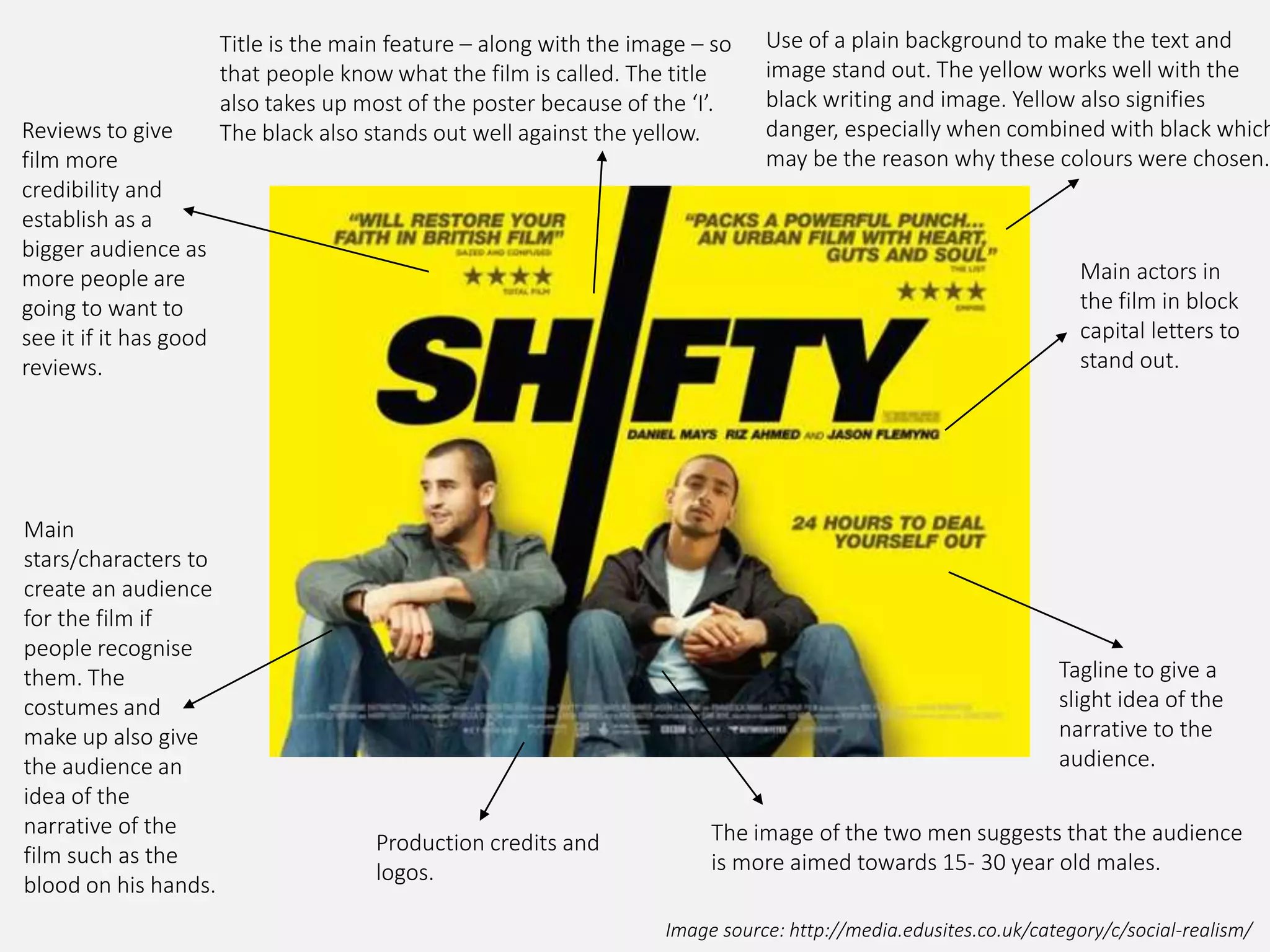
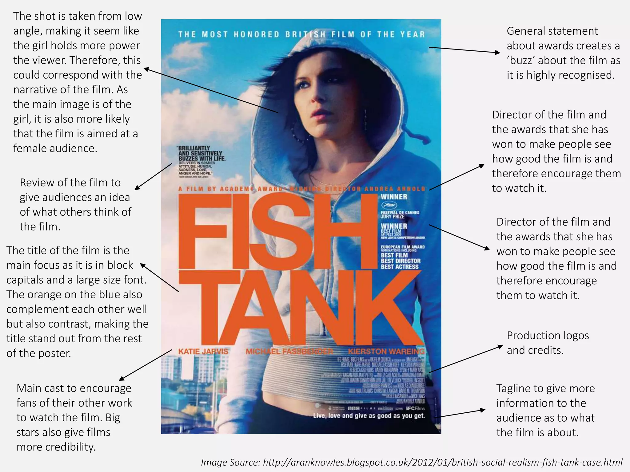
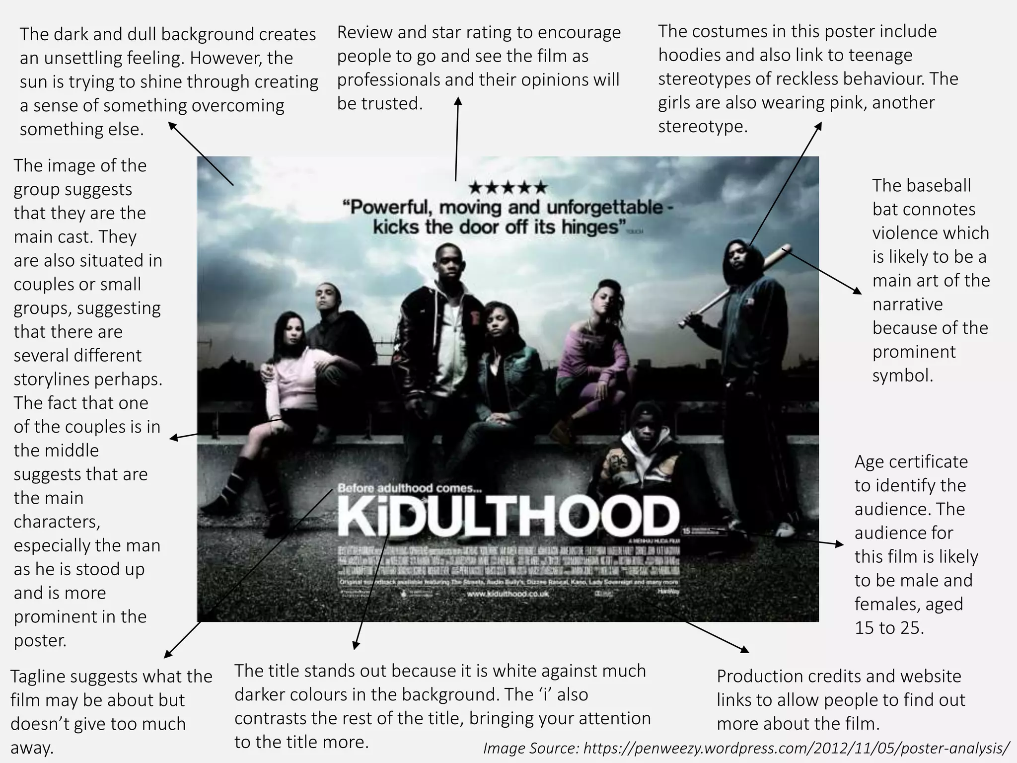
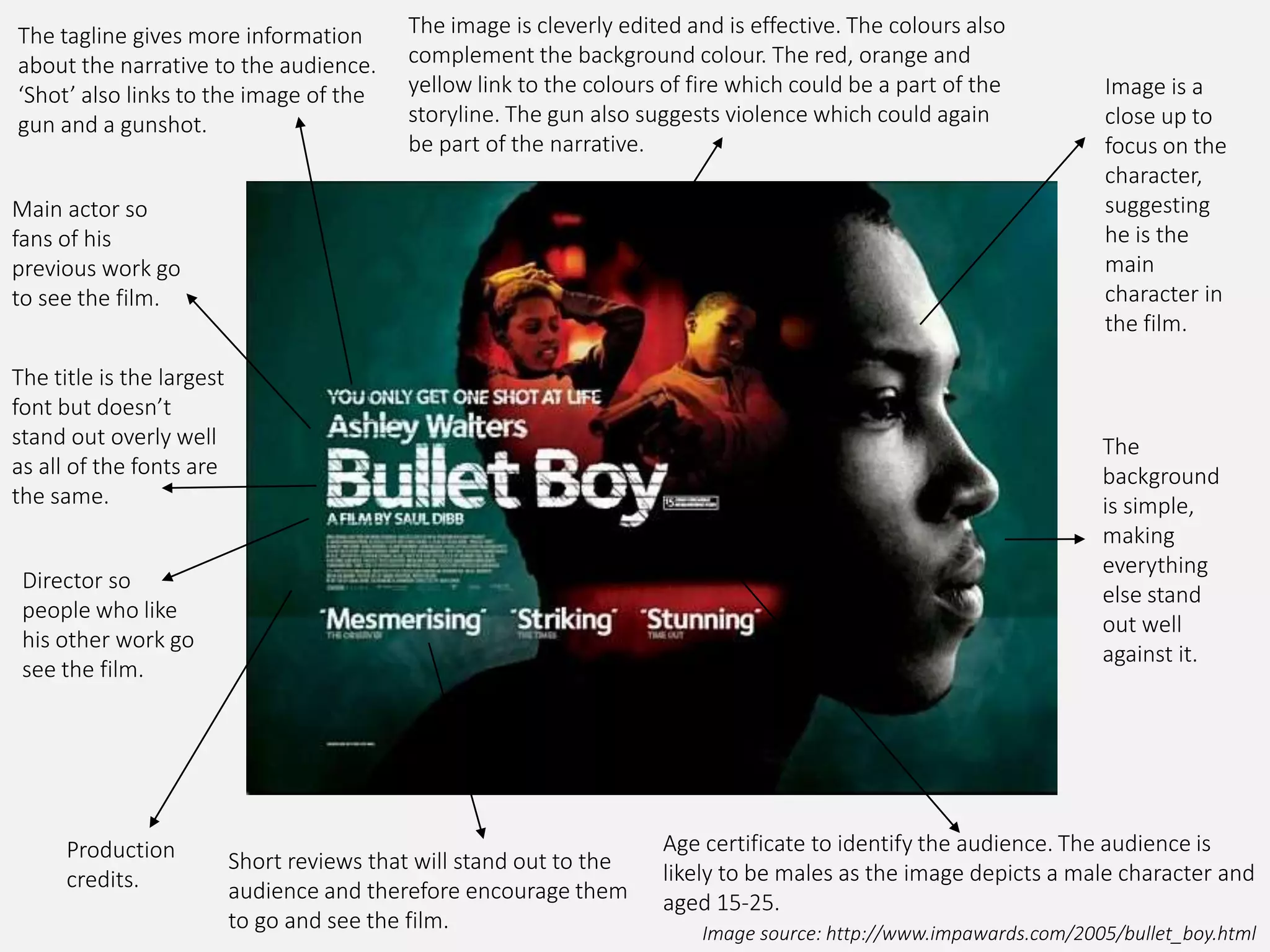
SOCIAL REALISM FILM
POSTER ANALYSIS
Image source: http://media.edusites.co.uk/category/c/social-realism/
Use of a plain background to make the text and
image stand out. The yellow works well with the
black writing and image. Yellow also signifies
danger, especially when combined with black which
may be the reason why these colours were chosen.
Main actors in
the film in block
capital letters to
stand out.
Tagline to give a
slight idea of the
narrative to the
audience.
Production credits and
logos.
Main
stars/characters to
create an audience
for the film if
people recognise
them. The
costumes and
make up also give
the audience an
idea of the
narrative of the
film such as the
blood on his hands.
Reviews to give
film more
credibility and
establish as a
bigger audience as
more people are
going to want to
see it if it has good
reviews.
Title is the main feature – along with the image – so
that people know what the film is called. The title
also takes up most of the poster because of the ‘I’.
The black also stands out well against the yellow.
The image of the two men suggests that the audience
is more aimed towards 15- 30 year old males.
Image Source: http://reemasmediablog.blogspot.co.uk/2011_05_01_archive.html
Most important
and recognised
award to generate
interest.
Who the film is
directed by. Shane
Meadows is widely
known by many and
‘This Is England’ is one
of his most well know
pieces of work.
Awards to show it’s
success.
Review to give
someone else's
opinion and
view of the film
to encourage
the audience to
see the film.
Tagline and background
information about the
film to tell the audience
more about the film’s
narrative and context.
The title is the main
focus and the colours all
stand out against the
background. The effect
of the metal fence below
is also used on the text.
The image used shows
all of the main
characters/actors
which may create a
bigger audience if they
are recognised. They
also give the audience
a better idea of what
the film’s about.
Production
credits and logos.
The colours reflect the
title with the colours
associated with the
union jack and England.
Graffiti style font
also reflects the
narrative of the
film.
Image Source: http://www.impawards.com/2006/london_to_brighton_xlg.html
Production credits and social media
links to allow the audience to find out
more about the film.
Images of the main cast so that the
audience recognise them and this may
possibly encourage them to go and see
the film.
Image of the
setting of the
film to provide
the audience
with more
information
about the film.
The layout of the
images suggests
that something is
disjointed and
could link to the
storyline such as
a family which is
having problems,
for example.
Reviews and stars to encourage the
audience to go see the film as there
are good reviews and opinions on the
film.
Director to
encourage people
who are fans of his
work to go see the
film.
The title is the
boldest element of
the poster as all of
the text is
together apart
from the reviews.
This makes it stand
out as everything
else is disjointed
and separated.
The tagline allows the
audience to get a
better idea of what
the film could be
about and also
intrigue them so they
have to go see it to
truly find out what
the narrative is.
Awards to show how good the film is
and therefore encourage more people
to go see it.
The gun
suggests
violence as well
as the dark
background
which creates
mystery.
Image Source: http://aranknowles.blogspot.co.uk/2012/01/british-social-realism-fish-tank-case.html
General statement
about awards creates a
’buzz’ about the film as
it is highly recognised.
Director of the film and
the awards that she has
won to make people see
how good the film is and
therefore encourage them
to watch it.
Director of the film and
the awards that she has
won to make people see
how good the film is and
therefore encourage
them to watch it.
Production logos
and credits.
Tagline to give more
information to the
audience as to what
the film is about.
Main cast to encourage
fans of their other work
to watch the film. Big
stars also give films
more credibility.
The title of the film is the
main focus as it is in block
capitals and a large size font.
The orange on the blue also
complement each other well
but also contrast, making the
title stand out from the rest
of the poster.
Review of the film to
give audiences an idea
of what others think of
the film.
The shot is taken from low
angle, making it seem like
the girl holds more power
the viewer. Therefore, this
could correspond with the
narrative of the film. As
the main image is of the
girl, it is also more likely
that the film is aimed at a
female audience.
Image Source: https://penweezy.wordpress.com/2012/11/05/poster-analysis/
Production credits and website
links to allow people to find out
more about the film.
Age certificate
to identify the
audience. The
audience for
this film is likely
to be male and
females, aged
15 to 25.
The baseball
bat connotes
violence which
is likely to be a
main art of the
narrative
because of the
prominent
symbol.
Review and star rating to encourage
people to go and see the film as
professionals and their opinions will
be trusted.
The costumes in this poster include
hoodies and also link to teenage
stereotypes of reckless behaviour. The
girls are also wearing pink, another
stereotype.
The image of the
group suggests
that they are the
main cast. They
are also situated in
couples or small
groups, suggesting
that there are
several different
storylines perhaps.
The fact that one
of the couples is in
the middle
suggests that are
the main
characters,
especially the man
as he is stood up
and is more
prominent in the
poster.
Tagline suggests what the
film may be about but
doesn’t give too much
away.
The title stands out because it is white against much
darker colours in the background. The ‘i’ also
contrasts the rest of the title, bringing your attention
to the title more.
The dark and dull background creates
an unsettling feeling. However, the
sun is trying to shine through creating
a sense of something overcoming
something else.
Image source: http://www.impawards.com/2005/bullet_boy.html
Production
credits.
Short reviews that will stand out to the
audience and therefore encourage them
to go and see the film.
Age certificate to identify the audience. The audience is
likely to be males as the image depicts a male character and
aged 15-25.
The
background
is simple,
making
everything
else stand
out well
against it.
Image is a
close up to
focus on the
character,
suggesting
he is the
main
character in
the film.
Main actor so
fans of his
previous work go
to see the film.
The title is the largest
font but doesn’t
stand out overly well
as all of the fonts are
the same.
Director so
people who like
his other work go
see the film.
The tagline gives more information
about the narrative to the audience.
‘Shot’ also links to the image of the
gun and a gunshot.
The image is cleverly edited and is effective. The colours also
complement the background colour. The red, orange and
yellow link to the colours of fire which could be a part of the
storyline. The gun also suggests violence which could again
be part of the narrative.

Social Realism Film Posters Analysis

  • 1.
  • 2.
    Image source: http://media.edusites.co.uk/category/c/social-realism/ Useof a plain background to make the text and image stand out. The yellow works well with the black writing and image. Yellow also signifies danger, especially when combined with black which may be the reason why these colours were chosen. Main actors in the film in block capital letters to stand out. Tagline to give a slight idea of the narrative to the audience. Production credits and logos. Main stars/characters to create an audience for the film if people recognise them. The costumes and make up also give the audience an idea of the narrative of the film such as the blood on his hands. Reviews to give film more credibility and establish as a bigger audience as more people are going to want to see it if it has good reviews. Title is the main feature – along with the image – so that people know what the film is called. The title also takes up most of the poster because of the ‘I’. The black also stands out well against the yellow. The image of the two men suggests that the audience is more aimed towards 15- 30 year old males.
  • 3.
    Image Source: http://reemasmediablog.blogspot.co.uk/2011_05_01_archive.html Mostimportant and recognised award to generate interest. Who the film is directed by. Shane Meadows is widely known by many and ‘This Is England’ is one of his most well know pieces of work. Awards to show it’s success. Review to give someone else's opinion and view of the film to encourage the audience to see the film. Tagline and background information about the film to tell the audience more about the film’s narrative and context. The title is the main focus and the colours all stand out against the background. The effect of the metal fence below is also used on the text. The image used shows all of the main characters/actors which may create a bigger audience if they are recognised. They also give the audience a better idea of what the film’s about. Production credits and logos. The colours reflect the title with the colours associated with the union jack and England. Graffiti style font also reflects the narrative of the film.
  • 4.
    Image Source: http://www.impawards.com/2006/london_to_brighton_xlg.html Productioncredits and social media links to allow the audience to find out more about the film. Images of the main cast so that the audience recognise them and this may possibly encourage them to go and see the film. Image of the setting of the film to provide the audience with more information about the film. The layout of the images suggests that something is disjointed and could link to the storyline such as a family which is having problems, for example. Reviews and stars to encourage the audience to go see the film as there are good reviews and opinions on the film. Director to encourage people who are fans of his work to go see the film. The title is the boldest element of the poster as all of the text is together apart from the reviews. This makes it stand out as everything else is disjointed and separated. The tagline allows the audience to get a better idea of what the film could be about and also intrigue them so they have to go see it to truly find out what the narrative is. Awards to show how good the film is and therefore encourage more people to go see it. The gun suggests violence as well as the dark background which creates mystery.
  • 5.
    Image Source: http://aranknowles.blogspot.co.uk/2012/01/british-social-realism-fish-tank-case.html Generalstatement about awards creates a ’buzz’ about the film as it is highly recognised. Director of the film and the awards that she has won to make people see how good the film is and therefore encourage them to watch it. Director of the film and the awards that she has won to make people see how good the film is and therefore encourage them to watch it. Production logos and credits. Tagline to give more information to the audience as to what the film is about. Main cast to encourage fans of their other work to watch the film. Big stars also give films more credibility. The title of the film is the main focus as it is in block capitals and a large size font. The orange on the blue also complement each other well but also contrast, making the title stand out from the rest of the poster. Review of the film to give audiences an idea of what others think of the film. The shot is taken from low angle, making it seem like the girl holds more power the viewer. Therefore, this could correspond with the narrative of the film. As the main image is of the girl, it is also more likely that the film is aimed at a female audience.
  • 6.
    Image Source: https://penweezy.wordpress.com/2012/11/05/poster-analysis/ Productioncredits and website links to allow people to find out more about the film. Age certificate to identify the audience. The audience for this film is likely to be male and females, aged 15 to 25. The baseball bat connotes violence which is likely to be a main art of the narrative because of the prominent symbol. Review and star rating to encourage people to go and see the film as professionals and their opinions will be trusted. The costumes in this poster include hoodies and also link to teenage stereotypes of reckless behaviour. The girls are also wearing pink, another stereotype. The image of the group suggests that they are the main cast. They are also situated in couples or small groups, suggesting that there are several different storylines perhaps. The fact that one of the couples is in the middle suggests that are the main characters, especially the man as he is stood up and is more prominent in the poster. Tagline suggests what the film may be about but doesn’t give too much away. The title stands out because it is white against much darker colours in the background. The ‘i’ also contrasts the rest of the title, bringing your attention to the title more. The dark and dull background creates an unsettling feeling. However, the sun is trying to shine through creating a sense of something overcoming something else.
  • 7.
    Image source: http://www.impawards.com/2005/bullet_boy.html Production credits. Shortreviews that will stand out to the audience and therefore encourage them to go and see the film. Age certificate to identify the audience. The audience is likely to be males as the image depicts a male character and aged 15-25. The background is simple, making everything else stand out well against it. Image is a close up to focus on the character, suggesting he is the main character in the film. Main actor so fans of his previous work go to see the film. The title is the largest font but doesn’t stand out overly well as all of the fonts are the same. Director so people who like his other work go see the film. The tagline gives more information about the narrative to the audience. ‘Shot’ also links to the image of the gun and a gunshot. The image is cleverly edited and is effective. The colours also complement the background colour. The red, orange and yellow link to the colours of fire which could be a part of the storyline. The gun also suggests violence which could again be part of the narrative.