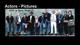
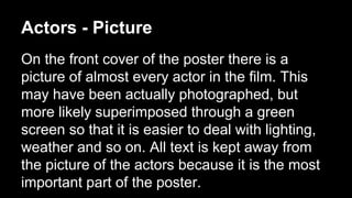
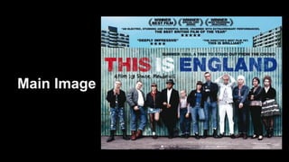
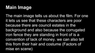
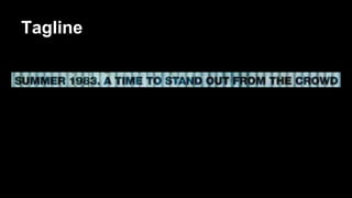
This Is England 
Film Poster Analysis
Actors - Names 
The names of the actors are not shown on the film 
poster. This may be because the actors are not well 
known and therefore won't make people want to watch 
the film. Another reason could be that it looks from the 
film poster that there are lots of main actors in the film 
and if they were to put all of their names on the poster 
it might look very cluttered and not aesthetically 
pleasing
Actors - Pictures
Actors - Picture 
On the front cover of the poster there is a 
picture of almost every actor in the film. This 
may have been actually photographed, but 
more likely superimposed through a green 
screen so that it is easier to deal with lighting, 
weather and so on. All text is kept away from 
the picture of the actors because it is the most 
important part of the poster.
Text Placement 
All the text is centered apart from the strap line and the 
‘Directed by Shane meadows’ which are placed aligned to 
either side of the title. These three pieces of test are placed 
at the top of the fence, the credit block is placed on the 
ground at the bottom and the critical praise is at the top 
overlaying the sky. These are cleverly placed so that they 
don’t cover up the background of the building estates. 
All the text in the middle has been placed to make sure that 
it is away from the picture of the characters but in the 
circumference of the fence
References to Other Films 
There are no references to other films. This may be 
because this direct or producer have produced any films 
yet which are highly rated enough to put on the poster. This 
is then confirmed by one of the laurels which shows the 
director has won an award for ‘Most Promising Newcomer’ 
which would suggest that this is one of her first films. This 
is the same for my film poster because there are no films 
that i have made which are well known or that would make 
people want to watch my short.
Cultural references
Laurels 
We can see from the laurels that this film has 
been heavily praised by film festivals. It has 
won very big awards such as ‘Winner Best 
Film’ by the BFIA (British Independent Film 
Awards). This will entice a big audience 
because it is rated the best british independent 
film of 2006.
Main Image
Main Image 
The main image tells us about the film. For one 
it lets us see that these characters are poor 
because there are council estates in the 
background and also because the corrugated 
iron fence they are standing in front of is a 
convention of lack of money. we can also tell 
this from their hair and costume (Factors of 
mise en scene)
Tagline
Tagline 
The tagline ‘Summer 1983. A time to stand out 
from the crowd.’ gives us a sense of what the 
movie is about and links to the main poster 
image. It tells us the date in which the movie is 
set and by saying ‘stand out from the crowd’ it 
links to the image of the characters due to their 
odd clothing and shaved heads
Website
Website 
Like almost all film posters, this one has a 
website. It is to get the audience involved in the 
film before, and leading up to, the films release. 
It includes things such as the films trailer, the 
release date and interactive apps
Critical Praise
Critical Praise 
There are two different types of critical praise 
on the poster. The first are quotes such as that 
from the observer saying “The directors best 
film yet. This is brilliant.” 
The second is the five star rating system in 
which total film gave 5 stars and empire gave 4.
Title
Title 
Size: The title is 
conventionally the 
largest piece of text 
on the poster and this 
poster fits those 
conventions. 
Font: There is a very 
basic bold font, 
kerned so that each 
letter is fairly separate
Title 
Colour: The colours 
used for the font are 
Red, White and Blue 
for the English flag. 
This is why the 
colours links in with 
the name of the film 
Style: The style of the 
font is as if it is printed 
onto corrugated iron. 
This gives it an urban, 
decayed feel which 
links in with the theme 
of the movie.
Credit Block
Credit Block 
The credit block is a legal obligation for film 
posters. It tells the audience who and which 
institutions were involved in the production of 
the film and credits them. In this poster it is 
used conventionally; tucked away at the bottom 
so that it does not attract attention
Age Certificate 
There is no age certificate on the poster 
although the film will have one because it is a 
legal requirement. It is surprising however 
because this might be a factor you base your 
decision on to go and see the movie or not. For 
instance if you are 17 years of age, you would 
not go and see it if it was rated an 18.

This Is England - Film Poster Analysis

  • 1.
    This Is England Film Poster Analysis
  • 3.
    Actors - Names The names of the actors are not shown on the film poster. This may be because the actors are not well known and therefore won't make people want to watch the film. Another reason could be that it looks from the film poster that there are lots of main actors in the film and if they were to put all of their names on the poster it might look very cluttered and not aesthetically pleasing
  • 4.
  • 5.
    Actors - Picture On the front cover of the poster there is a picture of almost every actor in the film. This may have been actually photographed, but more likely superimposed through a green screen so that it is easier to deal with lighting, weather and so on. All text is kept away from the picture of the actors because it is the most important part of the poster.
  • 6.
    Text Placement Allthe text is centered apart from the strap line and the ‘Directed by Shane meadows’ which are placed aligned to either side of the title. These three pieces of test are placed at the top of the fence, the credit block is placed on the ground at the bottom and the critical praise is at the top overlaying the sky. These are cleverly placed so that they don’t cover up the background of the building estates. All the text in the middle has been placed to make sure that it is away from the picture of the characters but in the circumference of the fence
  • 7.
    References to OtherFilms There are no references to other films. This may be because this direct or producer have produced any films yet which are highly rated enough to put on the poster. This is then confirmed by one of the laurels which shows the director has won an award for ‘Most Promising Newcomer’ which would suggest that this is one of her first films. This is the same for my film poster because there are no films that i have made which are well known or that would make people want to watch my short.
  • 8.
  • 9.
    Laurels We cansee from the laurels that this film has been heavily praised by film festivals. It has won very big awards such as ‘Winner Best Film’ by the BFIA (British Independent Film Awards). This will entice a big audience because it is rated the best british independent film of 2006.
  • 10.
  • 11.
    Main Image Themain image tells us about the film. For one it lets us see that these characters are poor because there are council estates in the background and also because the corrugated iron fence they are standing in front of is a convention of lack of money. we can also tell this from their hair and costume (Factors of mise en scene)
  • 12.
  • 13.
    Tagline The tagline‘Summer 1983. A time to stand out from the crowd.’ gives us a sense of what the movie is about and links to the main poster image. It tells us the date in which the movie is set and by saying ‘stand out from the crowd’ it links to the image of the characters due to their odd clothing and shaved heads
  • 14.
  • 15.
    Website Like almostall film posters, this one has a website. It is to get the audience involved in the film before, and leading up to, the films release. It includes things such as the films trailer, the release date and interactive apps
  • 16.
  • 17.
    Critical Praise Thereare two different types of critical praise on the poster. The first are quotes such as that from the observer saying “The directors best film yet. This is brilliant.” The second is the five star rating system in which total film gave 5 stars and empire gave 4.
  • 18.
  • 19.
    Title Size: Thetitle is conventionally the largest piece of text on the poster and this poster fits those conventions. Font: There is a very basic bold font, kerned so that each letter is fairly separate
  • 20.
    Title Colour: Thecolours used for the font are Red, White and Blue for the English flag. This is why the colours links in with the name of the film Style: The style of the font is as if it is printed onto corrugated iron. This gives it an urban, decayed feel which links in with the theme of the movie.
  • 21.
  • 22.
    Credit Block Thecredit block is a legal obligation for film posters. It tells the audience who and which institutions were involved in the production of the film and credits them. In this poster it is used conventionally; tucked away at the bottom so that it does not attract attention
  • 23.
    Age Certificate Thereis no age certificate on the poster although the film will have one because it is a legal requirement. It is surprising however because this might be a factor you base your decision on to go and see the movie or not. For instance if you are 17 years of age, you would not go and see it if it was rated an 18.