Fear  in his eyes suggests that something is taunting him, the fact that he is facing the camera, it portrays that he is unaware of her presence.   There is a contrast between the clearness of the face and the  distortion  and  blurriness  of the woman’s face.  Dull colours  reflects the mood that they are trying to create for example, scary, eerie and mysterious.  The  fogginess  is a convention of supernatural films as it indicates signs of  mystery and creates a tense and jumpy atmosphere. Using the name as a selling point for the film The  tag line  is short and therefore easy for people to  remember . It also leaves people with the question in their head and lets them know that the film is going to be ghost related.  The  key image  of the poster is half of the characters face. Our attention is drawn to his eye which is ironic because he cannot see the  ghost  behind him.
The poster shows  newspaper/magazine  reviews in order to promote how  good  the film is.  The  actresses name  is prominent and obvious at the top of the poster. They could be using the name as a  unique selling point . The  positioning  of her face on this poster is suggesting something is  lurking in the dark , her eye contact with the dark, raises the question on who is she glaring at and why?  Her open mouth portrays a look of shock and horror.  The term ‘ they’  suggests that there is no one specific which plays on the audiences mind as this also links to the title in the sense  that it is about the  ‘others’  rather than just the character shown in the poster.  The idea of the ‘ others ’ makes this more scary as we are not sure what we should be referring to,  human or not ? ‘ Rent it on’  is a demand this makes it more irresistible because it makes you believe as the audience you are missing out.  The  colour scheme  is   dark and atmospheric  due to the hint of candle light, revealing the characters scared facial expression. The  lack of colour  reflects the idea that they are  living in darkness .  There is a  strange supernatural  effect on the title and the light coming off of the letters looks like it is trying to break through the  darkness .
Blurriness  of the fog suggests that everything is  uncertain or unclear The  font  of the  writing suggests  someone has written it on the  window   The title  suggests that there is an  unpleasant/unwanted  presence around The  dirty window  suggests that it has been  abandoned   The fact you cant see the  face   raises enigmas  because it causes you to wonder  who it is and why they   are hidden.   The  empty background  suggests that it is in a  secluded area

Film poster presentation

  • 1.
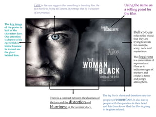
    Fear inhis eyes suggests that something is taunting him, the fact that he is facing the camera, it portrays that he is unaware of her presence. There is a contrast between the clearness of the face and the distortion and blurriness of the woman’s face. Dull colours reflects the mood that they are trying to create for example, scary, eerie and mysterious. The fogginess is a convention of supernatural films as it indicates signs of mystery and creates a tense and jumpy atmosphere. Using the name as a selling point for the film The tag line is short and therefore easy for people to remember . It also leaves people with the question in their head and lets them know that the film is going to be ghost related. The key image of the poster is half of the characters face. Our attention is drawn to his eye which is ironic because he cannot see the ghost behind him.
  • 2.
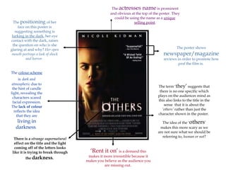
    The poster shows newspaper/magazine reviews in order to promote how good the film is. The actresses name is prominent and obvious at the top of the poster. They could be using the name as a unique selling point . The positioning of her face on this poster is suggesting something is lurking in the dark , her eye contact with the dark, raises the question on who is she glaring at and why? Her open mouth portrays a look of shock and horror. The term ‘ they’ suggests that there is no one specific which plays on the audiences mind as this also links to the title in the sense that it is about the ‘others’ rather than just the character shown in the poster. The idea of the ‘ others ’ makes this more scary as we are not sure what we should be referring to, human or not ? ‘ Rent it on’ is a demand this makes it more irresistible because it makes you believe as the audience you are missing out. The colour scheme is dark and atmospheric due to the hint of candle light, revealing the characters scared facial expression. The lack of colour reflects the idea that they are living in darkness . There is a strange supernatural effect on the title and the light coming off of the letters looks like it is trying to break through the darkness .
  • 3.
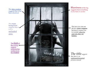
    Blurriness ofthe fog suggests that everything is uncertain or unclear The font of the writing suggests someone has written it on the window The title suggests that there is an unpleasant/unwanted presence around The dirty window suggests that it has been abandoned The fact you cant see the face raises enigmas because it causes you to wonder who it is and why they are hidden. The empty background suggests that it is in a secluded area