Designing the brand identity and CX for a startup
•
0 likes•263 views

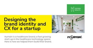
Humain is a healthcare brand, a fast growing start-up in the healthcare technology space. Here is how we helped them build their brand and Customer Experience

Recommended
Recommended
More Related Content
What's hot
What's hot (20)
Similar to Designing the brand identity and CX for a startup
Similar to Designing the brand identity and CX for a startup (20)
More from Rezonant Design
More from Rezonant Design (20)
Recently uploaded
Recently uploaded (20)
Designing the brand identity and CX for a startup
- 1. Designing the brand identity and CX for a startup Humain is a healthcare brand, a fast growing start-up in the healthcare technology space. Here is how we helped them build their brand.
- 2. The brand identity ⇢ Challenge → To create a unique and memorable visual identity → To push the boundaries of creativity hitherto untouched in the healthcare sector → To not alienate or confuse people in need of medical service → To create a energetic brand without trivialising it ⇢ Research → Understanding patient psychology → Benchmarking and analysis → Understanding what works ⇢ Design → The approach → The human in HUMAIN ⇢ Outcome → Appreciated by clients and customers alike
- 3. The story of the design ⇢ Humain Health is a chain of primary healthcare and diagnostic centres. ⇢ At the heart of this healthcare startup is innovative AI based technology which delivers superior diagnostic results to patients. ⇢ The logo we designed evolved from Humain Health’s core mission of providing quality healthcare to people. ⇢ Thus the logo mark consists of a human form with its arms raised; it depicts a healthy individual.
- 4. Evolution of the logomark
- 5. Green, the primary palette
- 6. Why the ‘H’ → The thought was to create an identity that was clutter-breaking, yet simple and easy to relate to. Since the company’s name started with ‘H’, we decided to explore a ‘basic’ route with the alphabet first. → Various experiments and trials and errors brought us around to using the H as a human form. → Not only was the word ‘human’ a part of the brand name but the services offered were also for the benefit of humanity. → The logomark is drawn from a single line, ‘the lifeline’ and forms the H in one smooth continuous motion. → The colour we used as the primary brand colour was green which represented freshness, energy and life. → The logo was scaled to myriad applications. The icons followed a single-stoke philosophy and used the design language set by the brand identity
- 7. The identity led the icon design
- 10. Icons have wide usage
- 11. A complete set of icons
- 12. The identity in installations
- 13. CX (Customer Experience) ⇢ Challenge → From the facade to the reception, the goal was to create visuals that communicated the Humain philosophy while being pleasant → Medical centres are generally traditional in design and design language had to be done to avoid visual and mental fatigue → The centre was not a run-of-the-mill healthcare centre, so illustrations that would cater to all touch points was key ⇢ Research → Understanding patient psychology → Benchmarking and analysis → Understanding what works
- 14. CX (Customer Experience) ⇢ Design → A short note on the brand’s philosophy, a self-registering kiosk combined with a green aura provided patients with the perfect ‘safe zone’ where they can get their health look after. → The reception had several touchpoints to engage a patient when he/she enters. We created a ‘hero illustration’ for the brand which was displayed prominently at the reception. → Here, patients could understand the methodology of treatment and diagnosis along with the services offered at Humain. → Each consulting room had useful information for the patient packaged in easy-to-consume, short points. → The brand identity was scaled across many applications such as delivery boys’ bikes, bags, vans, stationery, reports and much more. ⇢ Outcome → Highly appreciated by clients and customers alike .
- 15. Reception area
- 17. Brand philosophy
- 18. Illustrations are a crucial part of the brand’s identity
- 19. Core brand illustrations depicted a story for Humain
- 20. Evolution of illustration - WIP sketches on ipad for Humain diagnostic
- 22. ‘We care for you’ illustration
- 23. The illustration uses several nuances of the experience
- 26. BMI measuring machine ⇢ ⇢ We developed product innovations such as this BMI Machine that would help engage patients ⇢ The machine was a result of IOT development, product design and some deft co-ordination with the interior design team
- 28. Fun posters bring humour
- 29. A pun on organs
- 30. A few more...
- 34. Facade night time signage
- 35. Facade day time signage
- 37. Stay in touch with our design approach. Right in your inbox. Sign-up for our monthly newsletter on what we think is cool in the world of brand, signage, environmental graphics and digital transformation. Write to brands@rezonant.net