Care.fit case study
•
0 likes•41 views

Care.fit is part of the illustrious and disruptive Cure.fit group that has revolutionised healthcare in India. Care.fit wanted to create a healthcare experience for patients unlike any other. We were happy to oblige.

Recommended
More Related Content
Similar to Care.fit case study
Similar to Care.fit case study (20)
More from Rezonant Design
More from Rezonant Design (20)
Recently uploaded
Recently uploaded (20)
Care.fit case study
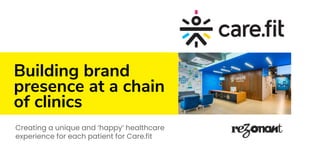
- 1. Building brand presence at a chain of clinics Creating a unique and ‘happy’ healthcare experience for each patient for Care.fit
- 2. The project ⇢ Challenge → Care.fit is part of the illustrious and disruptive Cure.fit group that has revolutionised healthcare in India. Care.fit wanted to create a healthcare experience for patients unlike any other. We were happy to oblige. → Challenges to resolve:: ● To create a medical centre that does not look like a traditional medical centre? ● To identify decades old deep-rooted medical industry problems with clinics and hospitals and eradicate them from a new-age space?
- 3. The project ⇢ Challenge ⇢ From an industry perspective, the challenges were: 1. How do we ensure that we create a medical centre that does not look like a medical centre? 2. How do we battle a centuries old perception that hospitals and clinics are a scary place? 3. How do we create a hassle-free and smooth customer journey that ensures the best possible experience? ⇢ From the perspective of the brand, the challenges were: 1. How do we create a space that inspires trust ? 2. How do we create a space that balances credibility and freshness all in one? 3. How to incorporate the parent brand’s philosophy within the content and art for the space? 4. How to ensure that the design reflects the brand’s existing powerful visual language but still has the merit to stand out on its own for Care.fit. It was interesting to work with these unique set of challenges, addressing them and then solving them eventually. ⇢ Research 1. Interviews with a diverse user base across all ages 2. Visits to medical centres across the city 3. To create a medical centre that looked like a modern day office space. 4. Consciously stay away from unsavoury visuals and scare tactics 5. Infuse some humour into the space ⇢ Our research revolved around: 1. What kind of experience do patients require from clinics and medical centres these days? 2. What are the different kinds of experience disasters faced by patients of all ages on a regular basis? 3. What are the kind of places that inspire trust in patient’s minds? ⇢ Benchmarking ⇢ Our benchmarking revolved around: 1. Who are the top deliverers of patient experience in India and abroad? 2. What are some of the best practices of industries like hospitality that can be used to deliver a great experience even in this domain?
- 4. The project ⇢ Design Understanding the space and how it was going to be used was key to getting us started with the process of idea generation. 1. Mapping the entire customer journey into experience touchpoints 2. Designing interventions for each touchpoint 3. Illustrations, graphics design, content strategy and wayfinding ⇢ Outcome We created a medical space unlike any other. It had humour, colour, attitude and comfort.
- 5. The entrance experience ⇢ First impressions are important for any brand. First interactions, first visits, first purchase and so on are all important touch-points in the experience design of any brand. Our thought process for the entrance facade was: 1. How does one make sure that it conveys that the space is a medical centre? 2. How does one ensure that it looks inviting, fun and out of the ordinary? ⇢ “Most medical centers have reception areas with uncomfortable furniture, not enough place to sit and scary posters of diseases” – One of our research candidates. ⇢ “The facade we solved by ensuring that a lot of the inside of the centre could be seen from the outside without putting up film on the glass. This created an element of curiosity. ⇢ The facade design was conceptualised to ensure that the centre stood out and was noticeable from far. We wanted it to be clear that the space was a medical centre and hence the most prominent aspect of the facade was a medical ‘plus’. ⇢ The reception was created with the theme of a ‘cool and funky start-up office’; a modern day workplace with light-hearted communication, colourful graphics and comfortable furniture.
- 7. The hero illustration ⇢ Care.fit’s famous tagline is ‘Be better everyday’. The company believes in lifestyle changes and long term gains. They advocate a holistic approach to healthy living. We represented the philosophy with a hero illustration that communicated this in a visual manner.
- 9. Consultation room ⇢ Each consultation room dispensed some lifestyle tips and advise to the patients. Each room had a theme around which the tips where given. However, the idea was not to preach but to inform; and that is why each piece of information was given in the form of a rhyme. The content was supported by simple and vibrant illustrations printed on 3D circles and pasted on a colourful wall pattern.
- 10. Flat graphics
- 11. Flat graphics
- 12. Child consultation room ⇢ Each consultation room dispensed some lifestyle tips and advise to the patients. Each room had a theme around which the tips where given. However, the idea was not to preach but to inform; and that is why each piece of information was given in the form of a rhyme. The content was supported by simple and vibrant illustrations printed on 3D circles and pasted on a colourful wall pattern. ⇢ “Doctor cabins are always so cluttered and uncomfortable. Full of free calendars, pens, etc they have got from pharma companies. It is depressing.” – An insight from our research
- 13. Flat graphics
- 14. Treatment room ⇢ Treatment Rooms are spaces where patients could be most uncomfortable and anxious. Here is where the medical professional run tests and check for anomalies. That is why, here, we decided to use fun and interesting cartoons. Each cartoon was themed on a doctor-patient interaction and made the patient relax and smile. ⇢ We wanted Treatment Rooms to cheer patients up and bring a smile to their faces.
- 15. Flat graphics
- 16. Flat graphics
- 17. Flat graphics
- 18. Flat graphics
- 19. Flat graphics
- 21. Informational Posters ⇢ Information posters: We designed 3D informational posters(refer to slide no. 22) ⇢ Humorous posters: We designed movie posters to bring smile on people’s face(refer to slide no. 23).
- 23. Humorous posters
- 24. Flat graphics
- 25. 3D quotes
- 26. 3D Quotes
- 27. Quotes on vinyl graphics
- 29. Signage
- 30. Signages
- 31. Stay in touch with our design approach. Right in your inbox. Sign-up for our monthly newsletter on what we think is cool in the world of brand, signage, environmental graphics and digital transformation. Read more: https://bit.ly/2KLfrxj