Rezonant mirable case study
•
0 likes•39 views

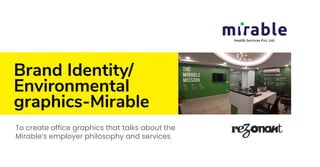
Mirable is a healthcare startup that runs a state-of-the-art chain of primary healthcare and diagnostics centres called Humain Health. Mirable envisions to be the preferred healthcare provider for a billion Indians in the near future. We were commissioned to Craft a cool brand identity and office graphics design for the healthcare start-up.

Recommended
More Related Content
What's hot
What's hot (20)
Similar to Rezonant mirable case study
Similar to Rezonant mirable case study (20)
More from Rezonant Design
More from Rezonant Design (20)
Recently uploaded
Recently uploaded (20)
Rezonant mirable case study
- 1. Brand Identity/ Environmental graphics-Mirable To create office graphics that talks about the Mirable’s employer philosophy and services
- 3. The project ⇢ Challenge → Mirable is a healthcare startup that runs a state-of-the-art chain of primary healthcare and diagnostics centres called Humain Health. Mirable envisions to be the preferred healthcare provider for a billion Indians in the near future. → We were commissioned to create an identity that resonated with the company and also aligned with its customer facing brand Humain Health. ⇢ Strategy → Create an intuitive brand identity that conveys the company’s deep connection with people. Use colors that are synonymous with the healthcare industry. ⇢ Design → The typeface used is Ubuntu which is a crisp. → Sans Serif font with good visibility. → The color palette uses green and blue, mirroring colors from nature – greenery and water. ⇢ Outcome → The brand identity has helped create a distinct identity for brand Mirable.
- 4. The ‘i’, in logo → The ‘i’ is a hidden person, similar to Humain’s logo which also focuses on the human → The figure & ground principle is commonly associated with gestalt theory. This can be very handy when we want to highlight a focal point. → In the design, we have incorporated a human element (fits for both health and the technology aspect of the brand) by simply shifting the circle a little towards right which provides a human figure as a whole.
- 7. EVP + Office graphics Case study
- 8. The project ⇢ Challenge → Challenges to solve: ● How to highlight the importance and the need for a complete revamp of the healthcare space in India to inspire employees everyday? ● How to enable employees to stay cognisant with the vision of this healthcare start-up? → Help attract talent and build the employer brand for Mirable → Communicate the core DNA of the company ⇢ Research → Used the Brand Archetype framework to identify with clarity the distinct personality of the brand → Conducted internal research to identify the distinct DNA of the company ⇢ Strategy → Highlight the impact the company was having and how it was going to scale on the country’s healthcare eco-system. → Create easy to consume content pieces that communicate the vision and mission of the company. → Create a visually engaging and interesting space for the Bangalore based healthcare start-up.
- 9. The project ⇢ Design → Coming up with the ‘Employee Value Proposition’ that clearly communicated the healthcare domain and also inspired employees everyday. → Built the brand story and employer value proposition (EVP) → The EVP we created was ‘We are Caregivers’ to firmly underline the care aspect of their every day work. → We planned and executed a full scale photoshoot with employees and models alike to create assets for the graphics that we had to create. → The idea was to create content and design applications that have ‘fresh’ value day after day. Since Mirable is in the healthcare domain, we also wanted to highlight the gravity of the work that was being done in the office everyday to keep employees inspired. → We created graphics that showcased the employees and the customers alike. An extensive photoshoot planned to the most minute details gave us the required assets to play with and create graphics that had maximum impact for this healthcare start-up. → Created a comprehensive culture book that would communicate everything about the company → Created TA deck for recruitment → Created photography assets for Mirable via photoshoot of the company and employees ⇢ Outcome → A streamlined employer brand proposition that excited Mirable employees and helped attract prospects
- 11. Reception
- 13. Ground floor
- 14. Ground floor
- 15. Posters → The posters we created were for two purposes: 1. Inform: → These were to let people know of the policies within the office and highlighted culture. Sensitive topics such as not sharing data → or being kind to your colleagues were expressed seamlessly. 2. Inspire: → These were custom designed; product design of the poster as well as the graphic design. → The content was inspiring quotes by → famous Indians.
- 16. Ground floor
- 18. Meeting room → The meeting rooms were all named after powerful medicinal plants that could help, soothe and heal a variety of ailments. We created custom illustrations and typography for the glass and walls of each meeting room. → The meeting room illustrations added a nice pop of colour to the office space.
- 19. Ground floor
- 20. Ground floor
- 21. Ground floor
- 22. Cafe → Namme Cafe: The place where employees hang and chill. The idea was to create a space that allows employees to forget about work and just chill. We also wanted to celebrate the city of Bangalore and infuse a dash of local flavour in design, language and subject matter. → The cafe we created had custom illustrations that we created from scratch. The illustrations showcased Bangalore streets, street food, colloquialisms, people and aesthetic. Check out Mirable and the work they do here.
- 23. Cafe
- 24. Stay in touch with our design approach. Right in your inbox. Sign-up for our monthly newsletter on what we think is cool in the world of brand, signage, environmental graphics and digital transformation. Read more about the case study: https://bit.ly/MirableOfficeGraphics. Write to brands@rezonant.net