
Recommended
More Related Content
Similar to DAV Seperate, Align, Staked.pptx
Similar to DAV Seperate, Align, Staked.pptx (20)
Recently uploaded
Recently uploaded (20)
DAV Seperate, Align, Staked.pptx
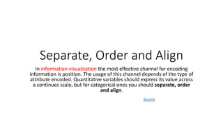
- 1. Separate, Order and Align In information visualization the most effective channel for encoding information is position. The usage of this channel depends of the type of attribute encoded. Quantitative variables should express its value across a continues scale, but for categorical ones you should separate, order and align. Source
- 2. Separate: • To separate means to divide or set apart different elements or entities. • It involves creating distinct boundaries or divisions between items or groups. • The purpose of separation is to distinguish or isolate individual components, ensuring that they are distinct and independent from one another.
- 3. Separate (Data Visualization): • In data visualization, separation involves visually distinguishing or isolating different data elements or categories. • It entails creating clear boundaries or visual cues that set apart various data points, groups, or variables. • By separating data, you can enhance the viewer's ability to differentiate and understand the distinct components within a visual representation, such as charts, graphs, or diagrams.
- 4. Example • Suppose you have a bar chart representing sales data for different product categories. To separate the data, you can use distinctive colors for each category. For instance, you could assign the color blue to electronics, red to clothing, and green to furniture. This visual separation helps viewers easily identify and differentiate the sales figures for each product category.
- 5. Order: • Order refers to arranging or organizing things in a particular sequence or pattern. • It involves placing items or elements in a structured manner according to a specific criterion or system. • Ordering can be done based on various factors, such as numerical, alphabetical, chronological, or hierarchical order. • It helps to bring clarity, efficiency, and logic to a set of elements.
- 6. Order (Data Visualization): • Ordering data in the context of data visualization means arranging the data points or categories in a structured manner to convey meaning or facilitate comprehension. • Depending on the nature of the data, you can order it based on numerical values, alphabetical sequences, time periods, or hierarchical relationships. • By ordering the data, you bring a logical and coherent structure to the visualization, allowing viewers to identify patterns, trends, or comparisons more easily.
- 7. Example • Consider a line graph depicting stock market prices over time. • To order the data, you would typically arrange the time series on the x-axis in chronological order, with the oldest date on the left and the most recent date on the right. • This allows viewers to observe the progression of stock prices over time and identify any patterns or trends, such as upward or downward movements.
- 8. Align • Alignment means adjusting or positioning things in such a way that they are in proper or accurate coordination or arrangement with one another. • It involves making sure that different elements are correctly placed or matched relative to a reference point or a common set of guidelines. • Alignment ensures that components are in harmony, agreement, or conformity with each other, facilitating coordination and coherence.
- 9. Align (Data Visualization): • Alignment in data visualization refers to positioning and coordinating visual elements to create a visually harmonious and informative display. • It involves aligning data points, labels, axes, or other graphical components with precision. • Proper alignment ensures that the visual elements are visually cohesive, making it easier for viewers to interpret and make accurate comparisons or connections within the visualization. • Alignment can also apply to text, spacing, and grid lines, promoting readability and clarity in the visualization.
- 10. Example • Imagine a scatter plot representing the relationship between a person's age and their income. • To align the data points, you would ensure that the x-axis represents age, starting from the lowest age value on the left and increasing towards the right. • The y-axis would represent income, starting from the lowest income value at the bottom and increasing as you move upward. • Aligning the axes in this way ensures that the data points align with the appropriate age and income values, enabling viewers to accurately interpret the relationship between the two variables.
- 11. Summary: • Separate: Visually distinguish or isolate different data elements or categories, creating clear boundaries or cues to enhance differentiation. • Order: Arrange data points or categories in a structured manner based on a specific criterion, facilitating comprehension and pattern identification. • Align: Position and coordinate visual elements with precision, creating a visually cohesive and informative display that promotes readability and interpretation.
- 12. Bar Chart • Use the bar chart to compare many items. The bar chart typically presents categories or items displayed along the Y axis, with their values displayed on the X axis. You can also break up the values by another category or group.
- 14. Staked Bar Graph • The stacked bar chart (aka stacked bar graph) extends the standard bar chart from looking at numeric values across one categorical variable to two. Each bar in a standard bar chart is divided into a number of sub-bars stacked end to end, each one corresponding to a level of the second categorical variable.
- 15. Read More
- 16. Dot Charts • Dot charts display the values of your data as a series of colored dots on two axes. Dimensions, such as time, display on the horizontal x- axis, and the dependent data displays on the vertical y-axis. • Dot charts show the exact values for your data points. Dot charts can be very effective as part of a combination chart. • Read More
- 18. Line Chart • A line chart is a way of plotting data points on a line. Often, it is used to show trend data, or the comparison of two data sets. • A line chart provides the clearest graphical representation of time- dependent variables. • It is also the preferred mode of representing trends or variables over a period of time. • People are familiar with this simple chart, which is made up of data values plotted as points along the X and Y axes and are connected using line segments. • Usually, time is plotted along the X-axis, and the Y-axis represents some metric of interest in the context of the period being tracked.
- 19. • Line charts represent everyday items like weekly weather trends, the price of stocks, what topics are trending on social media, and health information. • Example • Publicists, brand managers, or public relations specialists track their client’s social media ranking over time to plan campaigns. Read More
- 21. Tree Data • Tree data is a common type of data that represents hierarchical relationships between objects. • Tree data is used to represent a wide range of information, from organizational structures to computer file systems. • The nodes of a tree data structure represent the objects in the hierarchy, while the edges represent the relationships between them. • In data visualization, displaying hierarchical structures is commonly done using a tree diagram.
- 22. Tree data
- 24. Tree Map • The tree map functions as a visualization composed of nested rectangles. • These rectangles represent certain categories within a selected dimension and are ordered in a hierarchy, or “tree.” • Quantities and patterns can be compared and displayed in a limited chart space. • Tree maps represent part to whole relationships.
- 25. Tree map
- 26. • Hierarchical data is essentially a specialized form of network data.