Downloaded 201 times

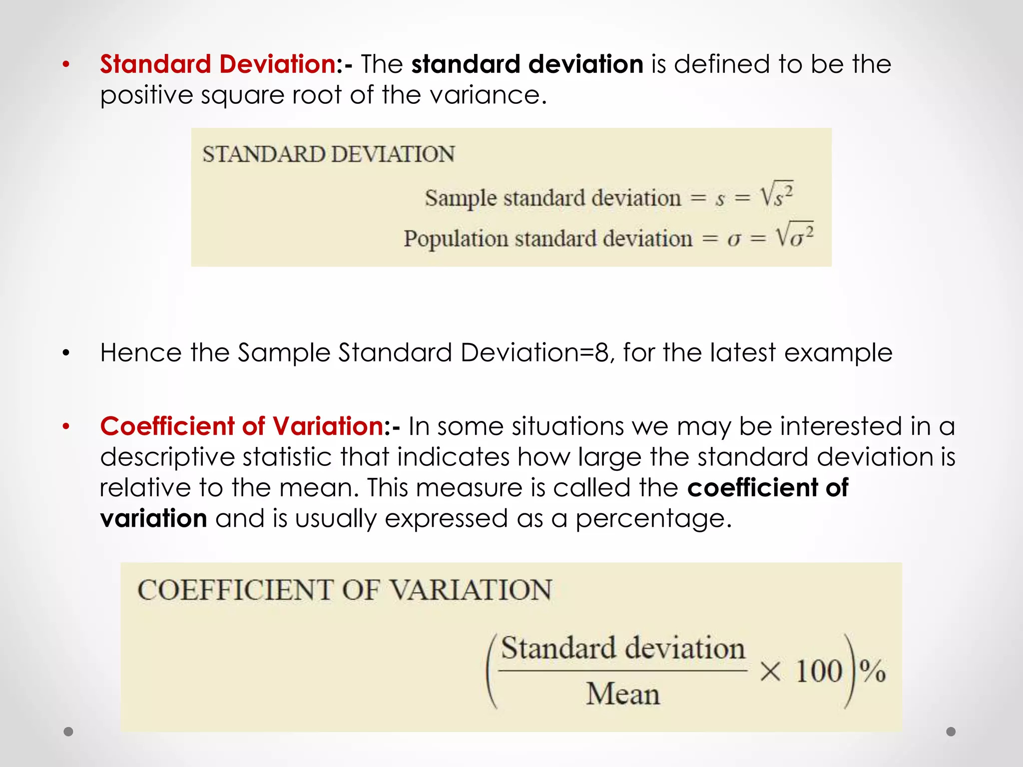
![• For the class size data, we found a sample mean of 44 and a sample
standard deviation of 8. The coefficient of variation is [(8/44)X100]%
=18.2%. In words, the coefficient of variation tells us that the sample
standard deviation is 18.2% of the value of the sample mean.](https://image.slidesharecdn.com/descriptivestatistics-150328173350-conversion-gate01/75/Descriptive-statistics-31-2048.jpg)


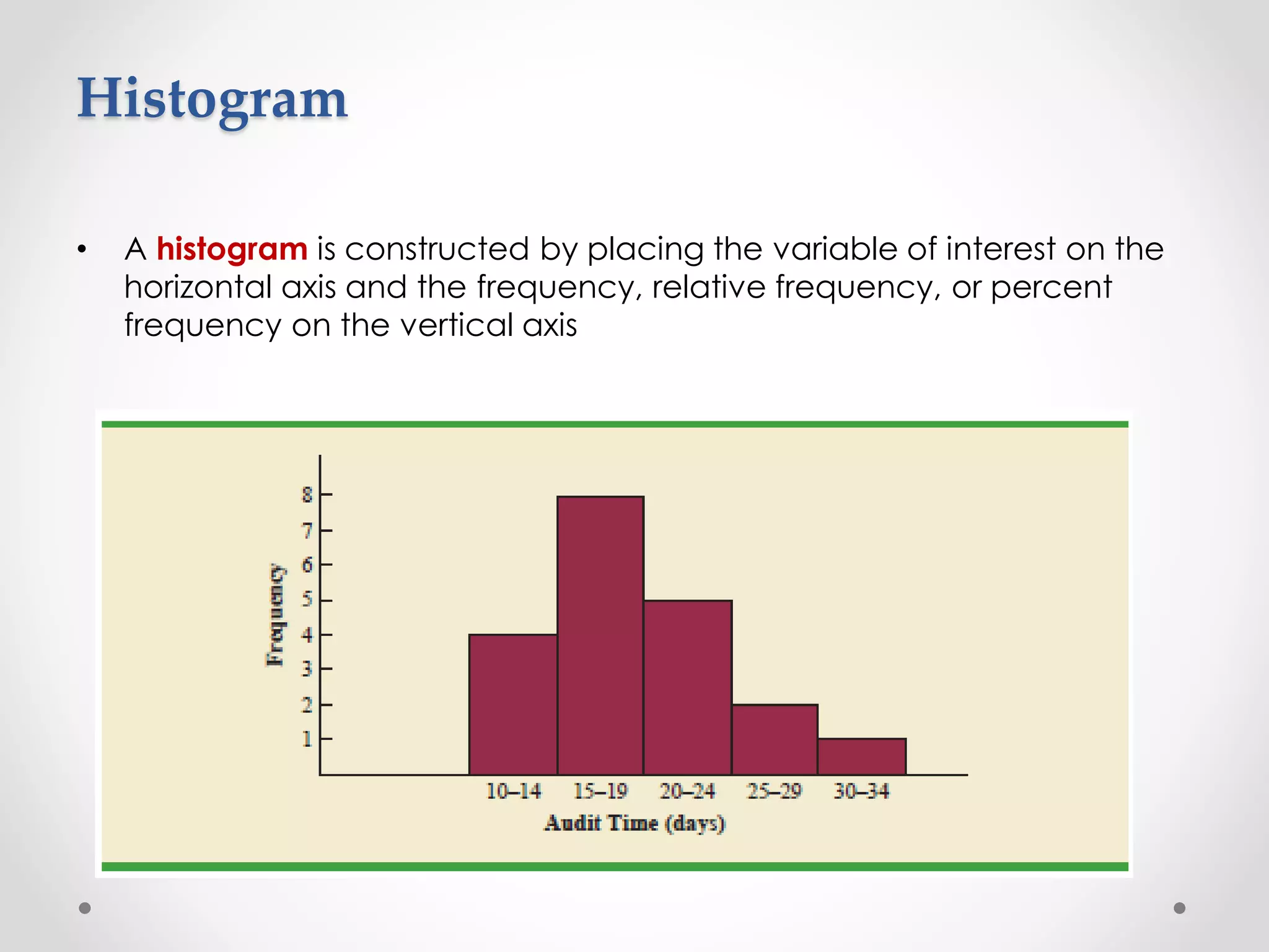
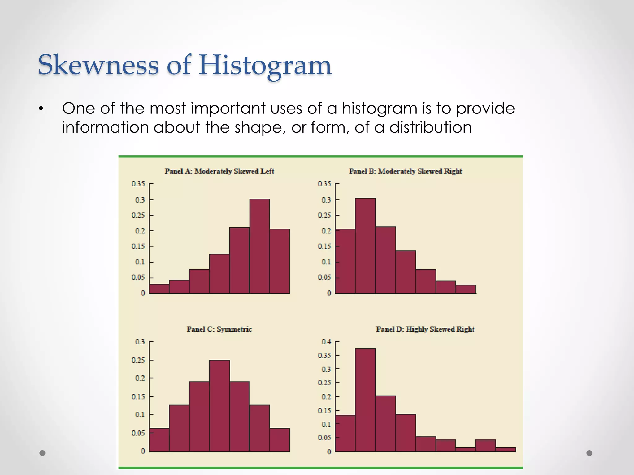
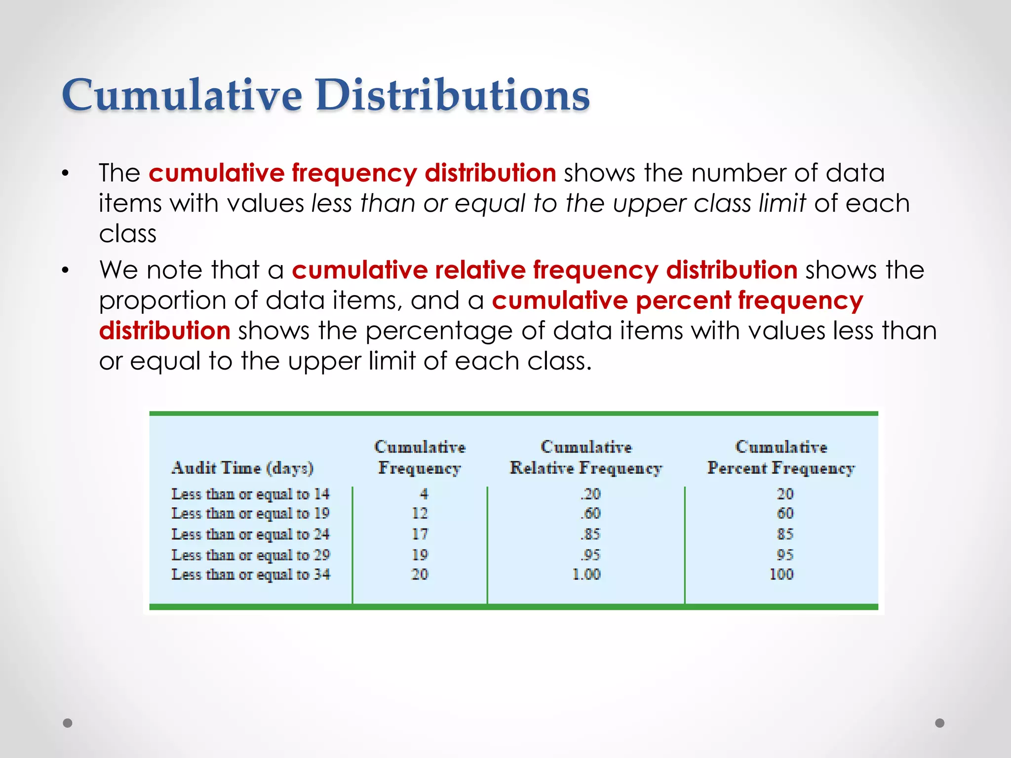
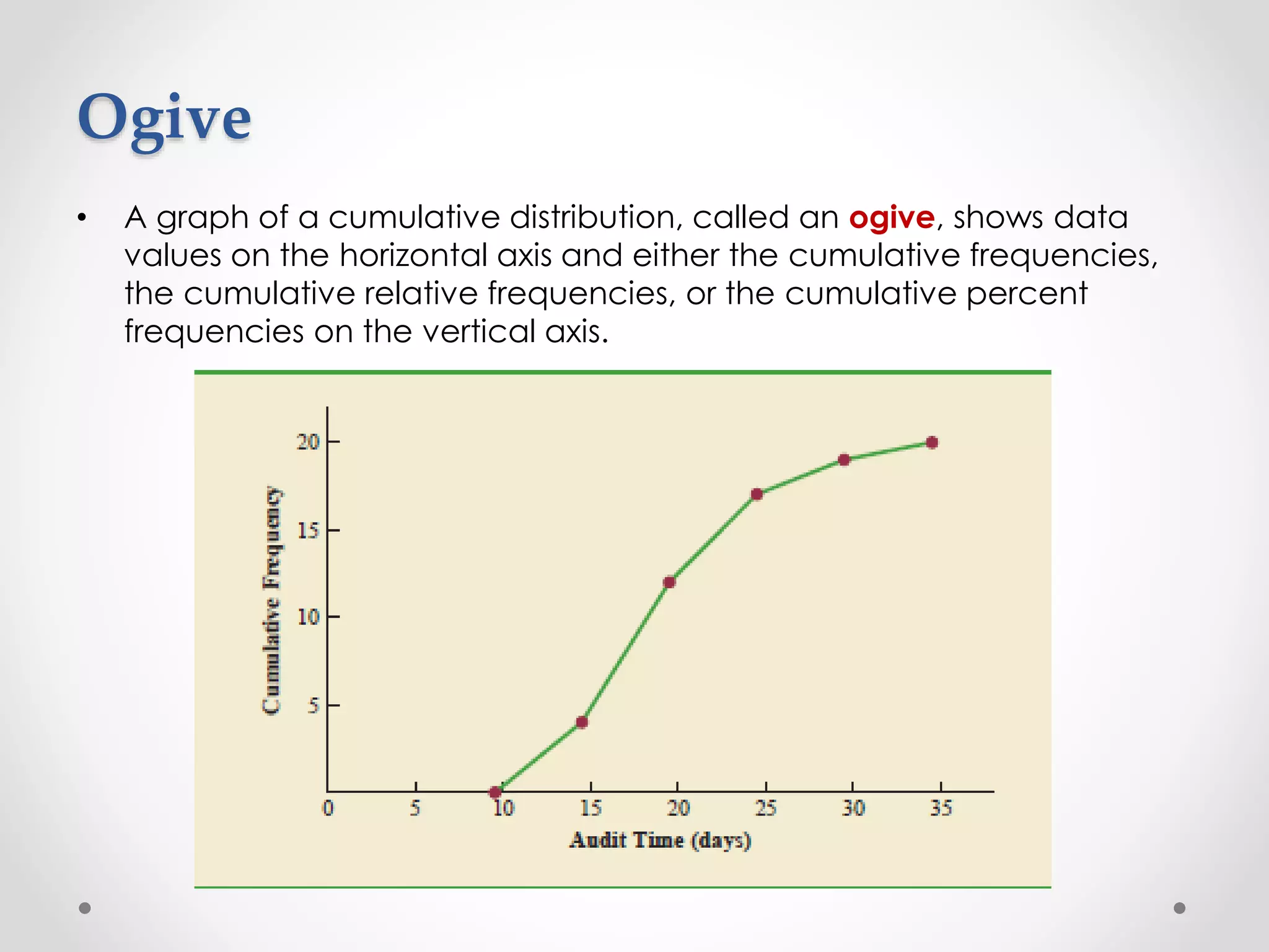
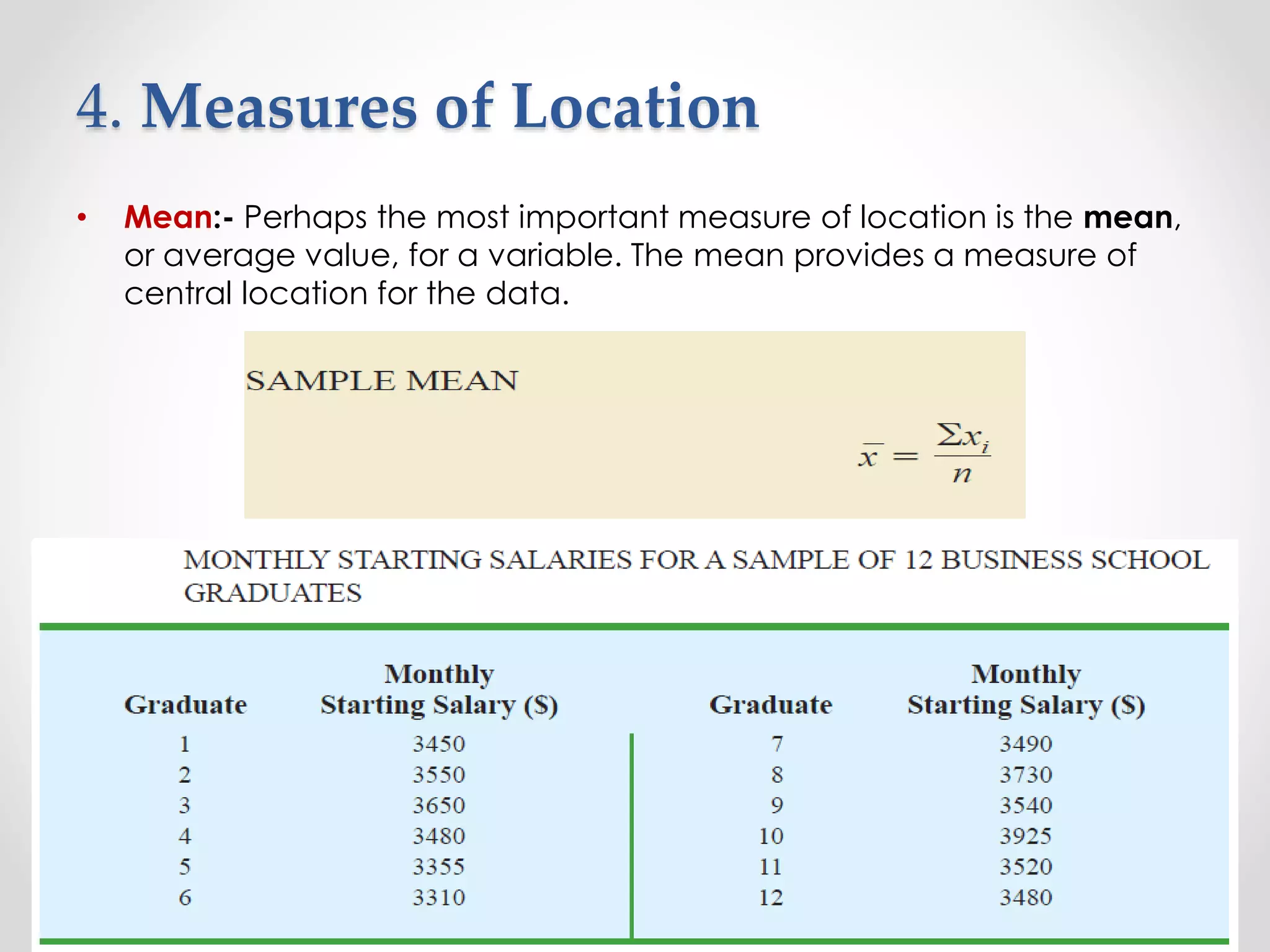
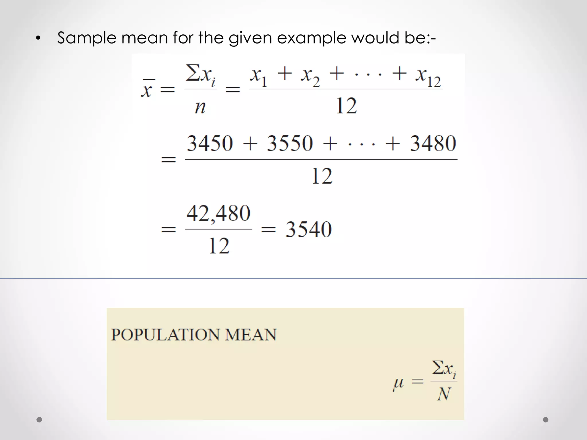
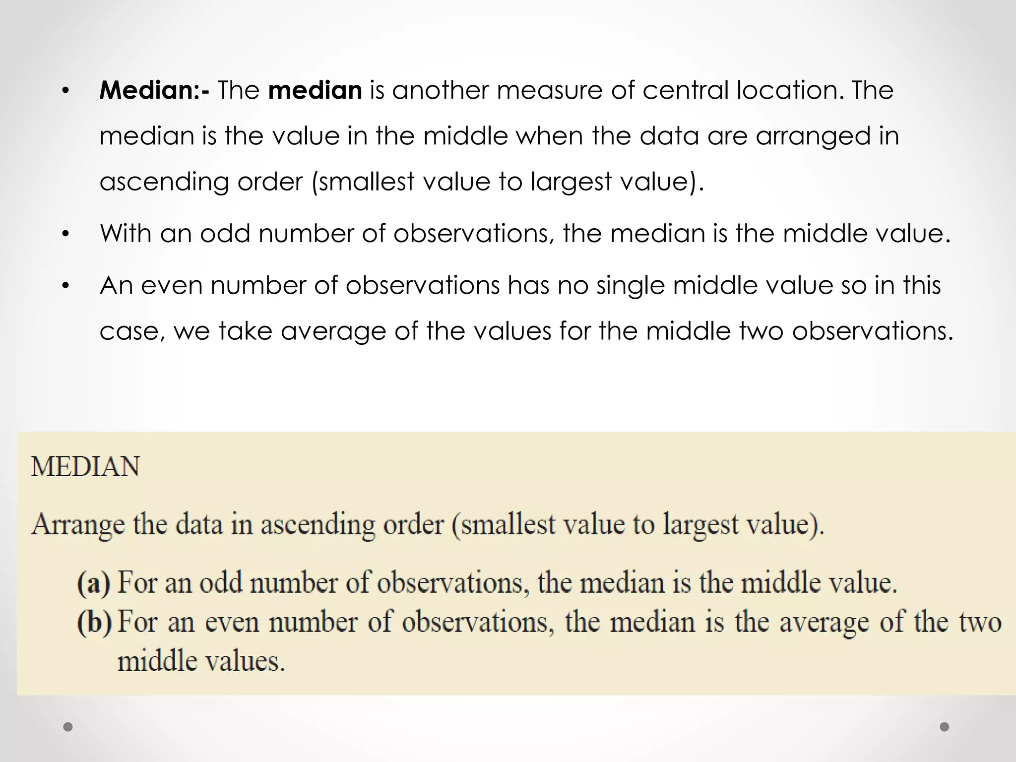
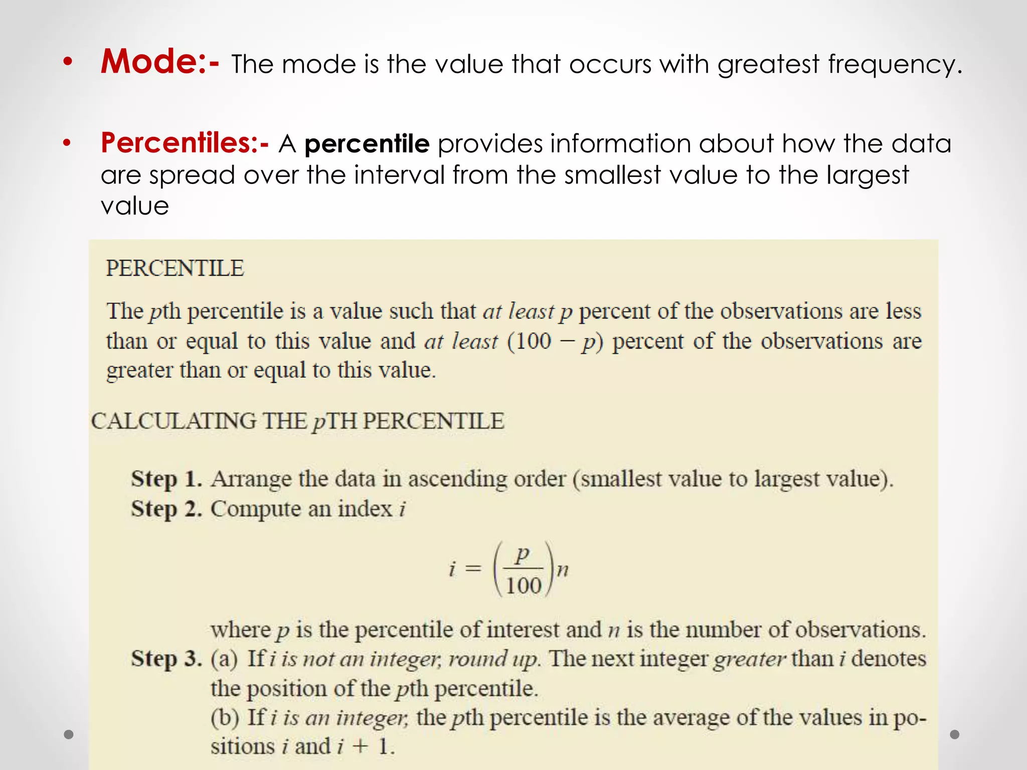
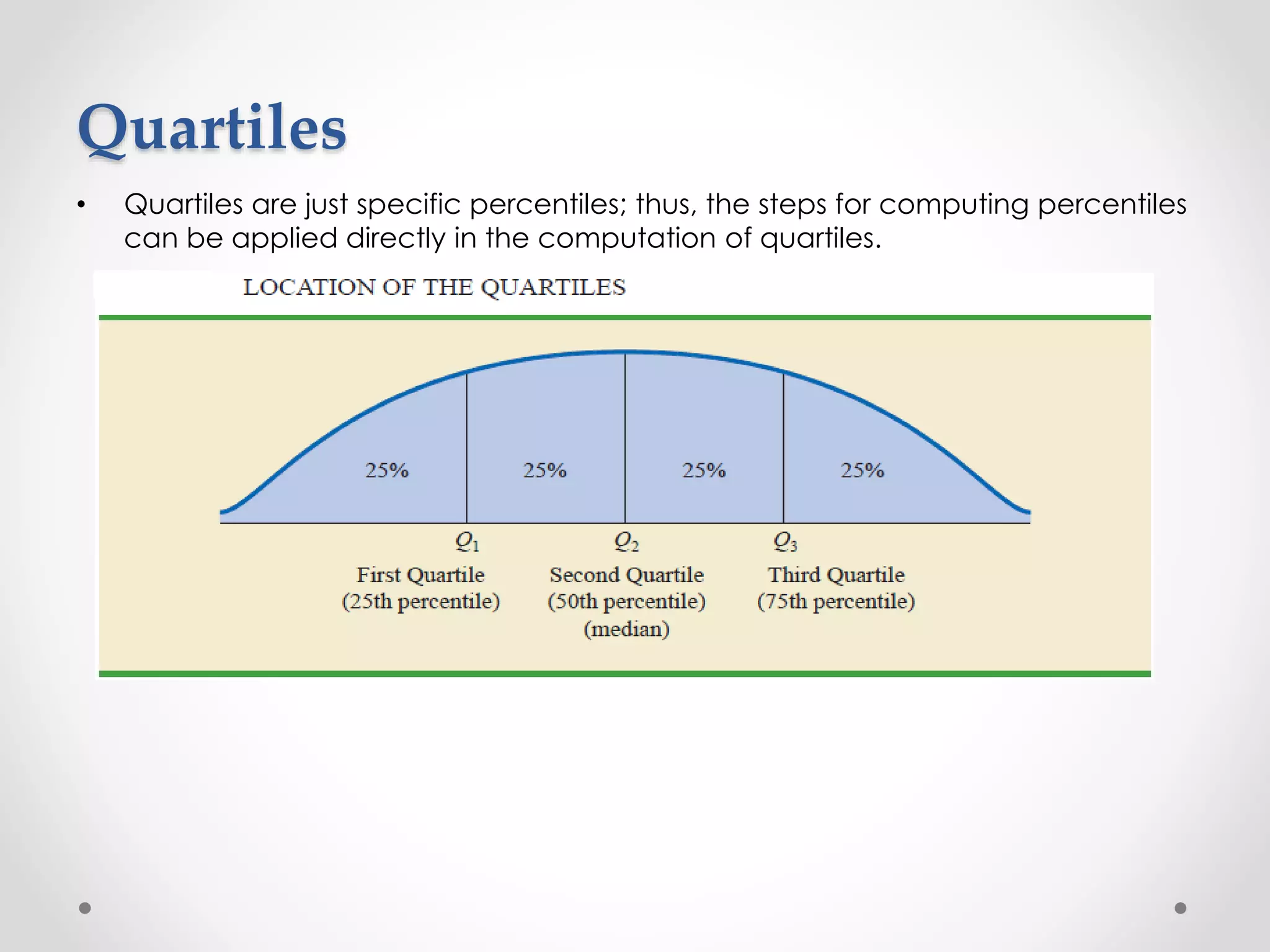
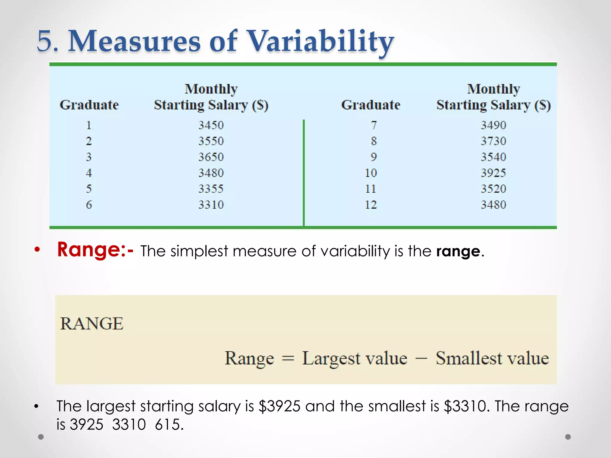
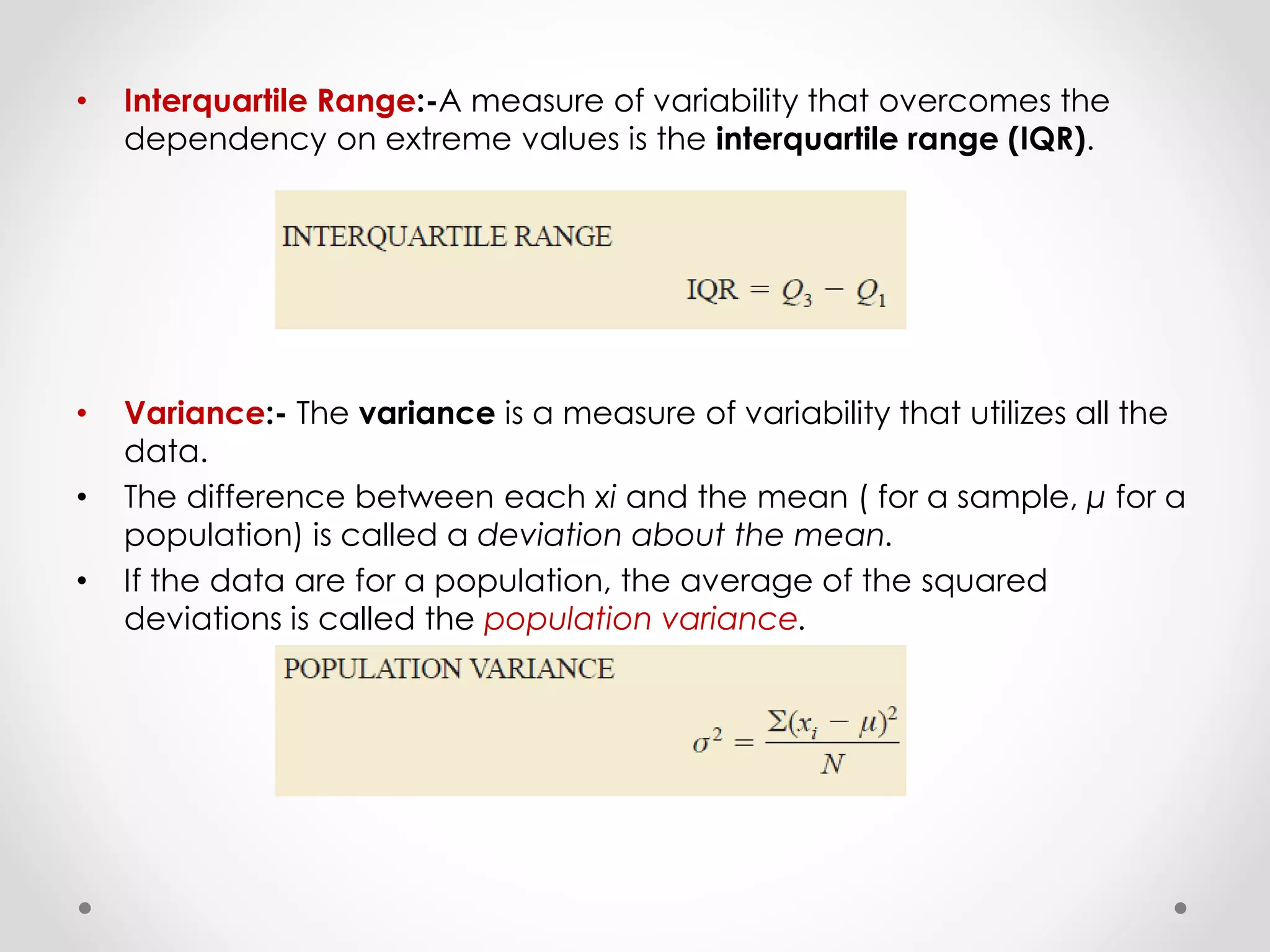
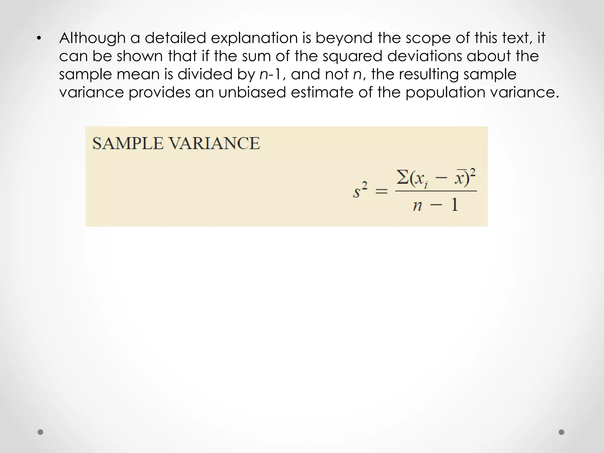
This document provides an overview of descriptive statistics techniques for summarizing categorical and quantitative data. It discusses frequency distributions, measures of central tendency (mean, median, mode), measures of variability (range, variance, standard deviation), and methods for visualizing data through charts, graphs, and other displays. The goal of descriptive statistics is to organize and describe the characteristics of data through counts, averages, and other summaries.