Downloaded 1,752 times


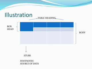
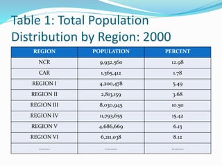
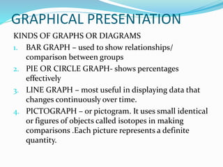


Data can be presented in three methods: textual, tabular, or graphical. Tabular presentation involves organizing data into a table with columns and rows for classification. Graphical presentation uses visual representations like bar graphs, pie charts, and line graphs to show relationships between data points. Different types of graphs are suited to different types of data and comparisons.


![Statistics -copy_-_copy[1]](https://cdn.slidesharecdn.com/ss_thumbnails/statistics-copy-copy1-150503082441-conversion-gate02-thumbnail.jpg?width=640&height=640&fit=bounds)


