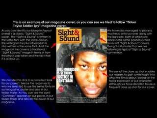
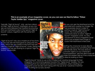
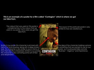
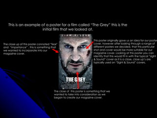
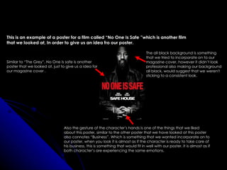
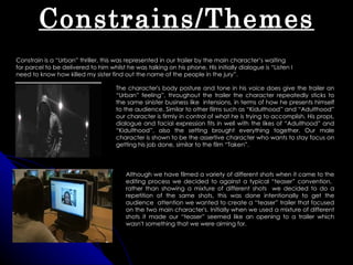
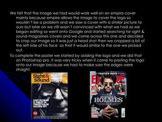
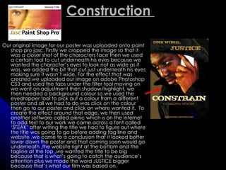
The document provides an evaluation of a media product's magazine cover. It summarizes how the magazine cover uses and challenges conventions of real magazines. Specifically, it aims to replicate the style of the "Sight & Sound" magazine cover by following conventions like font, layout, and close-up images. While most elements copy the real magazine, some creative choices were made like using a single color scheme and only two fonts to maintain consistency across the product. Overall, the evaluation demonstrates an attempt to adhere to real magazine conventions while incorporating some original design decisions.
The student created a film magazine, poster, and trailer to promote their fictional film "Infection".
They received feedback on the trailer from friends aged 17-18 who are the target audience, and from media studies teachers. The feedback helped the student learn how effectively they conveyed the thriller genre conventions and how the trailer and campaign could be improved.
The student distributed a survey to collect structured feedback on how people responded to the trailer, which will help them evaluate the success of communicating the intended message and themes. The consistent color scheme, imagery, and fonts across all campaign elements effectively linked the materials together as a cohesive promotion.
- The group presented their thriller film teaser trailer, poster, and magazine to a mixed audience of males and females aged 15-50 to get feedback
- The female audience members generally responded more positively to the materials, especially liking the female protagonist in the teaser trailer
- Younger audience members were more open-minded about the unconventional elements, while some older viewers found it different than their tastes
- Feedback was also positive about the portrayal of the hitman character and the intrigue created by the teaser trailer and poster
- Some found the magazine confusing as it did not clearly convey the thriller genre or provide information about the film
- The
The document discusses how the group's media products for a horror film trailer effectively combine through consistent style and representative elements. The magazine cover, poster, and trailer all feature the same main character Radiya and use a color scheme of black, white, and red. Intertitles in the trailer match the font and colors of the other products. Close-ups of Radiya's face in different media help familiarize the audience with her without revealing too much of the plot. The teaser trailer establishes key elements of the story in a suspenseful way that matches the mysterious atmosphere of the poster and magazine cover.
The font of the title block suggests movement and relates to an extreme sports brand to connote that genre. Red stands out from the pale background and connotes passion and excitement. The transparent block allows the main surfing image to take precedence. The magazine cover is dominated by natural colors like the sea to tie in with its surfing subject matter. Red contrasts to make the title and main article stand out. The target audiences are surfing fanatics attracted to the image, star, and article, and photography fans drawn to the dominance of the main image. The minimalist style appeals to a younger, style-conscious demographic.
The media product uses and develops some conventions of real magazines while also challenging others. It uses conventional elements like a masthead, cover lines, and issue date, but challenges conventions with elements like a gradient background, non-text masthead incorporation, and large overlapping subtitles. Overall, it aims to target an indie audience with its mixture of conventional and unconventional design choices.
The document describes revisions made to a magazine cover design based on feedback. The first draft included a selected photo and masthead. Main text was added including the film title and actor. Italic font was used and a tagline added. Feedback suggested adding more information, so details about featured content were added. A "call-out" was included about BAFTA award films. The issue number, date and price were also added to be consistent with previous issues. The anchorage text and fonts were updated to improve excitement and match the magazine's style.
The document discusses the effectiveness of linking ancillary texts like print work to a documentary product. It describes the themes and iconography used in the documentary and print pieces created to promote it. Iconic war items like poppies, guns and medals were featured to maintain the theme of remembrance and war. Research was conducted on documentary conventions and Radio Times specifications to ensure the print works matched expectations. Links between the pieces were created through consistent use of the poppy iconography.
The document discusses the design of a teaser poster and magazine cover for a film called "The Art of Living." The poster and magazine cover were designed to conform to the conventions of the adventure genre in order to appeal to the target audience. Key elements like the main image, title, tagline, and release date were carefully positioned on the poster according to genre conventions. Similarly, elements of the magazine cover like the masthead, sell lines, and anchoring text were placed in conventional locations and the color palette was selected to draw attention to the text. Both the poster and magazine cover use consistent fonts, imagery, language and themes to clearly link the two promotional materials and reinforce the themes of the adventure genre.
The magazine cover summarizes information about films in four key areas:
1) The central image features the main character from the film Inception to represent the main topic of the magazine.
2) Headlines around the edges advertise other films being released at a similar time.
3) Graphics relating to the design of Inception are used in the title layout.
4) The font and lighting of the central image aim to convey the mysterious nature of the film.
The document summarizes key elements of a magazine cover design. The masthead is located on the left and contains the magazine name. Buzzwords are used to grab readers' attention with exciting words. The main image is usually a celebrity shot. Coverlines frame the image without obstructing it, with the main coverline being largest in a unique font. The barcode includes issue details and is usually bottom right.
The document discusses how the author's main and ancillary texts for their media coursework effectively combine conventions from existing reality television shows and brands. Specifically, the author matches the color scheme, layout, fonts and poses used in the main text across ancillary posters and billboards. Style guides are used to replicate the logo and branding of Channel 4's e4 network to make the project feel authentic. The target audience of 14-25 year olds is represented across all texts.
The document discusses how the author's main and ancillary texts for their media coursework effectively combine conventions from existing reality television shows and magazines. Specifically, the author matches the color scheme, layout, fonts, logos and poses used in the main text across the ancillary billboard and magazine cover. Feedback is also provided on how the branding, target audience, and character representations align realistically within the created soap opera universe.
1) The film poster and magazine cover created by the student follow many conventions of real media products in their genres. Both utilize a limited color palette, minimal fonts, and emphasize key information like the title and credits.
2) However, the film poster challenges some conventions by having a landscape orientation rather than portrait. The magazine cover is also missing smaller supplementary images around the border.
3) Overall, the student's work fits conventions well through techniques like central images, supporting information placement, and technical design choices. But some conventions from a wider range of examples were not incorporated.
1) The film poster and magazine cover created by the student follow many conventions of real media products in their genres. Both utilize a limited color palette, minimal fonts, and emphasize key visual and textual elements like the title and credits.
2) However, the film poster challenges some conventions by having a landscape orientation rather than portrait. The magazine cover is also missing smaller supplementary images around the border.
3) Overall, the student was successful in researching conventions from example media and incorporating many of them into their own designs. Some small adjustments could better align with traditional formats.
The document discusses conventions used in indie magazines. It summarizes that magazines use sans-serif fonts, bright colors suited to the indie genre, coverlines on the left page, headings to split contents, images and captions to provide insight, and consistent color schemes. The same layout elements like mastheads, cover stories, bylines, pull quotes, and body copy are used to attract audiences and make the magazines look professional.
The document discusses the codes and conventions used in documentaries and how they were applied in creating a radio advertisement and documentary. It describes including stats and facts, archival footage, voxpops, expert interviews, and on-screen presenters in documentaries to make the content believable and show different viewpoints. It explains that the radio advertisement uses typical codes like a date/time/channel, expert clip, music bed, sound effects and voiceover to engage audiences and promote the documentary in a professional way. Overall, the document focuses on how following typical structures and techniques helps make documentaries and advertisements seem realistic and appealing to target audiences.
1) The document outlines plans for a magazine called "In-Tune" targeted at girls aged 13-18 that is centered around pop star Justin Bieber.
2) The cover design features Bieber prominently and uses bright colors and buzzwords to draw in the target audience.
3) Inside pages will include an exclusive interview with Bieber where he "reveals all" as well as fashion spreads and articles in four categories to interest readers.
The document analyzes magazine covers and interior pages, discussing elements like mastheads, photos, colors, quotes, and article topics. It examines how these components are used to target specific audiences, mainly 37-year-old males. Key points analyzed include how images, colors, and articles appeal to the target demographic through references to music genres and styles they likely enjoyed during their youth. The document provides a thorough breakdown of visual and written elements across multiple magazine spreads.
Annotated conventions of an indie magazineJonathanlarham
This document provides an analysis of the conventions used in an indie magazine's front cover, contents page, and double page spread layout. Key conventions highlighted include using bold fonts and capitalization on the front cover to draw attention, featuring iconic artists from the magazine's history, using contrasting colors and ordered layouts, and including pull quotes and multiple images with captions on article pages. The purpose is to concisely summarize the key design elements and conventions analyzed in the document.
The document provides details about the development of a magazine cover for a film called "Friendly Betrayal". It describes:
1) The original template that was used as inspiration and how elements were adapted from it such as layout and positioning of key elements.
2) Examples from real magazines that were also used for inspiration regarding consistent branding elements like the masthead, cover lines, and barcode.
3) Details about the chosen image, colors, fonts, and other design decisions made and how they relate to the film's genre and story.
4) Feedback that was gathered from the target audience on the magazine cover design, teaser poster, and trailer to help evaluate and improve the campaign elements.
This document discusses how the media product (a teaser trailer) uses, develops, and challenges conventions of real media products such as films and trailers. It analyzes the teaser trailer's editing style, duration, graphics, narrative information, shot types, music/sound, props/mise-en-scene, text use, poster, and magazine cover in comparison to conventions in similar genres. Many elements conform to conventions while others develop or challenge them, such as using unusual shot types like stop motion, or presenting narrative information in a mysterious way rather than revealing details. The goal is to create a cohesive promotional package that is consistent yet brings something new through conventions that are developed or challenged.
The document discusses different drafts and iterations of a magazine cover design. It begins by presenting two initial photo options and selecting one to move forward with. Several first draft designs are then shown and feedback provided, noting to use red instead of blue as the dominant color. The final draft incorporates this feedback, making the masthead more prominent, adding more cover lines for a busier look, and changing the font to better match the style. The conclusion reflects on how the final design better achieves an intimidating and rebellious feel in line with the target audience.
Both magazines position their central images using rule-of-thirds composition and ensure the models engage the viewer, but Total Film also features additional film images to showcase variety.
Movie Magazine Cover & Poster analysis Naomi Collins
1) The document analyzes the cover of a movie magazine, noting key design elements like the masthead, images of main characters, taglines, and layout.
2) Color schemes, fonts, and positioning of elements are discussed in terms of appealing to the target audience and representing the theme and genre of the film.
3) Additional text provides context for the characters' costumes, poses, and expressions to engage readers and suggest what the film involves.
The document summarizes magazine covers focusing on:
1) All the magazine covers feature prominent stars or celebrities anchoring the main feature story.
2) The covers use techniques like eye contact, bold colors and fonts, and intriguing pull quotes to draw attention to the main story and entice readers.
3) Details on each cover provide context clues about the intended audience, from mentions of brands, price, and cover design elements.
The document summarizes conventions of magazine covers and film posters for advertising movies. For magazines, it notes that the masthead is in bright colors and sans serif font to stand out. Images take up the whole page with a description. Cover lines are on the right with brief descriptions. Colors match the film's theme. Date, price, website and slogan are near the masthead.
For posters, the film title is the biggest text in sans serif and bright colors. Images commonly show characters in mid or long shots. Credits are at the bottom. Actors' names may be at the top. Posters often have slogans, references to other films, and release dates. Teen comedy posters use
This magazine uses bright colors and design elements to attract readers' attention on newsstands. It implies value through promotional messages and a low price. Images and text are arranged intentionally throughout the pages to guide readers' eyes and create excitement about the stories. The simple yet engaging layout aims to make the publication appealing and accessible to its target audience.
This magazine uses bright colors and design elements to attract readers' attention on newsstands. It implies value through promotional messages and a low price. Images and text are arranged intentionally throughout the pages to guide readers' eyes and create excitement around the stories. The simple yet engaging layout aims to make the publication appealing and accessible to its target weekly audience.
You constrain parts in Sketcher mode to define exact dimensions. You select the edge or area you want to constrain and click the Constrain button to open a dialogue box with constraint options. Common constraints include Distance to define the length between two points, Verticality to define a vertical line, and Concentricity to define two circles as concentric. You can apply multiple constraints at once. Constraining geometry prepares it for use in 3D modeling.
The document discusses the design choices for a film magazine cover, poster, and trailer for a thriller film called "Retribution". For the magazine cover, they chose a traditional layout with the title, barcode, and date in typical positions. The black and white image of the main character Jamie conveys mystery. For the poster, they used the film title in red text over a blurred background and an image of Jamie holding a gun. The trailer incorporates typical thriller elements like chases and violence but challenges conventions by having a female villain and casual male protagonist. It builds tension through changing shot pacing and ends on a cliffhanger. Consistent red, white, and black colors and the main character link the three promotional materials.
The document evaluates how a student media project uses, develops, or challenges conventions of real media. It summarizes that the project follows most conventions of Empire magazine but with some minor alterations, such as changing the magazine cover to a horror theme. It also discusses specific design elements of the magazine cover, articles, and film poster that were inspired by or similar to real media conventions to achieve a horror tone while still recognizable as a magazine.
Aston Recruitment is an independent recruitment consultancy based in Livingston, Scotland that specializes in recruiting candidates for various industries including accountancy, executive search, hospitality, human resources, retail, and sales & marketing. They work in partnership with both clients and candidates to ensure the right match and provide services tailored to each client's needs. Aston Recruitment is dedicated to delivering high quality service and developing long-term relationships.
The document discusses the production of a media campaign for a film called "The Package" including the creation of a trailer, magazine cover, and poster. It describes the research process, planning, construction of the various media texts, use of technology, and feedback received from test audiences. The campaign was effective at conveying the film as a thriller and establishing the narrative and main character.
This document discusses a group's choice to have Lionsgate distribute their film. Lionsgate is known for distributing major franchises like The Hunger Games and Twilight. The group feels Lionsgate could effectively distribute their mainstream action thriller film. The film may appeal to young adults aged 16-25 and have a big budget to film scenes in London. Investors could fund the film due to its creative story. Lionsgate's experience distributing films appealing to young adults makes it a good fit to distribute this group's film.
The document discusses a media product created by the student - a teaser trailer for a film called "Pursuit". It provides feedback on how the trailer uses conventions of the thriller genre and compares it to typical teaser trailers. Audience feedback was positive about the fast pace and building suspense, though some found it confusing. Research was conducted online to study thriller trailers, magazines and posters to inform the design of the ancillary texts.
The document evaluates how a media product uses conventions of real media. It summarizes a student project that created a magazine cover and movie poster for the film "Fraternity." The cover and poster effectively represent the film as an action thriller through their visual style, use of weapons/danger, and mysterious characterization of the main character seeking revenge. Both the main project and supplemental materials capture the film's tone and follow conventions of their real-life counterparts.
The document lists a schedule of political campaign events taking place from May 13th to May 20th, 2011 in Sant Pere de Torelló, Spain. It details the date, location, time, type of event, and sponsoring political party for various activities like meetups, meals, speeches and concerts happening over the course of the campaign period.
The document discusses how media technologies have changed over time and their impact on creating films. It provides examples of how filmmaking technologies used by the author have progressed from Adobe Premier 6.5 and mini DV tapes in previous years to uploading footage straight from memory cards using Adobe Premier Pro CS5. Various websites, software programs, and equipment used at different stages of researching, planning, filming and editing are described, highlighting how media technologies now make high quality film production more accessible.
Thermal power plants produce over 60% of global electricity but pollute the environment, while hydroelectric plants provide 21% of electricity worldwide but require suitable terrain. Nuclear power accounts for 17% of production globally and has significant capacity but challenges with waste disposal. Alternative energy sources like wind and solar are growing in use due to their environmental benefits, with solar seeing limited application currently but potential for future expansion and technologies like hydrogen fusion also being explored. Overall, much remains to be done in the energy field to develop sustainable sources.
Global warming is causing the ozone hole and melting glaciers, with polar bears becoming victims of the changing climate as their habitat disappears. The document discusses some of the key effects of global warming such as threats to the ozone layer, impacts on polar bears, and melting glaciers.
This document contains a 10 question job evaluation questionnaire. The questionnaire is designed for use at any managerial level or organizational structure. It includes questions about satisfaction with designation and salary, whether departmental goals are being achieved, rating of the working environment, suggestions for improving work culture, whether experience and knowledge are being utilized, adequacy of training, overall job satisfaction rating, ability to work in a team, manage time efficiently, and design solutions to problems. The respondent is asked to select from response options such as fully satisfied, somewhat satisfied, average, dissatisfied, etc. for each question.
The document provides feedback on a magazine cover, teaser poster, and teaser trailer created by students for their media production on the psychological thriller film "Truth Untold", praising elements like the effective combination of styles across the different media pieces and realistic shots in the trailer while also noting some criticisms of unrealistic shots.
Strategic control involves continually evaluating a strategy as it is implemented and making adjustments based on changes in the underlying assumptions. It includes four types of control: premise control checks assumptions, implementation control monitors resource allocation and progress, strategic surveillance broadly monitors internal and external events, and special control allows for rapid reassessment in response to unexpected crises. The overall goal is to continually assess the changing environment and make adjustments to ensure the strategy remains aligned with conditions.
Our media products - 'Annie' Film poster Magazine Cover https://www.youtube.com/watch?v=nVeCylAMi44 Teaser Trailer
The document discusses how the marketing campaign for the film "Annie" both adheres to and challenges conventions of real media products. It examines the conventions for format, genre, and institutions for the teaser trailer, film poster, and magazine cover. While generally following conventions like duration for the teaser trailer and layout for the poster and magazine cover, some elements are challenged, such as order of credits and placement of the film title. The goal is to make the marketing products look authentic while putting an original spin on some aspects.
The document discusses conventions used in real media products and how the student's media products for their film "Annie" both followed and challenged conventions. The student analyzed conventions for format (duration, editing style, sound, text/graphics), genre (horror/thriller) and institutions. Their teaser trailer followed conventions like duration (1:27 mins) and montage editing but not voiceovers. Their film poster followed conventions for layout, title design/placement but challenged credit order. Their magazine cover followed conventions like the masthead design/placement but challenged other element placements. The student aimed to make their products look realistic while putting their own spin.
The document discusses how the media products challenge and conform to conventions of their formats and genres.
It summarizes that the magazine cover, poster, and film teaser trailer each followed some conventions of their formats, like including key visual and text elements, while also challenging conventions to make the works stand out.
The teaser trailer challenged conventions by only using diegetic music and not including dialogue. The poster challenged conventions by including a graphic horror image not usually seen on posters.
Overall, the productions balanced following genre and format conventions to seem professional while also challenging conventions to create memorable, unique works.
Through researching real media products like trailers, magazines, and posters, this document discusses how the described media products use and develop conventions of those real products. A preview screen and production company are used in the trailer to appear official. News stories and locations are featured to set the scene, while characters are not shown much to disorient the audience. Filters and camerawork are added to increase realism. Credits, images, and information are formatted on the magazine cover similarly to influences like SFX magazine. Fonts, taglines, and layered visuals are employed on the poster to convey an unsettling tone while maintaining continuity across the media products.
The document evaluates the opening title sequence of a student film called "The Oxonians". It discusses nine ways the opening sequence uses and develops conventions from real films: 1) The main title takes inspiration from "The Number 23"; 2) Settings are similar to "The Omen"; 3) Costumes are inspired by films like "Juno"; 4) Props are inspired by "Se7en"; 5) Typography is similar to "The Number 23"; 6) It sets up the narrative; 7) It conveys the horror genre; 8) It introduces characters similarly to "One Hour Photo"; 9) The music layers sounds like "The Number 23" and "Se7en". The opening aims to represent
The document discusses the conventions of real media products like film trailers, posters, and magazine covers and how the student's media products both followed and challenged these conventions.
For the horror film teaser trailer, the student followed conventions like short length (1 minute) and incorporating a mix of slow shots and faster, more intense shots that build tension. However, the student challenged conventions by only using music from a Christmas carol rather than additional diegetic sounds.
For the film poster, conventions like placement of title, cast, and tagline were followed, but using a graphic bloody image of a household figure challenged expectations for posters aimed at general audiences.
The magazine cover feature followed conventions of featuring the main character
The document discusses how the student's media products both conform to and subvert conventions of real media. For their film poster and trailer, they researched conventions of similar genres to inspire their work. Their poster conforms to techniques like the rule of thirds but uses a black and white color scheme to make it seem more mysterious. Their trailer also uses cliffhangers to intrigue audiences without giving away the full story. Their magazine cover similarly conforms to techniques like the rule of thirds but places information in "dead corners" to subvert expectations. Overall, the student aimed to balance conforming to professional standards with adding their own creative flair.
The document describes the process of designing a magazine cover for a fictional magazine. It discusses researching existing magazine covers, experimenting with layouts and images, and getting feedback on early designs from friends. Key steps included using Photoshop to edit images and text, trying different background images before selecting a brick wall, and referencing real magazine covers to ensure the design followed industry conventions. The final magazine cover incorporated a single character image, a surveillance camera, and text elements like the magazine name and barcode.
The document discusses how the media product uses, develops, and challenges conventions of real media. It analyzes a film poster and magazine cover created for the media product. For the poster, conventions were followed such as including the title, antagonist, and location in the background. Colors and text placement also conformed to horror film conventions. Some conventions were initially challenged, such as the title font color, but were later adjusted to be more conventional. The magazine cover followed conventions like masthead placement and inclusion of a skyline. Conventions from magazines like Empire were utilized to create a professional look. Overall, the media product both conformed to and experimented with real media conventions in its promotional pieces.
The document discusses conventions for film posters, including:
1) A film poster should catch the audience's eye with a focal image and eye-catching font for the title. It should define the genre and attract the largest possible audience.
2) Typical information includes the release date and credits for directors and production companies at the bottom. Reviews or information on other films may also be included.
3) The discussed poster aimed to showcase the featured artists to promote unsigned talent, rather than strictly following conventions. It used multiple images and fonts to attract a wider audience and help lesser-known artists.
Our film poster, magazine cover, and film trailer effectively use conventions of real media products in these three ways:
1) The poster uses conventions like prominent central imagery, taglines, and credits that are typical of movie posters.
2) The magazine cover mimics real magazines with elements like film artwork, taglines, free offers, and barcodes.
3) The film trailer employs standard techniques of establishing shots, close-ups, text effects, and cuts that build suspense seen in thriller trailers.
The document summarizes the process of creating a magazine cover for a fictional film. It discusses researching existing magazine covers to identify conventions. It then describes selecting a photo shoot, choosing an image to feature, and removing the background in Photoshop. The final cover is presented, along with notes on what elements worked well and could be improved.
The opening sequence establishes the genre as horror through conventions like a knife and alleyway. It introduces the protagonist and antagonist, with more screen time and empathy given to the protagonist to identify him, and unstable visuals used to portray the antagonist's negative impact. The sequence aims to make the viewer uncomfortable and take the protagonist's side. It is inspired by the visual style and editing of the film Se7en to set expectations for the psychological thriller genre. Shots mimic those in other horror films to further signal the genre to viewers.
The document discusses how the media product, a horror film magazine and trailer, uses and develops conventions from real media products. Specifically:
1) The magazine design takes visual cues from other film magazines like large mastheads, sans-serif fonts, and limited sales lines. Color and font choices are meant to stand out.
2) The poster design is inspired by "Sinister" with a desaturated color scheme, serif font, and emphasis on lighting effects. It includes standard horror poster elements.
3) The trailer uses techniques like handheld camera shots and a forest setting to create an immersive experience, as informed by research on effective horror conventions. Symbolic accessories reference religion without crossing ethical lines
Film magazine front cover conventions and analysiskatie1head
This is a presentation on all of the magazine front cover convetions and my analysis of how Empire, Total film, Little white lies and more specifically Sight and Sound use them.
The document discusses the goals and creative process behind a student film project that included a trailer, poster, and magazine cover. The group aimed to create a psychological horror piece similar to the "Saw" films. They researched conventions of the horror genre from films like "Hostel" and "Silence of the Lambs" to inform their trailer. For the poster, they studied "Saw" posters and included imagery and text featuring blood. Across the trailer, poster, and magazine cover, they incorporated consistent visual elements like an actress and blood to tie the pieces together and market the film.
This document discusses conventions in film titling and summarizes how the student's film title sequence approaches conventions. It begins by noting that films typically use plain black backgrounds and white text for titles but that the film "Drive" uses a light purple italic font. The student's sequence merges the titles with the opening scene rather than having a dedicated title sequence. It uses white text over blue text for producers' names. Camera movements and angles are also discussed, with examples given of how different techniques were used to build tension or represent dominance. Mise-en-scene elements like the night city establishing shot and costumes are said to follow conventions typical for the thriller genre.
Our documentary follows conventions of real media products such as using vox pops and statistics with visuals to back them up. It includes establishing shots, professional interviews with proper shot composition, and cutaways during interviews. The documentary falls under public affairs genre as it investigates a current issue, and could be seen as polemical by focusing on perceived societal wrongs. Audience feedback found the documentary average, noting good sound and interviews but inconsistencies. The radio spot and magazine spread helped promote the documentary brand but some felt the tasks failed to target the intended teenage audience.
Assessment and Planning in Educational technology.pptxKavitha Krishnan
In an education system, it is understood that assessment is only for the students, but on the other hand, the Assessment of teachers is also an important aspect of the education system that ensures teachers are providing high-quality instruction to students. The assessment process can be used to provide feedback and support for professional development, to inform decisions about teacher retention or promotion, or to evaluate teacher effectiveness for accountability purposes.
How to Fix the Import Error in the Odoo 17Celine George
An import error occurs when a program fails to import a module or library, disrupting its execution. In languages like Python, this issue arises when the specified module cannot be found or accessed, hindering the program's functionality. Resolving import errors is crucial for maintaining smooth software operation and uninterrupted development processes.
How to Manage Your Lost Opportunities in Odoo 17 CRMCeline George
Odoo 17 CRM allows us to track why we lose sales opportunities with "Lost Reasons." This helps analyze our sales process and identify areas for improvement. Here's how to configure lost reasons in Odoo 17 CRM
This presentation was provided by Steph Pollock of The American Psychological Association’s Journals Program, and Damita Snow, of The American Society of Civil Engineers (ASCE), for the initial session of NISO's 2024 Training Series "DEIA in the Scholarly Landscape." Session One: 'Setting Expectations: a DEIA Primer,' was held June 6, 2024.
Executive Directors Chat Leveraging AI for Diversity, Equity, and InclusionTechSoup
Let’s explore the intersection of technology and equity in the final session of our DEI series. Discover how AI tools, like ChatGPT, can be used to support and enhance your nonprofit's DEI initiatives. Participants will gain insights into practical AI applications and get tips for leveraging technology to advance their DEI goals.
A Strategic Approach: GenAI in EducationPeter Windle
Artificial Intelligence (AI) technologies such as Generative AI, Image Generators and Large Language Models have had a dramatic impact on teaching, learning and assessment over the past 18 months. The most immediate threat AI posed was to Academic Integrity with Higher Education Institutes (HEIs) focusing their efforts on combating the use of GenAI in assessment. Guidelines were developed for staff and students, policies put in place too. Innovative educators have forged paths in the use of Generative AI for teaching, learning and assessments leading to pockets of transformation springing up across HEIs, often with little or no top-down guidance, support or direction.
This Gasta posits a strategic approach to integrating AI into HEIs to prepare staff, students and the curriculum for an evolving world and workplace. We will highlight the advantages of working with these technologies beyond the realm of teaching, learning and assessment by considering prompt engineering skills, industry impact, curriculum changes, and the need for staff upskilling. In contrast, not engaging strategically with Generative AI poses risks, including falling behind peers, missed opportunities and failing to ensure our graduates remain employable. The rapid evolution of AI technologies necessitates a proactive and strategic approach if we are to remain relevant.
How to Add Chatter in the odoo 17 ERP ModuleCeline George
In Odoo, the chatter is like a chat tool that helps you work together on records. You can leave notes and track things, making it easier to talk with your team and partners. Inside chatter, all communication history, activity, and changes will be displayed.
Thinking of getting a dog? Be aware that breeds like Pit Bulls, Rottweilers, and German Shepherds can be loyal and dangerous. Proper training and socialization are crucial to preventing aggressive behaviors. Ensure safety by understanding their needs and always supervising interactions. Stay safe, and enjoy your furry friends!
हिंदी वर्णमाला पीपीटी, hindi alphabet PPT presentation, hindi varnamala PPT, Hindi Varnamala pdf, हिंदी स्वर, हिंदी व्यंजन, sikhiye hindi varnmala, dr. mulla adam ali, hindi language and literature, hindi alphabet with drawing, hindi alphabet pdf, hindi varnamala for childrens, hindi language, hindi varnamala practice for kids, https://www.drmullaadamali.com
How to Build a Module in Odoo 17 Using the Scaffold MethodCeline George
Odoo provides an option for creating a module by using a single line command. By using this command the user can make a whole structure of a module. It is very easy for a beginner to make a module. There is no need to make each file manually. This slide will show how to create a module using the scaffold method.
2. 1.In what ways does your media
product use, develop or challenge
forms and conventions of real
media products?
3. For our magazine cover we wanted to establish a traditional “Sight & Sound" cover, in order to achieve
this we initially went through a variety of different “Sight and Sound” covers, after which we decided to
use “Tinker Taylor Solder Spy” as our guideline, we decided to use this cover because it was a typical
“Sight & Sound” cover, it also looked professional which we thought we be suitable for our magazine
cover as we wanted to follow the traditional look of a “Sight & Sound” cover which meant that we
couldn’t make any changes that would “Go Against” the typical “Sight & Sound” convention.
Traditionally “Sight & Sound” place their masthead in The “Sight & Sound” barcode is
the high left hand corner, again this was something traditionally placed in top right
that we hand to take into consideration because we corner.
were planning to stick to a traditional/typical “Sight &
Sound” cover. This is where we got our idea from, the
close up of the image makes it a
typical sight and sound cover.
“Sight & Sound” sometimes move their pugs on to
different areas of their magazine, this is something that The black and white effect portrays a
we researched whilst trying to decide on where we intellectual look for the audience, this is
would like to place our plug for our magazine. Also something that fits in well with a “sight &
traditionally the pugs are consistently “Red” which is Sound” audience, this is because their
done to link in with the magazine colour scheme. As magazine’s are commonly geared towards
you can see we have also followed the “sight & an intellectual and creative audience.
Sound” colour scheme by making the colour of our
pug “Red”
4. This is an example of our magazine cover, as you can see we tried to follow “Tinker
Taylor Soldier Spy” magazine cover.
The barcode and the date, informs
The masthead illustrates that this our readers about our film, this will
is a typical “Sight & Sound” cover inform that our film is up and
as it is no different from a typical coming and will be officially
masthead in terms of the released as soon as possible.
position, colour and font.
The image of our magazine cover is a
The colour of our background typical “Sight & Sound” image, this is
was taken from our poster. because we decided to use a close up
shot, because “Sight & Sound” typically
uses close up shots for the magazines,
Cover line is something that doing this suggest that we have followed
typically attracts the readers the “Sight & Sound” convention. However
to the magazine , it is initially we wanted to use a long shot of
something that will give the our main character, but doing that would
readers/target audience a suggest that we are going against the
rough idea as to what the film typical “Sight & Sound” convention.
is about.
As you can see we have included
information about interviews on our
front cover, doing this assures that we
are sticking to the convention of a
The titles of other films will give the readers typical “Sight & Sound” cover. Typically
an insight as to what will be included in the “Sight & Sound” place their cover lines
magazine. at the sides of their magazine.
5. This is an example of our magazine cover, as you can see we tried to follow “Tinker
Taylor Soldier Spy” magazine cover.
As you can identify our blueprint/layout We have also managed to place a
overall is a classic “Sight & Sound” masthead onto our over along with
cover. The “Sight & Sound” is written in The barcode, both of which are
the same font with the same colours, place in the same positions similar
the writing for the plus information is to recent “Sight & Sound” covers.
also written in the same font. And the Doing this illustrates that we are
image on the cover is a traditional following a typical “Sight & Sound”
“Sight & Sound” image in terms of how convention.
the photo was taken and the fact that
it is a close up.
The use of the close up shot enables
our readers to gain some insight into
what the film is about, based on the
We decided to stick to a consistent look facial expression of our character,
for our project, hence the reason as to Although we have decided to use a
why we selected to use the same fonts on frequent close up shot for our cover,
our magazine, poster and also in our
teaser trailer. As You can see the word
“Constrain” appears on our poster, in our
teaser trailer and also on the cover of our
magazine.
6. This is an example of our magazine cover, as you can see we tried to follow “Tinker
Taylor Soldier Spy” magazine cover.
Typically “Sight & Sound” only use two colours As you can see the Masthead and the
on their “Sight & Sound” masthead, as you can Barcode both overlap our image, this
see we have followed their tradition by ensuring was purposely done in order to
that our masthead is also in the typical “Sight & portray a typical “Sight & Sound”
Sound” colours, together with the same font cover, this is something that is
commonly done on each “Sight &
scheme.
Sound” magazine cover, it is very
uncommon to find a magazine cover
which has enabled their image to
“Sight & Sound” only use a maximum of two fonts, cover their Masthead or Barcode.
as you can see we have gone to using only two
fonts, which are very similar to the fonts that are
used on a typical “Sight & Sound” cover. Doing this Getting the character to look directly
suggest that we are sticking to a typical “Sight & into the camera was something that was
Sound” house-style. intentionally done. This was done to
connote urgency in our character’s
facial expression, also the direct look will
make the readers feel as if the character
is directly looking at them.
“Sight & Sound” tends to use a strict intellectual/ creative language for their
magazine, it is commonly geared towards the “higher level” readers, this was
something that we noticed and took into consideration, when creating our
magazine cover we also went along with the use of an “creative/ inventive”
style of writing for our plus section.
7. This is an example of our poster cover, we tried to make it look like a typical thriller
poster.
The photo for our poster is taken in a particular
way in order to connote a important message to
We decide to use a hoodie as a prop
the audience/readers, hence the reason as to
for our character, this is because this
why the character is pictured with foreboding
is a prop which is commonly used in a
look on his face. Also the readers/audience can
gangster type thriller.
not see the character’s full identity , this was
done to imply a cliff-hanger/mystery for our
audience.
We also went on experimenting with a range of
different colours on “Paint-Shop-Pro” and “Picnik”. We decided to add a site to our poster,
This process was rather difficult because we were this was done in order for us to follow the
finding difficult to come up with a colour that typical convention of a poster, also
could potentially create a Urban look. adding a website to our poster will make
it look professional and contemporary.
8. This is an example of our poster cover, we tried to make it look like a typical thriller
poster.
We decided to use “Paint-Shop-Pro” to The colours for our writing was taken from anothe
edit underneath our character’s eye, poster entitled “Contagion”, we decided to use
making underneath his eye darker this colour because it fitted well with our poster
created a sinister look, It also created and our character’s emotion. The colours looks
anger and rage, where as before there slightly begrimed and dirty, this was intentionally
was too much white showing which do to create a typical gritty “Urban” genre thrille
didn’t fit well with our concept. poster.
The use of the “Coming Soon” writing was intentionally done
to follow the conventions of modern/contemporary teaser
poster.
9. This is an example of a poster for a film called “Contagion” which is where we got
our idea from.
The colours that was used on this poster is The Layout of this particular poster is very
complementary to the colours that we similar to how we created ours.
used on our poster, this is were we got the
idea from.
Similar to our poster this character is pictured with The idea of the character holding a phone
half of his face showing, along with a deep sinister is something that we wanted to use on our
look, this character is very similar to ours in terms of poster, as it could potentially connote
how their identify is interpreted. Similar to our poster “Business”, “Urgency” and importance.
this character is also connoting some sort of fear
and desperation.
10. This is an example of a poster for a film called “The Grey” this is the
initial film that we looked at.
This poster originally gave us an idea for our poster
The close up of this poster connoted “fear" cover, however after looking through a range of
and “importance” , this is something that different posters we decided, that this particular
we wanted to incorporate into our shot and cover would be more suitable for our
magazine cover. magazine cover. Looking at this poster you can
identify that this would fit in with the typical “sight
& Sound” cover as it is a close, close up’s are
typically used on “Sight & Sound” covers.
The close of this poster is something that we
wanted to take into consideration as we
began to create our magazine cover.
11. This is an example of a poster for a film called “No One Is Safe ”which is another film
that we looked at, In order to give us an idea fro our poster.
The all black background is something
that we tried to incorporate on to our
Similar to “The Grey”, No One Is safe is another magazine cover, however it didn’t look
poster that we looked at, just to give us a idea for professional also making our background
our magazine cover . all black, would suggest that we weren't
sticking to a consistent look.
Also the gesture of the character’s hands is one of the things that we liked
about this poster, similar to the other poster that we have looked at this poster
also connotes “Business”. Which is something that we wanted incorporate on to
our poster, when you look it is almost as if the character is ready to take care of
his business, this is something that would fit in well with our poster. It is almost as if
both character’s are experiencing the same emotions.
12. Constrain Teaser
Trailer
Similar to a typical “Thriller Teaser Trailer”, our trailer “Constrain” has tried to follow a typical teaser convention. The
obvious idea of any “teaser” trailer” is to “tease” their audience, for our trailer we created a altercations of fast pace
movements, which we gradually built up in order for it to reach its peak. Teaser trailers are typically shorter than a
theatrical trailer, with a teaser trailer you can not reveal too much information about the film hence the reason as to
why they are called “teaser” trailers. This was one convention that we focused on and tried to incorporate into our
own “teaser”. In total our trailer is about 54 seconds long during this time period we intentionally tried to reveal little
information to our audience.
Narration: In terms of a narration we haven’t created any for our trailer, this was something that was intentionally
done mainly because we wanted to go against the typical “teaser” trailer conventions which do often incorporate
narrations into their trailers. That being said there are a few moments in our trailer which does suggest that we have
followed a typical “teaser” convention, for example in our trailer we have divided the 54 seconds into a three part
structure, initially the trailer starts off at a slow pace however as it makes its way to the mid-point the pace gradually
begins to build up to a peak, after reaching a peak it gradually went back down to a slow pace. This form of editing is
something that is repeatedly done most “teaser” trailers.
13. Constrains/Themes
Constrain is a “Urban” thriller, this was represented in our trailer by the main character’s waiting
for parcel to be delivered to him whilst he was talking on his phone. His initially dialogue is “Listen I
need to know how killed my sister find out the name of the people in the jury”.
The character's body posture and tone in his voice does give the trailer an
“Urban” feeling”, throughout the trailer the character repeatedly sticks to
the same sinister business like intensions, in terms of how he presents himself
to the audience. Similar to other films such as “Kidulthood” and “Adulthood”
our character is firmly in control of what he is trying to accomplish. His props,
dialogue and facial expression fits in well with the likes of “Adulthood” and
“Kidulthood”, also the setting brought everything together. Our male
character is shown to be the assertive character who wants to stay focus on
getting his job done, similar to the film “Taken”.
Although we have filmed a variety of different shots when it came to the
editing process we decided to against a typical “teaser” convention,
rather than showing a mixture of different shots we decided to do a
repetition of the same shots, this was done intentionally to get the
audience attention we wanted to create a “teaser” trailer that focused
on the two main character's. Initially when we used a mixture of different
shots it made our “teaser” seemed like an opening to a trailer which
wasn't something that we were aiming for.
14. Constrain Trailer
This is the “Coming Soon” title for our “Teaser” as you can see we
have stuck the same consistent style, similar to our poster and
magazine cover the title for our “teaser” also uses the same style
font and the same consistent use of Colours. Looking at our title
you can identify that we have followed the title convention of a
“teaser” trailer this is because we have intentionally decided not
to create a official release date for trailer, we have also added
a website to our trailer “constrain-movie.com” doing this follows
a typical “teaser” convention.
15. Constrain Trailer
Our “teaser” is unusual creation of a typical ‘teaser” trailer, we may not have used a variety of
different shots in our trailer, but what we have tried to do is to create a “teaser” trailer that could
potentially leave the audience wanting more. Hence the reason as to why we repeatedly used the
same shots back to back on our main character's. One convention that we tried to incorporate into
our trailer was the use of fast pace movements, this technique is commonly used In “teaser” trailers for
example “Vanilla Sky”.
Our “teaser” trailer may not have a variety of shots, we many not have used a narration or used
captions, but this is something that we as a group decided to intentionally do. This is because we
wanted to give the audience minimum information about our “teaser” trailer, we wanted to leave
them puzzled enough to make them want more. The whole concept of a “teaser” trailer is to “tease”
their audience. Which means minimum information is something that we had to take into consideration
throughout the whole filming process, including editing and so on.
16. Iconography
There are few iconography in our “teaser” trailer for example when the male character was on his
phone trying to get information about his sister’s death, this was done to help the audience understand
the pain that the character is going through. Another prop was used in the “teaser” trailer when a
contactor passes the male character a note which contains information about key witnesses to his
sister’s death, this was done to add to the realistic element of our trailer, also we decided to add this to
our trailer as it is a prop that is often used in thriller, most commonly in thrillers we as the audience can
witness the exchange of parcel’s being passed around from one place to another, which traditionally
does play a important role in the film.
17. Audio & Visual Style
Within the 11th second of our trailer there is a “extreme close up” of the victims eye, this technique is commonly
used in trailers as it typically gets the audience attention by enabling them to focus on what is in front of them. A
“over the shoulder” shot was used in order to get a point of view shot of what a witness is viewing. A “high angle”
shot of the victim laying on the her kitchen floor was intentionally created to make the victim look smaller than she
actually is, this was done to create some sort of sympathy for the victim, again this is a technique that is often used
in trailers. A “low angel” shot of the male character opening a note was done to show what the character was
doing. Repeated “close up’s” shots of the male character running directly towards the camera was done to
follow the typical convention a “thriller” most commonly close up’s are repeatedly shown in a variety of thrillers ,
the use of this technique helps the audience get a feel of the character, simply by looking at his facial expression
and tension in his face. “Close Up’s enables you to read a character, without them having the say a single word.
The music that we decided to use for our “teaser” trailer is very edgy it can easily be recognized for being a
“thriller” teaser film, this is something that we wanted to get right although it took a while we were still able to find a
audio file which suited our “teaser”.
18. 2.How effective is the combination
of your main product and ancillary
text?
19. Our three media texts work well collectively because they have
a consistent style .With our products we used the main
character which you see in the trailer, we also used the
same type of font in the trailer inter-titles and the poster.
However we couldn’t actually use the same STEAK font that we
used in our poster because it looked a bit too much and also
the sight and sound magazine that we got our inspiration
from used a white colour font and Arial writing but we used
something a bit similar sight and sight element which was a
font called IMPACT on picnik and made it white.
We have also used more consistent element in our products
such as the same sort of colour we used in our poster which
was a sepia effect we also tried to use the same effect in
our magazine cover too.
Our character has two different poses which shows that he is
serious and means business ,we also see the same pose the
character did in the poster ,he also does it in the trailer when
he’s on the phone. This helps the audience know that the
two products are linked to the trailer.
20. we also tried to create a typical strong male character and by
looking at his picture you can’t tell if his a bad guy or not which
we thought was a good thing because it makes the audience
want to know more about the film and his role in it. We also tried
to keep a consist style with our three texts, judging by our
magazine cover and poster the word ‘JUSTICE’ is used in both
print outs as a tagline and cover line. The colour of the title
‘CONSTRAIN’ has appeared in our magazine cover as the
background we also included again in our final title slide for out
trailer using the same font and range of colours to keep it
consistent.
21. The text that we feel works better, is our
magazine cover because it falls under
the sight & sound elements. As sight &
sound magazine never allow the
images to cover their logos we also
made sure that our image wasn’t
covering the logo, we also tried to give
it that sight & sound effect on the
image and background ,for the
background we picked out that colour
from our poster and it was from the title.
Then we used the same effect from our
poster. The colour white) we used for
our font is a typical colour that sight &
sound use, from our research a majority
of the sight & sound magazines have
white writing we followed that too and
used it as you can see.
23. Target Audience
To gain feedback about our teaser we decided to create three short questionnaires about out teaser trailer, magazine
cover and also our poster. After creating our questionnaires we decided to ask a range of people to answer our
questions. The main focus of our questionnaire was geared towards male and female aged 15-35, this is because we felt
that our trailer is within their interest, we believe that our teaser fits in within the Urban genre, hence the reason as to why
we wanted to gain feedbacks from a male perspective, however the concept of our teaser may be of interest to the
female audience, hence the reason as to why decided to gain feedbacks from both male and females perspective.
Since then we have gone over our feedbacks which has revealed to us that, the female audience felt that they
understood the plot behind our trailer, “The magazine cover was consistent based on the font style to the colour that was
used it really worked with background image". They also felt that we kept to the same consistent look, throughout our
developing process which includes the poster, magazine cover and the teaser trailer, i.e. using the same fonts, similar
colour scheme. Although they enjoyed the plot/story they also felt that “it had a sense of a confusion, but it looked as if
that was what they were trying to portray”. Similar to the girls the boys also felt that each of product linked well together
they said “I think that the tagline on the magazine is interesting as it links back to the trailer/movie title”. The boys also felt
that they could understand the concept/plot of the trailer, they said that they believe that elements of our products
created a sinister emotion around our character. “I think that the trailer worked well in establishing the main narrative. It
had a good pace of editing and I liked the way that the shot of the girl watching herself on the monitor was a sort of
anchoring point as we kept returning to it. It gave the trailer a sense of structure that is sometimes missing”.
24. Constrain Teaser Questionnaire
•Did you like our trailer? (If yes please state what you
liked about it)
•Did you understand the plot/storyline?
•Do you have a full understanding of who the main
characters are?
•Would you go and see the film if it was released in
cinema’s?
•What would you rate our film on a scale of 1-10?
25. Students Trailer-Feedback/Age15-35
I loved the storyline/plot of the trailer The storyline of the trailer was
and thought that the editing of the really good but it had a sense
trailer helped put the storyline plot of a confusion, but it looked as
across. if that was what they were
trying to portray.
26. Students Trailer -Feedback/Age15-35
I really liked this trailer. The story line Based on the story line of the trailer
was very easy for me to understand I thing that every sequence had a
and I would strongly recommend it nice follow up. What I like about
to my peers because it is something the trailer the way it ended and
we can all relate to easily. personally I would recommend this
to other people.
27. Teacher-Feedback/Age
15-35
I think that the trailer worked well in establishing I liked the whole concept of the
the main narrative. It had a good pace of teaser trailer, I thought that the editing
editing and I liked the way that the shot of the really brought it to life. Also I like the
girl watching herself on the monitor was a sort of fact that they kept of going back to
anchoring point as we kept returning to it. It one particular character, which was
gave the trailer a sense of structure that is the girl, it made me anxious to see the
sometimes missing. out come.
28. Constrain Magazine Questionnaire
•What did you like about our Magazine cover?
•Do you think that our magazine cover fits well with our trailer and
poster?
•What stands out on our magazine cover?
•Does our magazine cover looks like a typical “Sight & Sound”
cover?
29. Students Feedback Age 15-35
I think that the tagline on the The thing that stands out the most
magazine is interesting as it links about this magazine is the facial
back to the trailer/movie title. expression on the characters
face. It delivers a sinister emotion.
30. Teachers Feedback Age 15-35
I believe that your magazine cover is a
I like that the fact that the boy is the typical “Sight & Sound” cover because
main focus on the magazine cover, it “Sight & Sounds” do tend to use close
allows us to see the dominance he up’s for their covers, which is something
has in the film that has been successfully portrayed on
your magazine cover.
31. Constrain Poster Feedback Age 15-35
•Overall do you think that we stuck to the same consistent style?
(Teaser Trailer, Magazine Cover and Poster)?.
•What do you like about our poster?
•Do you think that our poster fits the purpose of our film?
32. Students Feedback Age 15-35
I think that the magazine is The magazine cover was consistent
good but it could look more based on the font style to the colour
sinister and mysterious. that was used it really worked with
background image. In relation movies
like Kidulthood and Boyz N Da hood
(which I categorize as urban) I would
was it fits its purpose.
33. Teachers Feedback Age 15-35
Overall I believe that you have stuck to the same
consistency throughout your products, looking at the
I believe that the plot fits in well with the
trailer, poster and magazine cover you can identify
purpose of your film, this is because you
some similarities, for example the consistent repetition
have successfully managed to create a
of the title “Constrain” was shown on each product
poster which looks slightly “Urban” and
all of which was shown with the same repeated font
“Begrimed”
and colours.
34. 4.How did you use media
technologies in the construction
and research planning and
evaluation stages?
35. We used media technologies to help us with our
trailer, planning, poster , magazine cover
researches. we started of by going on
Google in typing in key words like ‘thriller
posters', horror posters’ ,’film posters’ then for
the magazine covers we typed in ‘thriller
magazine cover’, ‘magazine cover', ‘horror
magazine cover’ after that we still didn’t find
a poster that we liked so we looked at some
more posters and magazine covers in the
school shared documents, that's where we
found an idea for our magazine cover but
our original picture that we had of our
character was a head to knee picture and
as we carried on with our research, we went
on comingsoon.net to look at discussed
review.
36. We felt that the image we had would work well on an empire cover
mainly because empire allows the image to cover the logo so
wouldn’t be a problem and we saw a cover with a similar picture to
ours but later on we still wasn’t convinced with what we had as we
began editing so went onto Google and started searching for sight &
sound magazines covers and we came across this one and decided
to crop our image so it was just a head shot then we cropped a bit of
the left side of his face so that it would similar to the one we picked
out.
To complete the poster we started by adding the logo and we did that
on Photoshop pro ,it was very tricky when it came to pasting the logo
onto our image because we had to make sure the edges were
straight.
37. From our online research we
got a few strong posters
that we liked and felt
would go well with what
we had but we couldn't
decide which one we Overall out of them posters
was going to stick to but we picked the strongest
we liked these posters one and something that is
because of the way the quiet easy to produce. we
characters looked they uploaded our image onto
had a very strong pose paint shop pro so that we
and a serious look that get that sepia effect which
meant business that’s way is like a yellowish colour like
we were more attracted this poster, after we gave a
character that glowing
to it.
effect we realised that the
character looked joyful so
we copied n pasted his
under eye so that his eyes
wont too wide open that
worked very well because
it gave it a different look.
We then needed a
background colour
because white was too
plain.
38. So we picked the colour from the contagion poster and placed it
on the background the colour was a bit too light so we used the
colour tool bar to make it darker since it is a horror we then saved
it and uploaded it onto another programme called picnik and
that’s where we started looking for the right type of font that will
suit the theme and trailer.
Since Arial is a simple font that usually goes with everything we
tried using it but it is was still plain so we came across a font called
STEAK and as soon as we wrote out title we liked it so went along
with that one, it was time to add colour to the font and this was
the difficult part because we couldn’t use any colour for
examples we tried using red and it looked wrong we also tried
black but it was clashing with the colour in the background which
was the characters jacket.
The contagion poster inspired us a lot because we already had a
picture of our character doing a similar pose so we went a head
and started producing something similar.
39. Research
It was very difficult when it came to researching a teaser trailer
because we also had to consider certain things such as the
location ,the characters, props etc since as we were a
group of two it would be quite difficult creating something
so exclusive.
Watching other trailers online we noticed for our teaser trailer
to look appropriate we needed to include key elements to
create the 3 peak so whilst watching several trailers we
notice that they start off by using slow shots and settle music
then build up with fast paced shots and more up beat
sound and as its about to come to an end the music starts
slowing down and that’s how the three peak is created,
there’s also suspense building up. With these types of trailers
its also good to withhold some information because as a
teaser you don’t want to tell the audience too much but
you want to make them watch .
After watching these trailers we still didn’t have an idea for an
official trailer so we started reading film synopsis and real life
murder stories and we found a story that gave us the idea
to base our trailer on murder and justice.
This research helped us a lot because it gave us a rough idea
of what we needed in order to go out and film.
40. We moved on to looking at the school’s
hub blog- archive work to look at
different reviews.
We also looked at comingsoon.net that
has cinema and retail release dates,
trailers, reviews and news. we watched
a few trailers to see what methods they
used to create it like the soundtrack
,speed, editing etc.
41. Planning
For our planning we started by creating a blog on blogger.com
,that’s where we put all of our planning stages. when we started
writing our planning for our poster and magazine cover we would
go back to our group blog and put it on there so that everything
was in one place and easy to look at. In our individual blogs we
had a chance to do a lot of evaluating and annotations, this
helped us a lot because we had to be aware of certain elements
such as the image ,banner , coverlines , pug etc to produce good
magazine cover and poster. So we started planning drawing our
shots, writing the angles on paper and how many shots we will
need.
Using the school’s internet to go on Google
also helped because we looked at different
types of
posters and magazine covers but we realised
that some of magazine covers had different
layouts even though they were from the same
company so that’s was also something we
had to pay a attention to.
42. Construction
Our original image for our poster was uploaded onto paint
shop pro jasc. Firstly we cropped the image so that it
was a closer shot of the characters face then we used
a certain tool to cut underneath his eyes because we
wanted the character’s eyes to look not as wide as it
was, we added the bit that cut just underneath his eyes
making sure it wasn’t wide. For the effect that was
created we uploaded our image on adobe Photoshop
CS3 and used the tabs under the filter tool moving on
we went on adjustment then shadow/highlight, we
then needed a background colour so we used the
eyedropper tool to pick out a colour from a different
poster and all we had to do was click on the colour
then go to our poster and click on where wanted it. To
create the effect around that edge. we then used
another software called piknic which is on the internet
to add text to our work we came across a font called
‘STEAK’ after writing the title we had to figure out where
the title was going to go before adding tag line and
website ,we came to a conclusion that it looked better
lower down the poster and that coming soon would go
underneath ,the website right at the bottom and the
tagline at the top ,we wanted the title to be big
because that is what’s going to catch the audience’s
attention plus we made the word JUSTICE bigger
because that’s what our film was based on.
43. We wanted to keep the colour consistent so
we decided everything apart from the title
should be in the same range of colour. We
tried to match our background colour using
the colour tool bar on picnik for our title but
when we did that ,we realised we didn't like
the way it looked so we picked a lighter
colour so that it will stand out and that's
where we came across a cream/ beige
colour. we used the background colour
which is like dull green for our tagline
,website etc.
44. We started with editing our main picture first
to give it a consistent look by adding the
same effect used in our poster and we
did that using the same software paint
shop pro then on Photoshop CS3 we
added a background colour using the
eyedropper tool then we had to add the
masterhead and to do this we used the
lasso tool on Photoshop to go around the
masthead then pasted it on the picture,
it was very difficult to do because we had
to make sure the edges were straight .The
reason being of the master head being
there is because sight and sound don’t
allow pictures to cover their logo and
sight and sound logo is usually on the left
at the top of the page. For the barcode
and the pug we went through the same
process as the logo/master head .
45. We used picnik once again to add text ,we placed
the text there because we saw a sight and sound
cover that was similar to ours and the writing was
on the left side of the page but in the middle ,along
with the cover line was at the bottom.
Picking a colour was tricky .we tried a range of
colours like black , red , yellow but it wasn’t working
for us, so we tried white because we took a look at
the similar sight and sound cover and the cover line
and other information was in white and we liked it
on our cover so we kept it.
46. Evaluation
For our evaluation we used PowerPoint ,blogger and
YouTube. We used PowerPoint to present and
answer all the questions , blogger helped us
because we have a group blog on there and that’s
where we wrote all our stages of planning ,
storyboards , shot list and how we made our poster
and magazine cover , so when it came to writing
about planning and construction our blog was very
helpful. We also used YouTube to capture some
scenes of our trailer for evidence in our evaluation.