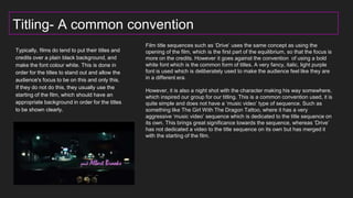
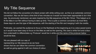
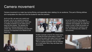
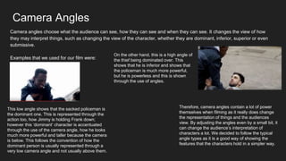
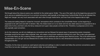
Q1- In what ways does your media products use,
develop or challenge forms and conventions of
real media products?
Titling- A common convention
Typically, films do tend to put their titles and
credits over a plain black background, and
make the font colour white. This is done in
order for the titles to stand out and allow the
audience's focus to be on this and only this.
If they do not do this, they usually use the
starting of the film, which should have an
appropriate background in order for the titles
to be shown clearly.
t
Film title sequences such as ‘Drive’ uses the same concept as using the
opening of the film, which is the first part of the equilibrium, so that the focus is
more on the credits. However it goes against the convention of using a bold
white font which is the common form of titles. A very fancy, italic, light purple
font is used which is deliberately used to make the audience feel like they are
in a different era.
However, it is also a night shot with the character making his way somewhere,
which inspired our group for our titling. This is a common convention used, it is
quite simple and does not have a ‘music video’ type of sequence. Such as
something like The Girl With The Dragon Tattoo, where it has a very
aggressive ‘music video’ sequence which is dedicated to the title sequence on
its own. This brings great significance towards the sequence, whereas ‘Drive’
has not dedicated a video to the title sequence on its own but has merged it
with the starting of the film.
My Title Sequence
We did not follow the convention of a black screen with white writing over, as this is an extremely common
convention. Also we did have a time limit of two minutes so it would not have been appropriate to do it this
way. As previously mentioned, we were inspired by the title sequence of the film ‘Drive’. This helped us to
fit the titles in our film without having to take up time. This is quite a common convention as most films
these days do use this type of title sequence, with the starting of the film and merging it with the credits.
Preferably, we wanted the audience to focus on the flashback at the beginning as it is a slow paced scene
so it would have been easy to focus on the titles as well as the opening. We used a white font and a blue
font underneath to differentiate e.g ‘Producer’ would be in white and the name of the producer below
would be blue.
We are pleased with our way of
representing our title sequence as we have
shown that we can follow the common convention
as well as going against it with our choice of colour.
Camera movement
Camera movement is a major key during filming, and especially when relating it to an audience. This part of filming defines
and manipulates the vibes and how the audience view the scenario.
As for our film, we were very careful and
focused a lot on our camera movement.
Such as for the restaurant scene, there was
no buildup of tension so we made sure to
keep the shot steady. This allowed the
audience’s viewing experience to be a
certain way, such as remaining cool and calm
because it is supposed to be relaxed at the
beginning
Another example is that for the chase scene,
we made the shots quite shaky in order to
build up the action and make it look more fast
paced so that it builds a lot more tension.
This is a typical convention that we followed
as in most action films, they use these shot
movements.
As for the POV shot, this helped to
make the audience feel like they are in
character and engaged, we made this
shaky in order to keep the tension up
as the character has nowhere to go
now, and shakiness also relates to
nervousness.
Camera Angles
Camera angles choose what the audience can see, how they can see and when they can see. It changes the view of how
they may interpret things, such as changing the view of the character, whether they are dominant, inferior, superior or even
submissive.
Examples that we used for our film were:
This low angle shows that the sacked policeman is
the dominant one. This is represented through the
action too, how Jimmy is holding Frank down;
however this ‘dominant’ character is accentuated
through the use of the camera angle, how he looks
much more powerful and taller because the camera
is below. This follows the convention of how the
dominant person is usually represented through a
very low camera angle and not usually above them.
On the other hand, this is a high angle of
the thief being dominated over. This
shows that he is inferior and shows that
the policeman is much more powerful,
but he is powerless and this is shown
through the use of angles.
Therefore, camera angles contain a lot of power
themselves when filming as it really does change
the representation of things and the audiences
view. By adjusting the angles even by a small bit, it
can change the audience’s interpretation of
characters a lot. We decided to follow the typical
angle types as it is a good way of showing the
features that the characters hold in a simpler way.
Mise-En-Scene
We thought about the mise-en-scene very carefully for the certain genre ‘thriller’. The use of the night city at the beginning was good for
us to use as an establishing shot as it is a common convention used typically at the beginning of action/thriller films so we followed this.
Night and ‘danger’ are very much associated with each other through media terms, and how most crime happens late at night.
The restaurant setting helped to create the ‘innocent’ atmosphere which contrasts to the crime/thriller theme as the beginning is
supposed to be calm and cool with no tension. Also, the chase scene is in a run down and not very clean area as it is supposed to be a
place full of crime, and that is why the fancy restaurant and upper class people contrast to this. Therefore, it juxtaposes and is not a
very typically used convention.
As for the costumes, we did not challenge any conventions and we followed the typical ways of representing certain characters.
Examples would be the upper class character Jess, who wears a long brown expensive looking furry coat. She is also quite glammed
up, and looks flashy as she is wearing Prada sunglasses and an extremely eye catching silver diamond purse. This is the stereotypical
representation of a ‘rich girl’ and we followed this to make it look obvious as she is a two dimensional character and only appears once
throughout the film
Therefore, for the mise-en-scene we used typical costumes and settings in order to match and follow the common conventions used in
most films; but we also challenged some aspects mildly, as mentioned above.

Untitled presentation

  • 1.
    Q1- In whatways does your media products use, develop or challenge forms and conventions of real media products?
  • 2.
    Titling- A commonconvention Typically, films do tend to put their titles and credits over a plain black background, and make the font colour white. This is done in order for the titles to stand out and allow the audience's focus to be on this and only this. If they do not do this, they usually use the starting of the film, which should have an appropriate background in order for the titles to be shown clearly. t Film title sequences such as ‘Drive’ uses the same concept as using the opening of the film, which is the first part of the equilibrium, so that the focus is more on the credits. However it goes against the convention of using a bold white font which is the common form of titles. A very fancy, italic, light purple font is used which is deliberately used to make the audience feel like they are in a different era. However, it is also a night shot with the character making his way somewhere, which inspired our group for our titling. This is a common convention used, it is quite simple and does not have a ‘music video’ type of sequence. Such as something like The Girl With The Dragon Tattoo, where it has a very aggressive ‘music video’ sequence which is dedicated to the title sequence on its own. This brings great significance towards the sequence, whereas ‘Drive’ has not dedicated a video to the title sequence on its own but has merged it with the starting of the film.
  • 3.
    My Title Sequence Wedid not follow the convention of a black screen with white writing over, as this is an extremely common convention. Also we did have a time limit of two minutes so it would not have been appropriate to do it this way. As previously mentioned, we were inspired by the title sequence of the film ‘Drive’. This helped us to fit the titles in our film without having to take up time. This is quite a common convention as most films these days do use this type of title sequence, with the starting of the film and merging it with the credits. Preferably, we wanted the audience to focus on the flashback at the beginning as it is a slow paced scene so it would have been easy to focus on the titles as well as the opening. We used a white font and a blue font underneath to differentiate e.g ‘Producer’ would be in white and the name of the producer below would be blue. We are pleased with our way of representing our title sequence as we have shown that we can follow the common convention as well as going against it with our choice of colour.
  • 4.
    Camera movement Camera movementis a major key during filming, and especially when relating it to an audience. This part of filming defines and manipulates the vibes and how the audience view the scenario. As for our film, we were very careful and focused a lot on our camera movement. Such as for the restaurant scene, there was no buildup of tension so we made sure to keep the shot steady. This allowed the audience’s viewing experience to be a certain way, such as remaining cool and calm because it is supposed to be relaxed at the beginning Another example is that for the chase scene, we made the shots quite shaky in order to build up the action and make it look more fast paced so that it builds a lot more tension. This is a typical convention that we followed as in most action films, they use these shot movements. As for the POV shot, this helped to make the audience feel like they are in character and engaged, we made this shaky in order to keep the tension up as the character has nowhere to go now, and shakiness also relates to nervousness.
  • 5.
    Camera Angles Camera angleschoose what the audience can see, how they can see and when they can see. It changes the view of how they may interpret things, such as changing the view of the character, whether they are dominant, inferior, superior or even submissive. Examples that we used for our film were: This low angle shows that the sacked policeman is the dominant one. This is represented through the action too, how Jimmy is holding Frank down; however this ‘dominant’ character is accentuated through the use of the camera angle, how he looks much more powerful and taller because the camera is below. This follows the convention of how the dominant person is usually represented through a very low camera angle and not usually above them. On the other hand, this is a high angle of the thief being dominated over. This shows that he is inferior and shows that the policeman is much more powerful, but he is powerless and this is shown through the use of angles. Therefore, camera angles contain a lot of power themselves when filming as it really does change the representation of things and the audiences view. By adjusting the angles even by a small bit, it can change the audience’s interpretation of characters a lot. We decided to follow the typical angle types as it is a good way of showing the features that the characters hold in a simpler way.
  • 6.
    Mise-En-Scene We thought aboutthe mise-en-scene very carefully for the certain genre ‘thriller’. The use of the night city at the beginning was good for us to use as an establishing shot as it is a common convention used typically at the beginning of action/thriller films so we followed this. Night and ‘danger’ are very much associated with each other through media terms, and how most crime happens late at night. The restaurant setting helped to create the ‘innocent’ atmosphere which contrasts to the crime/thriller theme as the beginning is supposed to be calm and cool with no tension. Also, the chase scene is in a run down and not very clean area as it is supposed to be a place full of crime, and that is why the fancy restaurant and upper class people contrast to this. Therefore, it juxtaposes and is not a very typically used convention. As for the costumes, we did not challenge any conventions and we followed the typical ways of representing certain characters. Examples would be the upper class character Jess, who wears a long brown expensive looking furry coat. She is also quite glammed up, and looks flashy as she is wearing Prada sunglasses and an extremely eye catching silver diamond purse. This is the stereotypical representation of a ‘rich girl’ and we followed this to make it look obvious as she is a two dimensional character and only appears once throughout the film Therefore, for the mise-en-scene we used typical costumes and settings in order to match and follow the common conventions used in most films; but we also challenged some aspects mildly, as mentioned above.