Download as PDF, PPTX

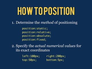
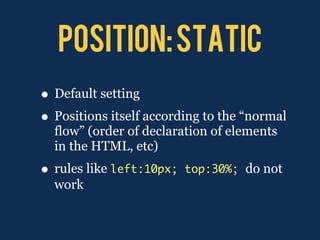
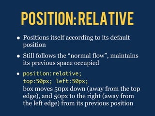
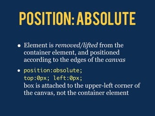
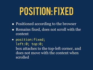


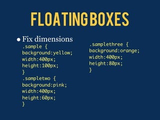
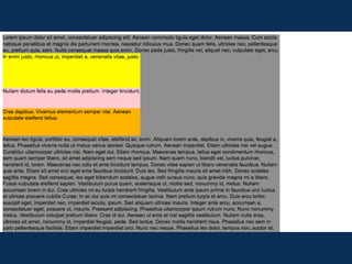
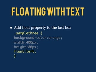
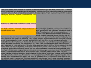
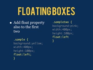
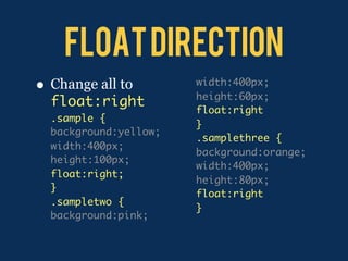
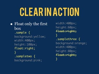
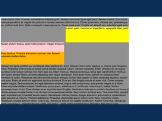
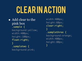

This document discusses CSS positioning and floating techniques. It covers the position property values of static, relative, absolute, and fixed and how they position elements on a page. It also covers floating elements and how the float, clear, and width properties can be used to make elements line up and flow around each other.