


![p {
background:
[background-image]
[background-position]
[/ background-size]
[background-repeat]
[background-attachment]
[background-origin]
[background-clip]
[background-color];
}](https://image.slidesharecdn.com/remix-110602052343-phpapp01/85/CSS3-is-everything-we-used-to-do-wrong-73-320.jpg)

![E:lang(c)
E:first-child
E:first-line
E:first-letter
E:before
E:after
E[att]
E[att=val]
E[att~=val]
E[att|=val]](https://image.slidesharecdn.com/remix-110602052343-phpapp01/85/CSS3-is-everything-we-used-to-do-wrong-75-320.jpg)


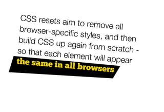


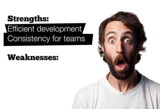
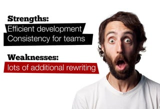
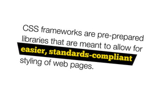
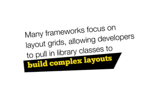
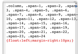


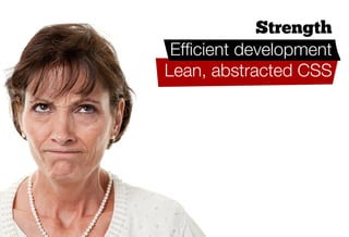

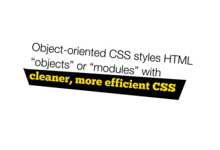


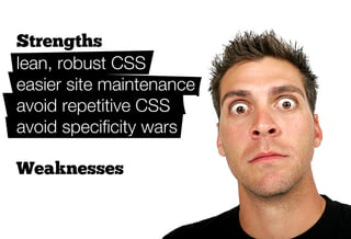
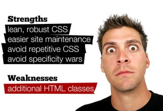
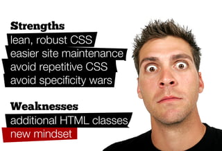

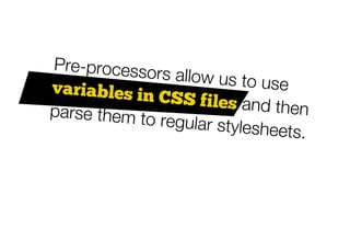
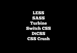
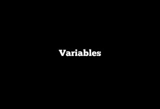
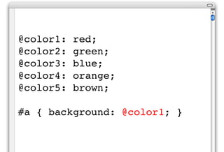

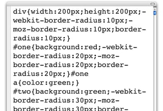

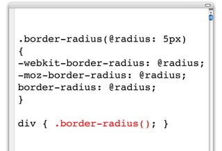


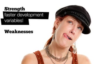

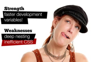
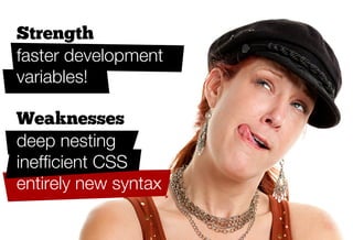


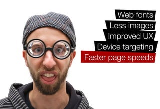
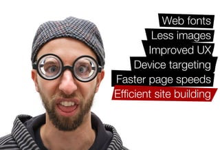
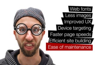
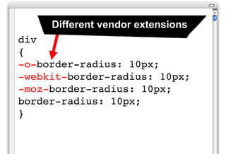
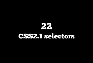
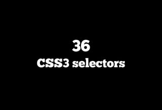
The document discusses the benefits and potential issues of using CSS3 and preprocessors. It recommends learning CSS2.1 fundamentals first before jumping into CSS3. Object-oriented CSS, resets, frameworks and preprocessors can make development more efficient and flexible by reducing repetitive code and improving maintenance. However, they also have drawbacks like additional classes and changing mindsets.


![[Worskhop Summits] CSS3 Workshop](https://cdn.slidesharecdn.com/ss_thumbnails/schmitt-css3-v4-100114155033-phpapp02-thumbnail.jpg?width=640&height=640&fit=bounds)