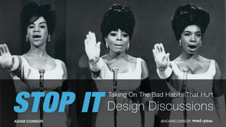
STOP IT
Taking On The Bad Habits That Hurt
ADAM CONNOR @ADAMCONNOR
Design Discussions
Conversations can hurt
It’s laid out too much like [popular service]. We should be different.
The new Spotify design is perhaps even worse than the old Spotify design. The
visual hierarchy and underlying IA are terrible.
If you wanted to make it less obviously
wrong, next time…
It needs more flululululuh!!
The wireframes are still not answering our problem and are not
providing enough an easier solution for the page.
Change the order of the screens so that the 3rd and
first one are switched.
It doesn't have enough spunk.
What kind of company shuts down a much-loved service like
Google Reader but keeps the vegetative Google Plus?
We're disappointed in this solution. We're going to have our own designers come up with
one.
Looks ugly. Make it pretty.
What. The hell. Is this?
I would never use this. I don’t like the
layout.
We should make that a dropdown instead of
radio buttons.
None of this is what I asked for.
This is terrible. I have no idea what the lines
mean.
I like the paper form better.
I'm just not feeling it. I don't know what, but it isn't right yet.
Just needs to be more innovative.
Make it look more like
SharePoint.
Here is a rewrite. My intention is to
sharpen the language, make it more
precise.
criticalthinking
critique
We react
We get selfish
We don’t start from a
common foundation
We don’t discuss
We don’t talk about strengths
We don’t focus
Artist Unknown
We defend
Artist Unknown
We don’t participate
We problem solve
We confuse critique with review
THANK
YOU!For more thoughts on critique, communication and collaboration,
check out discussingdesign.com
Adam Connor
Experience Designer
VP Organizational Design & Training
!
@adamconnor
aconnor@madpow.com
And look for
Discussing Design: Improving Communication & Collaboration Through Critique
Available June 2015 from O’Reilly Media

Stop It! Taking on the bad habits that hurt design discussions.

  • 1.
    STOP IT Taking OnThe Bad Habits That Hurt ADAM CONNOR @ADAMCONNOR Design Discussions
  • 2.
  • 3.
    It’s laid outtoo much like [popular service]. We should be different. The new Spotify design is perhaps even worse than the old Spotify design. The visual hierarchy and underlying IA are terrible. If you wanted to make it less obviously wrong, next time… It needs more flululululuh!! The wireframes are still not answering our problem and are not providing enough an easier solution for the page. Change the order of the screens so that the 3rd and first one are switched. It doesn't have enough spunk. What kind of company shuts down a much-loved service like Google Reader but keeps the vegetative Google Plus? We're disappointed in this solution. We're going to have our own designers come up with one. Looks ugly. Make it pretty. What. The hell. Is this? I would never use this. I don’t like the layout. We should make that a dropdown instead of radio buttons. None of this is what I asked for. This is terrible. I have no idea what the lines mean. I like the paper form better. I'm just not feeling it. I don't know what, but it isn't right yet. Just needs to be more innovative. Make it look more like SharePoint. Here is a rewrite. My intention is to sharpen the language, make it more precise.
  • 4.
  • 5.
  • 6.
  • 7.
  • 8.
    We don’t startfrom a common foundation
  • 9.
  • 10.
    We don’t talkabout strengths
  • 11.
  • 12.
  • 13.
  • 14.
  • 15.
  • 16.
    THANK YOU!For more thoughtson critique, communication and collaboration, check out discussingdesign.com Adam Connor Experience Designer VP Organizational Design & Training ! @adamconnor aconnor@madpow.com And look for Discussing Design: Improving Communication & Collaboration Through Critique Available June 2015 from O’Reilly Media