Download as PDF, PPTX


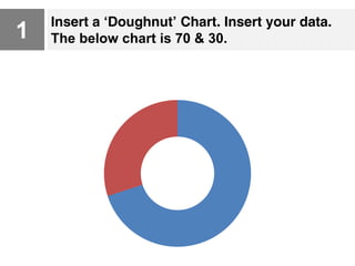
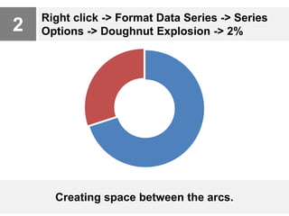
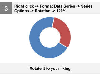
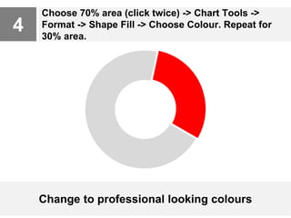
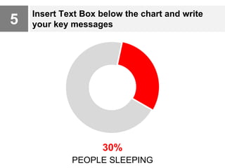


This document provides 6 steps to create professional-looking doughnut charts: 1) Insert a doughnut chart and data, 2) Add 2% explosion to create space between arcs, 3) Rotate the chart 120% to preference, 4) Change the fill colors of each data area to professional colors, 5) Add a text box below to write key messages, and 6) Insert icons from sources like Google or Iconfinder to complete the chart. The overall process helps make doughnut charts visually appealing for presentations.