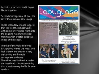
Diana A Samuels.
(1) Research
(2) planning
(3)Finished products
(4)evaluation
Model is wearing a
uniform to
highlight and
present that the
magazine is a
school magazine.
The models direct
gaze and smiling
facial expression
indicates to
parents that she is
happy and she
enjoys school.
Editors may have
chosen this image
to persuade
readers that their
daughters will or
already do enjoy
attending the
school.
The use of the feminine
colours e.g. pink and
purple connotes that
the school is an only
girls school.
The simple effective
and neat organised
structure highlight and
promote the
organisation and
sophistication of the
school.This has
possibly been done to
attract and persuade
parents that the school
is a good school to their
daughter too.
The puffs on the left hand side of
the page highlight the fact that the
school is focused on giving the best
opportunities to your daughter
“How your child can get ahead.”
the inclusive language persuades
the reader to send their child this
school.
The masthead is
behind the models
head possibly
suggesting that it is
a well known
magazine.
Bold bright colours
such as : yellow,
white and pink.
Have been used to
make the magazine
‘pop’ and stand out
to new readers.
Possibly done to
increase sales.
The model is
smiling and has a
direct gaze this
suggesting that
the model is
confident
academically his
broad posture
also suggests
this.
The props e.g. Books
remind the reader that
it is a school magazine
Books relating to ->
academic education.
This use of
iconography allows the
target audience to be
identified.Which, since
it being a ‘collage’
magazine, is targeted
and male and females
18+
The use of the different
colours ( black ,yellow & pink)
suggest that this is unisex
targeted magazine.
Layout is structured and it looks
like newspaper.
Secondary images are all over the
cover there is no central image .
These secondary images suggest
that the well the school works
with community it also highlights
the ongoing history the school
making which creates a positive
image of the school.
The use of the multi-coloured
background makes the magazine
look vibrant and creates a very
welcoming and friendly
atmosphere and tone
The white used in the title makes
the masthead standout meaning
that is easily recognizable for new
readers.
(2)Planning
(flat plans)
Form Base
‘Sixth form 2.0’
Common room
Our college
Titles for my magazine
This is the title I’ve chosen
for my magazine.
-Free oyster card application page 30
- Top ten places to study .
- Top 5 revision tips.
- 10 steps to achieving success.
- How to style your uniform
fashionably.
Possible cover lines
Pictures from school magazine photo-
shoot
Cover
photo
Contents page
secondary
images
I used my I phone to take
the pictures of the images
needed for my school
magazine
(3)Finished products
I used codes and conventions I have learnt in lesson and applied them to my
magazine such as:
-Date
-Barcode
-Anchorage text (triple)
-Puffs
I used My close friend, Deisy Rojas as the cover model for my magazine we
used her school book as a prop to highlight that my magazine is specifically
a school magazine.
On a whole I am pleased with my work as this was my first attempt to
making a school magazine using pic monkey.
Evaluation

Preliminary task MEDIA AS

  • 1.
    Diana A Samuels. (1)Research (2) planning (3)Finished products (4)evaluation
  • 2.
    Model is wearinga uniform to highlight and present that the magazine is a school magazine. The models direct gaze and smiling facial expression indicates to parents that she is happy and she enjoys school. Editors may have chosen this image to persuade readers that their daughters will or already do enjoy attending the school. The use of the feminine colours e.g. pink and purple connotes that the school is an only girls school. The simple effective and neat organised structure highlight and promote the organisation and sophistication of the school.This has possibly been done to attract and persuade parents that the school is a good school to their daughter too. The puffs on the left hand side of the page highlight the fact that the school is focused on giving the best opportunities to your daughter “How your child can get ahead.” the inclusive language persuades the reader to send their child this school.
  • 3.
    The masthead is behindthe models head possibly suggesting that it is a well known magazine. Bold bright colours such as : yellow, white and pink. Have been used to make the magazine ‘pop’ and stand out to new readers. Possibly done to increase sales. The model is smiling and has a direct gaze this suggesting that the model is confident academically his broad posture also suggests this. The props e.g. Books remind the reader that it is a school magazine Books relating to -> academic education. This use of iconography allows the target audience to be identified.Which, since it being a ‘collage’ magazine, is targeted and male and females 18+ The use of the different colours ( black ,yellow & pink) suggest that this is unisex targeted magazine.
  • 4.
    Layout is structuredand it looks like newspaper. Secondary images are all over the cover there is no central image . These secondary images suggest that the well the school works with community it also highlights the ongoing history the school making which creates a positive image of the school. The use of the multi-coloured background makes the magazine look vibrant and creates a very welcoming and friendly atmosphere and tone The white used in the title makes the masthead standout meaning that is easily recognizable for new readers.
  • 5.
  • 6.
    Form Base ‘Sixth form2.0’ Common room Our college Titles for my magazine This is the title I’ve chosen for my magazine.
  • 7.
    -Free oyster cardapplication page 30 - Top ten places to study . - Top 5 revision tips. - 10 steps to achieving success. - How to style your uniform fashionably. Possible cover lines
  • 8.
    Pictures from schoolmagazine photo- shoot Cover photo Contents page secondary images I used my I phone to take the pictures of the images needed for my school magazine
  • 9.
  • 10.
    I used codesand conventions I have learnt in lesson and applied them to my magazine such as: -Date -Barcode -Anchorage text (triple) -Puffs I used My close friend, Deisy Rojas as the cover model for my magazine we used her school book as a prop to highlight that my magazine is specifically a school magazine. On a whole I am pleased with my work as this was my first attempt to making a school magazine using pic monkey. Evaluation