Cover
Analysis
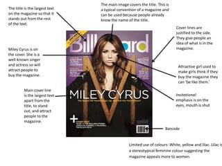
The title is the largest text
on the magazine so that it
stands out from the rest
of the text.
Attractive girl used to
make girls think if they
buy the magazine they
can ‘be like them.’
Miley Cyrus is on
the cover. She is a
well-known singer
and actress so will
attract people to
buy the magazine.
Limited use of colours: White, yellow and lilac. Lilac is
a stereotypical feminine colour suggesting the
magazine appeals more to women.
The main image covers the title. This is
a typical convention of a magazine and
can be used because people already
know the name of the title.
Cover lines are
justified to the side.
They give people an
idea of what is in the
magazine.
Main cover line
is the largest text
apart from the
title, to stand
out, and attract
people to the
magazine.
Invitational:
emphasis is on the
eyes, mouth is shut
Barcode
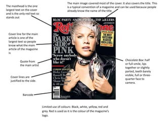
The masthead is the one
largest text on the cover
and is the only red text so
stands out
The main image covered most of the cover. It also covers the title. This
is a typical convention of a magazine and can be used because people
already know the name of the title.
Cover lines are
justified to the side.
Quote from
the main artist
Cover line for the main
article is one of the
largest text so people
know what the main
article of the magazine
is
Limited use of colours: Black, white, yellow, red and
grey. Red is used as it is the colour of the magazine’s
logo.
Barcode
Chocolate Box: half
or full-smile, lips
together or slightly
parted, teeth barely
visible, full or three-
quarter face to
camera.
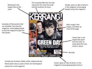
Masthead is the
largest title on the
cover
Header: gives an idea of what is
in the magazine encouraging
people to buy the magazine.
Footer: gives an idea of what is in the
magazine encouraging people to buy it
Main image is the
largest, and takes up
most of the page.
‘Green Day’ is the
largest text apart
from the title, to
show what the main
article is about.
Examples of free posters that
are available if you buy the
magazine, encouraging people
to buy the magazine to get the
free poster.
Limited use of colours: Black, white, yellow and red.
Mainly dark colours used as these are stereotypical
colours for a rock magazine.
The smashed effect for the title
represents the word ‘kerrang!’
and the loudness of music.
Barcode
Iconic title. It is simple and
the largest text, standing out
from the rest of the
magazine.
Tagline along the top of the magazine.
‘Biggest Music Magazine’, persuading
people to buy it because it is the ‘best.’
Famous bands and artists
justified to the
sides, suggesting the target
audience of the magazine.
The colours used are white, black and
red. These are normally the colours
used in Q, keeping a house style.
Attractive girl used to
make girls think if they
buy the magazine they
can ‘be like them’, and
also attracts men to buy
the magazine.
Imagine uses a sexual
gesture to appeal to the
target audience of male and
persuade them to buy the
magazine.
Her face is light
making her lips stand
out, making the
image more sexual
and creating a main
focus
point, encouraging
males to buy the
magazine.

Cover Analysis

  • 1.
  • 2.
    The title isthe largest text on the magazine so that it stands out from the rest of the text. Attractive girl used to make girls think if they buy the magazine they can ‘be like them.’ Miley Cyrus is on the cover. She is a well-known singer and actress so will attract people to buy the magazine. Limited use of colours: White, yellow and lilac. Lilac is a stereotypical feminine colour suggesting the magazine appeals more to women. The main image covers the title. This is a typical convention of a magazine and can be used because people already know the name of the title. Cover lines are justified to the side. They give people an idea of what is in the magazine. Main cover line is the largest text apart from the title, to stand out, and attract people to the magazine. Invitational: emphasis is on the eyes, mouth is shut Barcode
  • 3.
    The masthead isthe one largest text on the cover and is the only red text so stands out The main image covered most of the cover. It also covers the title. This is a typical convention of a magazine and can be used because people already know the name of the title. Cover lines are justified to the side. Quote from the main artist Cover line for the main article is one of the largest text so people know what the main article of the magazine is Limited use of colours: Black, white, yellow, red and grey. Red is used as it is the colour of the magazine’s logo. Barcode Chocolate Box: half or full-smile, lips together or slightly parted, teeth barely visible, full or three- quarter face to camera.
  • 4.
    Masthead is the largesttitle on the cover Header: gives an idea of what is in the magazine encouraging people to buy the magazine. Footer: gives an idea of what is in the magazine encouraging people to buy it Main image is the largest, and takes up most of the page. ‘Green Day’ is the largest text apart from the title, to show what the main article is about. Examples of free posters that are available if you buy the magazine, encouraging people to buy the magazine to get the free poster. Limited use of colours: Black, white, yellow and red. Mainly dark colours used as these are stereotypical colours for a rock magazine. The smashed effect for the title represents the word ‘kerrang!’ and the loudness of music. Barcode
  • 5.
    Iconic title. Itis simple and the largest text, standing out from the rest of the magazine. Tagline along the top of the magazine. ‘Biggest Music Magazine’, persuading people to buy it because it is the ‘best.’ Famous bands and artists justified to the sides, suggesting the target audience of the magazine. The colours used are white, black and red. These are normally the colours used in Q, keeping a house style. Attractive girl used to make girls think if they buy the magazine they can ‘be like them’, and also attracts men to buy the magazine. Imagine uses a sexual gesture to appeal to the target audience of male and persuade them to buy the magazine. Her face is light making her lips stand out, making the image more sexual and creating a main focus point, encouraging males to buy the magazine.