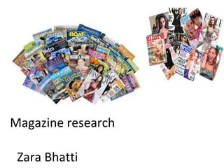
2. Introduction…
In this PowerPoint I will explain what
features, different types of magazines
include such as; masthead, images
and strapline. I will be doing this
through inductive research. I will look
at a variety of different magazines
which are targeted at different
audiences.
3. The remaining
subheadings are in
smaller font and don’t
stand out as much as the
main headline. This
suggests the magazine is
based around Nicole
Scherzinger.
The main head line is in
black, bold capital letters
situated underneath the
main image as it is the
next bit of the magazine
the audience will see. It
also stands out more
than other headlines
which implies that the
main headline is the
main storyline.
The use of the colour yellow is
warming and is reflected in the
magazine, ‘I’ve had my heart
broken’ also the natural look of
Nicole also gives it emotion and
makes the reader feel emotion
which shows it is effective.
The strapline of the magazine
is situated at the top of the
magazine, this is seen quickly
as it is above the masthead, it
promises to ‘improve sex life’;
this persuades women in
particular to buy the
magazine.
This is the masthead which is also
known as the name of the
product, in this case ‘more!’. It is a
yellow and black font which
appeals to the audience as the
colours together stand out. It is
placed across the top of the
magazine as that’s where the
readers look first; this is also
known as visual hierarchy.
The main image is a medium
close-up shot of celebrity Nicole
Scherzinger; this portrays the
magazine is based on her and her
life; this also indicates that the
magazine is targeting women,
specifically 16- 35 year olds as
they can relate to the singer,
however other fans are also
targeted.
The magazine also includes readers stories which
will make the audience feel more involved in the
magazine, the quote situated on the bottom right
of the cover gives an outline of what is included in
the magazine. Also the magazine uses exaggerated
words to catch the audiences attention.
4. The use of the colour blue
represents the school colours
and gives a connotation of
discipline which is reflected in
the magazine through the
student in uniform. The use of
the colour white headlines
makes the text stand out against
the dark blue; it also catches the
audiences eye.
The main image is of a
student at ‘Whitley Bay
High’; it is a medium closeup shot, this indicates that
magazine is based on the
students. It also suggests the The article includes advice and
tips from students at the
magazine is targeting
students at Whitley Bay High school which my make the
audience feel more involved in
or students that are looking
the magazine as they can feel
to join the school.
empathy however they also
The strapline is
may feel ostracized as they
situated above the
may feel uncomfortable with
main headlines ‘what's
the Idea of having a student
inside this week’ this is
with higher ability then them.
ensuring the audience
that the particular
topic is included in the
article.
This is the masthead, this is the
name of the article. It is in bright
blue font outlined in a darker blue
to represent the school colours. It
also stands out to the audience as
it has been situated at the top of
the article, and is the first thing
seen by the audience known as
visual hierarchy.
There are 2 main headlines of
the magazine which are on
the main image ensuring the
audience will read what is in
the issue. It is written it bold,
capitals in white making it
stand out so the audience is
attracted to it. It also implies
that the magazine will mainly
be based on ‘what’s cooking
in Whitley Bay High’
The magazine has been targeted to
the students who attend Whitley
Bay High and other students who
may be interested in joining. This is
because it says ‘get creative tips
from GCSE art students’ insinuating
the article is for other students.
5. There are two main headlines
other than the masthead, they
are advertising the groups and
artists in the charts. They are
written in white font which
makes it stand out against the
background.
Masthead is the main
headline for the article
so the audience knows.
It is written in bold
white and red font. This
makes it stand out as it
is one of the first things
the audience reads. It is
also in bold font which
catches the audiences
eye.
The article includes
information on varied
types of music as it has
informed the viewer it
is the UK’S biggest
music magazine.
The main image is an
attractive picture of
Cheryl Cole to attract
more than the typical
targeted of audience
which is fans that enjoy
varied music. Because of
this image Cheryl Cole
fans are also targeted,
however the typical
audience is fans from 25+.
The use of colour black and
red reflects a denotation of
the colours and gives a
connotation of sexual danger
through the image of Cheryl
Cole. The white headlines
stand out against the dark
background attracting the
audiences eye.
The strapline is situated
at the top of the
magazine which is placed
above the logo and main
subheading. ‘the UK’S
biggest music magazine’
informing the reader that
it IS the biggest article.
This will intrigue music
fans and they will want to
buy the magazine, the
strapline has been used
as persuasive technique.
6. There are two main headlines
other than the masthead, they
are advertising the groups and
artists in the charts. They are
written in white font which
makes it stand out against the
background.
Masthead is the main
headline for the article
so the audience knows.
It is written in bold
white and red font. This
makes it stand out as it
is one of the first things
the audience reads. It is
also in bold font which
catches the audiences
eye.
The article includes
information on varied
types of music as it has
informed the viewer it
is the UK’S biggest
music magazine.
The main image is an
attractive picture of
Cheryl Cole to attract
more than the typical
targeted of audience
which is fans that enjoy
varied music. Because of
this image Cheryl Cole
fans are also targeted,
however the typical
audience is fans from 25+.
The use of colour black and
red reflects a denotation of
the colours and gives a
connotation of sexual danger
through the image of Cheryl
Cole. The white headlines
stand out against the dark
background attracting the
audiences eye.
The strapline is situated
at the top of the
magazine which is placed
above the logo and main
subheading. ‘the UK’S
biggest music magazine’
informing the reader that
it IS the biggest article.
This will intrigue music
fans and they will want to
buy the magazine, the
strapline has been used
as persuasive technique.