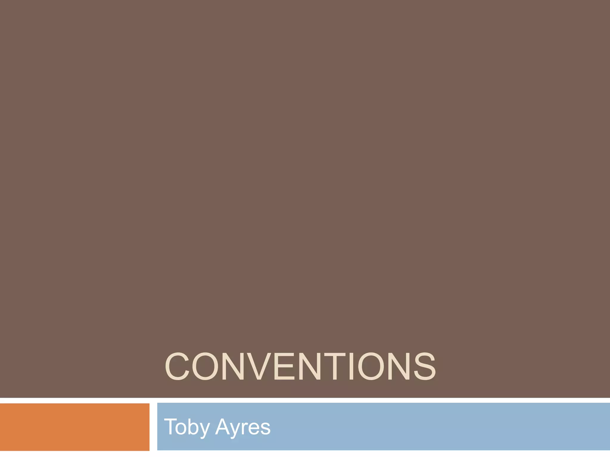
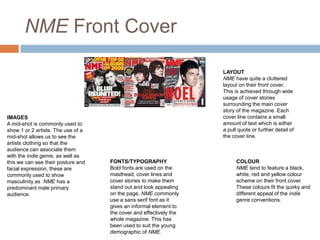
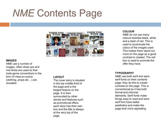
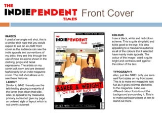
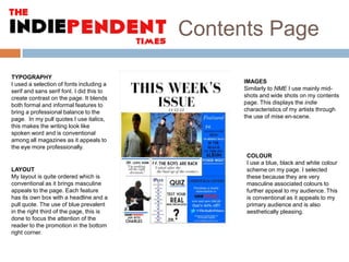
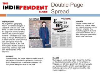
The document discusses conventions used in NME magazine layout and design. It analyzes images, layout, fonts/typography, and color used on the front cover, contents page, and double page spreads. Mid-shots showing clothing are commonly used on covers to represent the indie genre. Layouts are cluttered on covers and orderly on inner pages. Bold fonts stand out on covers, while serif and sans serif fonts create contrast on contents pages. Black, white, red and yellow are typical cover colors that fit the indie aesthetic.