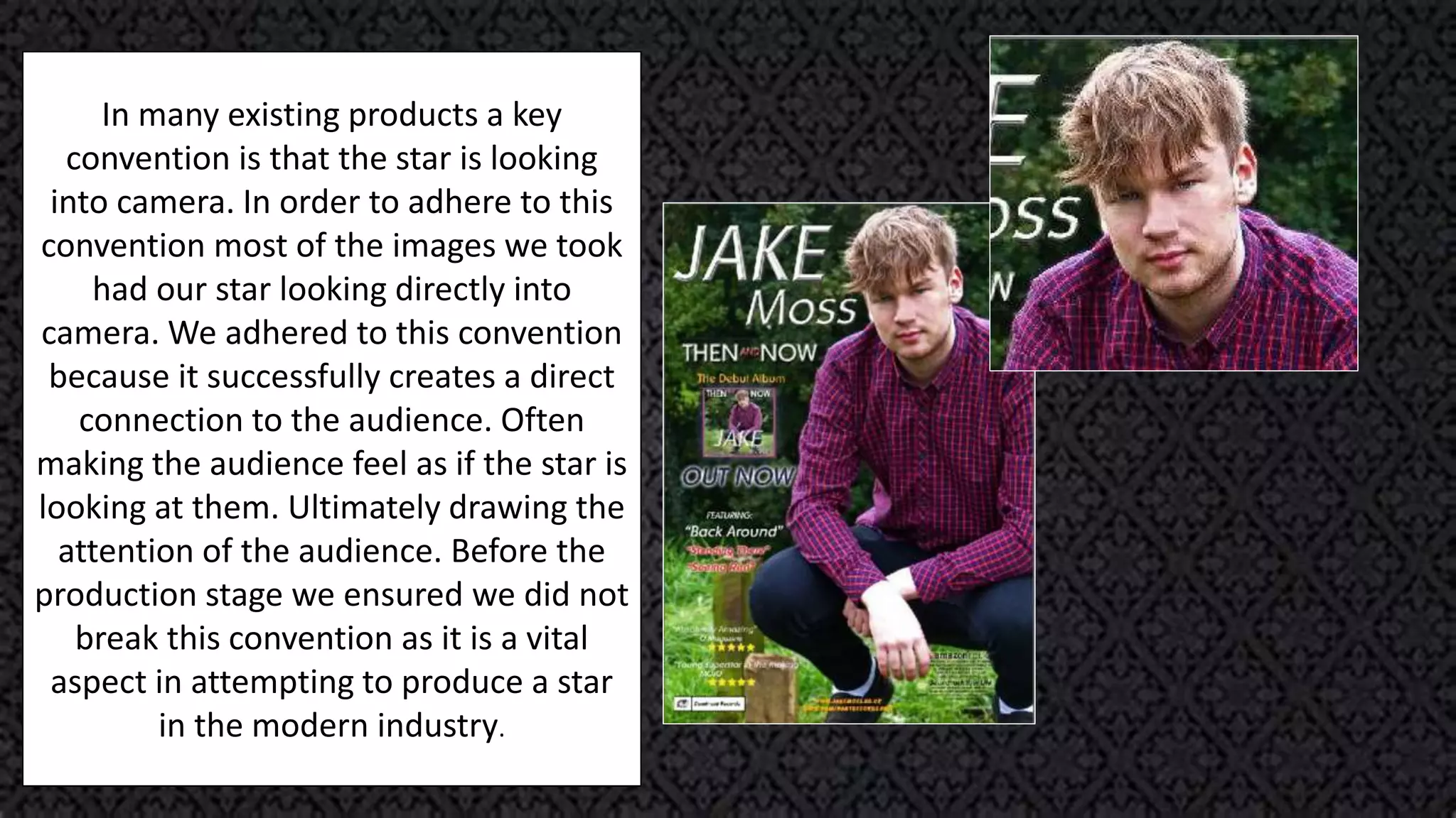
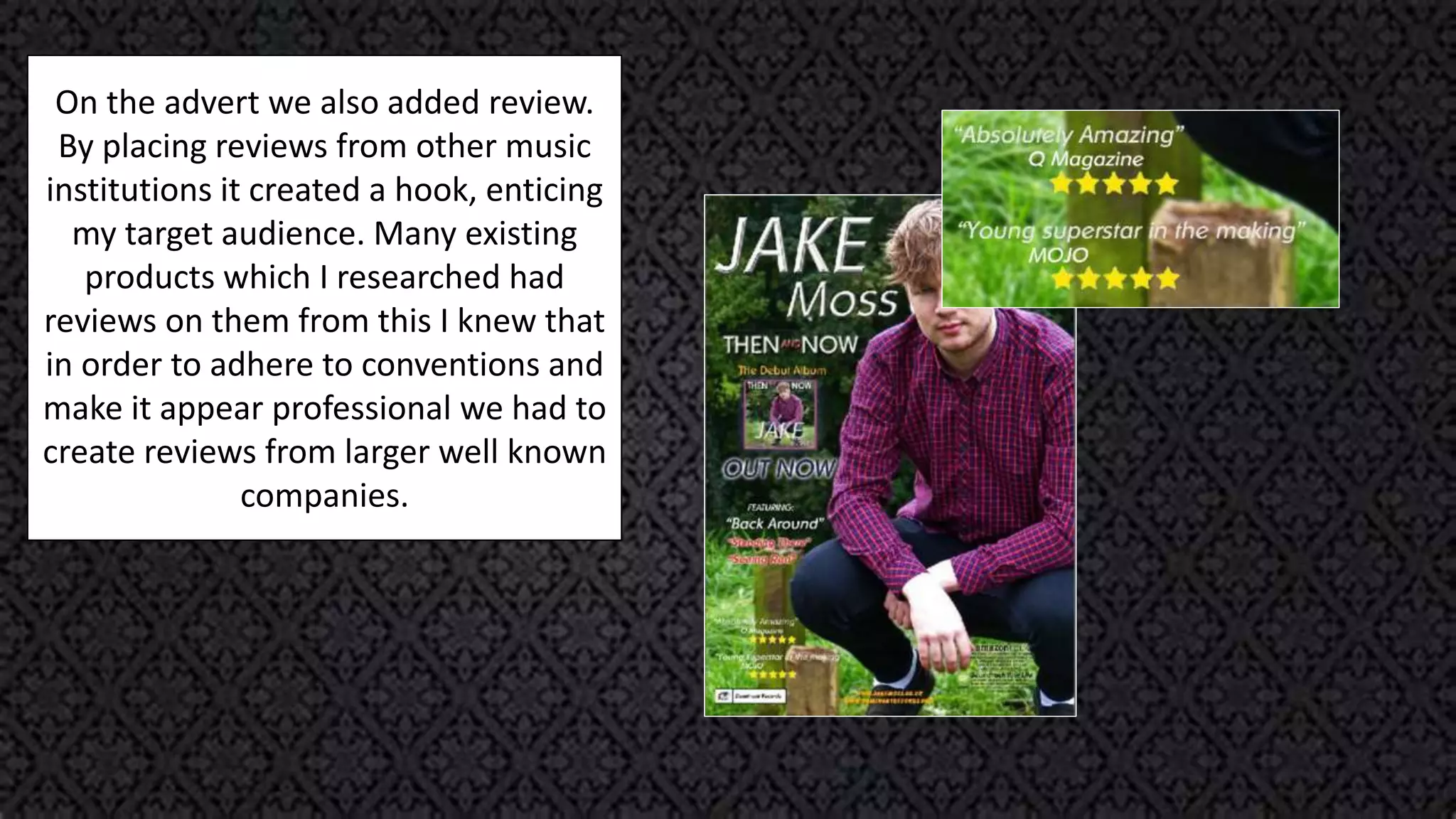
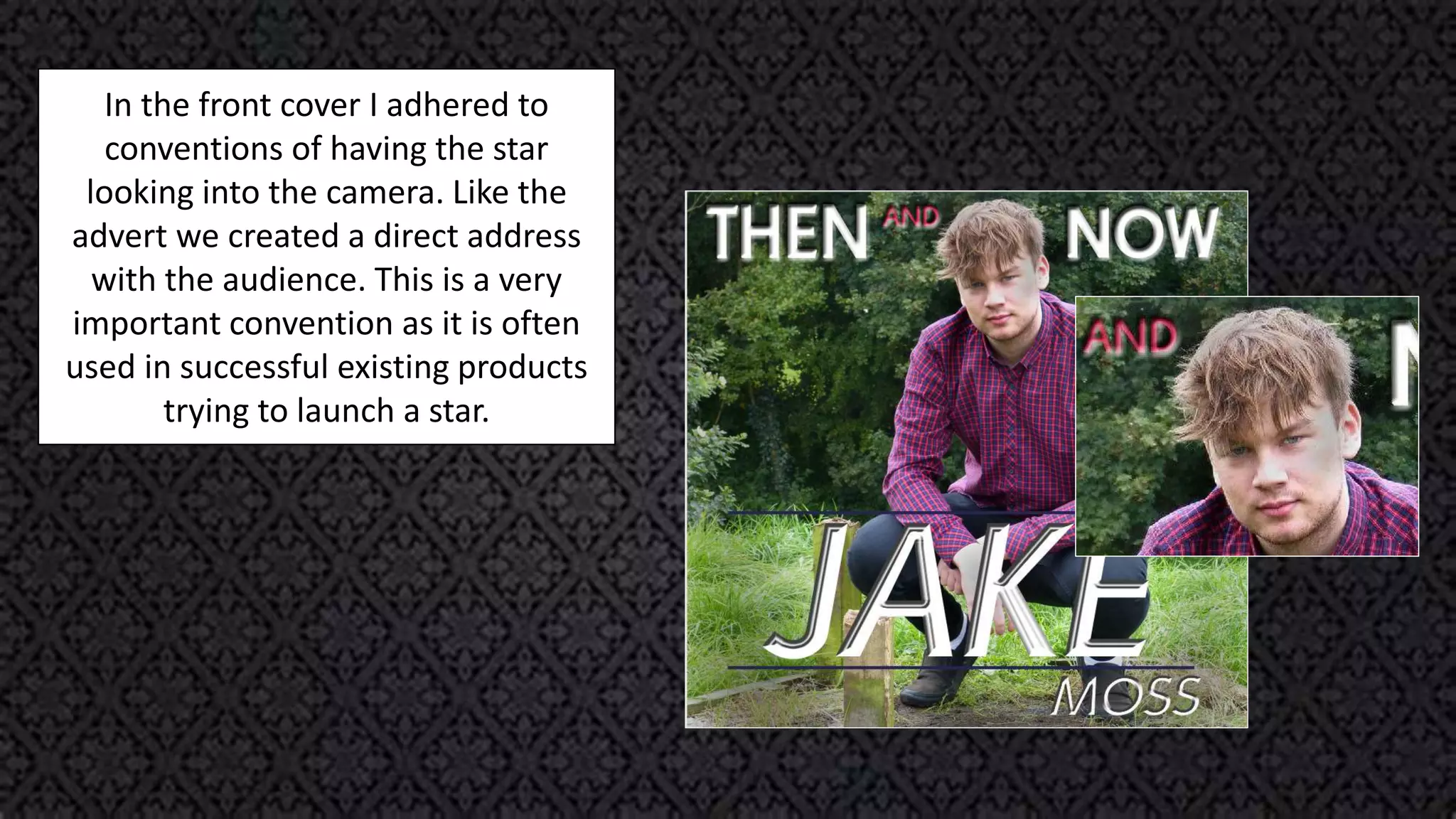
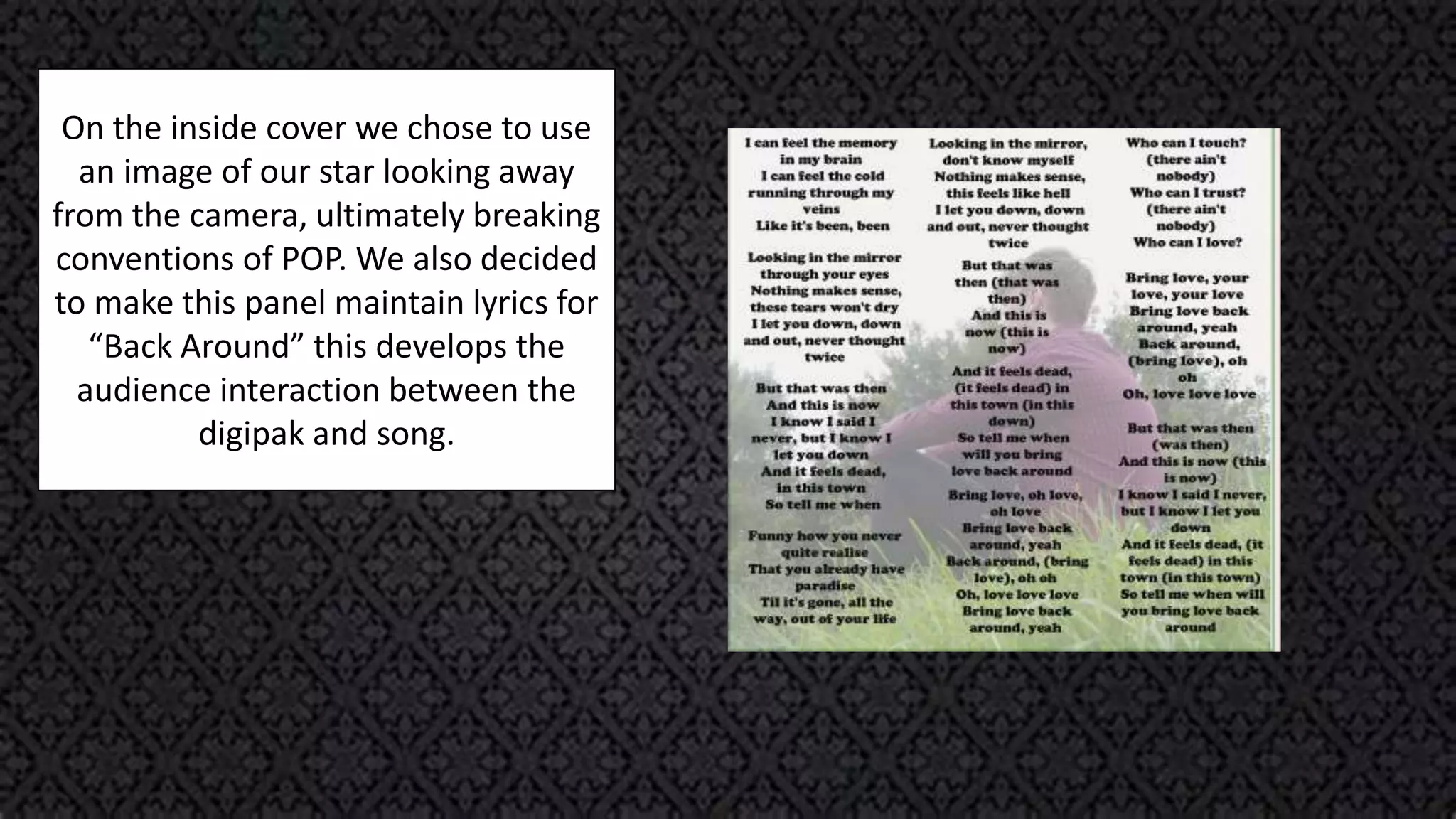
Conventions
Of
Ancillaries
ADVERT
In many existing products a key
convention is that the star is looking
into camera. In order to adhere to this
convention most of the images we took
had our star looking directly into
camera. We adhered to this convention
because it successfully creates a direct
connection to the audience. Often
making the audience feel as if the star is
looking at them. Ultimately drawing the
attention of the audience. Before the
production stage we ensured we did not
break this convention as it is a vital
aspect in attempting to produce a star
in the modern industry.
We purposefully decided to have our
stars name large. This adheres to POP
conventions because he is currently
an artist trying to get into the music
industry. In order to successfully
accomplish this goal his ancillaries
need to have large fonts making them
stand out. In the research stage of my
course I looked into an advert for Olly
Murs. The advert had very large text
and stood out dramatically against the
rest of the text on the page. We just
slightly changed the title so it could
text wrap around our stars head.
On the advert we also added review.
By placing reviews from other music
institutions it created a hook, enticing
my target audience. Many existing
products which I researched had
reviews on them from this I knew that
in order to adhere to conventions and
make it appear professional we had to
create reviews from larger well known
companies.
DIGIPAK
In the front cover I adhered to
conventions of having the star
looking into the camera. Like the
advert we created a direct address
with the audience. This is a very
important convention as it is often
used in successful existing products
trying to launch a star.
In the front cover I adhered to
conventions of having the star
looking into the camera. Like the
advert we created a direct address
with the audience. This is a very
important convention as it is often
used in successful existing products
trying to launch a star.
On the digipak we used a bar code.
This adhered to conventions as bar
codes are commonly used on the
back panels.
In addition to the bar codes we
decided to adhere to conventions
and have the artists name and album
name on the spine of the digipak.
Furthermore we met conventions by
having our institutional details in
small print on the back. All of these
aspects help out product appear
professional.
In addition to adhering to
conventions we also broke a few
conventions regarding where the
song list has been aligned. In many
existing products I have researched
the text is centre aligned. I felt
aligning it against the white wall in
the background looks more
aesthetically pleasing and modern.
As well as this we also broke
conventions as our star is looking
away from the camera. We felt this
would give the impression that he is
reading the songs.
On the inside cover we chose to use
an image of our star looking away
from the camera, ultimately breaking
conventions of POP. We also decided
to make this panel maintain lyrics for
“Back Around” this develops the
audience interaction between the
digipak and song.
The underside of the CD is
conventionally plain white. We chose
to use a rural background and
overlay the outline of the CD in the
red we used in other fonts and
borders of the ancillaries. On the red
outline we filled it in
with the names of songs in the
album. Exactly where the CD should
be placed we added an image of
hands in the shape of a love heart.
We also included the album name
and a link to Jake Moss’s website we
created.

Conventions Of Ancillaries

  • 1.
  • 2.
  • 3.
    In many existingproducts a key convention is that the star is looking into camera. In order to adhere to this convention most of the images we took had our star looking directly into camera. We adhered to this convention because it successfully creates a direct connection to the audience. Often making the audience feel as if the star is looking at them. Ultimately drawing the attention of the audience. Before the production stage we ensured we did not break this convention as it is a vital aspect in attempting to produce a star in the modern industry.
  • 4.
    We purposefully decidedto have our stars name large. This adheres to POP conventions because he is currently an artist trying to get into the music industry. In order to successfully accomplish this goal his ancillaries need to have large fonts making them stand out. In the research stage of my course I looked into an advert for Olly Murs. The advert had very large text and stood out dramatically against the rest of the text on the page. We just slightly changed the title so it could text wrap around our stars head.
  • 5.
    On the advertwe also added review. By placing reviews from other music institutions it created a hook, enticing my target audience. Many existing products which I researched had reviews on them from this I knew that in order to adhere to conventions and make it appear professional we had to create reviews from larger well known companies.
  • 6.
  • 7.
    In the frontcover I adhered to conventions of having the star looking into the camera. Like the advert we created a direct address with the audience. This is a very important convention as it is often used in successful existing products trying to launch a star.
  • 8.
    In the frontcover I adhered to conventions of having the star looking into the camera. Like the advert we created a direct address with the audience. This is a very important convention as it is often used in successful existing products trying to launch a star.
  • 9.
    On the digipakwe used a bar code. This adhered to conventions as bar codes are commonly used on the back panels. In addition to the bar codes we decided to adhere to conventions and have the artists name and album name on the spine of the digipak. Furthermore we met conventions by having our institutional details in small print on the back. All of these aspects help out product appear professional.
  • 10.
    In addition toadhering to conventions we also broke a few conventions regarding where the song list has been aligned. In many existing products I have researched the text is centre aligned. I felt aligning it against the white wall in the background looks more aesthetically pleasing and modern. As well as this we also broke conventions as our star is looking away from the camera. We felt this would give the impression that he is reading the songs.
  • 11.
    On the insidecover we chose to use an image of our star looking away from the camera, ultimately breaking conventions of POP. We also decided to make this panel maintain lyrics for “Back Around” this develops the audience interaction between the digipak and song.
  • 12.
    The underside ofthe CD is conventionally plain white. We chose to use a rural background and overlay the outline of the CD in the red we used in other fonts and borders of the ancillaries. On the red outline we filled it in with the names of songs in the album. Exactly where the CD should be placed we added an image of hands in the shape of a love heart. We also included the album name and a link to Jake Moss’s website we created.