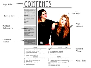
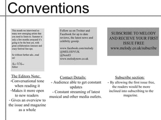
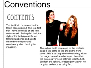
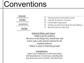
Contents
 Page
By: Noir Georgia El-Nour
Page Title


               Photo
Editors Note


               Page
Contact        Numbers
Information


Subscribe
section


               Editorial
               Pillars


               Article Titles
Conventions


  The Editors Note:          Contact Details:                  Subscribe section:
 -Conversational tone   - Audience able to get constant   - By allowing the first issue free,
    when reading it                 updates                  the readers would be more
 -Makes it more open     - Constant streaming of latest    inclined into subscribing to the
    to new readers     musical and other media outlets.               magazine.
- Gives an overview to
the issue and magazine
       as a whole
Conventions

The font that I have used on the
title is eccentric stnd. This is a font
that I have also used on the front
cover as well. And again I think the
style of the font represents my
targeted audience and also to
create some fluency and
consistency when reading the
magazine.                             The picture that I have used on the contents
                                   page is the same as the one on the front
                                   cover. This is to keep some consistency within
                                   the magazine and also because I think that
                                   the picture is very eye catching with the high
                                   contrast and lighting, reflecting my view of my
                                   targeted audience as being fun.
Conventions


          Editorial Pillars and Topics:
             -Addressing the audience
     Reviews on the things they should hear and
     watch; topics and contents tailored for the
                 targeted audience
       - Makes it easier to find desired topic

                  Competitions:
      - Spine Line Competition; involves the readers
     with the production of each issue, something that
     they themselves can see and be motivated to do.

Contents page with commentary

  • 1.
    Contents Page By: NoirGeorgia El-Nour
  • 2.
    Page Title Photo Editors Note Page Contact Numbers Information Subscribe section Editorial Pillars Article Titles
  • 3.
    Conventions TheEditors Note: Contact Details: Subscribe section: -Conversational tone - Audience able to get constant - By allowing the first issue free, when reading it updates the readers would be more -Makes it more open - Constant streaming of latest inclined into subscribing to the to new readers musical and other media outlets. magazine. - Gives an overview to the issue and magazine as a whole
  • 4.
    Conventions The font thatI have used on the title is eccentric stnd. This is a font that I have also used on the front cover as well. And again I think the style of the font represents my targeted audience and also to create some fluency and consistency when reading the magazine. The picture that I have used on the contents page is the same as the one on the front cover. This is to keep some consistency within the magazine and also because I think that the picture is very eye catching with the high contrast and lighting, reflecting my view of my targeted audience as being fun.
  • 5.
    Conventions Editorial Pillars and Topics: -Addressing the audience Reviews on the things they should hear and watch; topics and contents tailored for the targeted audience - Makes it easier to find desired topic Competitions: - Spine Line Competition; involves the readers with the production of each issue, something that they themselves can see and be motivated to do.