Looking back at your preliminary
  task, what do you feel you have
learned in the progression from it
        to the full product?
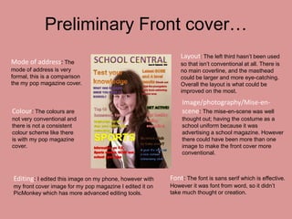
Preliminary Front cover…
                                                              Layout: The left third hasn’t been used
Mode of address: The                                          so that isn’t conventional at all. There is
mode of address is very                                       no main coverline, and the masthead
formal, this is a comparison                                  could be larger and more eye-catching.
the my pop magazine cover.                                    Overall the layout is what could be
                                                              improved on the most.

                                                              Image/photography/Mise-en-
Colour: The colours are                                       scene: The mise-en-scene was well
not very conventional and                                     thought out; having the costume as a
there is not a consistent                                     school uniform because it was
colour scheme like there                                      advertising a school magazine. However
is with my pop magazine                                       there could have been more than one
cover.                                                        image to make the front cover more
                                                              conventional.


Editing: I edited this image on my phone, however with    Font: The font is sans serif which is effective.
my front cover image for my pop magazine I edited it on   However it was font from word, so it didn’t
PicMonkey which has more advanced editing tools.          take much thought or creation.
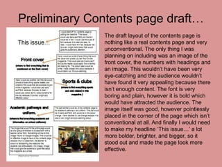
Preliminary Contents page draft…
              The draft layout of the contents page is
              nothing like a real contents page and very
              unconventional. The only thing I was
              planning on including was an image of the
              front cover, the numbers with headings and
              an image. This wouldn’t have been very
              eye-catching and the audience wouldn’t
              have found it very appealing because there
              isn’t enough content. The font is very
              boring and plain, however it is bold which
              would have attracted the audience. The
              image itself was good, however pointlessly
              placed in the corner of the page which isn’t
              conventional at all. And finally I would need
              to make my headline ‘This issue…’ a lot
              more bolder, brighter, and bigger, so it
              stood out and made the page look more
              effective.
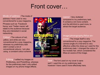
Front cover…
Mode of address: The mode of                                 Layout: Very cluttered
address I have used is very                                  compared to my preliminary task.
conventional for a pop magazine.                             It contains a lot more content,
Phrases such as ‘Facebook                                    and the left-third is used more, to
frenzy’ and ‘Twitter mania’ will                             attract the target audience.
relate to the audience because
they are interested in social
networking.
                                                             Image/photography/Mise-en-
Colour: The colours of red,
yellow, and white are very
                                                             scene: The image itself is very
conventional for a pop magazine,                             conventional for a pop magazine. The
whereas my preliminary task                                  camera angle of a mid-shot is very
didn’t contain a lot of                                      effective unlike the close-up I used for the
conventional colours. I am also                              preliminary task. I changed the colour of
using a constant colour scheme                               the models hair, which considered the
                                                             Mise-en-scene of the image.


   Editing: I edited my images on           Font: The font used on my cover is sans
   PicMonkey, and PhotoShop, whereas
                                            serif. I used this on my preliminary task
   for the preliminary task I only edited
                                            however I have used it more effectively here.
   images on my phone image effects.
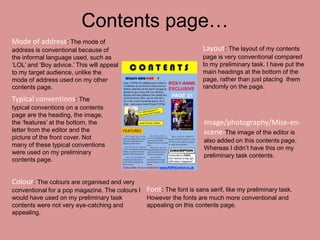
Contents page…
Mode of address: The mode of
address is conventional because of                                   Layout: The layout of my contents
the informal language used, such as                                  page is very conventional compared
‘LOL’ and ‘Boy advice.’ This will appeal                             to my preliminary task. I have put the
to my target audience, unlike the                                    main headings at the bottom of the
mode of address used on my other                                     page, rather than just placing them
contents page.                                                       randomly on the page.

Typical conventions: The
typical conventions on a contents
page are the heading, the image,
the ‘features’ at the bottom, the                                    Image/photography/Mise-en-
letter from the editor and the                                       scene-The image of the editor is
picture of the front cover. Not
                                                                     also added on this contents page.
many of these typical conventions
                                                                     Whereas I didn’t have this on my
were used on my preliminary
                                                                     preliminary task contents.
contents page.


Colour: The colours are organised and very
conventional for a pop magazine. The colours I Font: The font is sans serif, like my preliminary task.
would have used on my preliminary task         However the fonts are much more conventional and
contents were not very eye-catching and        appealing on this contents page.
appealing.
How I have progressed and what I have learned.
I believe I have progressed a lot during the course of making my magazine. I
now know how to make a magazine conventional and appealing to a certain
type of target audience. I know how to edit images to make them effective,
and I also know how to layout a front cover, contents page, and double page
spread effectively. In Question 7 I have learned that during the production of
my preliminary task, I didn’t know how to make layout, colour, and mode of
address effective. I didn’t know how to use PicMonkey, so my images were
poorly edited, making them unconventional for a magazine. I also didn’t
know how to make colour and fonts effective in my preliminary task. I now
Know what aspects are needed for a conventional, effective magazine. I
applied the knowledge I gained from doing my preliminary task, and took
these skills with me when completing my pop magazine.

Question 7

  • 1.
    Looking back atyour preliminary task, what do you feel you have learned in the progression from it to the full product?
  • 2.
    Preliminary Front cover… Layout: The left third hasn’t been used Mode of address: The so that isn’t conventional at all. There is mode of address is very no main coverline, and the masthead formal, this is a comparison could be larger and more eye-catching. the my pop magazine cover. Overall the layout is what could be improved on the most. Image/photography/Mise-en- Colour: The colours are scene: The mise-en-scene was well not very conventional and thought out; having the costume as a there is not a consistent school uniform because it was colour scheme like there advertising a school magazine. However is with my pop magazine there could have been more than one cover. image to make the front cover more conventional. Editing: I edited this image on my phone, however with Font: The font is sans serif which is effective. my front cover image for my pop magazine I edited it on However it was font from word, so it didn’t PicMonkey which has more advanced editing tools. take much thought or creation.
  • 3.
    Preliminary Contents pagedraft… The draft layout of the contents page is nothing like a real contents page and very unconventional. The only thing I was planning on including was an image of the front cover, the numbers with headings and an image. This wouldn’t have been very eye-catching and the audience wouldn’t have found it very appealing because there isn’t enough content. The font is very boring and plain, however it is bold which would have attracted the audience. The image itself was good, however pointlessly placed in the corner of the page which isn’t conventional at all. And finally I would need to make my headline ‘This issue…’ a lot more bolder, brighter, and bigger, so it stood out and made the page look more effective.
  • 4.
    Front cover… Mode ofaddress: The mode of Layout: Very cluttered address I have used is very compared to my preliminary task. conventional for a pop magazine. It contains a lot more content, Phrases such as ‘Facebook and the left-third is used more, to frenzy’ and ‘Twitter mania’ will attract the target audience. relate to the audience because they are interested in social networking. Image/photography/Mise-en- Colour: The colours of red, yellow, and white are very scene: The image itself is very conventional for a pop magazine, conventional for a pop magazine. The whereas my preliminary task camera angle of a mid-shot is very didn’t contain a lot of effective unlike the close-up I used for the conventional colours. I am also preliminary task. I changed the colour of using a constant colour scheme the models hair, which considered the Mise-en-scene of the image. Editing: I edited my images on Font: The font used on my cover is sans PicMonkey, and PhotoShop, whereas serif. I used this on my preliminary task for the preliminary task I only edited however I have used it more effectively here. images on my phone image effects.
  • 5.
    Contents page… Mode ofaddress: The mode of address is conventional because of Layout: The layout of my contents the informal language used, such as page is very conventional compared ‘LOL’ and ‘Boy advice.’ This will appeal to my preliminary task. I have put the to my target audience, unlike the main headings at the bottom of the mode of address used on my other page, rather than just placing them contents page. randomly on the page. Typical conventions: The typical conventions on a contents page are the heading, the image, the ‘features’ at the bottom, the Image/photography/Mise-en- letter from the editor and the scene-The image of the editor is picture of the front cover. Not also added on this contents page. many of these typical conventions Whereas I didn’t have this on my were used on my preliminary preliminary task contents. contents page. Colour: The colours are organised and very conventional for a pop magazine. The colours I Font: The font is sans serif, like my preliminary task. would have used on my preliminary task However the fonts are much more conventional and contents were not very eye-catching and appealing on this contents page. appealing.
  • 6.
    How I haveprogressed and what I have learned. I believe I have progressed a lot during the course of making my magazine. I now know how to make a magazine conventional and appealing to a certain type of target audience. I know how to edit images to make them effective, and I also know how to layout a front cover, contents page, and double page spread effectively. In Question 7 I have learned that during the production of my preliminary task, I didn’t know how to make layout, colour, and mode of address effective. I didn’t know how to use PicMonkey, so my images were poorly edited, making them unconventional for a magazine. I also didn’t know how to make colour and fonts effective in my preliminary task. I now Know what aspects are needed for a conventional, effective magazine. I applied the knowledge I gained from doing my preliminary task, and took these skills with me when completing my pop magazine.