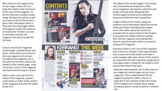
This document summarizes the layout and design of Kerrang magazine's content page. It notes that the page uses yellow, black, and white colors and iconic fonts that represent the Kerrang brand. The content is separated into categories like featured articles to make content easy to find. There are advertisements to subscribe at cheaper prices. Images accompanying articles provide visuals of artists and locations to grab readers' attention. The main article has a larger image and title to draw readers in and entice them to purchase the full magazine.