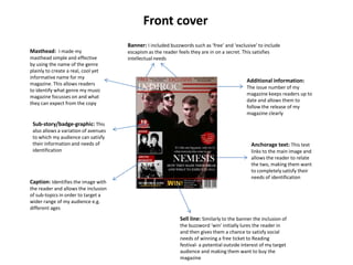
Q5. How did you attract/address your
audience?
Front cover
Masthead: I made my
masthead simple and effective
by using the name of the genre
plainly to create a real, cool yet
informative name for my
magazine. This allows readers
to identify what genre my music
magazine focusses on and what
they can expect from the copy

Banner: I included buzzwords such as ‘free’ and ‘exclusive’ to include
escapism as the reader feels they are in on a secret. This satisfies
intellectual needs

Additional information:
The issue number of my
magazine keeps readers up to
date and allows them to
follow the release of my
magazine clearly

Sub-story/badge-graphic: This
also allows a variation of avenues
to which my audience can satisfy
their information and needs of
identification

Caption: Identifies the image with

Anchorage text: This text
links to the main image and
allows the reader to relate
the two, making them want
to completely satisfy their
needs of identification

the reader and allows the inclusion
of sub-topics in order to target a
wider range of my audience e.g.
different ages

Sell line: Similarly to the banner the inclusion of
the buzzword ‘win’ initially lures the reader in
and then gives them a chance to satisfy social
needs of winning a free ticket to Reading
festival- a potential outside interest of my target
audience and making them want to buy the
magazine
Contents

A band index allows readers to feel
closely attached to the whole
magazine and it adds a summary
effect to the whole of the magazine

Page numbers on my contents
add structure and a clear
organised feel to the magazine,
readers will want to read if they
are aware of the layout as they’ll
feel more in control and
comfortable

Sub-headings: Different
sub-headings include
various different aspects of
the genre e.g. reviews of
albums that have been
released, events coming up
and current events in the
‘live’ section.

The ask section gives
readers a chance to interact
and ask one to one
questions with the editor of
the magazine
Double page spread
Heading: By using a quote as a
heading it gives the reader an
insight into the article. This
ultimately grabs their interest
and leads them to read more
into the interview

Image strip: By outlining the article with a strip
of images down the left side this has a similar
effect to the main image whereby it relates image
to text. However, this also adds a more relaxed
feel to the article and that readers can gain an
understanding of NEMESIS’ attitudes and all round
ora by their positioning in the photos for instance
a ‘thumbs up’ pose reveals a very informal,
friendly and fun representation of the band.

Image: This image is the main
aspect that draws readers into
the main of the article. It is the
basis of association between
the two and helps the reader to
feel more personally attached
with the article and also as if
they are close to the artist
himself.

Q5

  • 1.
    Q5. How didyou attract/address your audience?
  • 2.
    Front cover Masthead: Imade my masthead simple and effective by using the name of the genre plainly to create a real, cool yet informative name for my magazine. This allows readers to identify what genre my music magazine focusses on and what they can expect from the copy Banner: I included buzzwords such as ‘free’ and ‘exclusive’ to include escapism as the reader feels they are in on a secret. This satisfies intellectual needs Additional information: The issue number of my magazine keeps readers up to date and allows them to follow the release of my magazine clearly Sub-story/badge-graphic: This also allows a variation of avenues to which my audience can satisfy their information and needs of identification Caption: Identifies the image with Anchorage text: This text links to the main image and allows the reader to relate the two, making them want to completely satisfy their needs of identification the reader and allows the inclusion of sub-topics in order to target a wider range of my audience e.g. different ages Sell line: Similarly to the banner the inclusion of the buzzword ‘win’ initially lures the reader in and then gives them a chance to satisfy social needs of winning a free ticket to Reading festival- a potential outside interest of my target audience and making them want to buy the magazine
  • 3.
    Contents A band indexallows readers to feel closely attached to the whole magazine and it adds a summary effect to the whole of the magazine Page numbers on my contents add structure and a clear organised feel to the magazine, readers will want to read if they are aware of the layout as they’ll feel more in control and comfortable Sub-headings: Different sub-headings include various different aspects of the genre e.g. reviews of albums that have been released, events coming up and current events in the ‘live’ section. The ask section gives readers a chance to interact and ask one to one questions with the editor of the magazine
  • 4.
    Double page spread Heading:By using a quote as a heading it gives the reader an insight into the article. This ultimately grabs their interest and leads them to read more into the interview Image strip: By outlining the article with a strip of images down the left side this has a similar effect to the main image whereby it relates image to text. However, this also adds a more relaxed feel to the article and that readers can gain an understanding of NEMESIS’ attitudes and all round ora by their positioning in the photos for instance a ‘thumbs up’ pose reveals a very informal, friendly and fun representation of the band. Image: This image is the main aspect that draws readers into the main of the article. It is the basis of association between the two and helps the reader to feel more personally attached with the article and also as if they are close to the artist himself.