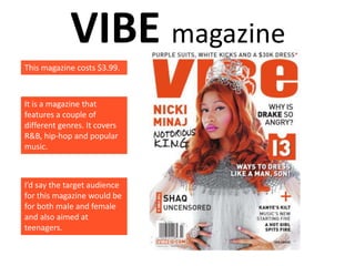
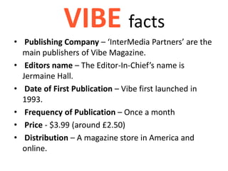
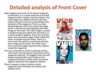
Choose 2 existing magazines that are similar in some way to the
magazine you are planning, and produce a PowerPoint
presentation on each of them, covering the following points:
- Type/focus of magazine
- Publishing Company
- Editor’s name
- Date of First Publication
- Frequency of Publication
- Price
- Distribution – ie. How/where readers can get it
- Detailed analysis of Front Cover
- Detailed analysis of Contents Page
- Detailed analysis of Double Page Spread
- Explanation of aspects you intend to use/imitate in your
magazine.
VIBE magazine
This magazine costs $3.99.


It is a magazine that
features a couple of
different genres. It covers
R&B, hip-hop and popular
music.


I’d say the target audience
for this magazine would be
for both male and female
and also aimed at
teenagers.
VIBE facts
• Publishing Company – ‘InterMedia Partners’ are the
  main publishers of Vibe Magazine.
• Editors name – The Editor-In-Chief’s name is
  Jermaine Hall.
• Date of First Publication – Vibe first launched in
  1993.
• Frequency of Publication – Once a month
• Price - $3.99 (around £2.50)
• Distribution – A magazine store in America and
  online.
Detailed analysis of Front Cover
Vibe magazine has most of the typical magazine
    conventions. It is a quite neat and structured
    magazine with a simple and clean layout. The
    cover page has a different house style and
    colour scheme in each issue according to the
    contents of the magazine. There is a mast
    head (magazine title) at the top of the page
    which is sometimes overlapped by the main
    image on the cover. The main image is usually
    a medium long shot where the star/icon is in
    a direct mode of address. There are very few
    cover lines around the page which makes the
    cover so simple and not messy. There is a
    main cover line which is connected with the
    main image on the cover. The other cover
    lines around the page represent the content
    inside the magazine.
The size and boldness of the masthead and the
    main cover line represents importance of the
    magazine contents. The biggest cover line will
    always represent the main image on the
    magazine and then smaller ones around the
    page to represent the magazine contents.
There is always a colour scheme to each
    magazine cover therefore the colours will
    always match.
Detailed analysis of Contents Page
               The contents pages in Vibe magazine are once
               again clean and structured just like the cover
               pages.
               The word ‘contents’ is used at the top of the
               page to specify that it is a contents page. The
               typical Vibe magazine contents page has the
               same masthead at the top of the page.
               CO
               NTEN
               TS 2,3
               It shows the date and issue number on these
               pages to go with the particular magazine.
               Each article has a bold title and then smaller
               writing underneath to give the reader an insight
               of each article. There are also visible page
               numbers for the reader to see which page each
               article is on.
               There is 1 column used on the page to separate
               the articles from the main image on the page.
               Subheadings are used to separate the magazine
               articles into ‘categories’.
Detailed analysis of Double Page
            Spread
             The images that are used on a double page
             spread usually relate to the main image on the
             front cover of the magazine. Vibe magazine use
             vibrant colours to make the images and text
             stand out of the page. The articles in these
             magazines are laid out in columns like a typical
             magazine article. They have used ‘pull quotes’
             from the article and made them stand out to
             split the article up. It will also attract the
             readers attention and get them to read the
             article. They have also used extra pictures on
             the page in relation to the article. There is 1
             main image, in a direct mode of address,
             surrounded by other smaller images. These
             pages both have a ‘stand’ at the beginning of
             the article to tell the reader more about the
             celebrities in the article if they didn’t know
             already.
Explanation of aspects you intend to
    use/imitate in your magazine
For my front cover I will be using a main masthead which is slightly covered by
the main image on the page. I will be adding in a few cover lines to give the
reader an insight of the magazine but I will not use too many because I don’t
want the cover page to look too busy. I will use a colour scheme which will
match the ‘genre’ of my magazine and make the magazine stand out. The
main cover line that I will use will relate to the main image on the page.

For my contents page I will be using columns to divide my articles. I will also
be using article headings, sub-headings and page numbers to order the
articles. A picture which relates to the main article on the cover page will be
used.

For the double page spread, I will use another image which relates to the
main image on the cover page. The article will be about the article featured
on the cover page. I will use columns to separate the article. I will use smaller
pictures around the pages which also relate to the article. I will use a stand
for the readers if they don’t know about the person I am writing about.

Presentation2[1]

  • 1.
    Choose 2 existingmagazines that are similar in some way to the magazine you are planning, and produce a PowerPoint presentation on each of them, covering the following points: - Type/focus of magazine - Publishing Company - Editor’s name - Date of First Publication - Frequency of Publication - Price - Distribution – ie. How/where readers can get it - Detailed analysis of Front Cover - Detailed analysis of Contents Page - Detailed analysis of Double Page Spread - Explanation of aspects you intend to use/imitate in your magazine.
  • 2.
    VIBE magazine This magazinecosts $3.99. It is a magazine that features a couple of different genres. It covers R&B, hip-hop and popular music. I’d say the target audience for this magazine would be for both male and female and also aimed at teenagers.
  • 3.
    VIBE facts • PublishingCompany – ‘InterMedia Partners’ are the main publishers of Vibe Magazine. • Editors name – The Editor-In-Chief’s name is Jermaine Hall. • Date of First Publication – Vibe first launched in 1993. • Frequency of Publication – Once a month • Price - $3.99 (around £2.50) • Distribution – A magazine store in America and online.
  • 4.
    Detailed analysis ofFront Cover Vibe magazine has most of the typical magazine conventions. It is a quite neat and structured magazine with a simple and clean layout. The cover page has a different house style and colour scheme in each issue according to the contents of the magazine. There is a mast head (magazine title) at the top of the page which is sometimes overlapped by the main image on the cover. The main image is usually a medium long shot where the star/icon is in a direct mode of address. There are very few cover lines around the page which makes the cover so simple and not messy. There is a main cover line which is connected with the main image on the cover. The other cover lines around the page represent the content inside the magazine. The size and boldness of the masthead and the main cover line represents importance of the magazine contents. The biggest cover line will always represent the main image on the magazine and then smaller ones around the page to represent the magazine contents. There is always a colour scheme to each magazine cover therefore the colours will always match.
  • 5.
    Detailed analysis ofContents Page The contents pages in Vibe magazine are once again clean and structured just like the cover pages. The word ‘contents’ is used at the top of the page to specify that it is a contents page. The typical Vibe magazine contents page has the same masthead at the top of the page. CO NTEN TS 2,3 It shows the date and issue number on these pages to go with the particular magazine. Each article has a bold title and then smaller writing underneath to give the reader an insight of each article. There are also visible page numbers for the reader to see which page each article is on. There is 1 column used on the page to separate the articles from the main image on the page. Subheadings are used to separate the magazine articles into ‘categories’.
  • 6.
    Detailed analysis ofDouble Page Spread The images that are used on a double page spread usually relate to the main image on the front cover of the magazine. Vibe magazine use vibrant colours to make the images and text stand out of the page. The articles in these magazines are laid out in columns like a typical magazine article. They have used ‘pull quotes’ from the article and made them stand out to split the article up. It will also attract the readers attention and get them to read the article. They have also used extra pictures on the page in relation to the article. There is 1 main image, in a direct mode of address, surrounded by other smaller images. These pages both have a ‘stand’ at the beginning of the article to tell the reader more about the celebrities in the article if they didn’t know already.
  • 7.
    Explanation of aspectsyou intend to use/imitate in your magazine For my front cover I will be using a main masthead which is slightly covered by the main image on the page. I will be adding in a few cover lines to give the reader an insight of the magazine but I will not use too many because I don’t want the cover page to look too busy. I will use a colour scheme which will match the ‘genre’ of my magazine and make the magazine stand out. The main cover line that I will use will relate to the main image on the page. For my contents page I will be using columns to divide my articles. I will also be using article headings, sub-headings and page numbers to order the articles. A picture which relates to the main article on the cover page will be used. For the double page spread, I will use another image which relates to the main image on the cover page. The article will be about the article featured on the cover page. I will use columns to separate the article. I will use smaller pictures around the pages which also relate to the article. I will use a stand for the readers if they don’t know about the person I am writing about.