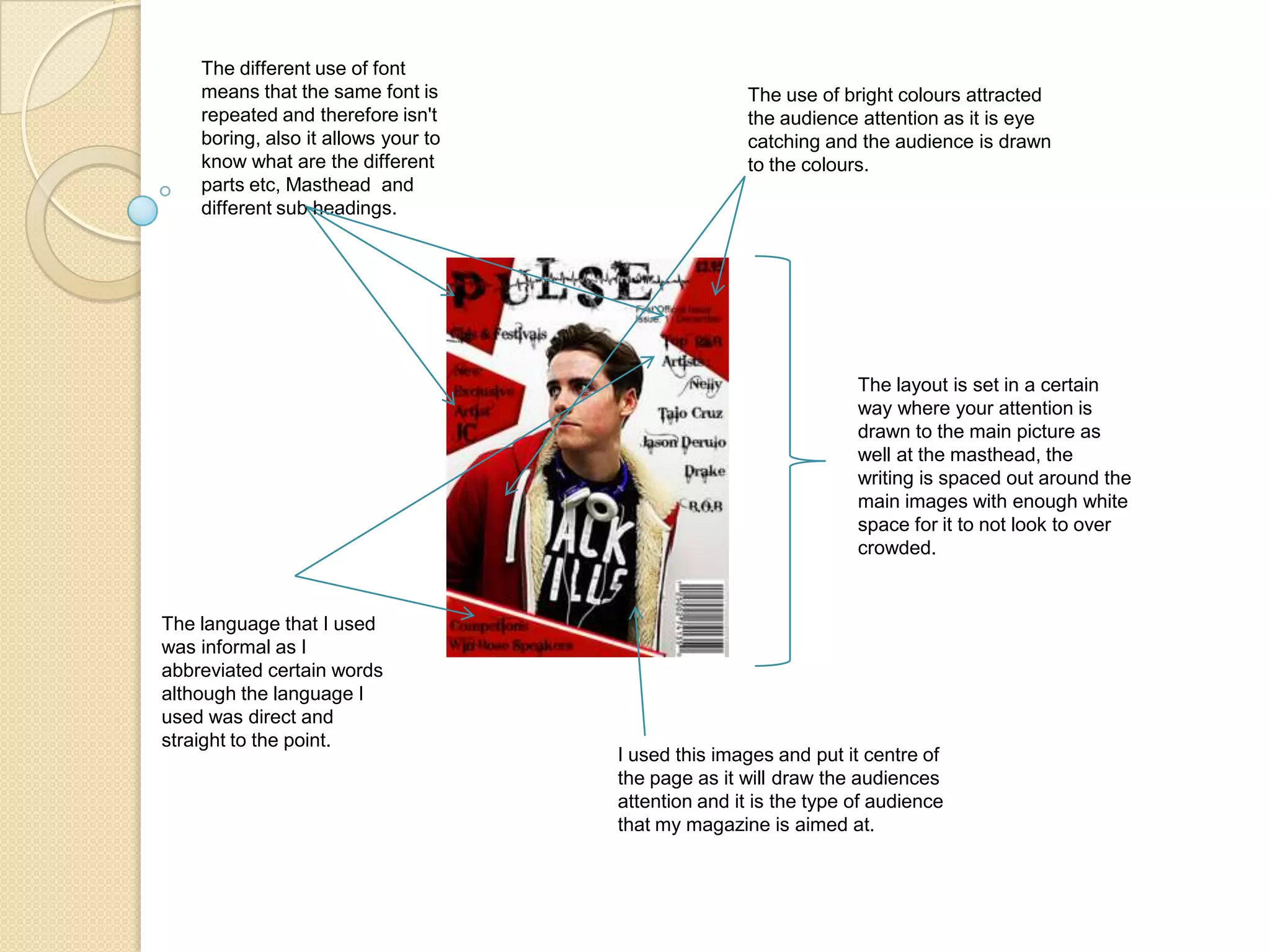
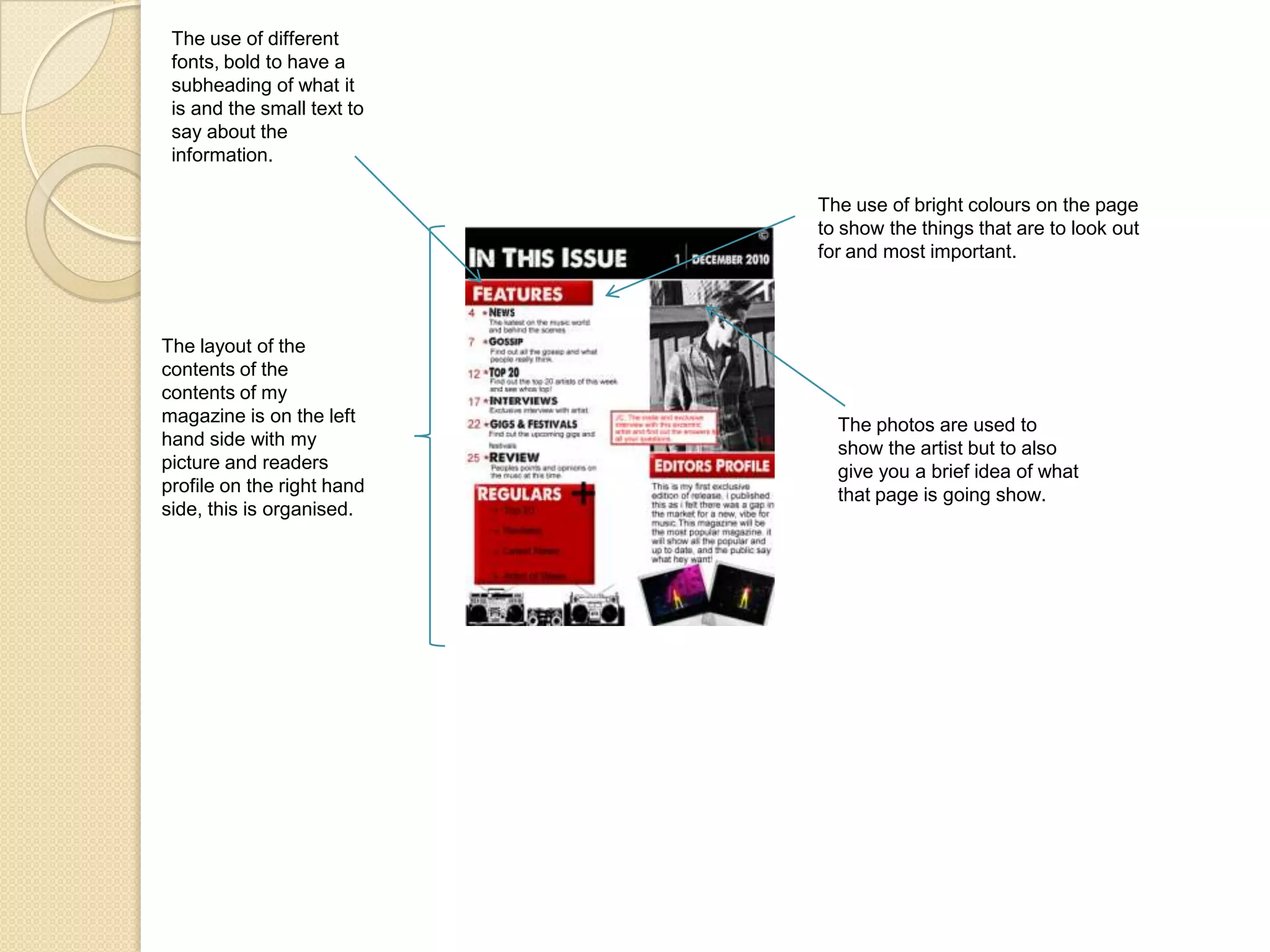
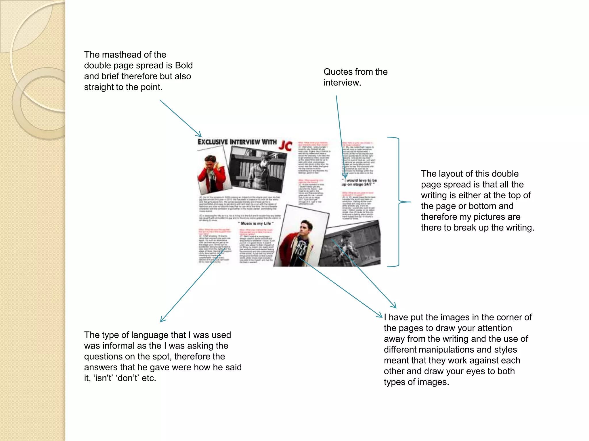
5: How Did You Attract/Address Your Audience ?
The different use of font means that the same font is repeated and therefore isn't boring, also it allows your to know what are the different parts etc, Masthead  and different sub headings.The use of bright colours attracted the audience attention as it is eye catching and the audience is drawn to the colours.The layout is set in a certain way where your attention is drawn to the main picture as well at the masthead, the writing is spaced out around the main images with enough white space for it to not look to over crowded.The language that I used was informal as I abbreviated certain words although the language I used was direct and straight to the point. I used this images and put it centre of the page as it will draw the audiences attention and it is the type of audience that my magazine is aimed at.
The use of different fonts, bold to have a subheading of what it is and the small text to say about the information.The use of bright colours on the page to show the things that are to look out for and most important.The layout of the contents of the contents of my magazine is on the left hand side with my picture and readers profile on the right hand side, this is organised.The photos are used to show the artist but to also give you a brief idea of what that page is going show.
The masthead of the double page spread is Bold and brief therefore but also straight to the point.Quotes from the interview.The layout of this double page spread is that all the writing is either at the top of the page or bottom and therefore my pictures are there to break up the writing.I have put the images in the corner of the pages to draw your attention away from the writing and the use of different manipulations and styles meant that they work against each other and draw your eyes to both types of images.The type of language that I was used was informal as the I was asking the questions on the spot, therefore the answers that he gave were how he said it, ‘isn't’ ‘don’t’ etc.
Summary and Feedback of Front Cover, Contents and Double Page Spread.What  did you think of the images?  I felt that the images used were good as it represented the social group that the magazine was aimed at, its also good because the clothes that he is wearing are fashionable and stylish.What did you think of the house style that was used? I thought it was good because it drew my attention to it as the colours were bright and eye catching.Was the information that was given relevant? Yes, I feel that on all the pages it was good as it let me know about the new artist that is making his name worldwide and it is easily as good as any magazine that is out now if not better.Did the magazine appeal to you? Yes it did as it is all about the music that I am into and I was also informed about some information I didn't  know about already.Was the layout easy to follow?Yes it was because it was organised, which meant it was so easy to follow, the writing was like any other ordinary text, from left to right although I feel on the contents page there could have been more pages with information on.

Presentation for question 5

  • 1.
    5: How DidYou Attract/Address Your Audience ?
  • 2.
    The different useof font means that the same font is repeated and therefore isn't boring, also it allows your to know what are the different parts etc, Masthead and different sub headings.The use of bright colours attracted the audience attention as it is eye catching and the audience is drawn to the colours.The layout is set in a certain way where your attention is drawn to the main picture as well at the masthead, the writing is spaced out around the main images with enough white space for it to not look to over crowded.The language that I used was informal as I abbreviated certain words although the language I used was direct and straight to the point. I used this images and put it centre of the page as it will draw the audiences attention and it is the type of audience that my magazine is aimed at.
  • 3.
    The use ofdifferent fonts, bold to have a subheading of what it is and the small text to say about the information.The use of bright colours on the page to show the things that are to look out for and most important.The layout of the contents of the contents of my magazine is on the left hand side with my picture and readers profile on the right hand side, this is organised.The photos are used to show the artist but to also give you a brief idea of what that page is going show.
  • 4.
    The masthead ofthe double page spread is Bold and brief therefore but also straight to the point.Quotes from the interview.The layout of this double page spread is that all the writing is either at the top of the page or bottom and therefore my pictures are there to break up the writing.I have put the images in the corner of the pages to draw your attention away from the writing and the use of different manipulations and styles meant that they work against each other and draw your eyes to both types of images.The type of language that I was used was informal as the I was asking the questions on the spot, therefore the answers that he gave were how he said it, ‘isn't’ ‘don’t’ etc.
  • 5.
    Summary and Feedbackof Front Cover, Contents and Double Page Spread.What did you think of the images? I felt that the images used were good as it represented the social group that the magazine was aimed at, its also good because the clothes that he is wearing are fashionable and stylish.What did you think of the house style that was used? I thought it was good because it drew my attention to it as the colours were bright and eye catching.Was the information that was given relevant? Yes, I feel that on all the pages it was good as it let me know about the new artist that is making his name worldwide and it is easily as good as any magazine that is out now if not better.Did the magazine appeal to you? Yes it did as it is all about the music that I am into and I was also informed about some information I didn't know about already.Was the layout easy to follow?Yes it was because it was organised, which meant it was so easy to follow, the writing was like any other ordinary text, from left to right although I feel on the contents page there could have been more pages with information on.