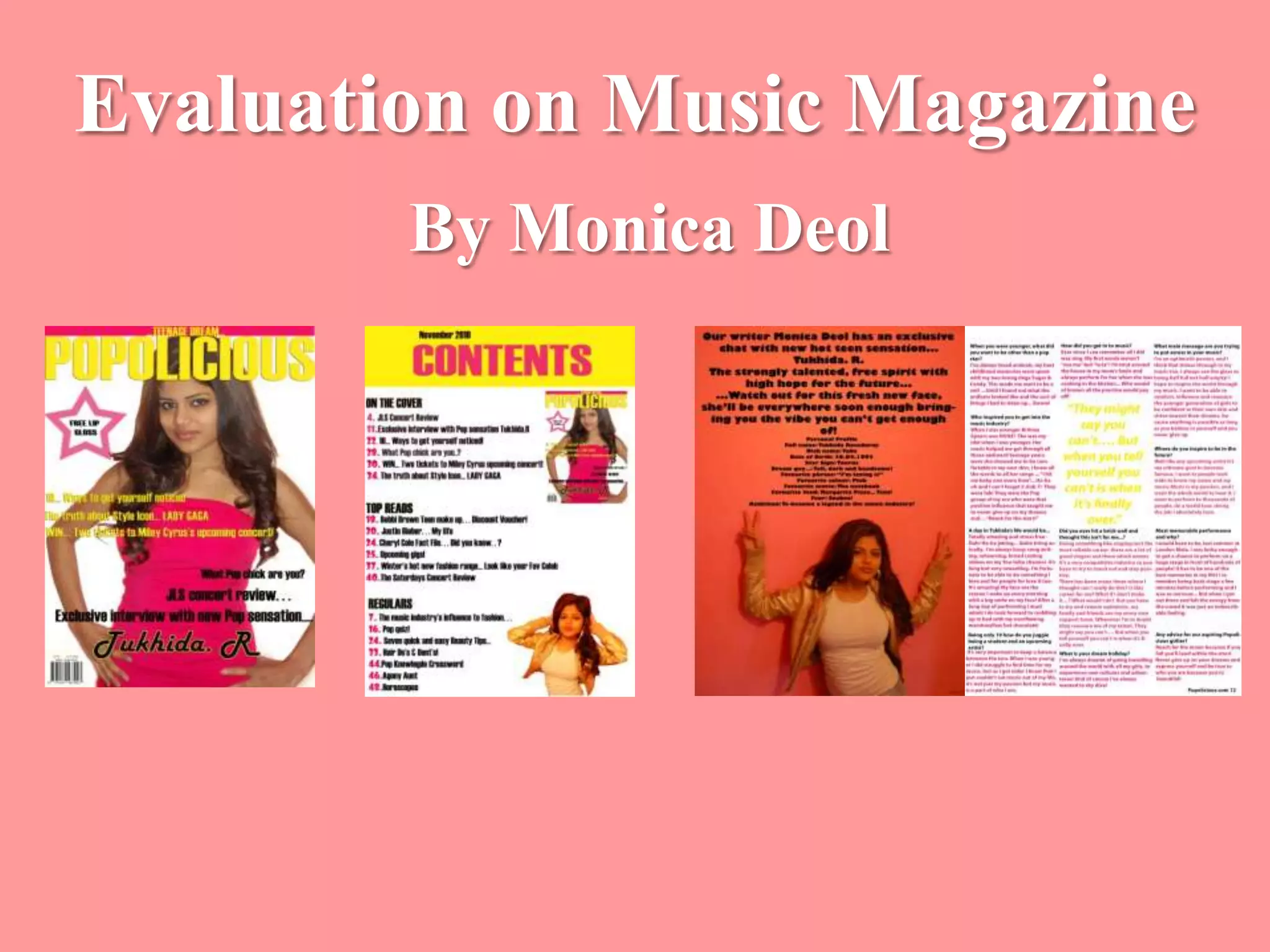
This document summarizes and evaluates the ways in which the author's music magazine project meets conventions of real music magazines. It discusses design elements like the front cover, contents page, and a double page spread interview. For the front cover, the author followed conventions like limited colors, catchy title, and slogans. For the contents page, a single page layout and color scheme was used. The double page spread included a large interviewee image, page numbers, and introduction as is typical in music magazines. Overall, the author demonstrated knowledge of music magazine conventions in layout, design, and information presentation.


![Evaluation[1]](https://cdn.slidesharecdn.com/ss_thumbnails/evaluation1-100510061649-phpapp01-thumbnail.jpg?width=640&height=640&fit=bounds)


