Question 1: In what ways does your media product develop or challenge forms o...
5 magazine front covers
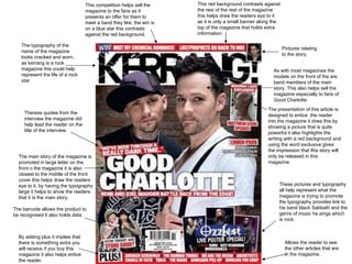
1. The typography of the name of the magazine looks cracked and worn, as kerrang is a rock magazine this could help represent the life of a rock star. This competition helps sell the magazine to the fans as it presents an offer for them to meet a band they like, the win is on a blue star this contrasts against the red background. This red background contrasts against the rest of the rest of the magazine this helps draw the readers eye to it as it is only a small banner along the top of the magazine that holds extra information. By adding plus it implies that there is something extra you will receive if you buy this magazine it also helps entice the reader. These pictures and typography all help represent what the magazine is trying to promote the typography provides link to his band black Sabbath and the genre of music he sings which is rock. The main story of the magazine is promoted in large letter on the front o the magazine it is also closest to the middle of the front cover this helps draw the readers eye to it, by having the typography large it helps to show the readers that it is the main story. As with most magazines the models on the front of the are band members of the main story. This also helps sell the magazine especially to fans of Good Charlotte Therese quotes from the interview the magazine did help lead the reader on the title of the interview. Pictures relating to the story. Allows the reader to see the other articles that are in the magazine. The barcode allows the product to be recognised it also holds data. The presentation of this article is designed to entice the reader into the magazine it does this by showing a picture that is quite powerful it also highlights the writing with a red background and using the word exclusive gives the impression that this story will only be released in this magazine.
2. The masthead of the magazine stands out as the red contrasts against the white of the background it is also a convention of Q magazine alone as it is the same on every magazine. The models are put over the front of the masthead this is a convention of music magazines. As with most magazines the main article is put on the front cover with the largest font this draws in the reader and helps sell the magazine to Take That fans especially Buy using a question such as this and making it stand out against the background not only draws the eye but it make want to read at the article to find the answer This banner at the bottom of the page tell the reader other articles that are in the magazine and the red make it stand out Buy making it a world exclusive it helps sell the magazine as it tells the reader that they can only find out what in this article in this magazine and because its red it stands out. The red that is used in the typography is not only used to make this stand out but it is also part of a colour scheme A barcode is used on all magazines that are produced on a large scale as they help to identity them By using a completely different colour it helps draw the eye also a unique shape also helps draw they eye also an event helps draw the reader to the magazine.
3. Like other magazines it is a convention to the model over the masthead A barcode is used to identify a magazine or product of any sort when they are produced on a large scale The red cross breaks up the list of articles it also draws the eye to it and to the text below which is enlarged this obviously emphasis that this article is important The main article of the magazine is put in large font this draws the readers eye to it also shows that it is the main article this is a convention of magazines By putting the singer of the main article on the front cover it will help sell the magazine especially to fan of Nas this is a convention of magazines Another convention of music magazines are sell lines these help sell the magazines and also give them an identity These red lines break up the text and make them separate rather than making them look like one thing these are conventions of the some magazines as not all do this The model is put in the middle of the front cover this leaves space around the edge cover so that you can fit the articles and barcode around them this is a convention of magazines The red square that out lines the masthead make it standout this gives the magazine an identify At the beginning of each of these article titles the lead is used although it is not an article it is used to draw the eye to the rest of the title
4. Barcode used to identify products that are produced on a large scale The model is put in the middle of the front cover this allows space around the out side of the page so that other articles in the magazine can be seen this is a convention of magazines. The model is put over the top of the masthead this makes them stand out and catch the readers eye which helps sell the magazine this is a convention of magazines. These pictures relate to the articles that they re beside this gives a small insight into the article it also draws they are that then leads to the title of he article being read this is a convention of music magazines although not all magazines use them on all of there issues A free CD helps sell the magazine as it is offering the customer something because it is red it stands out against the colour scheme of blue, white and black this draws the readers eye encouraging them to buy the magazine Using this red sign draws the eye to it this makes you read it and therefore leading your eye to the articles below encouraging to buy it so you can read the articles The masthead is the same with every magazine a never changing this gives the magazine an identity The main article is put on the front cover in the biggest font this is a convention of magazines because the Bob is put vertically it leads the eye to the CD which is a selling point of the magazine also on the right side of the CD the Scene is also put vertically this shows a pattern in the magazine By putting this CD cover on the front of the magazine it helps sell the magazines especially to Bob Dylan fans it can also be used as a selling point The articles along the side of the magazine are bold and eccentric drawing the eye of the customer
5. One hole page is often dedicated to a picture that covers the picture is of the band that the article is about this is a convention of magazines. The article is written in columns and often in small font and the gutters in-between lines is small this allows a large amount of text to be fit into a small area this is a convention of music magazines Highlighted in the red box is the picture credits this tell you who took the photo this is a convention of magazines This drop capital starts of the article also being a large letter draws the eye to the beginning of the article encouraging you to read it this is a convention of magazine and not only music ones The title runs onto the next page in recent music magazines this has become a convention A quote from the article is highlight in blue drawing the readers eye and encouraging them to read the full article This small bit of information is titled encouraging you to read it it is also highlighted in blue to catch the readers eye The colour scheme involves a lot of blue it is used to highlight areas to make them standout as they contrast against the white and black background Extra information of on the side is put in black to contrast against the white of the page The name of this part of the magazine is highlighted in blue drawing your eye towards it letting you know what the section is