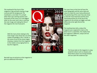
1. The masthead of the front of the
magazine is big and bold creating a huge
contrast with the background, The
masthead is a one letter ‘Q’ a simple
letter that’s eye catching and the main
focal point of the cover as it’s the biggest
letter on the cover and it also is covering
the main image and making the title of
the magazine the main focal point.
With the main article relating to the
main image it also shows the use of the
readers knowledge as the ‘3 words’ is
the name of one of the artists singles
showing a relation from the magazine
to the readers encouraging them to
buy the magazine.
The cover lines on the front all have the
same typography and the same style and
colour to make the cover look professional.
The positioning of the cover lines also show
us that the most important and the more
interesting articles are at the top of the
magazine as the articles are bigger and look
differently to the right third of the
magazine.
The masthead also tells us about the
magazine your supposed to read, as the
letter Q isn’t a used letter, this implies that
the magazine is different, unique and not
like other magazines.
The house style on the magazine is using
powerful colours such as red grey and
black these colours are strong and bold
and can catch the audiences eye.
Barcode issue at and price on the magazine to
give out additional information
2. The mast head has been presented at the top
of the magazine, also with the colours fitted
into the lettering it makes the title stand out
more and becomes a focal point making the
mast head different and unique making it
stand out from other magazines.
The artists name in large lettering doesn’t cover
the main image of beyonces face, with the
lettering being In a different font from the articles
it makes the headline stand out more than others
and will make the readers know the main focus on
what’s inside the magazine.
With the name of a popular venue and with a
sell-out star like beyonces by advertising her
latest performance so fans can get to see
what the performance was like and
information about her and what she has
done.
The main image on the front cover is a medium
close up of a well-known popular star who would be
recognized by anyone with the star looking directly
at you draws the reader into the the magazine and
as the image has been spread over the whole page
it puts a different perspective on the magazine. The
fact that there is no other images on the front it
would mean that the magazine is mainly based on
the star and the lead articles and headline are all
about her.
The cover lines have been
positioned on the left of the
cover to show the main image
more detailed show that it looks
better than the hand getting
covered up. The house style of
the magazine looks as if the
articles and main features are all
in white making a contrast on
the colours used for beyonce
with the different types of fonts
used it puts a different effect on
each other articles showing the
separate articles.
There is a website on the bottom of the
cover as it shows us that the magazine is
legitimate company and if any extra
details are needed then people can find it
there
3. Special Edition:
Because this edition of the magazine is all
about Ibiza and its an Ibiza special then the
house style of the magazine fits in with
holiday sort of vibe. By doing this makes
people excited about the summer and
wondering about the Ibiza life in the
summer. The house style of this magazine
would be all bright summery colours that fit
in with the special edition.
Masthead:
The masthead on the front of the magazine is big
and bold and is different from the sub-headings
and the colours are different than the main title
so that the masthead can become the main focal
point for the magazine.
Subheading and House Style:
The subheading and colours all contrast
with the main masthead title. It also
shows the main focal point towards the
masthead title as all the other bits of
text are in the pink and yellow colour
scheme.
Main image:
The main image on the cover of the
magazine links into the lead article that is
on the page as we know the lead article is
‘cut price Ibiza’ the main image on the
cover will link in with the main heading.
Even though the main image isn’t a wellknown artist it still appeals to the target
audience as it links into the themes of
summer and holidays. This appeals to the
target audience and makes the readers
want to find out more about what's going
on as the main image is sort of mysterious.
Skyline/Tagline:
As the skyline runs across the magazine it
gives us some extra advertisement about the
magazine making us want to purchase it even
more. By adding a skyline saying ‘The worlds
biggest dance music and clubbing magazine’ it
tells the readers that what they’re buying is
the best and they cant get any better than
what they are about to buy.
The left third:
On the left third of the cover page it tells the
feature articles in the magazine and telling us
some of the content before even looking at
the contents page itself. Also by using well
known names on the front of the magazine
makes the magazine itself look better as it
has information about well known artists
which for some people may be one of their
favourites, making sure it fits into the target
audience and the genre of music by adding
these feature articles makes the magazine
looked packed with information and making
what your reading good for what you paid for
it.
Additional Information:
Barcode put on the bottom of the cover to show
the readers the price they pay for the magazine.
Also the issue number and date is on the front
to see whether the magazine is in date or not.