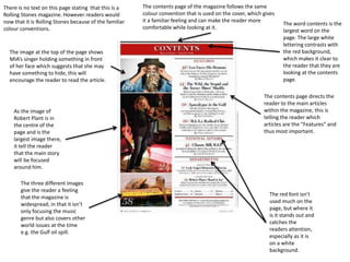
The three different images
give the reader a feeling
that the magazine is
widespread, in that it isn’t
only focusing the music
genre but also covers other
world issues at the time
e.g. the Gulf oil spill.
The word contents is the
largest word on the
page. The large white
lettering contrasts with
the red background,
which makes it clear to
the reader that they are
looking at the contents
page.
As the image of
Robert Plant is in
the centre of the
page and is the
largest image there,
it tell the reader
that the main story
will be focused
around him.
The contents page of the magazine follows the same
colour convention that is used on the cover, which gives
it a familiar feeling and can make the reader more
comfortable while looking at it.
There is no text on this page stating that this is a
Rolling Stones magazine. However readers would
now that it is Rolling Stones because of the familiar
colour conventions.
The red font isn’t
used much on the
page, but where it
is it stands out and
catches the
readers attention,
especially as it is
on a white
background.
The contents page directs the
reader to the main articles
within the magazine, this is
telling the reader which
articles are the “Features” and
thus most important.
The image at the top of the page shows
MIA’s singer holding something in front
of her face which suggests that she may
have something to hide, this will
encourage the reader to read the article.
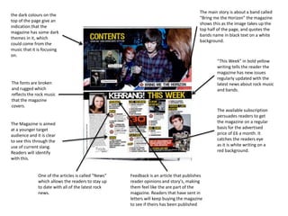
the dark colours on the
top of the page give an
indication that the
magazine has some dark
themes in it, which
could come from the
music that it is focusing
on.
One of the articles is called “News”
which allows the readers to stay up
to date with all of the latest rock
news.
Feedback is an article that publishes
reader opinions and story's, making
them feel like the are part of the
magazine. Readers that have sent in
letters will keep buying the magazine
to see if theirs has been published
The fonts are broken
and rugged which
reflects the rock music
that the magazine
covers.
“This Week” in bold yellow
writing tells the reader the
magazine has new issues
regularly updated with the
latest news about rock music
and bands.
The available subscription
persuades readers to get
the magazine on a regular
basis for the advertised
price of £6 a month. It
catches the readers eye
as it is white writing on a
red background.
The Magazine is aimed
at a younger target
audience and it is clear
to see this through the
use of current slang.
Readers will identify
with this.
The main story is about a band called
“Bring me the Horizon” the magazine
shows this as the image takes up the
top half of the page, and quotes the
bands name in black text on a white
background.
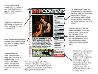
This tells the readers that the
magazine will inform them
when and where their
favourite bands are playing,
or if there are any other
concerts they might be
interested in going to. This
information makes the
magazine seem more in
touch with the music that it
is writing about.
There is a subscription offer at the
bottom in bold yellow writing against a
black background “Subscribe today and
save!” This encourages the reader to buy
the magazine on a regular basis.
We know exactly what
magazine it is as it tells us in
bold rad and white letters
against a black background.
“NME contents”
The contents page uses the
NME colour scheme of red
white and black. This gives
it a familiar feel.
Along the sides are band names
and page numbers which allow
the reader to navigate straight
to the correct page.
The page numbers down the
right hand side of the magazine
are not in order and some of the
are not there. This will
encourage the reader to look
through all of the magazine to
see what articles they may have
missed.
The main cover story is about
the Arctic monkeys. This s clear
to see as it has a large picture
with the words “Arctic
Monkeys” below it together
with the page which is in red
text and directs the reader
quickly to the page the article
starts.
The small paragraph
under the cover story
image gives the reader a
quick overview of the
article. It catches the
readers attention as it
uses a larger font than
most of the text on the
page.

Contents page analysis

  • 1.
    The three differentimages give the reader a feeling that the magazine is widespread, in that it isn’t only focusing the music genre but also covers other world issues at the time e.g. the Gulf oil spill. The word contents is the largest word on the page. The large white lettering contrasts with the red background, which makes it clear to the reader that they are looking at the contents page. As the image of Robert Plant is in the centre of the page and is the largest image there, it tell the reader that the main story will be focused around him. The contents page of the magazine follows the same colour convention that is used on the cover, which gives it a familiar feeling and can make the reader more comfortable while looking at it. There is no text on this page stating that this is a Rolling Stones magazine. However readers would now that it is Rolling Stones because of the familiar colour conventions. The red font isn’t used much on the page, but where it is it stands out and catches the readers attention, especially as it is on a white background. The contents page directs the reader to the main articles within the magazine, this is telling the reader which articles are the “Features” and thus most important. The image at the top of the page shows MIA’s singer holding something in front of her face which suggests that she may have something to hide, this will encourage the reader to read the article.
  • 2.
    the dark colourson the top of the page give an indication that the magazine has some dark themes in it, which could come from the music that it is focusing on. One of the articles is called “News” which allows the readers to stay up to date with all of the latest rock news. Feedback is an article that publishes reader opinions and story's, making them feel like the are part of the magazine. Readers that have sent in letters will keep buying the magazine to see if theirs has been published The fonts are broken and rugged which reflects the rock music that the magazine covers. “This Week” in bold yellow writing tells the reader the magazine has new issues regularly updated with the latest news about rock music and bands. The available subscription persuades readers to get the magazine on a regular basis for the advertised price of £6 a month. It catches the readers eye as it is white writing on a red background. The Magazine is aimed at a younger target audience and it is clear to see this through the use of current slang. Readers will identify with this. The main story is about a band called “Bring me the Horizon” the magazine shows this as the image takes up the top half of the page, and quotes the bands name in black text on a white background.
  • 3.
    This tells thereaders that the magazine will inform them when and where their favourite bands are playing, or if there are any other concerts they might be interested in going to. This information makes the magazine seem more in touch with the music that it is writing about. There is a subscription offer at the bottom in bold yellow writing against a black background “Subscribe today and save!” This encourages the reader to buy the magazine on a regular basis. We know exactly what magazine it is as it tells us in bold rad and white letters against a black background. “NME contents” The contents page uses the NME colour scheme of red white and black. This gives it a familiar feel. Along the sides are band names and page numbers which allow the reader to navigate straight to the correct page. The page numbers down the right hand side of the magazine are not in order and some of the are not there. This will encourage the reader to look through all of the magazine to see what articles they may have missed. The main cover story is about the Arctic monkeys. This s clear to see as it has a large picture with the words “Arctic Monkeys” below it together with the page which is in red text and directs the reader quickly to the page the article starts. The small paragraph under the cover story image gives the reader a quick overview of the article. It catches the readers attention as it uses a larger font than most of the text on the page.