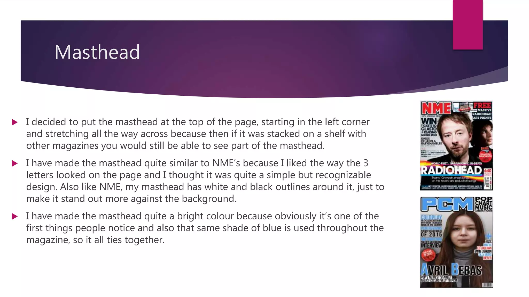
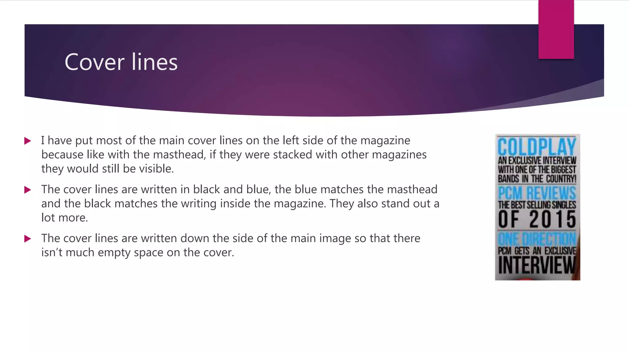
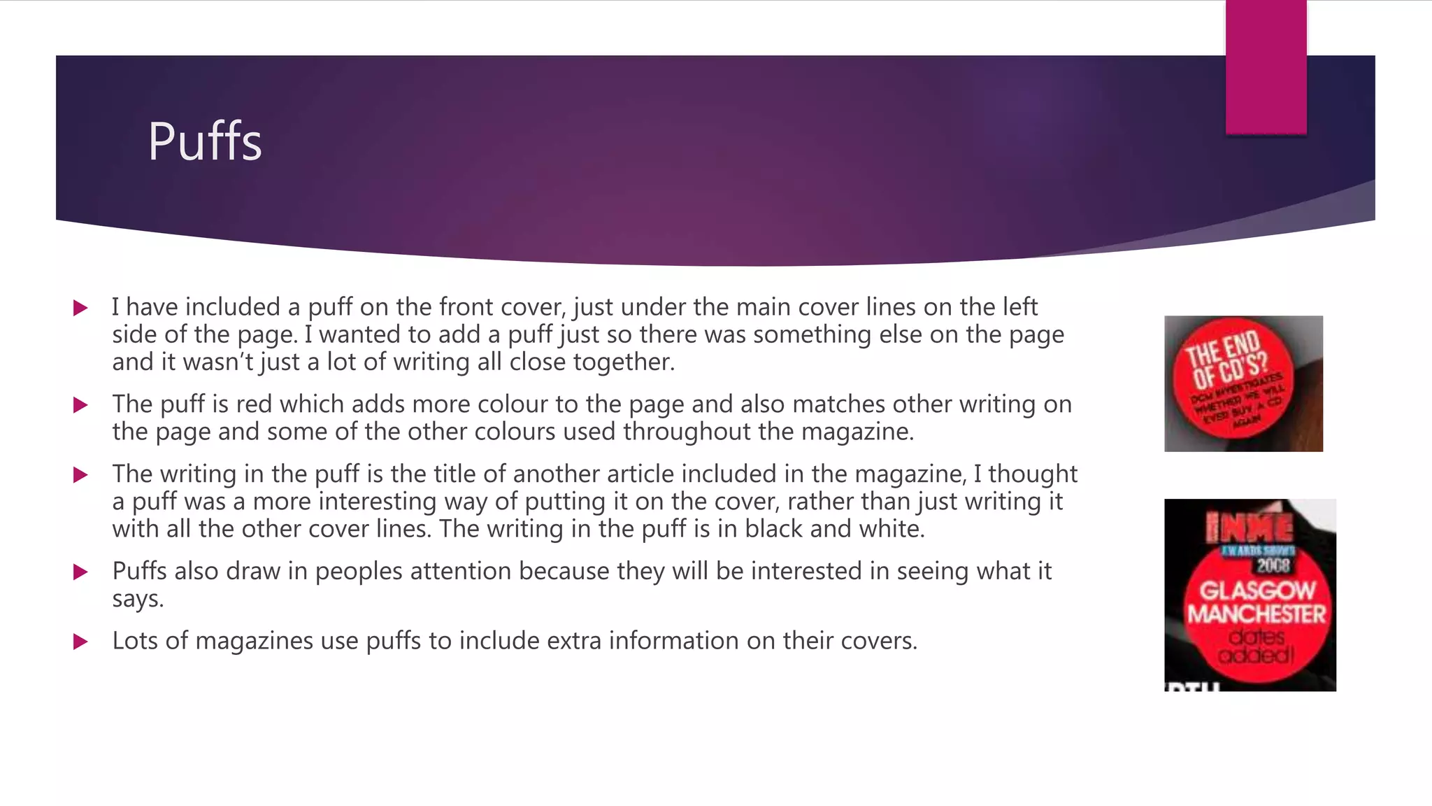
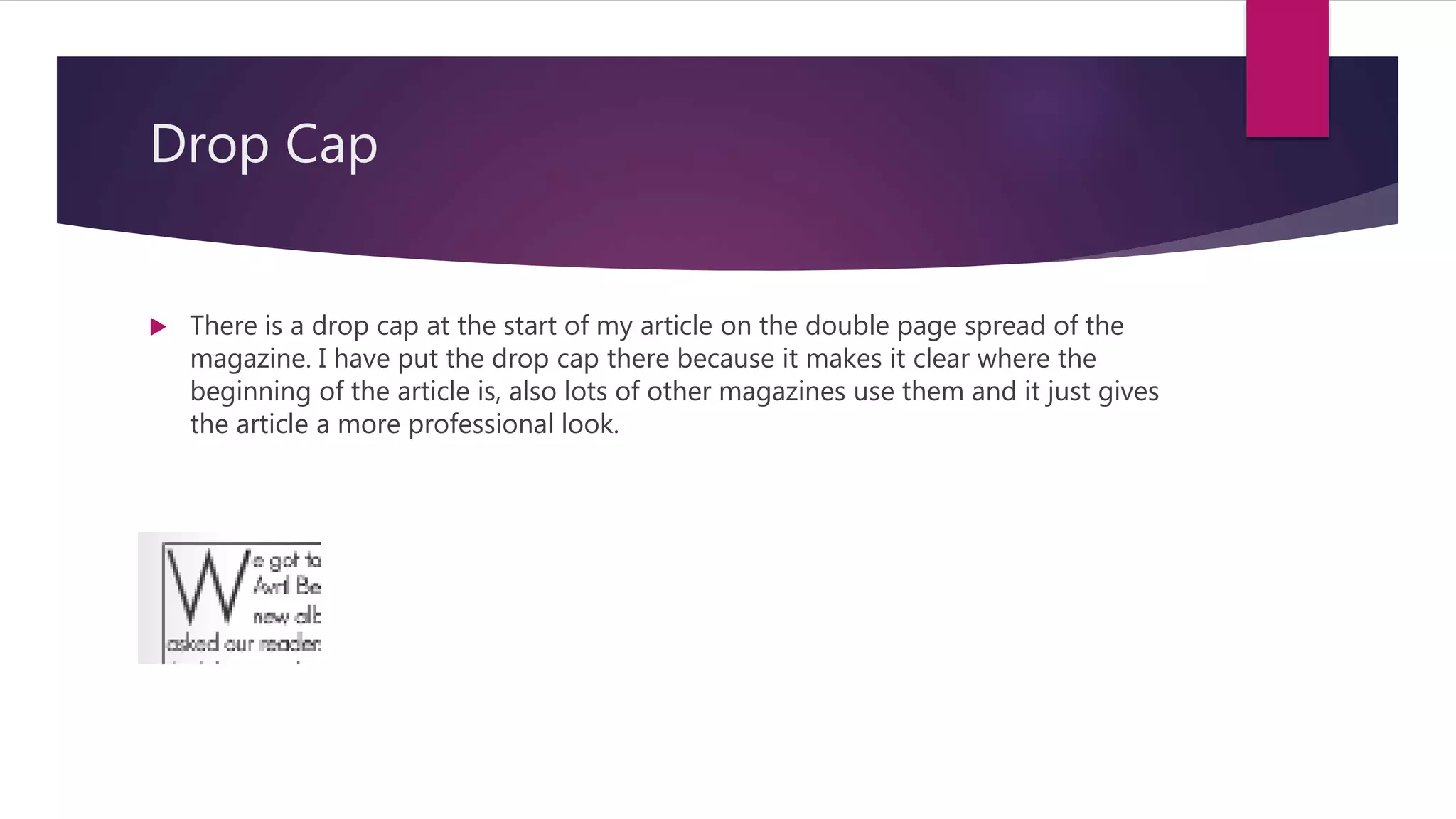
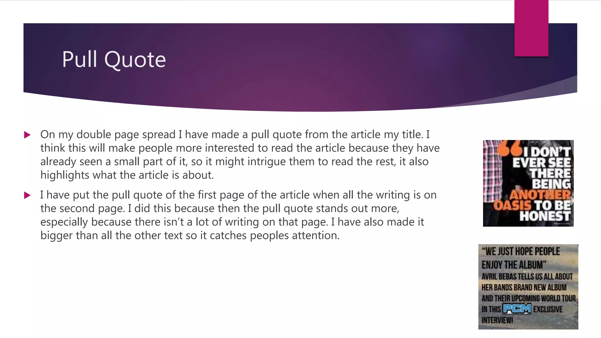
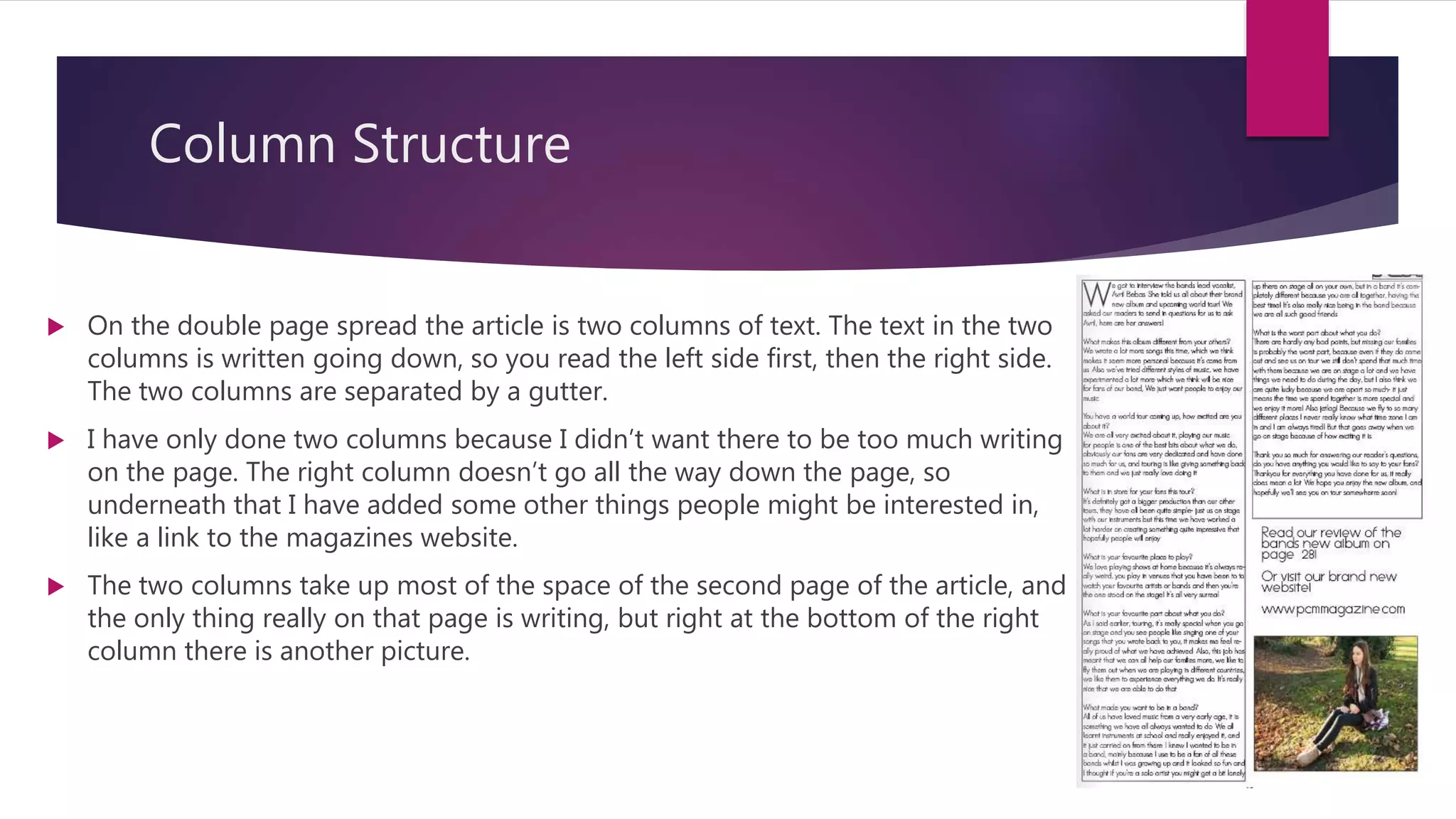
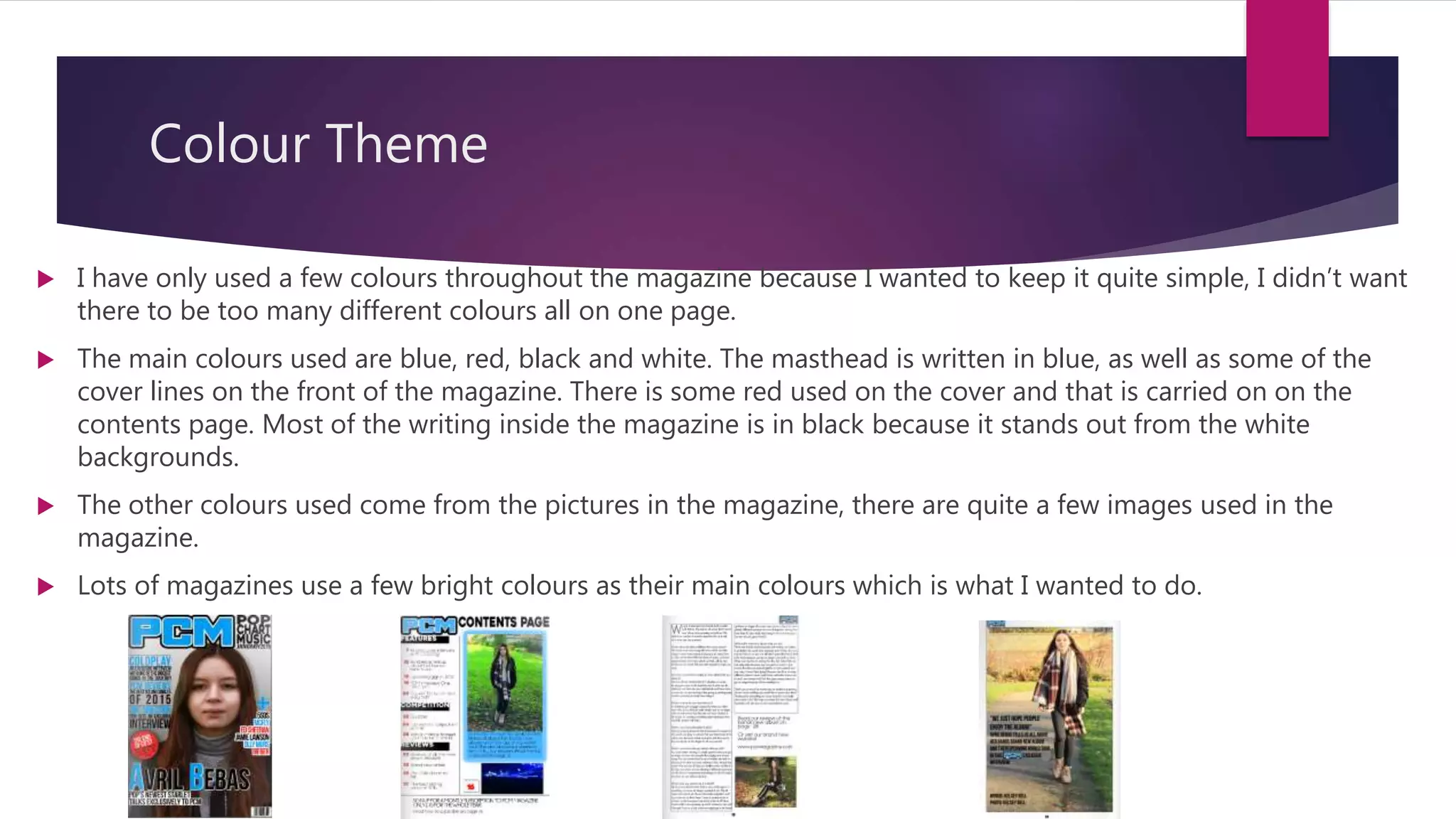
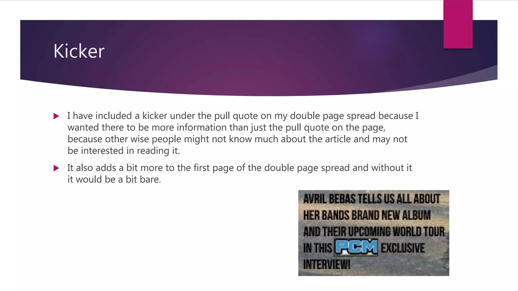
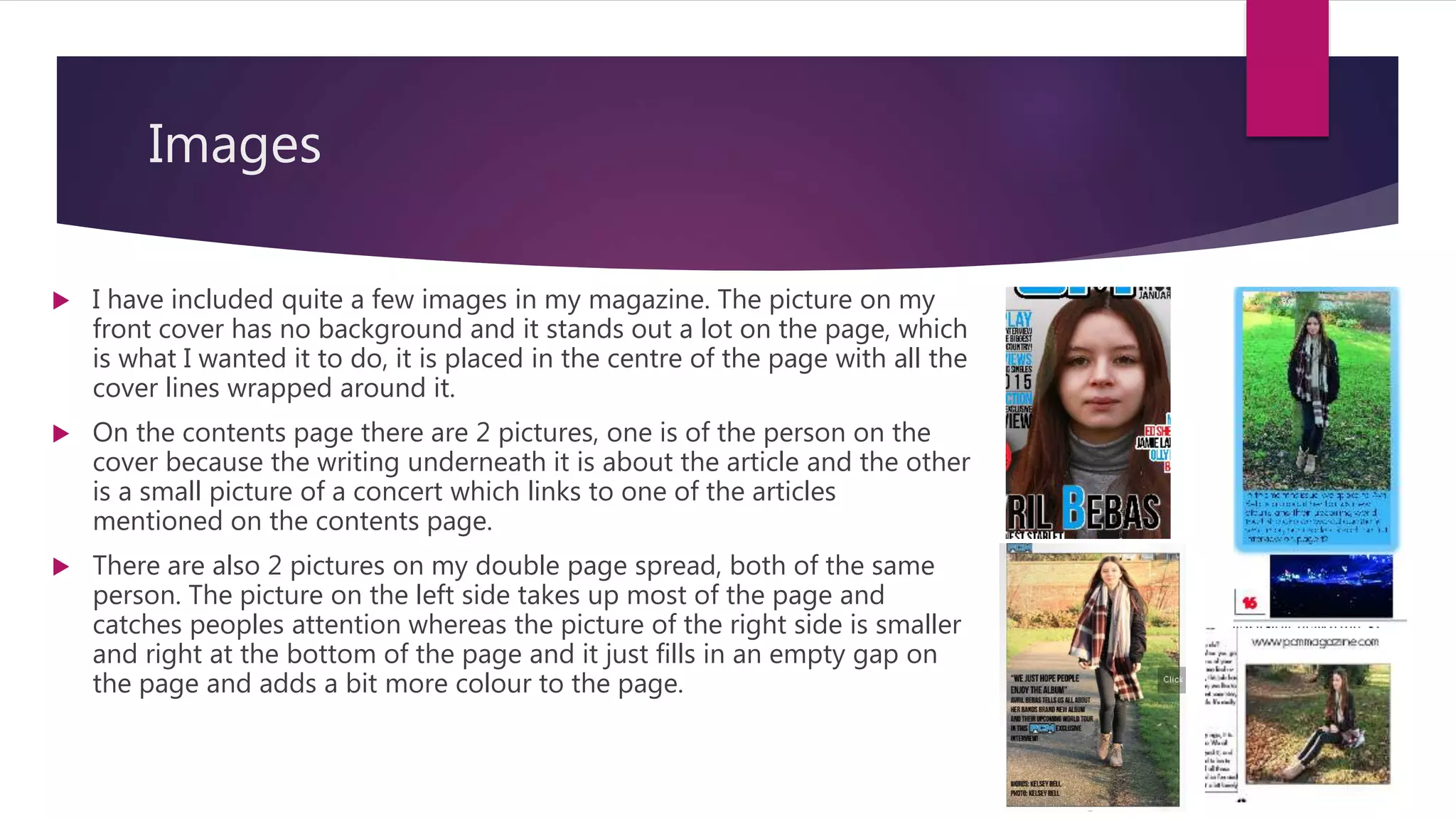
Forms and Conventions
Masthead
 I decided to put the masthead at the top of the page, starting in the left corner
and stretching all the way across because then if it was stacked on a shelf with
other magazines you would still be able to see part of the masthead.
 I have made the masthead quite similar to NME’s because I liked the way the 3
letters looked on the page and I thought it was quite a simple but recognizable
design. Also like NME, my masthead has white and black outlines around it, just to
make it stand out more against the background.
 I have made the masthead quite a bright colour because obviously it’s one of the
first things people notice and also that same shade of blue is used throughout the
magazine, so it all ties together.
Cover lines
 I have put most of the main cover lines on the left side of the magazine
because like with the masthead, if they were stacked with other magazines
they would still be visible.
 The cover lines are written in black and blue, the blue matches the masthead
and the black matches the writing inside the magazine. They also stand out a
lot more.
 The cover lines are written down the side of the main image so that there
isn’t much empty space on the cover.
Puffs
 I have included a puff on the front cover, just under the main cover lines on the left
side of the page. I wanted to add a puff just so there was something else on the page
and it wasn’t just a lot of writing all close together.
 The puff is red which adds more colour to the page and also matches other writing on
the page and some of the other colours used throughout the magazine.
 The writing in the puff is the title of another article included in the magazine, I thought
a puff was a more interesting way of putting it on the cover, rather than just writing it
with all the other cover lines. The writing in the puff is in black and white.
 Puffs also draw in peoples attention because they will be interested in seeing what it
says.
 Lots of magazines use puffs to include extra information on their covers.
Drop Cap
 There is a drop cap at the start of my article on the double page spread of the
magazine. I have put the drop cap there because it makes it clear where the
beginning of the article is, also lots of other magazines use them and it just gives
the article a more professional look.
Pull Quote
 On my double page spread I have made a pull quote from the article my title. I
think this will make people more interested to read the article because they have
already seen a small part of it, so it might intrigue them to read the rest, it also
highlights what the article is about.
 I have put the pull quote of the first page of the article when all the writing is on
the second page. I did this because then the pull quote stands out more,
especially because there isn’t a lot of writing on that page. I have also made it
bigger than all the other text so it catches peoples attention.
Column Structure
 On the double page spread the article is two columns of text. The text in the two
columns is written going down, so you read the left side first, then the right side.
The two columns are separated by a gutter.
 I have only done two columns because I didn’t want there to be too much writing
on the page. The right column doesn’t go all the way down the page, so
underneath that I have added some other things people might be interested in,
like a link to the magazines website.
 The two columns take up most of the space of the second page of the article, and
the only thing really on that page is writing, but right at the bottom of the right
column there is another picture.
Colour Theme
 I have only used a few colours throughout the magazine because I wanted to keep it quite simple, I didn’t want
there to be too many different colours all on one page.
 The main colours used are blue, red, black and white. The masthead is written in blue, as well as some of the
cover lines on the front of the magazine. There is some red used on the cover and that is carried on on the
contents page. Most of the writing inside the magazine is in black because it stands out from the white
backgrounds.
 The other colours used come from the pictures in the magazine, there are quite a few images used in the
magazine.
 Lots of magazines use a few bright colours as their main colours which is what I wanted to do.
Use of white space
 I tried not to leave too much white space in my magazine but the page with the
most white space is the double page spread because I didn’t want it to have too
much writing on it, so I wanted to have some white spaces to break up the writing
a bit.
 There are also some white spaces on the contents page because there is also quite
a lot of writing on that page as well.
Kicker
 I have included a kicker under the pull quote on my double page spread because I
wanted there to be more information than just the pull quote on the page,
because other wise people might not know much about the article and may not
be interested in reading it.
 It also adds a bit more to the first page of the double page spread and without it
it would be a bit bare.
Images
 I have included quite a few images in my magazine. The picture on my
front cover has no background and it stands out a lot on the page, which
is what I wanted it to do, it is placed in the centre of the page with all the
cover lines wrapped around it.
 On the contents page there are 2 pictures, one is of the person on the
cover because the writing underneath it is about the article and the other
is a small picture of a concert which links to one of the articles
mentioned on the contents page.
 There are also 2 pictures on my double page spread, both of the same
person. The picture on the left side takes up most of the page and
catches peoples attention whereas the picture of the right side is smaller
and right at the bottom of the page and it just fills in an empty gap on
the page and adds a bit more colour to the page.

Forms and conventions

  • 1.
  • 2.
    Masthead  I decidedto put the masthead at the top of the page, starting in the left corner and stretching all the way across because then if it was stacked on a shelf with other magazines you would still be able to see part of the masthead.  I have made the masthead quite similar to NME’s because I liked the way the 3 letters looked on the page and I thought it was quite a simple but recognizable design. Also like NME, my masthead has white and black outlines around it, just to make it stand out more against the background.  I have made the masthead quite a bright colour because obviously it’s one of the first things people notice and also that same shade of blue is used throughout the magazine, so it all ties together.
  • 3.
    Cover lines  Ihave put most of the main cover lines on the left side of the magazine because like with the masthead, if they were stacked with other magazines they would still be visible.  The cover lines are written in black and blue, the blue matches the masthead and the black matches the writing inside the magazine. They also stand out a lot more.  The cover lines are written down the side of the main image so that there isn’t much empty space on the cover.
  • 4.
    Puffs  I haveincluded a puff on the front cover, just under the main cover lines on the left side of the page. I wanted to add a puff just so there was something else on the page and it wasn’t just a lot of writing all close together.  The puff is red which adds more colour to the page and also matches other writing on the page and some of the other colours used throughout the magazine.  The writing in the puff is the title of another article included in the magazine, I thought a puff was a more interesting way of putting it on the cover, rather than just writing it with all the other cover lines. The writing in the puff is in black and white.  Puffs also draw in peoples attention because they will be interested in seeing what it says.  Lots of magazines use puffs to include extra information on their covers.
  • 5.
    Drop Cap  Thereis a drop cap at the start of my article on the double page spread of the magazine. I have put the drop cap there because it makes it clear where the beginning of the article is, also lots of other magazines use them and it just gives the article a more professional look.
  • 6.
    Pull Quote  Onmy double page spread I have made a pull quote from the article my title. I think this will make people more interested to read the article because they have already seen a small part of it, so it might intrigue them to read the rest, it also highlights what the article is about.  I have put the pull quote of the first page of the article when all the writing is on the second page. I did this because then the pull quote stands out more, especially because there isn’t a lot of writing on that page. I have also made it bigger than all the other text so it catches peoples attention.
  • 7.
    Column Structure  Onthe double page spread the article is two columns of text. The text in the two columns is written going down, so you read the left side first, then the right side. The two columns are separated by a gutter.  I have only done two columns because I didn’t want there to be too much writing on the page. The right column doesn’t go all the way down the page, so underneath that I have added some other things people might be interested in, like a link to the magazines website.  The two columns take up most of the space of the second page of the article, and the only thing really on that page is writing, but right at the bottom of the right column there is another picture.
  • 8.
    Colour Theme  Ihave only used a few colours throughout the magazine because I wanted to keep it quite simple, I didn’t want there to be too many different colours all on one page.  The main colours used are blue, red, black and white. The masthead is written in blue, as well as some of the cover lines on the front of the magazine. There is some red used on the cover and that is carried on on the contents page. Most of the writing inside the magazine is in black because it stands out from the white backgrounds.  The other colours used come from the pictures in the magazine, there are quite a few images used in the magazine.  Lots of magazines use a few bright colours as their main colours which is what I wanted to do.
  • 9.
    Use of whitespace  I tried not to leave too much white space in my magazine but the page with the most white space is the double page spread because I didn’t want it to have too much writing on it, so I wanted to have some white spaces to break up the writing a bit.  There are also some white spaces on the contents page because there is also quite a lot of writing on that page as well.
  • 10.
    Kicker  I haveincluded a kicker under the pull quote on my double page spread because I wanted there to be more information than just the pull quote on the page, because other wise people might not know much about the article and may not be interested in reading it.  It also adds a bit more to the first page of the double page spread and without it it would be a bit bare.
  • 11.
    Images  I haveincluded quite a few images in my magazine. The picture on my front cover has no background and it stands out a lot on the page, which is what I wanted it to do, it is placed in the centre of the page with all the cover lines wrapped around it.  On the contents page there are 2 pictures, one is of the person on the cover because the writing underneath it is about the article and the other is a small picture of a concert which links to one of the articles mentioned on the contents page.  There are also 2 pictures on my double page spread, both of the same person. The picture on the left side takes up most of the page and catches peoples attention whereas the picture of the right side is smaller and right at the bottom of the page and it just fills in an empty gap on the page and adds a bit more colour to the page.