
Recommended
More Related Content
What's hot
What's hot (20)
Viewers also liked
Viewers also liked (14)
Similar to Screen shots final contents
Similar to Screen shots final contents (20)
Screen shots final contents
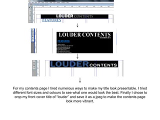
- 1. For my contents page I tired numerous ways to make my title look presentable. I tried different font sizes and colours to see what one would look the best. Finally I chose to crop my front cover title of “louder” and save it as a jpeg to make the contents page look more vibrant.
- 2. I then went onto to add my feature articles I chose the font “times new roman” as I think it is a suitable font for my magazine as is clear and easy to read. I used the blue and the black as this is colour scheme as I wanted it to contrast in with my contents page as this creates effect.
- 3. • I then went on to deciding my background I originally decided black but I then went on to realise that not allot of music magazine contents pages have a black background so I thought the white would be a better option.
- 4. • I changed the blue font to the black and white font as it looked more effective and contrasted with my colour scheme it also looks more indie which is my genre rather than the blue font which looked plain.
- 5. I then changed and moved “gig guide” next to monthly so that the would be more room for pictures
- 6. I then added all the pictures to my contents page with page numbers picture 8 I took at v festival in the summer picture 19 I took at v festival picture 17 I took at Coldplay in Manchester in the Etihad arena I took picture 15 at snow patrol in Liverpool and picture 14 I took at Ellie Golding in Liverpool
- 7. I lastly changed the colour of my headline from blue to black I did this as I thought it looked more neater and stylish and made my contents page look indie.