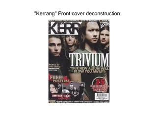
SlideShare a Scribd company logo
1 of 12
"Kerrang" Front cover deconstruction
•   This is a “kerrang's” masthead's font that is used very much
    representative of harsh sound. The text is broken and cracked implying
    it has been shattered by something, that something probably being
    sound. The main singer of the band is located to the front of the text
    and in front of the title, this shows his importance and role in the band.
    There is no real indication to show that this magazine is for a younger
    audience however the advertisement of posters does seem to give the
    indication that its target audience is that of an teenage age. The writing
    “our new album will blow you away” is written on top of all else on the
    text, this makes the words stand out and feel like they are in your face
    ready to “blow you away”. The mail dominated front cover also gives us
    the indication that this magazine is one for males not females. The rule
    of thirds has been used in this front cover, Masthead and characters
    faces (which are giving eye contact to make that connections between
    the user and the magazine itself), then the selling line and then the lure
    located at the
"Metal Hammer" contents
     d
     deconstruction
• The contents of this magazine “metal hammer” does not have a
  unique layout. The page is split in 3 parts. Upper left, upper right
  and bottom. The upper let consists of the contents itself, and
  upper right consist of a segment of information which is there
  persuade to want to look at the pages shown in the contents
  and the lower part of the image is potentially the add
  segmentation of the contents page. The contents page also fits
  the theme of what will be found later ahead and is correlates the
  type of metal to be found. The font of the contents also fits its
  subject and has a metal arty style to it. The main image seen is
  the one of the bottom right, the main point of it is the devil horn
  sign shown by his hand which again relates to the contents of
  the magazine.
"Kerrang" Contents
  deconstruction
• The contents page to the “kerrang” magazine follows a very
  generic layout. A large image on the right with the primary
  information for the contents on the left. The colour scheme for
  this contents page is not as dark as other metal magazines
  contents page, this is because kerrang tend to have a much
  broader audience. The colour scheme is white, black and blue.
  It is primarily white which is seen much morally nicer colour to
  black. This will appeal to a much larger audience. There is also
  blue on the text. This colour has no resemblance to metal so my
  only assumption could be to appeal to that larger audience. The
  text stays true to fitting the metal “scene”. The main image on
  he right is also giving direct eye contact to the user. Engaging
  them like the front cover would do.
"Metal Hammer" contents
     deconstruction
• This “metal hammer” contents page like the last is split into
  three rather than just the generic two. The left is the contents,
  the right are images relating to the contents and the bottom like
  the other metal hammer contents are ads which not only
  promote metal bands etc. but persuade the user further to want
  to look deeper into the magazine. The contents page fits the
  target audience well, it uses an verbal insult image to
  emphasise the musics stereotypical genre which is aggressive.
  It also uses a some what attractive female at the bottom right
  not as as sex appeal but to possibly show that this magazine is
  some what targeted at females also. The contents text font
  remains a metal style, jagged and spiky etc. The colour scheme
  again is white, black and red.
DPS deconstruction "Kerrang"
• This is a double page spread for a kerrang magazine. The first
  major denotation of this double page spread is the colour
  scheme. It is all black and white. This connotes the stereo
  typical genre colours that metal represent of which being dark.
• The images are also very cluttered around the page as opposed
  to being structured like various other non metal magazines. This
  could be to show that this magazine along with its genre of
  music is “different” and unique to others. Under the assumption
  that this magazine is primarily designed for a younger teen
  audience the uniqueness of the magazine should be found more
  appealing to them as often at a teenage age people are looking
  to be different thus this magazine fits the target audience of that.
•   Another point in this double page spread is that most of the images consist of the guitarist,
    Not the drummer. I feel that the reasoning for this is because an electric guitar is mainly
    found in metal genres and rock as a pose to pop, If they showed of the drummer more it
    may give a connection between other genres of music as drums are heard in most genres
    of music which would give the opposite effect of what the magazine wants to en tale,
    uniqueness and would be counter productive for that reason.
•   A basic point about this double page spread is the main article writing is located around the
    outside of the magazine rather than in-between the pictures. This does not necessary
    connote anything but does make it much easier for the reader to read and allows them to
    locate the text almost without having to even search for it, which brings me to the second
    point of the colour of the text being white. It is a complete contrast in colour to its
    background which cause it to stand out.
•   None of the text overlays pages and each section of text remains on either one side or
    another. This improves the ease of use for the reader.
DPS deconstruction "Rock
        Sound"

More Related Content

What's hot (17)

Analysis of Contents Page
Analysis of Contents PageAnalysis of Contents Page
Analysis of Contents Page
 
As 21
As 21As 21
As 21
 
Rocksound analysis
Rocksound analysisRocksound analysis
Rocksound analysis
 
Double page spread analysis
Double page spread analysisDouble page spread analysis
Double page spread analysis
 
Magazine analysis
Magazine analysisMagazine analysis
Magazine analysis
 
Contents page analysis
Contents page analysisContents page analysis
Contents page analysis
 
Evaluation Q1
Evaluation Q1 Evaluation Q1
Evaluation Q1
 
As 21
As 21As 21
As 21
 
Music Magazine Analysis
Music Magazine AnalysisMusic Magazine Analysis
Music Magazine Analysis
 
Evaluation
EvaluationEvaluation
Evaluation
 
Evaluation
EvaluationEvaluation
Evaluation
 
Evaluation
EvaluationEvaluation
Evaluation
 
Music Magazine Analysis
Music Magazine AnalysisMusic Magazine Analysis
Music Magazine Analysis
 
Contents cover analysis
Contents cover analysisContents cover analysis
Contents cover analysis
 
Front cover analysis
Front cover analysisFront cover analysis
Front cover analysis
 
Magazine research
Magazine researchMagazine research
Magazine research
 
Feature Article Analysis
Feature Article AnalysisFeature Article Analysis
Feature Article Analysis
 

Viewers also liked (20)

Find your tribe
Find your tribeFind your tribe
Find your tribe
 
Our characters
Our charactersOur characters
Our characters
 
Horror Trailer Editing Inspirations
Horror Trailer Editing InspirationsHorror Trailer Editing Inspirations
Horror Trailer Editing Inspirations
 
Mongol the rise of genghis khan
Mongol the rise of genghis khanMongol the rise of genghis khan
Mongol the rise of genghis khan
 
Typical conventions of a female fan of indie
Typical conventions of a female fan of indieTypical conventions of a female fan of indie
Typical conventions of a female fan of indie
 
Institution Research
Institution ResearchInstitution Research
Institution Research
 
Image1
Image1Image1
Image1
 
Rockstar
RockstarRockstar
Rockstar
 
Front cover draft idea1
Front cover draft idea1Front cover draft idea1
Front cover draft idea1
 
A2 Media Music Video Evaluation
A2 Media Music Video EvaluationA2 Media Music Video Evaluation
A2 Media Music Video Evaluation
 
Potfolio chatinho
Potfolio chatinhoPotfolio chatinho
Potfolio chatinho
 
Evaluation
EvaluationEvaluation
Evaluation
 
Media q4
Media q4Media q4
Media q4
 
Recce shots
Recce shotsRecce shots
Recce shots
 
Front covers
Front coversFront covers
Front covers
 
9 frames
9 frames9 frames
9 frames
 
Shutter speed
Shutter speedShutter speed
Shutter speed
 
CD Skills development Photoshop
CD Skills development PhotoshopCD Skills development Photoshop
CD Skills development Photoshop
 
Timeline plan
Timeline planTimeline plan
Timeline plan
 
Media Evaluation- Preliminary
Media Evaluation- PreliminaryMedia Evaluation- Preliminary
Media Evaluation- Preliminary
 

Similar to Presentation1

Analysis of Contents Pages
Analysis of Contents PagesAnalysis of Contents Pages
Analysis of Contents Pages
Joannenmbec08
 
Magazine anaylisis
Magazine anaylisisMagazine anaylisis
Magazine anaylisis
sineadjen
 
Magazine anaylisis
Magazine anaylisisMagazine anaylisis
Magazine anaylisis
sineadjen
 
Music Magazine Contents Page Analysis
Music Magazine Contents Page AnalysisMusic Magazine Contents Page Analysis
Music Magazine Contents Page Analysis
Pieter Jollans
 
AS Media Analysis of Music Magazines
AS Media Analysis of Music MagazinesAS Media Analysis of Music Magazines
AS Media Analysis of Music Magazines
IxDooom
 
Music and school Magazine analysis
Music and school Magazine analysisMusic and school Magazine analysis
Music and school Magazine analysis
halimashalim
 
Contents page analysis
Contents page analysisContents page analysis
Contents page analysis
Benjamin Irons
 
Analysing music magazines tasks 1,2,3
Analysing music magazines tasks 1,2,3Analysing music magazines tasks 1,2,3
Analysing music magazines tasks 1,2,3
asmediag13
 
Analysing music magazines tasks 1,2,3
Analysing music magazines tasks 1,2,3Analysing music magazines tasks 1,2,3
Analysing music magazines tasks 1,2,3
asmediag13
 
Doublepage 110303030414-phpapp02
Doublepage 110303030414-phpapp02Doublepage 110303030414-phpapp02
Doublepage 110303030414-phpapp02
Longmark12
 
Music magazine front cover analysis
Music magazine front cover analysisMusic magazine front cover analysis
Music magazine front cover analysis
bj05077281
 
Music Magazine Textual Analysis
Music Magazine Textual AnalysisMusic Magazine Textual Analysis
Music Magazine Textual Analysis
Lennon Riley
 

Similar to Presentation1 (20)

Kerrang Magazine Deconstruction
Kerrang Magazine Deconstruction Kerrang Magazine Deconstruction
Kerrang Magazine Deconstruction
 
Analysis of Contents Pages
Analysis of Contents PagesAnalysis of Contents Pages
Analysis of Contents Pages
 
Evaluation
EvaluationEvaluation
Evaluation
 
Music
MusicMusic
Music
 
Magazine anaylisis
Magazine anaylisisMagazine anaylisis
Magazine anaylisis
 
Magazine anaylisis
Magazine anaylisisMagazine anaylisis
Magazine anaylisis
 
Music Magazine draft
Music Magazine draft Music Magazine draft
Music Magazine draft
 
Music Magazine Contents Page Analysis
Music Magazine Contents Page AnalysisMusic Magazine Contents Page Analysis
Music Magazine Contents Page Analysis
 
AS Media Analysis of Music Magazines
AS Media Analysis of Music MagazinesAS Media Analysis of Music Magazines
AS Media Analysis of Music Magazines
 
Task 2 - Detailed Analysis of Music Magazines
Task 2 - Detailed Analysis of Music MagazinesTask 2 - Detailed Analysis of Music Magazines
Task 2 - Detailed Analysis of Music Magazines
 
Music and school Magazine analysis
Music and school Magazine analysisMusic and school Magazine analysis
Music and school Magazine analysis
 
Contents page analysis
Contents page analysisContents page analysis
Contents page analysis
 
Analysing music magazines tasks 1,2,3
Analysing music magazines tasks 1,2,3Analysing music magazines tasks 1,2,3
Analysing music magazines tasks 1,2,3
 
Analysing music magazines tasks 1,2,3
Analysing music magazines tasks 1,2,3Analysing music magazines tasks 1,2,3
Analysing music magazines tasks 1,2,3
 
Doublepage 110303030414-phpapp02
Doublepage 110303030414-phpapp02Doublepage 110303030414-phpapp02
Doublepage 110303030414-phpapp02
 
Music Magazine Analysis
Music Magazine AnalysisMusic Magazine Analysis
Music Magazine Analysis
 
Music magazine front cover analysis
Music magazine front cover analysisMusic magazine front cover analysis
Music magazine front cover analysis
 
Music Magazine Textual Analysis
Music Magazine Textual AnalysisMusic Magazine Textual Analysis
Music Magazine Textual Analysis
 
Metal Hammer Magazine Analysis
Metal Hammer Magazine AnalysisMetal Hammer Magazine Analysis
Metal Hammer Magazine Analysis
 
DPS 1
DPS 1DPS 1
DPS 1
 

Recently uploaded

Architecting Cloud Native Applications
Architecting Cloud Native ApplicationsArchitecting Cloud Native Applications
Architecting Cloud Native Applications
WSO2
 
Cloud Frontiers: A Deep Dive into Serverless Spatial Data and FME
Cloud Frontiers:  A Deep Dive into Serverless Spatial Data and FMECloud Frontiers:  A Deep Dive into Serverless Spatial Data and FME
Cloud Frontiers: A Deep Dive into Serverless Spatial Data and FME
Safe Software
 
Why Teams call analytics are critical to your entire business
Why Teams call analytics are critical to your entire businessWhy Teams call analytics are critical to your entire business
Why Teams call analytics are critical to your entire business
panagenda
 

Recently uploaded (20)

Platformless Horizons for Digital Adaptability
Platformless Horizons for Digital AdaptabilityPlatformless Horizons for Digital Adaptability
Platformless Horizons for Digital Adaptability
 
Six Myths about Ontologies: The Basics of Formal Ontology
Six Myths about Ontologies: The Basics of Formal OntologySix Myths about Ontologies: The Basics of Formal Ontology
Six Myths about Ontologies: The Basics of Formal Ontology
 
How to Troubleshoot Apps for the Modern Connected Worker
How to Troubleshoot Apps for the Modern Connected WorkerHow to Troubleshoot Apps for the Modern Connected Worker
How to Troubleshoot Apps for the Modern Connected Worker
 
Architecting Cloud Native Applications
Architecting Cloud Native ApplicationsArchitecting Cloud Native Applications
Architecting Cloud Native Applications
 
Apidays New York 2024 - Scaling API-first by Ian Reasor and Radu Cotescu, Adobe
Apidays New York 2024 - Scaling API-first by Ian Reasor and Radu Cotescu, AdobeApidays New York 2024 - Scaling API-first by Ian Reasor and Radu Cotescu, Adobe
Apidays New York 2024 - Scaling API-first by Ian Reasor and Radu Cotescu, Adobe
 
Exploring Multimodal Embeddings with Milvus
Exploring Multimodal Embeddings with MilvusExploring Multimodal Embeddings with Milvus
Exploring Multimodal Embeddings with Milvus
 
Corporate and higher education May webinar.pptx
Corporate and higher education May webinar.pptxCorporate and higher education May webinar.pptx
Corporate and higher education May webinar.pptx
 
TrustArc Webinar - Unlock the Power of AI-Driven Data Discovery
TrustArc Webinar - Unlock the Power of AI-Driven Data DiscoveryTrustArc Webinar - Unlock the Power of AI-Driven Data Discovery
TrustArc Webinar - Unlock the Power of AI-Driven Data Discovery
 
Biography Of Angeliki Cooney | Senior Vice President Life Sciences | Albany, ...
Biography Of Angeliki Cooney | Senior Vice President Life Sciences | Albany, ...Biography Of Angeliki Cooney | Senior Vice President Life Sciences | Albany, ...
Biography Of Angeliki Cooney | Senior Vice President Life Sciences | Albany, ...
 
Understanding the FAA Part 107 License ..
Understanding the FAA Part 107 License ..Understanding the FAA Part 107 License ..
Understanding the FAA Part 107 License ..
 
Artificial Intelligence Chap.5 : Uncertainty
Artificial Intelligence Chap.5 : UncertaintyArtificial Intelligence Chap.5 : Uncertainty
Artificial Intelligence Chap.5 : Uncertainty
 
Web Form Automation for Bonterra Impact Management (fka Social Solutions Apri...
Web Form Automation for Bonterra Impact Management (fka Social Solutions Apri...Web Form Automation for Bonterra Impact Management (fka Social Solutions Apri...
Web Form Automation for Bonterra Impact Management (fka Social Solutions Apri...
 
Cloud Frontiers: A Deep Dive into Serverless Spatial Data and FME
Cloud Frontiers:  A Deep Dive into Serverless Spatial Data and FMECloud Frontiers:  A Deep Dive into Serverless Spatial Data and FME
Cloud Frontiers: A Deep Dive into Serverless Spatial Data and FME
 
CNIC Information System with Pakdata Cf In Pakistan
CNIC Information System with Pakdata Cf In PakistanCNIC Information System with Pakdata Cf In Pakistan
CNIC Information System with Pakdata Cf In Pakistan
 
presentation ICT roal in 21st century education
presentation ICT roal in 21st century educationpresentation ICT roal in 21st century education
presentation ICT roal in 21st century education
 
EMPOWERMENT TECHNOLOGY GRADE 11 QUARTER 2 REVIEWER
EMPOWERMENT TECHNOLOGY GRADE 11 QUARTER 2 REVIEWEREMPOWERMENT TECHNOLOGY GRADE 11 QUARTER 2 REVIEWER
EMPOWERMENT TECHNOLOGY GRADE 11 QUARTER 2 REVIEWER
 
Strategize a Smooth Tenant-to-tenant Migration and Copilot Takeoff
Strategize a Smooth Tenant-to-tenant Migration and Copilot TakeoffStrategize a Smooth Tenant-to-tenant Migration and Copilot Takeoff
Strategize a Smooth Tenant-to-tenant Migration and Copilot Takeoff
 
Why Teams call analytics are critical to your entire business
Why Teams call analytics are critical to your entire businessWhy Teams call analytics are critical to your entire business
Why Teams call analytics are critical to your entire business
 
Apidays New York 2024 - APIs in 2030: The Risk of Technological Sleepwalk by ...
Apidays New York 2024 - APIs in 2030: The Risk of Technological Sleepwalk by ...Apidays New York 2024 - APIs in 2030: The Risk of Technological Sleepwalk by ...
Apidays New York 2024 - APIs in 2030: The Risk of Technological Sleepwalk by ...
 
FWD Group - Insurer Innovation Award 2024
FWD Group - Insurer Innovation Award 2024FWD Group - Insurer Innovation Award 2024
FWD Group - Insurer Innovation Award 2024
 

Presentation1

  • 1. "Kerrang" Front cover deconstruction
  • 2. This is a “kerrang's” masthead's font that is used very much representative of harsh sound. The text is broken and cracked implying it has been shattered by something, that something probably being sound. The main singer of the band is located to the front of the text and in front of the title, this shows his importance and role in the band. There is no real indication to show that this magazine is for a younger audience however the advertisement of posters does seem to give the indication that its target audience is that of an teenage age. The writing “our new album will blow you away” is written on top of all else on the text, this makes the words stand out and feel like they are in your face ready to “blow you away”. The mail dominated front cover also gives us the indication that this magazine is one for males not females. The rule of thirds has been used in this front cover, Masthead and characters faces (which are giving eye contact to make that connections between the user and the magazine itself), then the selling line and then the lure located at the
  • 3. "Metal Hammer" contents d deconstruction
  • 4. • The contents of this magazine “metal hammer” does not have a unique layout. The page is split in 3 parts. Upper left, upper right and bottom. The upper let consists of the contents itself, and upper right consist of a segment of information which is there persuade to want to look at the pages shown in the contents and the lower part of the image is potentially the add segmentation of the contents page. The contents page also fits the theme of what will be found later ahead and is correlates the type of metal to be found. The font of the contents also fits its subject and has a metal arty style to it. The main image seen is the one of the bottom right, the main point of it is the devil horn sign shown by his hand which again relates to the contents of the magazine.
  • 5. "Kerrang" Contents deconstruction
  • 6. • The contents page to the “kerrang” magazine follows a very generic layout. A large image on the right with the primary information for the contents on the left. The colour scheme for this contents page is not as dark as other metal magazines contents page, this is because kerrang tend to have a much broader audience. The colour scheme is white, black and blue. It is primarily white which is seen much morally nicer colour to black. This will appeal to a much larger audience. There is also blue on the text. This colour has no resemblance to metal so my only assumption could be to appeal to that larger audience. The text stays true to fitting the metal “scene”. The main image on he right is also giving direct eye contact to the user. Engaging them like the front cover would do.
  • 7. "Metal Hammer" contents deconstruction
  • 8. • This “metal hammer” contents page like the last is split into three rather than just the generic two. The left is the contents, the right are images relating to the contents and the bottom like the other metal hammer contents are ads which not only promote metal bands etc. but persuade the user further to want to look deeper into the magazine. The contents page fits the target audience well, it uses an verbal insult image to emphasise the musics stereotypical genre which is aggressive. It also uses a some what attractive female at the bottom right not as as sex appeal but to possibly show that this magazine is some what targeted at females also. The contents text font remains a metal style, jagged and spiky etc. The colour scheme again is white, black and red.
  • 10. • This is a double page spread for a kerrang magazine. The first major denotation of this double page spread is the colour scheme. It is all black and white. This connotes the stereo typical genre colours that metal represent of which being dark. • The images are also very cluttered around the page as opposed to being structured like various other non metal magazines. This could be to show that this magazine along with its genre of music is “different” and unique to others. Under the assumption that this magazine is primarily designed for a younger teen audience the uniqueness of the magazine should be found more appealing to them as often at a teenage age people are looking to be different thus this magazine fits the target audience of that.
  • 11. Another point in this double page spread is that most of the images consist of the guitarist, Not the drummer. I feel that the reasoning for this is because an electric guitar is mainly found in metal genres and rock as a pose to pop, If they showed of the drummer more it may give a connection between other genres of music as drums are heard in most genres of music which would give the opposite effect of what the magazine wants to en tale, uniqueness and would be counter productive for that reason. • A basic point about this double page spread is the main article writing is located around the outside of the magazine rather than in-between the pictures. This does not necessary connote anything but does make it much easier for the reader to read and allows them to locate the text almost without having to even search for it, which brings me to the second point of the colour of the text being white. It is a complete contrast in colour to its background which cause it to stand out. • None of the text overlays pages and each section of text remains on either one side or another. This improves the ease of use for the reader.