Double page spread analysis
•Download as DOCX, PDF•
0 likes•243 views

This document summarizes and analyzes the layout, design, and content of different magazine double-page spreads (DPS). It discusses DPS from magazines like Mojo, Metal Hammer, Kerrang!, NME, and Q Magazine. Key points made include how the design of each DPS conveys the genre of music covered by the magazine (e.g. black background and gothic font for Mojo, blood splatter for Metal Hammer). Specific design elements like drop caps, images, fonts, and callouts are examined in terms of how they draw in readers and highlight important information.

Recommended
More Related Content
What's hot
What's hot (19)
Viewers also liked
Similar to Double page spread analysis
Similar to Double page spread analysis (20)
More from Benjamin Irons
More from Benjamin Irons (20)
Double page spread analysis
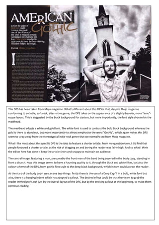
- 1. This DPS has been taken from Mojo magazine. What's different about this DPS is that, despite Mojo magazine conforming to an indie, soft-rock, alternative genre, the DPS takes on the appearance of a slightly heavier, more "emo"- esque layout. This is suggested by the black background for starters, but more importantly, the font style chosen for the masthead. The masthead adopts a white and gold font. The white font is used to contrast the bold black background whereas the gold is there to stand out, but more importantly to almost emphasise the word "Gothic", which again makes this DPS seem to stray away from the stereotypical indie-rock genre that we normally see from Mojo magazine. What I like most about this specific DPS is the idea to feature a shorter article. From my questionnaire, I did find that people favoured a shorter article, as the risk of dragging on and boring the reader was fairly high. And so what I think the editor here has done is keep the article short and snappy to maintain an audience. The central image, featuring a man, presumably the front man of the band being covered in the body copy, standing in front a church. Now this image seems to have a haunting quality to it, through the black and white filter, but also the colour scheme of the DPS, from gothic font style to the deep black background, which in turn could attract the reader. At the start of the body copy, we can see two things: firstly there is the use of a Drop Cap 'I' in a bold, white font but also, there is a hanging indent which has adopted a callout. The desired effect could be that they want to grab the reader immediately, not just by the overall layout of the DPS, but by the enticing callout at the beginning, to make them continue reading.
- 2. For Q magazine, we can see a very different approach to a DPS. Firstly, there aren't the mass amount of images that we see from Kerrang! and Metal Hammer, instead, there is just the one large image, much like the NME DPS. As we already know, Q magazine conforms to the same music genre as NME (easy listening, indie, rock) and so the colour adopted here is soft, simplistic and consistent, through the use of the black and white appearance, which is contrasted heavily by the large red 'L' that runs through the middle of the body copy. Moreover, the central image stands out as we can see a popular artist being portrayed half naked. This can attract audiences as it is quite abstract and captivating. The body copy is in a small black font to stand out amongst the white background. At the start of two of the paragraphs in the body copy, we can see use of Drop Cap 'S' and 'I' to signify the start of a new paragraph. This can also suggest that these two paragraphs are more important than the others as they feel the need to capitalise the beginning letter.
- 3. This is a DPS taken from Metal Hammer magazine. We can automatically judge that this has been taken from a metal magazine, just by looking at the masthead design. The font is white on a black background, which is actually a metal case for a pedal effects board, used to change the effect on an electric guitar, which thus has connotations of rock, metal music etc. Also, the white is used to stand out from the black on the case, but also, to show clearly, the blood splattered pattern which has been adopted. This immediately sends out messages of death, blood, murder, anger etc. which all conform to the aggressive stereotype that Metal Hammer adopt. The masthead itself reads, "The Art Of Shredding". The use of the word, "Shredding", connotes an aggressive nature, referencing a specific style of playing guitar, so again, just by looking at the masthead and what it represents, we know it is a metal magazine. There are various graphic features around the DPS to anchor the main subject of playing guitar violently. In the body copy, we are told how playing guitar is becoming a revolutionary way to live your life, simply by looking at the pull quote, "Playing metal is a passion, it becomes your whole life". The words "metal" and "passion" are highlighted in a blood red to stand out amongst the rest of the black text. The reason being is because, they want to persuade readers to become ultimately influenced by metal, persuading them not only to subscribe to the magazine brand, but also to make metal music a priority in life. The body copy is black, to stand out amongst the white background. The white background has been used to make everything in the DPS stand out clearly to create an energetic mood. The titles of each paragraph are highlighted in red to signify the start of a new section in the main article. Also, at the start of the body copy, on the left hand side, below the masthead, there is a Drop Cap 'F' to signify the start of the article.
- 4. This Kerrang! DPS, talks about My Chemical Romance on their new album. The layout of the page is centred around the central image, which here acts as the main background. The central image has adopted a black and white filter to conform to the darker, heavier, rockier appearance that Kerrang! is known for. The masthead of the article uses a callout, "We're being the best MCR we can be!". The callout uses the consistent, red and white font. The white, more prominent colour has been used to emphasise the words "The Best MCR" to grab the reader, more so than the red areas of the masthead, to highlight importance and excitability. Above the main figure in the central image (top left corner), we have the buzz words, "World Exclusive", suggesting that this is the only magazine to cover this story, almost informing the reader that they won't find this article anywhere else. Surrounding the central image, we have other graphic features, which depict the other band members working in a recording studio, recording songs for their new album. We are able to establish this idea, simply by the connotations from the masthead and central image. The graphic features are also anchored down by the body copy (main text), which is in a white font, to stand out amongst the black background. At the start of the body copy, there is a Drop Cap, to signify the start of the main paragraph.
- 5. This is a double page spread about the Blur reunion. The two things that grab us immediately are obviously the large central image on the left side, and the callout in the top right, in a large, bold, black font to stand out amongst the white background. The central image is anchored by the body copy and the callout. The dull colours of the DPS conform the indie, simplistic, un-excitable colour scheme that NME mainly stick to. However, the central image brings the page to life by being so big. Also with the callout, shocking words have been used, such as, "Orgies, Vomiting and Vicodin", to capture the reader's attention. The editor has slanted the story for this magazine, because the main audience for NME are indie, rocky, easy listeners and so this particular article talks about a band that fits those fields of music, Blur. On the right hand side of the page, on the bottom, middle area of the body copy, we can see a Drops Cap (Bold, capitalised 'G'). This can suggest that this specific paragraph should stand out amongst the other areas of the main text, because it has a greater value of importance to the main subject of the article, in this case the Blur reunion.