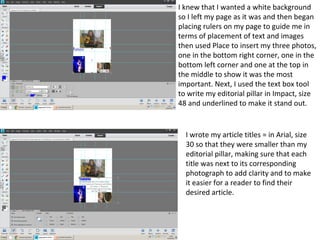
Download to read offline

The document describes the process of laying out a magazine page in a design program. The creator placed rulers as guides and inserted three photos - one large photo in the middle at the top and two smaller photos in the bottom corners. Text was added including a large editorial pillar, smaller article titles positioned next to the photos, and a masthead logo. Grey text was used to match the cover design and add uniformity. A large underlined 'Contents' heading was also added to link to the editorial pillar and identify the page.


