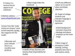
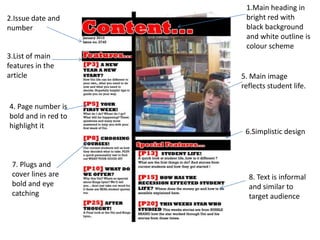
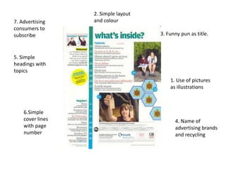
SlideShare a Scribd company logo
1 of 19
Magazine Analysis

        By
    Dan Martin
9. Colour is a                1.Main image hides the       2.Puff uses different
  neutral lime to               masthead                     colour so it is out of
  appeal to all                                              place and draws
  audiences                                                  attention

                                                             10. Target of college
5.Website address:                                           students and
www.collegelifestyle.com                                     indicates language is
                                                             friendly and
                                                             optimistic
3.Cover lines like ‘make
money on campus’ seem                                         6.Dark background
to lean towards a guide                                       connotes masculine
like magazine for the                                         ideology and places
reader                                                        emphasis on the main
                                                              image

    4.Barcode and
    price indicate                                           7.Main image of
    that it is a                                             young guy in dark
    monthly issue                                            clothing, smiling,
    $4.99 US               8. Books of law, business and     jewellery item ties in
                           society show responsibility for   with skyline article.
                           studies
1. The main image hides part of the title which implies
   consumer loyalty as the audience can identify the
   masthead without seeing all of it.
2. The colour of the puff about paintballing is in a
   completely different colour scheme to the rest of the
   magazine cover which grabs the attention to it and
   also reflects the paint of paintballing that the puff
   mentions.
3. The cover lines use titles such as ‘make money on
   campus’ which show it is a guide to how to live on
   campus, as American college is like a university.
4. The high price of $4.99 connotes a monthly issue and
   that the magazine is a good quality to have such a high
   price. Plus shows international success as they also
   sell copies in Canada.
5. The online address is used to get their target
demographic online and maybe include digital copies as
the younger generation are more technological savvy.
6.The dark background places emphasis on the main
image as there is not much to draw your attention away
from it. It is also a cliché colour as most male images are
dark to reflect a tragic hero of mysterious which indicates
a more male dominant approach and maybe target
audience.
7.The main image is of a young male wearing dark
clothing and a chain which shows a stereotype of what
the male should be and attractive to get female audiences
engaged with the magazine. The clothing reflects the
fashion and jewellery reflects the skyline story.
8. The books symbolise wisdom and responsibility, the
title of the books are law, business and society
symbolise, which shows that students take their
subjects seriously and are not the careless stereotype.
9. The colour of the titles are lime and therefore are a
neutral colour in order to appeal to both genders and
the mass market.
10. The pull quotes, such as ‘thank god it’s Friday’ and
‘the ultimate spring break escape’ are friendly and
optimistic for the audience if they need help of
escapism. It attempts similar language to appeal to
their target demographic and to seem a similar age
for the audience to relate to and understand.
1.Masthead is big
bold and in a dark
blue
                      5.Issue 11 fall
                      indicates monthly
2.Pull quote of       magazine and D.C
articles inside the   edition shows
magazine suited for   specific location
target audience


                       6.Main image of
 3.Main colours        young male in
 are dark blue         dark clothing and
 and wax yellow        stylish jewellery


                      7. Text is similar
 4.Use of buzz word   and associated
 ‘exclusive’          with their
                      audience
1. The masthead is in a big bold font to be eye-
   catching and the dark blue colour reflects a male
   audience
2. The pull quotes and plugs like ‘I slept with my
   professor’ maybe more suited to the target
   audience of college students as it is interesting and
   scandalous. Also other stories which affects the
   lives around them.
3. Main colour scheme is dark blue and wax yellow
   which are stereotypical colours for males as wax
   yellow is used in male sports.
4. Buzz word ‘exclusive’ intrigues the audience and
   makes the story unique to the magazine.
5. ‘issue 11 fall 2011’ indicates that it is a monthly
issue and the ‘D.C edition’ connotes that the
particular issue is specific to Washington DC which
may imply altering it to suit this specific region.
6. The main image is of a young male wearing dark
clothing and a chain which shows a stereotype of
what the male should be and attractive to get female
audiences engaged with the magazine. The clothing
reflects and jewellery may reflect current trends and
fashions.
6. Text like ‘411’ implies an attempt to use similar
language of their target audience which they can
associate with.
6.Headings that have main articles
1.Title which is      show opinions in magazine               5.Head hides part
identifiable with                                             of the title.
the reader big
bold red colour


7.Plain                                                     4. Light blue text used
background to                                               in a fun font
keep focus on
main image and
cover lines

8.Main image is of                                            3.Cover lines suited
young male in a                                               to target audience
smart suit but                                                as they are fun and
wearing trainers.                                             helpful


9.Slogan at the                                            2.Sept 2010 shows
bottom of the page                                         that it is a monthly
makes it seem best                                         issue.
suited for audience
1. Big bold red title to catch the audiences
   attention, also identifiable with the target
   audience as they are most likely in university. The
   colours scheme is red and blue which is suitable to
   both genders and appealing to the mass market.
2. The use of the ‘Sep 2010’ connotes to a monthly
   issue.
3. Cover lines, such as ‘fashion on 40 dollars’ and
   ‘Sexercise’ are fun and helpful to the audience as it
   is about that effects them in their lives and
   provides escapism from the real world.
4. Text is in a light blue and in a fun text which reflect
   the fun, young and energetic qualities of youth
5. The main image hides part of the title which
implies consumer loyalty as the audience can identify
the masthead without seeing all of it.
6. Cover lines at the top show main articles ‘Goo Goo
Dolls: great since 1986’ which also uses their opinions
which may connote that the audience hold the
magazine’s opinions as important and key.
7. The background is plain white as to place emphasis
on the main image and on the cover lines. To keep
attention on that and not for the audience to get
distracted.
8. The main image is of a young male in a suit which
symbolises many thing from responsibility to wealth
and money. From smart and Sauvé to
cool, professional and business like. However the
male is wearing trainers which reveal his young age
and that reflects us going out in the world but still
remaining young. It also reflect the article with it
‘fashion on 40 dollars’
9. The slogan at the bottom ‘For college students by
college students’ imply that they are the same as their
target demographic and more reliable/trustworthy
sources so they audience should buy the magazine as
it is better than any other college magazine.
1.Main heading in
2.Issue date and      bright red with
number                black background
                      and white outline is
                      colour scheme
3.List of main
features in the
article              5. Main image
                     reflects student life.

4. Page number is
bold and in red to
highlight it
                      6.Simplistic design


 7. Plugs and
 cover lines are       8. Text is informal
 bold and eye          and similar to
 catching              target audience
1. The main title is in a bright red in bold which is
   eye-catching and simple. The colour scheme is red,
   white and black which seem like neutral colours
   but the way the magazine is presented seems to be
   more leaning towards the male demographic
2. Issue date and number, are just there to remind
   the audience
3. The main features and stories fall under the topic
   and are placed easily for the audience to find.
4. The page numbers are big, bold and in red to
   highlight the page and stands out to the audience
5. Main image of large amount of books is a little
   cliché and comical for the audience but it also does
   reflect the amount of work students do.
6. The design is simplistic so it is easy to follow. Plus
the best designs are the most simple ones, like the
McDonalds double arches.
7. Plugs and cover lines are simple quotes to catch the
attention of the audience and may contain a pun.
8. The text is informal and similar to the audience so
they can associate with it and it appears friendly and
chatty.
2. Simple layout
7. Advertising    and colour
consumers to
subscribe                            3. Funny pun as title.


5. Simple
headings with
topics
                                         1. Use of pictures
                                         as illustrations


    6.Simple
    cover lines                            4. Name of
    with page                              advertising brands
    number                                 and recycling
1. The use of pictures are to illustrate the article and
   draw attention to the articles as shown when it as
   the page number alongside it.
2. A simple layout without coloured background to
   draw attention to the content. The green colour on
   the bar, the colour of the pictures, puffs and cover
   lines to draw attention to them.
3. Funny puns as titles like ‘what’s inside?’ for
   comedy for the audience which may indicate a
   young age.
4. The name of advertises at the bottom of the page
   and also recycling symbol to show magazine is eco-
   friendly.
5. Use of simple headings like features and regulars,
used to identify topics and is easy for the audience.
6. The magazine states the cover line as well as
highlight the page number along side it for the
audience understand easily
7. Some messages like ‘welcome’ as well as
persuading the reader to subscribe for consumer
loyalty and also for the best deal for the audience.
Thanks for watching

More Related Content

What's hot

Market analysis hjgj
Market analysis hjgjMarket analysis hjgj
Market analysis hjgjmaddiegalll
 
Evaluation
EvaluationEvaluation
Evaluationayreslou
 
Article analyse
Article analyseArticle analyse
Article analysejackherbz
 
Magazine cover reviews
Magazine cover reviewsMagazine cover reviews
Magazine cover reviewsToddwhitsey
 
Analysing 2 front covers and 2 contents for the prelimiary task
Analysing 2 front covers and 2 contents for the prelimiary taskAnalysing 2 front covers and 2 contents for the prelimiary task
Analysing 2 front covers and 2 contents for the prelimiary taskLeah Hancox
 
Music magazine research
Music magazine researchMusic magazine research
Music magazine researchbroganlan
 
Analysing magazine front covers
Analysing magazine front coversAnalysing magazine front covers
Analysing magazine front covers954451
 
Analysis of cover page
Analysis of cover pageAnalysis of cover page
Analysis of cover pageKlarasa098
 
Magazine analysis
Magazine analysisMagazine analysis
Magazine analysiselinhh
 
Magazine Analysis
Magazine AnalysisMagazine Analysis
Magazine AnalysisJessDruett
 
Realedited22
Realedited22Realedited22
Realedited22kirstyy94
 
Final powerpoint
Final powerpointFinal powerpoint
Final powerpointkirstyy94
 
Final powerpoint
Final powerpointFinal powerpoint
Final powerpointkirstyy94
 
Final powerpoint
Final powerpointFinal powerpoint
Final powerpointkirstyy94
 
Evaluation Q1
Evaluation Q1Evaluation Q1
Evaluation Q1Abbie1997
 
Powerpoint q1
Powerpoint q1Powerpoint q1
Powerpoint q1Abbie1997
 
Analysis of pop magazines
Analysis of pop magazinesAnalysis of pop magazines
Analysis of pop magazineslaurenmorgan
 

What's hot (20)

Market analysis hjgj
Market analysis hjgjMarket analysis hjgj
Market analysis hjgj
 
Evaluation
EvaluationEvaluation
Evaluation
 
Article analyse
Article analyseArticle analyse
Article analyse
 
Magazine cover reviews
Magazine cover reviewsMagazine cover reviews
Magazine cover reviews
 
Analysing 2 front covers and 2 contents for the prelimiary task
Analysing 2 front covers and 2 contents for the prelimiary taskAnalysing 2 front covers and 2 contents for the prelimiary task
Analysing 2 front covers and 2 contents for the prelimiary task
 
Music magazine research
Music magazine researchMusic magazine research
Music magazine research
 
Analysing magazine front covers
Analysing magazine front coversAnalysing magazine front covers
Analysing magazine front covers
 
Media pitch
Media pitchMedia pitch
Media pitch
 
Evaluation q5
Evaluation q5Evaluation q5
Evaluation q5
 
Analysis of cover page
Analysis of cover pageAnalysis of cover page
Analysis of cover page
 
Magazine analysis
Magazine analysisMagazine analysis
Magazine analysis
 
Magazine Analysis
Magazine AnalysisMagazine Analysis
Magazine Analysis
 
Realedited22
Realedited22Realedited22
Realedited22
 
Final powerpoint
Final powerpointFinal powerpoint
Final powerpoint
 
Final powerpoint
Final powerpointFinal powerpoint
Final powerpoint
 
Final powerpoint
Final powerpointFinal powerpoint
Final powerpoint
 
Textual analsis
Textual analsisTextual analsis
Textual analsis
 
Evaluation Q1
Evaluation Q1Evaluation Q1
Evaluation Q1
 
Powerpoint q1
Powerpoint q1Powerpoint q1
Powerpoint q1
 
Analysis of pop magazines
Analysis of pop magazinesAnalysis of pop magazines
Analysis of pop magazines
 

Viewers also liked

Culture And Language Dr Shriniwas Kashalikar
Culture And  Language Dr  Shriniwas KashalikarCulture And  Language Dr  Shriniwas Kashalikar
Culture And Language Dr Shriniwas Kashalikarahoskeri
 
Q U E S T I O N S A N D U N I V E R S A L L E A R N I N G D R S H R I N ...
Q U E S T I O N S  A N D  U N I V E R S A L  L E A R N I N G  D R  S H R I N ...Q U E S T I O N S  A N D  U N I V E R S A L  L E A R N I N G  D R  S H R I N ...
Q U E S T I O N S A N D U N I V E R S A L L E A R N I N G D R S H R I N ...ahoskeri
 
B L O S S O M W I T H S T R E S S M A N A G E M E N T D R S H R I N I W...
B L O S S O M  W I T H  S T R E S S  M A N A G E M E N T   D R  S H R I N I W...B L O S S O M  W I T H  S T R E S S  M A N A G E M E N T   D R  S H R I N I W...
B L O S S O M W I T H S T R E S S M A N A G E M E N T D R S H R I N I W...ahoskeri
 
New Study Of Gita Nov 14 Dr Shriniwas J. Kashalikar
New Study Of Gita Nov 14 Dr Shriniwas J. KashalikarNew Study Of Gita Nov 14 Dr Shriniwas J. Kashalikar
New Study Of Gita Nov 14 Dr Shriniwas J. Kashalikarahoskeri
 
D I A B E T E S D I S C U S S I O N D R
D I A B E T E S  D I S C U S S I O N  D RD I A B E T E S  D I S C U S S I O N  D R
D I A B E T E S D I S C U S S I O N D Rahoskeri
 
Holistic Approach To Saving Energy Dr Shriiwas Kashalikar
Holistic  Approach To  Saving  Energy  Dr  Shriiwas  KashalikarHolistic  Approach To  Saving  Energy  Dr  Shriiwas  Kashalikar
Holistic Approach To Saving Energy Dr Shriiwas Kashalikarahoskeri
 
Family Diety (Kuladevata) Dr. Shriniwas Kashalikar
Family Diety (Kuladevata) Dr. Shriniwas KashalikarFamily Diety (Kuladevata) Dr. Shriniwas Kashalikar
Family Diety (Kuladevata) Dr. Shriniwas Kashalikarahoskeri
 
New Study Of Gita Nov 12 Dr. Shriniwas J. Kashalikar
New Study Of Gita Nov 12  Dr. Shriniwas J. KashalikarNew Study Of Gita Nov 12  Dr. Shriniwas J. Kashalikar
New Study Of Gita Nov 12 Dr. Shriniwas J. Kashalikarahoskeri
 

Viewers also liked (8)

Culture And Language Dr Shriniwas Kashalikar
Culture And  Language Dr  Shriniwas KashalikarCulture And  Language Dr  Shriniwas Kashalikar
Culture And Language Dr Shriniwas Kashalikar
 
Q U E S T I O N S A N D U N I V E R S A L L E A R N I N G D R S H R I N ...
Q U E S T I O N S  A N D  U N I V E R S A L  L E A R N I N G  D R  S H R I N ...Q U E S T I O N S  A N D  U N I V E R S A L  L E A R N I N G  D R  S H R I N ...
Q U E S T I O N S A N D U N I V E R S A L L E A R N I N G D R S H R I N ...
 
B L O S S O M W I T H S T R E S S M A N A G E M E N T D R S H R I N I W...
B L O S S O M  W I T H  S T R E S S  M A N A G E M E N T   D R  S H R I N I W...B L O S S O M  W I T H  S T R E S S  M A N A G E M E N T   D R  S H R I N I W...
B L O S S O M W I T H S T R E S S M A N A G E M E N T D R S H R I N I W...
 
New Study Of Gita Nov 14 Dr Shriniwas J. Kashalikar
New Study Of Gita Nov 14 Dr Shriniwas J. KashalikarNew Study Of Gita Nov 14 Dr Shriniwas J. Kashalikar
New Study Of Gita Nov 14 Dr Shriniwas J. Kashalikar
 
D I A B E T E S D I S C U S S I O N D R
D I A B E T E S  D I S C U S S I O N  D RD I A B E T E S  D I S C U S S I O N  D R
D I A B E T E S D I S C U S S I O N D R
 
Holistic Approach To Saving Energy Dr Shriiwas Kashalikar
Holistic  Approach To  Saving  Energy  Dr  Shriiwas  KashalikarHolistic  Approach To  Saving  Energy  Dr  Shriiwas  Kashalikar
Holistic Approach To Saving Energy Dr Shriiwas Kashalikar
 
Family Diety (Kuladevata) Dr. Shriniwas Kashalikar
Family Diety (Kuladevata) Dr. Shriniwas KashalikarFamily Diety (Kuladevata) Dr. Shriniwas Kashalikar
Family Diety (Kuladevata) Dr. Shriniwas Kashalikar
 
New Study Of Gita Nov 12 Dr. Shriniwas J. Kashalikar
New Study Of Gita Nov 12  Dr. Shriniwas J. KashalikarNew Study Of Gita Nov 12  Dr. Shriniwas J. Kashalikar
New Study Of Gita Nov 12 Dr. Shriniwas J. Kashalikar
 

Similar to Magazine analysis

Music magazine research
Music magazine researchMusic magazine research
Music magazine research960940
 
My magazineanalysis
My magazineanalysisMy magazineanalysis
My magazineanalysisJvrdan
 
Music contents new
Music contents newMusic contents new
Music contents newDragonium
 
Analysis of magazine covers
Analysis of magazine coversAnalysis of magazine covers
Analysis of magazine coversAmy Lea
 
How to Write Effective Feature Articles
How to Write Effective Feature ArticlesHow to Write Effective Feature Articles
How to Write Effective Feature ArticlesJerry Noveno
 
Music covers
Music coversMusic covers
Music coversDragonium
 
Media presentation
Media presentationMedia presentation
Media presentationEmily Birks
 
Evaluation leigh-anne davenport
Evaluation   leigh-anne davenportEvaluation   leigh-anne davenport
Evaluation leigh-anne davenportleighanne999
 
Magazine Conventions
Magazine ConventionsMagazine Conventions
Magazine ConventionsFayeVictoria
 
Magazine Conventions
Magazine ConventionsMagazine Conventions
Magazine ConventionsFayeVictoria
 
Preliminary task
Preliminary taskPreliminary task
Preliminary tasksophiet27
 
Music covers
Music coversMusic covers
Music coversDragonium
 
D:\Media\Dps\Double Page Spread [Compatibility Mode]
D:\Media\Dps\Double Page Spread [Compatibility Mode]D:\Media\Dps\Double Page Spread [Compatibility Mode]
D:\Media\Dps\Double Page Spread [Compatibility Mode]guest924bb5c
 
Preliminary Task
Preliminary TaskPreliminary Task
Preliminary Tasksophiet27
 
Music magazine research
Music magazine researchMusic magazine research
Music magazine research960940
 
Audience reseafrcchchh
Audience reseafrcchchhAudience reseafrcchchh
Audience reseafrcchchhlaurajtaylor94
 

Similar to Magazine analysis (20)

Music magazine research
Music magazine researchMusic magazine research
Music magazine research
 
My magazineanalysis
My magazineanalysisMy magazineanalysis
My magazineanalysis
 
other magazines
other magazinesother magazines
other magazines
 
Research (5)
Research (5)Research (5)
Research (5)
 
Music contents new
Music contents newMusic contents new
Music contents new
 
Analysis of magazine covers
Analysis of magazine coversAnalysis of magazine covers
Analysis of magazine covers
 
How to Write Effective Feature Articles
How to Write Effective Feature ArticlesHow to Write Effective Feature Articles
How to Write Effective Feature Articles
 
Music covers
Music coversMusic covers
Music covers
 
Media presentation
Media presentationMedia presentation
Media presentation
 
Evaluation leigh-anne davenport
Evaluation   leigh-anne davenportEvaluation   leigh-anne davenport
Evaluation leigh-anne davenport
 
Magazine Conventions
Magazine ConventionsMagazine Conventions
Magazine Conventions
 
Magazine Conventions
Magazine ConventionsMagazine Conventions
Magazine Conventions
 
Contents pages
Contents pagesContents pages
Contents pages
 
Preliminary task
Preliminary taskPreliminary task
Preliminary task
 
Music covers
Music coversMusic covers
Music covers
 
D:\Media\Dps\Double Page Spread [Compatibility Mode]
D:\Media\Dps\Double Page Spread [Compatibility Mode]D:\Media\Dps\Double Page Spread [Compatibility Mode]
D:\Media\Dps\Double Page Spread [Compatibility Mode]
 
Task 8
Task 8Task 8
Task 8
 
Preliminary Task
Preliminary TaskPreliminary Task
Preliminary Task
 
Music magazine research
Music magazine researchMusic magazine research
Music magazine research
 
Audience reseafrcchchh
Audience reseafrcchchhAudience reseafrcchchh
Audience reseafrcchchh
 

More from 960940

Reflection on research
Reflection on researchReflection on research
Reflection on research960940
 
Props list
Props listProps list
Props list960940
 
Audience Research
Audience ResearchAudience Research
Audience Research960940
 
Audience research
Audience researchAudience research
Audience research960940
 
Evaluation Question 1
Evaluation Question 1Evaluation Question 1
Evaluation Question 1960940
 
Magazine production drafts
Magazine production draftsMagazine production drafts
Magazine production drafts960940
 
Task 7- Analysis of Film Posters
Task 7- Analysis of Film PostersTask 7- Analysis of Film Posters
Task 7- Analysis of Film Posters960940
 
Media horror research
Media horror researchMedia horror research
Media horror research960940
 
Sample recce
Sample recceSample recce
Sample recce960940
 
Call sheet
Call sheetCall sheet
Call sheet960940
 
Thirst script
Thirst scriptThirst script
Thirst script960940
 
Stalker script
Stalker scriptStalker script
Stalker script960940
 
Purple man script
Purple man scriptPurple man script
Purple man script960940
 
Asylum script
Asylum scriptAsylum script
Asylum script960940
 
Task 7
Task 7Task 7
Task 7960940
 
Task 2 media
Task 2 mediaTask 2 media
Task 2 media960940
 
Institutions
InstitutionsInstitutions
Institutions960940
 
Mood board
Mood boardMood board
Mood board960940
 
Uses and gratifications theory
Uses and gratifications theoryUses and gratifications theory
Uses and gratifications theory960940
 
Readership profile
Readership profileReadership profile
Readership profile960940
 

More from 960940 (20)

Reflection on research
Reflection on researchReflection on research
Reflection on research
 
Props list
Props listProps list
Props list
 
Audience Research
Audience ResearchAudience Research
Audience Research
 
Audience research
Audience researchAudience research
Audience research
 
Evaluation Question 1
Evaluation Question 1Evaluation Question 1
Evaluation Question 1
 
Magazine production drafts
Magazine production draftsMagazine production drafts
Magazine production drafts
 
Task 7- Analysis of Film Posters
Task 7- Analysis of Film PostersTask 7- Analysis of Film Posters
Task 7- Analysis of Film Posters
 
Media horror research
Media horror researchMedia horror research
Media horror research
 
Sample recce
Sample recceSample recce
Sample recce
 
Call sheet
Call sheetCall sheet
Call sheet
 
Thirst script
Thirst scriptThirst script
Thirst script
 
Stalker script
Stalker scriptStalker script
Stalker script
 
Purple man script
Purple man scriptPurple man script
Purple man script
 
Asylum script
Asylum scriptAsylum script
Asylum script
 
Task 7
Task 7Task 7
Task 7
 
Task 2 media
Task 2 mediaTask 2 media
Task 2 media
 
Institutions
InstitutionsInstitutions
Institutions
 
Mood board
Mood boardMood board
Mood board
 
Uses and gratifications theory
Uses and gratifications theoryUses and gratifications theory
Uses and gratifications theory
 
Readership profile
Readership profileReadership profile
Readership profile
 

Magazine analysis

  • 1. Magazine Analysis By Dan Martin
  • 2. 9. Colour is a 1.Main image hides the 2.Puff uses different neutral lime to masthead colour so it is out of appeal to all place and draws audiences attention 10. Target of college 5.Website address: students and www.collegelifestyle.com indicates language is friendly and optimistic 3.Cover lines like ‘make money on campus’ seem 6.Dark background to lean towards a guide connotes masculine like magazine for the ideology and places reader emphasis on the main image 4.Barcode and price indicate 7.Main image of that it is a young guy in dark monthly issue clothing, smiling, $4.99 US 8. Books of law, business and jewellery item ties in society show responsibility for with skyline article. studies
  • 3. 1. The main image hides part of the title which implies consumer loyalty as the audience can identify the masthead without seeing all of it. 2. The colour of the puff about paintballing is in a completely different colour scheme to the rest of the magazine cover which grabs the attention to it and also reflects the paint of paintballing that the puff mentions. 3. The cover lines use titles such as ‘make money on campus’ which show it is a guide to how to live on campus, as American college is like a university. 4. The high price of $4.99 connotes a monthly issue and that the magazine is a good quality to have such a high price. Plus shows international success as they also sell copies in Canada.
  • 4. 5. The online address is used to get their target demographic online and maybe include digital copies as the younger generation are more technological savvy. 6.The dark background places emphasis on the main image as there is not much to draw your attention away from it. It is also a cliché colour as most male images are dark to reflect a tragic hero of mysterious which indicates a more male dominant approach and maybe target audience. 7.The main image is of a young male wearing dark clothing and a chain which shows a stereotype of what the male should be and attractive to get female audiences engaged with the magazine. The clothing reflects the fashion and jewellery reflects the skyline story.
  • 5. 8. The books symbolise wisdom and responsibility, the title of the books are law, business and society symbolise, which shows that students take their subjects seriously and are not the careless stereotype. 9. The colour of the titles are lime and therefore are a neutral colour in order to appeal to both genders and the mass market. 10. The pull quotes, such as ‘thank god it’s Friday’ and ‘the ultimate spring break escape’ are friendly and optimistic for the audience if they need help of escapism. It attempts similar language to appeal to their target demographic and to seem a similar age for the audience to relate to and understand.
  • 6. 1.Masthead is big bold and in a dark blue 5.Issue 11 fall indicates monthly 2.Pull quote of magazine and D.C articles inside the edition shows magazine suited for specific location target audience 6.Main image of 3.Main colours young male in are dark blue dark clothing and and wax yellow stylish jewellery 7. Text is similar 4.Use of buzz word and associated ‘exclusive’ with their audience
  • 7. 1. The masthead is in a big bold font to be eye- catching and the dark blue colour reflects a male audience 2. The pull quotes and plugs like ‘I slept with my professor’ maybe more suited to the target audience of college students as it is interesting and scandalous. Also other stories which affects the lives around them. 3. Main colour scheme is dark blue and wax yellow which are stereotypical colours for males as wax yellow is used in male sports. 4. Buzz word ‘exclusive’ intrigues the audience and makes the story unique to the magazine.
  • 8. 5. ‘issue 11 fall 2011’ indicates that it is a monthly issue and the ‘D.C edition’ connotes that the particular issue is specific to Washington DC which may imply altering it to suit this specific region. 6. The main image is of a young male wearing dark clothing and a chain which shows a stereotype of what the male should be and attractive to get female audiences engaged with the magazine. The clothing reflects and jewellery may reflect current trends and fashions. 6. Text like ‘411’ implies an attempt to use similar language of their target audience which they can associate with.
  • 9. 6.Headings that have main articles 1.Title which is show opinions in magazine 5.Head hides part identifiable with of the title. the reader big bold red colour 7.Plain 4. Light blue text used background to in a fun font keep focus on main image and cover lines 8.Main image is of 3.Cover lines suited young male in a to target audience smart suit but as they are fun and wearing trainers. helpful 9.Slogan at the 2.Sept 2010 shows bottom of the page that it is a monthly makes it seem best issue. suited for audience
  • 10. 1. Big bold red title to catch the audiences attention, also identifiable with the target audience as they are most likely in university. The colours scheme is red and blue which is suitable to both genders and appealing to the mass market. 2. The use of the ‘Sep 2010’ connotes to a monthly issue. 3. Cover lines, such as ‘fashion on 40 dollars’ and ‘Sexercise’ are fun and helpful to the audience as it is about that effects them in their lives and provides escapism from the real world. 4. Text is in a light blue and in a fun text which reflect the fun, young and energetic qualities of youth
  • 11. 5. The main image hides part of the title which implies consumer loyalty as the audience can identify the masthead without seeing all of it. 6. Cover lines at the top show main articles ‘Goo Goo Dolls: great since 1986’ which also uses their opinions which may connote that the audience hold the magazine’s opinions as important and key. 7. The background is plain white as to place emphasis on the main image and on the cover lines. To keep attention on that and not for the audience to get distracted.
  • 12. 8. The main image is of a young male in a suit which symbolises many thing from responsibility to wealth and money. From smart and Sauvé to cool, professional and business like. However the male is wearing trainers which reveal his young age and that reflects us going out in the world but still remaining young. It also reflect the article with it ‘fashion on 40 dollars’ 9. The slogan at the bottom ‘For college students by college students’ imply that they are the same as their target demographic and more reliable/trustworthy sources so they audience should buy the magazine as it is better than any other college magazine.
  • 13. 1.Main heading in 2.Issue date and bright red with number black background and white outline is colour scheme 3.List of main features in the article 5. Main image reflects student life. 4. Page number is bold and in red to highlight it 6.Simplistic design 7. Plugs and cover lines are 8. Text is informal bold and eye and similar to catching target audience
  • 14. 1. The main title is in a bright red in bold which is eye-catching and simple. The colour scheme is red, white and black which seem like neutral colours but the way the magazine is presented seems to be more leaning towards the male demographic 2. Issue date and number, are just there to remind the audience 3. The main features and stories fall under the topic and are placed easily for the audience to find. 4. The page numbers are big, bold and in red to highlight the page and stands out to the audience 5. Main image of large amount of books is a little cliché and comical for the audience but it also does reflect the amount of work students do.
  • 15. 6. The design is simplistic so it is easy to follow. Plus the best designs are the most simple ones, like the McDonalds double arches. 7. Plugs and cover lines are simple quotes to catch the attention of the audience and may contain a pun. 8. The text is informal and similar to the audience so they can associate with it and it appears friendly and chatty.
  • 16. 2. Simple layout 7. Advertising and colour consumers to subscribe 3. Funny pun as title. 5. Simple headings with topics 1. Use of pictures as illustrations 6.Simple cover lines 4. Name of with page advertising brands number and recycling
  • 17. 1. The use of pictures are to illustrate the article and draw attention to the articles as shown when it as the page number alongside it. 2. A simple layout without coloured background to draw attention to the content. The green colour on the bar, the colour of the pictures, puffs and cover lines to draw attention to them. 3. Funny puns as titles like ‘what’s inside?’ for comedy for the audience which may indicate a young age. 4. The name of advertises at the bottom of the page and also recycling symbol to show magazine is eco- friendly.
  • 18. 5. Use of simple headings like features and regulars, used to identify topics and is easy for the audience. 6. The magazine states the cover line as well as highlight the page number along side it for the audience understand easily 7. Some messages like ‘welcome’ as well as persuading the reader to subscribe for consumer loyalty and also for the best deal for the audience.