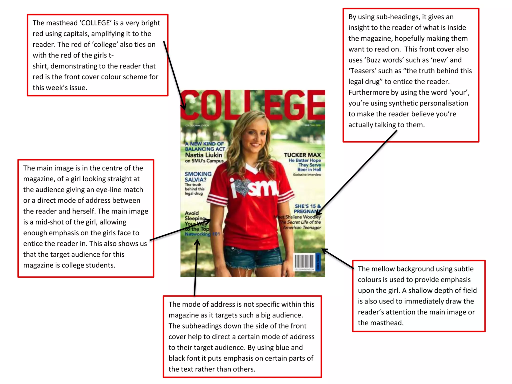
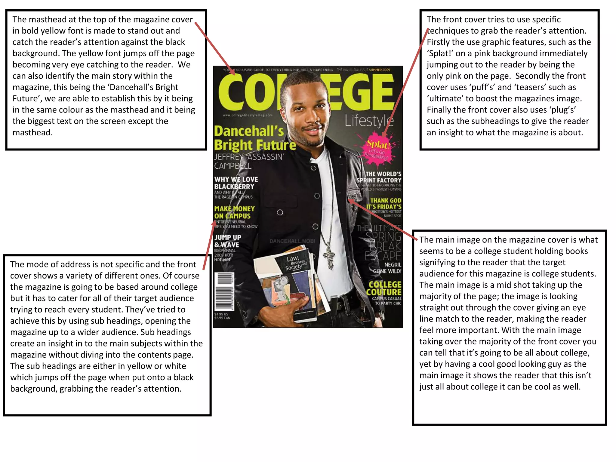
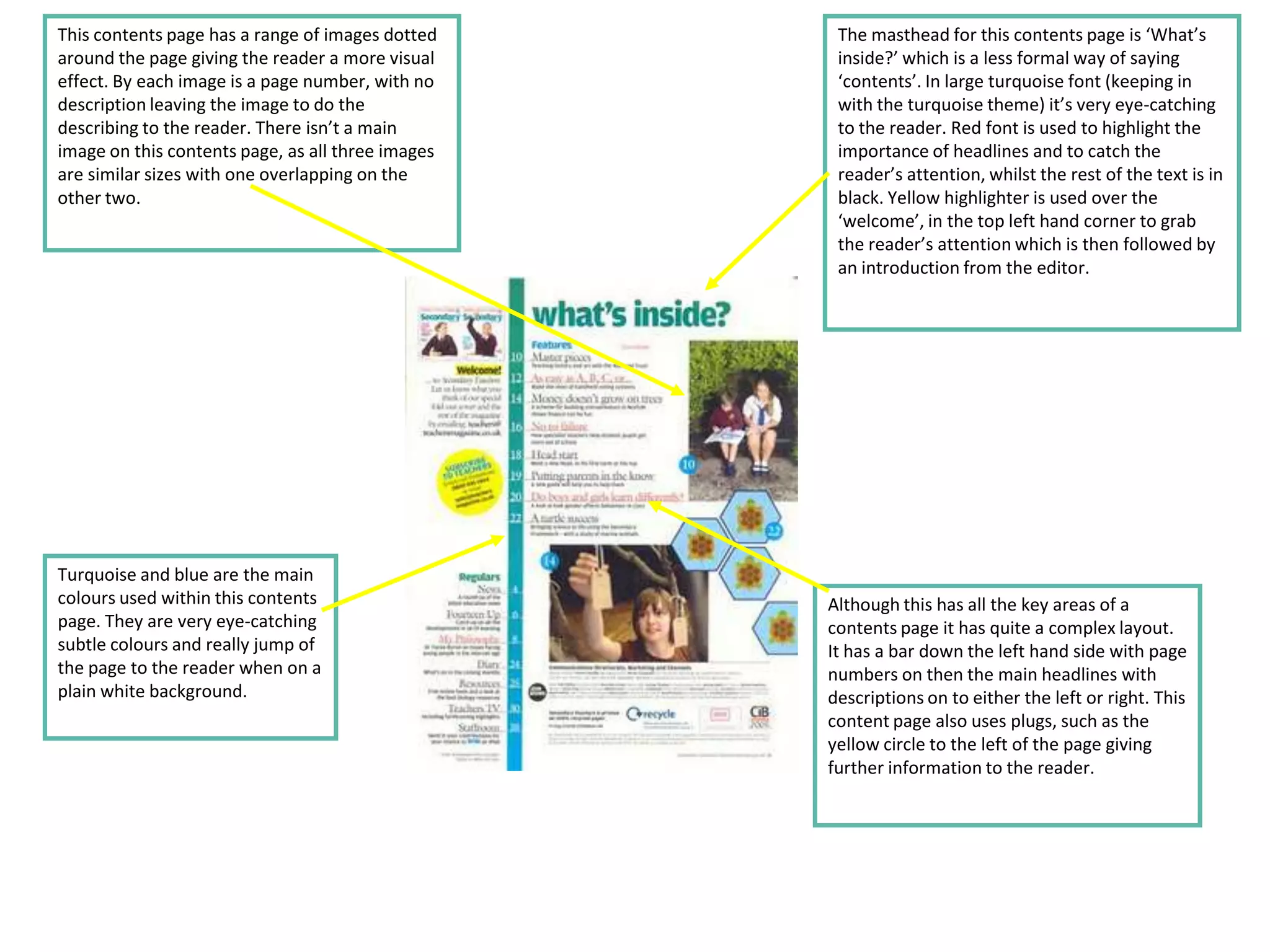
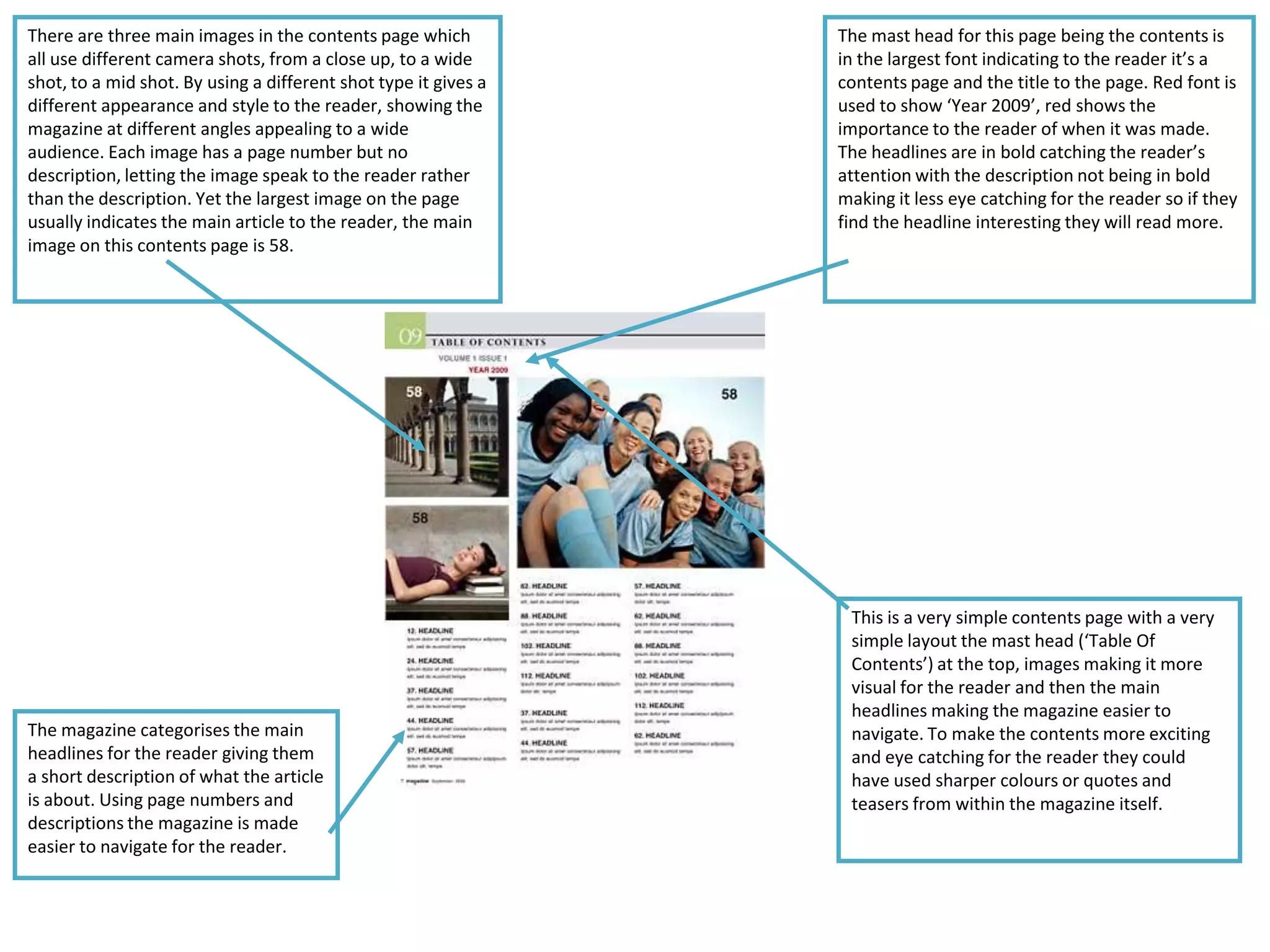
By using sub-headings, it gives an
   The masthead ‘COLLEGE’ is a very bright
                                                                                                 insight to the reader of what is inside
   red using capitals, amplifying it to the
                                                                                                 the magazine, hopefully making them
   reader. The red of ‘college’ also ties on
                                                                                                 want to read on. This front cover also
   with the red of the girls t-
                                                                                                 uses ‘Buzz words’ such as ‘new’ and
   shirt, demonstrating to the reader that
                                                                                                 ‘Teasers’ such as “the truth behind this
   red is the front cover colour scheme for
                                                                                                 legal drug” to entice the reader.
   this week’s issue.
                                                                                                 Furthermore by using the word ‘your’,
                                                                                                 you’re using synthetic personalisation
                                                                                                 to make the reader believe you’re
                                                                                                 actually talking to them.


The main image is in the centre of the
magazine, of a girl looking straight at
the audience giving an eye-line match
or a direct mode of address between
the reader and herself. The main image
is a mid-shot of the girl, allowing
enough emphasis on the girls face to
entice the reader in. This also shows us
that the target audience for this
magazine is college students.                                                                       The mellow background using subtle
                                                                                                    colours is used to provide emphasis
                                                                                                    upon the girl. A shallow depth of field
                                               The mode of address is not specific within this      is also used to immediately draw the
                                               magazine as it targets such a big audience.          reader’s attention the main image or
                                               The subheadings down the side of the front           the masthead.
                                               cover help to direct a certain mode of address
                                               to their target audience. By using blue and
                                               black font it puts emphasis on certain parts of
                                               the text rather than others.
The masthead at the top of the magazine cover            The front cover tries to use specific
in bold yellow font is made to stand out and             techniques to grab the reader’s attention.
catch the reader’s attention against the black           Firstly the use graphic features, such as the
background. The yellow font jumps off the page           ‘Splat!’ on a pink background immediately
becoming very eye catching to the reader. We             jumping out to the reader by being the
can also identify the main story within the              only pink on the page. Secondly the front
magazine, this being the ‘Dancehall’s Bright             cover uses ‘puff’s’ and ‘teasers’ such as
Future’, we are able to establish this by it being       ‘ultimate’ to boost the magazines image.
in the same colour as the masthead and it being          Finally the front cover also uses ‘plug’s’
the biggest text on the screen except the                such as the subheadings to give the reader
masthead.                                                an insight to what the magazine is about.


                                                       The main image on the magazine cover is what
                                                       seems to be a college student holding books
The mode of address is not specific and the front      signifying to the reader that the target
cover shows a variety of different ones. Of course     audience for this magazine is college students.
the magazine is going to be based around college       The main image is a mid shot taking up the
but it has to cater for all of their target audience   majority of the page; the image is looking
trying to reach every student. They’ve tried to        straight out through the cover giving an eye
achieve this by using sub headings, opening the        line match to the reader, making the reader
magazine up to a wider audience. Sub headings          feel more important. With the main image
create an insight in to the main subjects within the   taking over the majority of the front cover you
magazine without diving into the contents page.        can tell that it’s going to be all about college,
The sub headings are either in yellow or white         yet by having a cool good looking guy as the
which jumps off the page when put onto a black         main image it shows the reader that this isn’t
background, grabbing the reader’s attention.           just all about college it can be cool as well.
This contents page has a range of images dotted     The masthead for this contents page is ‘What’s
around the page giving the reader a more visual     inside?’ which is a less formal way of saying
effect. By each image is a page number, with no     ‘contents’. In large turquoise font (keeping in
description leaving the image to do the             with the turquoise theme) it’s very eye-catching
describing to the reader. There isn’t a main        to the reader. Red font is used to highlight the
image on this contents page, as all three images    importance of headlines and to catch the
are similar sizes with one overlapping on the       reader’s attention, whilst the rest of the text is in
other two.                                          black. Yellow highlighter is used over the
                                                    ‘welcome’, in the top left hand corner to grab
                                                    the reader’s attention which is then followed by
                                                    an introduction from the editor.


Turquoise and blue are the main
colours used within this contents                  Although this has all the key areas of a
page. They are very eye-catching                   contents page it has quite a complex layout.
subtle colours and really jump of                  It has a bar down the left hand side with page
the page to the reader when on a                   numbers on then the main headlines with
plain white background.                            descriptions on to either the left or right. This
                                                   content page also uses plugs, such as the
                                                   yellow circle to the left of the page giving
                                                   further information to the reader.
There are three main images in the contents page which           The mast head for this page being the contents is
all use different camera shots, from a close up, to a wide       in the largest font indicating to the reader it’s a
shot, to a mid shot. By using a different shot type it gives a   contents page and the title to the page. Red font is
different appearance and style to the reader, showing the        used to show ‘Year 2009’, red shows the
magazine at different angles appealing to a wide                 importance to the reader of when it was made.
audience. Each image has a page number but no                    The headlines are in bold catching the reader’s
description, letting the image speak to the reader rather        attention with the description not being in bold
than the description. Yet the largest image on the page          making it less eye catching for the reader so if they
usually indicates the main article to the reader, the main       find the headline interesting they will read more.
image on this contents page is 58.


                                                                  This is a very simple contents page with a very
                                                                  simple layout the mast head (‘Table Of
                                                                  Contents’) at the top, images making it more
                                                                  visual for the reader and then the main
                                                                  headlines making the magazine easier to
The magazine categorises the main                                 navigate. To make the contents more exciting
headlines for the reader giving them                              and eye catching for the reader they could
a short description of what the article                           have used sharper colours or quotes and
is about. Using page numbers and                                  teasers from within the magazine itself.
descriptions the magazine is made
easier to navigate for the reader.

College contents analysis 2

  • 1.
    By using sub-headings,it gives an The masthead ‘COLLEGE’ is a very bright insight to the reader of what is inside red using capitals, amplifying it to the the magazine, hopefully making them reader. The red of ‘college’ also ties on want to read on. This front cover also with the red of the girls t- uses ‘Buzz words’ such as ‘new’ and shirt, demonstrating to the reader that ‘Teasers’ such as “the truth behind this red is the front cover colour scheme for legal drug” to entice the reader. this week’s issue. Furthermore by using the word ‘your’, you’re using synthetic personalisation to make the reader believe you’re actually talking to them. The main image is in the centre of the magazine, of a girl looking straight at the audience giving an eye-line match or a direct mode of address between the reader and herself. The main image is a mid-shot of the girl, allowing enough emphasis on the girls face to entice the reader in. This also shows us that the target audience for this magazine is college students. The mellow background using subtle colours is used to provide emphasis upon the girl. A shallow depth of field The mode of address is not specific within this is also used to immediately draw the magazine as it targets such a big audience. reader’s attention the main image or The subheadings down the side of the front the masthead. cover help to direct a certain mode of address to their target audience. By using blue and black font it puts emphasis on certain parts of the text rather than others.
  • 2.
    The masthead atthe top of the magazine cover The front cover tries to use specific in bold yellow font is made to stand out and techniques to grab the reader’s attention. catch the reader’s attention against the black Firstly the use graphic features, such as the background. The yellow font jumps off the page ‘Splat!’ on a pink background immediately becoming very eye catching to the reader. We jumping out to the reader by being the can also identify the main story within the only pink on the page. Secondly the front magazine, this being the ‘Dancehall’s Bright cover uses ‘puff’s’ and ‘teasers’ such as Future’, we are able to establish this by it being ‘ultimate’ to boost the magazines image. in the same colour as the masthead and it being Finally the front cover also uses ‘plug’s’ the biggest text on the screen except the such as the subheadings to give the reader masthead. an insight to what the magazine is about. The main image on the magazine cover is what seems to be a college student holding books The mode of address is not specific and the front signifying to the reader that the target cover shows a variety of different ones. Of course audience for this magazine is college students. the magazine is going to be based around college The main image is a mid shot taking up the but it has to cater for all of their target audience majority of the page; the image is looking trying to reach every student. They’ve tried to straight out through the cover giving an eye achieve this by using sub headings, opening the line match to the reader, making the reader magazine up to a wider audience. Sub headings feel more important. With the main image create an insight in to the main subjects within the taking over the majority of the front cover you magazine without diving into the contents page. can tell that it’s going to be all about college, The sub headings are either in yellow or white yet by having a cool good looking guy as the which jumps off the page when put onto a black main image it shows the reader that this isn’t background, grabbing the reader’s attention. just all about college it can be cool as well.
  • 3.
    This contents pagehas a range of images dotted The masthead for this contents page is ‘What’s around the page giving the reader a more visual inside?’ which is a less formal way of saying effect. By each image is a page number, with no ‘contents’. In large turquoise font (keeping in description leaving the image to do the with the turquoise theme) it’s very eye-catching describing to the reader. There isn’t a main to the reader. Red font is used to highlight the image on this contents page, as all three images importance of headlines and to catch the are similar sizes with one overlapping on the reader’s attention, whilst the rest of the text is in other two. black. Yellow highlighter is used over the ‘welcome’, in the top left hand corner to grab the reader’s attention which is then followed by an introduction from the editor. Turquoise and blue are the main colours used within this contents Although this has all the key areas of a page. They are very eye-catching contents page it has quite a complex layout. subtle colours and really jump of It has a bar down the left hand side with page the page to the reader when on a numbers on then the main headlines with plain white background. descriptions on to either the left or right. This content page also uses plugs, such as the yellow circle to the left of the page giving further information to the reader.
  • 4.
    There are threemain images in the contents page which The mast head for this page being the contents is all use different camera shots, from a close up, to a wide in the largest font indicating to the reader it’s a shot, to a mid shot. By using a different shot type it gives a contents page and the title to the page. Red font is different appearance and style to the reader, showing the used to show ‘Year 2009’, red shows the magazine at different angles appealing to a wide importance to the reader of when it was made. audience. Each image has a page number but no The headlines are in bold catching the reader’s description, letting the image speak to the reader rather attention with the description not being in bold than the description. Yet the largest image on the page making it less eye catching for the reader so if they usually indicates the main article to the reader, the main find the headline interesting they will read more. image on this contents page is 58. This is a very simple contents page with a very simple layout the mast head (‘Table Of Contents’) at the top, images making it more visual for the reader and then the main headlines making the magazine easier to The magazine categorises the main navigate. To make the contents more exciting headlines for the reader giving them and eye catching for the reader they could a short description of what the article have used sharper colours or quotes and is about. Using page numbers and teasers from within the magazine itself. descriptions the magazine is made easier to navigate for the reader.