This document provides details on the design and layout of a college magazine cover and contents page. Key points include:
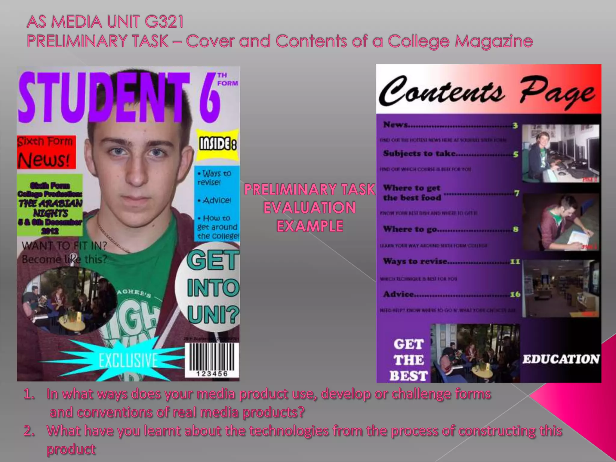
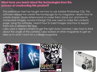
- The cover features a student photo with shapes and text overlaid to make him look like a model, along with varied colors and different font styles for the masthead and cover lines.
- The contents page uses multiple colors but may not clearly indicate the magazine contents as clearly as competitor Men's Health.
- Photoshop was used to alter the cover image and create shapes/text, while InDesign helped make the contents page by inserting images and formatting for export.
- Care was taken in image selection, layout, and font choices, though some elements could be improved for professional quality

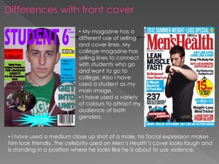
![Masthead
Cover Lines
Dominant Image
[rule of thirds] &
Plain background
Barcode/
price/website](https://image.slidesharecdn.com/collegemagazine-121009041348-phpapp01/85/College-magazine-2-320.jpg)


![Final%20 magazine%20–%20double%20page%20spread[2]](https://cdn.slidesharecdn.com/ss_thumbnails/final20magazine2020double20page20spread2-120511045804-phpapp02-thumbnail.jpg?width=640&height=640&fit=bounds)


![Looking back at your preliminary task, what [autosaved]](https://cdn.slidesharecdn.com/ss_thumbnails/lookingbackatyourpreliminarytaskwhatautosaved-120503190551-phpapp02-thumbnail.jpg?width=640&height=640&fit=bounds)


